
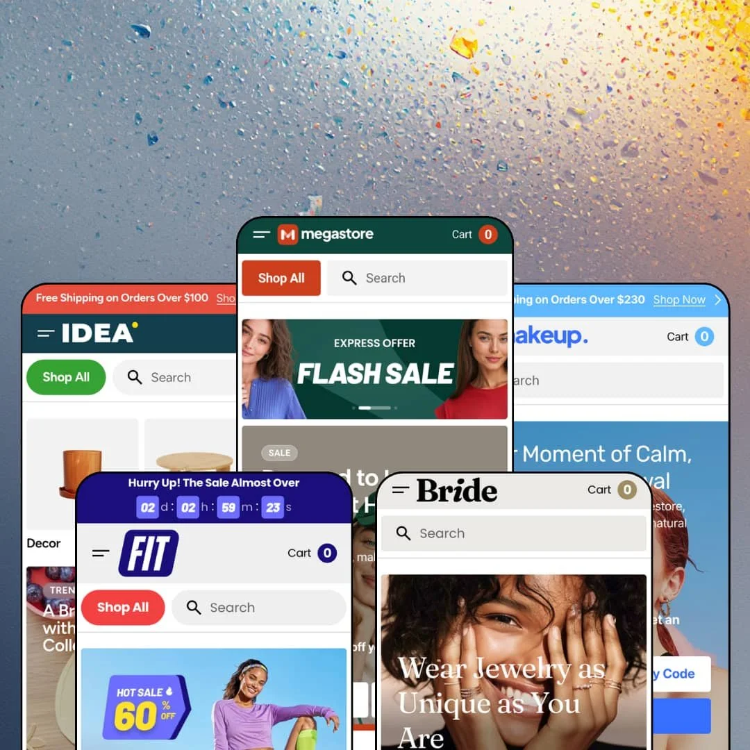
Most multipurpose Shopify themes pick one demo to show off and let the other four coast. Megastore's five presets each stage a different catalog with its own variant grammar: cup sizes for sports bras, millilitres for serums, kettlebell weights, ten-colour bracelet pills. That's the pitch at $320, and the open question is whether an Online Store 2.0 theme with three Theme Store reviews to its name has the depth to back it. I spent a few days inside all five demos to find out.
A homepage buy module with the full product widget
The Item of the Day section drops a complete buy box onto the homepage: media gallery, colour and size pickers, Size Guide modal, quantity stepper, share row and Add to Cart. On the Fit demo the Essential Lounge Shorts run nine gallery images and five colours inside that block, and the Megastore demo's V-Neck Knit Top adds a bust, waist and hips table in the modal, none of it requiring a click through. It converts on the landing page. For single-hero-product brands and small-catalog apparel stores under 50 SKUs, that's the section the whole homepage can be built around.
Native stock counters and back-in-stock capture
Cards print unit counts as a label: 3 Last Items on the Lace-Up Sneakers, 10 Last Items on Presley Frames, 2 Last Items on the Striped Bamboo Cuff. When a variant is out, the product widget swaps in an Availability Notification email form with the vendor, product and selected variant pre-filled, so the capture happens without a third-party install. No app needed for either. Drop-model and restock-driven stores with 50 to 500 SKUs get the two urgency signals that matter most, and they get them from one theme setting rather than two subscriptions.
Multi-brand catalog grammar built into the cards
Every product card prints a vendor line above the title, and the Brands section renders an A-to-Z directory where each entry links to a vendor-filtered collection. Bride lists fourteen labels that way. Megastore lists twenty-seven. A Popular Brands logo row sits alongside for the labels a merchant wants to feature. For multi-brand retailers and marketplace-style stores carrying 500+ SKUs across a dozen suppliers, brand navigation is part of the theme rather than a metafield project.
Cart drawer for stores that sell on thresholds
If your shipping offer is a threshold, this drawer already speaks it. The slide-out cart carries a free-shipping progress line at the top, an Order Special Instructions field, and a promo code entry added in the August release, so the three things a threshold-driven shop needs are in place before checkout. The empty state is the interesting part. Instead of a blank panel it shows a tabbed cross-sell block, Best Offer, For Women, For Men on the fashion demo, with eight products and colour chips ready to add, which turns an abandoned drawer into a merchandising surface for impulse-buy apparel and accessories stores running free-shipping promotions.
Three reviews in fifteen months
Megastore launched in June 2025 and has collected three Theme Store reviews since. Two are positive; the negative one, from October 2025, reports side-cart problems with no resolution, and the developer's reply says a rework was in final testing. That's a thin record. Merchants running subscription-driven or 500+ SKU stores who need a theme with a visible bug-and-fix history should weigh that against the feature list before committing a launch to it.
Discount is the default voice
Every one of the five demos stages a Black Friday countdown block, a SALE UP TO 50 % or 60 % ticker, a Flash Deals row, and a 25 % newsletter incentive, and the Megastore demo layers a FLASH SALE, BUY 3 PAY FOR 2 and 1+1 = FREE slider on top. Five presets, one volume setting: loud. The countdown, ticker and promo sections are all optional, so a merchant can strip them, but the presets as shipped are built around urgency rather than brand. Luxury jewelry, considered-purchase furniture and single-brand skincare stores will be rebuilding the tone of the homepage before they touch the catalog.
Social proof is presentation, not mechanism
The product page ships a Reviews accordion, and it opens empty. Why Over 10,000 Customers Trust Us is a headline field above four icon columns, and the Testimonials section is a text block per quote. Nothing collects or verifies anything. Stores where repeat buyers and review volume drive conversion, mid-market beauty and apparel in particular, will install Judge.me, Loox or Yotpo and route the accordion to it, which is a normal step but not one the Theme Store listing prepares you for.
Online Store 2.0 at a 2026 price
The theme is built on the Online Store 2.0 generation, with Dawn's vocabulary visible in the media and variant strings, and the same two-level block nesting that generation allows. Dawn, Shopify's free baseline, sits on identical architecture. Megastore adds a lot on top: sections, promo tooling, brand grammar, the product widget. What it doesn't add is the Theme Blocks nesting that Shopify's post-2025 themes ship with, and agencies building multi-store setups or evergreen catalogs they expect to run into 2028 should know the $320 buys breadth on current architecture rather than headroom on the next one.
What it takes to launch
Expect a multi-day pass across promo banners, countdown dates, discount-code stickers and ticker copy on every preset, plus a market-and-currency re-staging, brand directory population, placeholder contact details, and a price audit on a few demo products before launch.
-
What works in this preset
The first thing that hits you is how much the header is doing before you scroll. A utility row carries a phone number, About, Journal and Help Center; below it the mega menu runs three levels deep, so Women opens Blouses, Blouses opens four named products, and a Premium Collection column closes the panel with six product links of its own. It's a department-store map. For a fashion catalog split across women, men and accessories, a shopper can land on a specific cardigan from the nav without ever touching a collection page.
The New In block is a Products Tabs section with All, Tops, Bottoms and Accessories as tabs, and every apparel card in it carries a Choose Size row of XS to XL pills. That turns the homepage grid into a quick-add surface. I clicked around the Bestsellers row and found the same pattern on the Cap Sleeve Mini Dress and the Classic Piqué Polo, while caps and frames, which have no size axis, show colour chips instead. The card adapts to whatever options the product carries.
Promo blocks here use a Copy Code mechanic rather than plain text. The hero carries NEW10 with a Copy Code button that flips to Code Copied, and the Dressed to Impress banner does the same with MEGA50. It's a small thing that saves a shopper retyping a code at checkout, and it's built into the banner block rather than bolted on.
Where it stumbles
For a preset that names itself after clothing and shoes, footwear is under-staged. Lace-Up Sneakers, Retro Trainers, Low Profile Sneaker and Penny Loafers all render with colour chips and no size axis, so the size pills that make the apparel cards useful never appear on a single shoe. A footwear merchant would be rebuilding every shoe's variant structure before the cards mean anything.
-
What works in this preset
A $1,820 dining table sits three tiles away from an $8 candle pair, and the layout copes with both. The Furniture row runs eight cards of tables, benches and shelves at four-figure prices, and the Bestsellers row below it drops to towels and vases in the $14 to $28 band without changing card size or type hierarchy. That's the right behaviour for a home-goods catalog where price spread is wide. Nothing looks cheap next to the expensive pieces, and nothing looks overpriced next to the small ones.
Badges do real work in this demo. Flash Deals stacks a percentage badge (-38 % on the Steel S-Hook, -28 % on the Classic Stripe Towel), a Best Price label, and a Sold Out state on the Textured Paper Lantern Shade, all rendered as card-level markers rather than copy in the title. Colour chips overflow gracefully too: the Cloud Form Vase shows two swatches and a 1+ More tag, the Corduroy Weekend Bag shows two and a 2+ More. I went looking for a card that broke under a long option list and didn't find one.
Where it stumbles
Furniture is staged without furniture variants. The Minimalist Dining Table, the Low Round Table and the Modular Storage Shelf are single-variant products with no finish, size or material axis, and the Lidded Organizer Box family is split into three separate Small, Medium and Large products instead of one product with a size option. For a home-goods merchant that's the opposite of how furniture is actually sold, and the demo's kids-room banner links to Bestsellers because no kids collection exists in the nav.
-
What works in this preset
"Cup size: A, AA, B, C, D, DD, DDD." That's the picker on the Ribbed Racerback Bra, and the Mesh Panel Bra goes further to E and FF. The Cast Iron Kettlebell renders its own option as 7 LBS through 35 LBS. Whatever the merchant names the option, the pill row prints it. For a sportswear and equipment store, that means bras, weights and resistance bands share one card component without any of them looking wrong.
Sport Equipment gets a top-level slot in the header alongside Women, Men and Sale, with Bags, Bottles, Dumbbells and Weights underneath, and the homepage mirrors that split with four category tiles. A Before / After slider sits on the homepage as well, which is a section I'd expect to see on a beauty demo rather than here. I sat up at that. It suggests the section library is being deployed by vertical logic rather than copied from one preset to the next.
Where it stumbles
The bras carry cup sizes and nothing else. No band size, no chest measurement, so a shopper choosing DD has no way to pick 34 versus 38, and the Size Guide modal on the Essential Lounge Shorts prints a bust, waist and hips table under a pair of shorts. Sportswear lives on fit accuracy. This demo stages the pickers and skips the part that makes them usable.
-
What works in this preset
Skincare shoppers browse by concern and by step, and this header lets them. The mega menu splits Face Care, Body Care and Hair Care as first-level entries, and the Shop by Collections row on the homepage repeats the same split as ten image tiles. The Balancing Toner carries a Cosmetic function option with Balancing, Comforting and Clarifying as its values, and the Herbal Deodorant offers Ocean breeze and Lavender as a Scent axis. Both render as plain pill rows. Neither needed a custom field.
The Size Guide modal accepts free-form rows rather than a fixed measurement table. On the Retinol Alternative Serum it reads 50 ml Travel-friendly, 100 ml Daily use, 200 ml Long-lasting value, which is a size guide rewritten as a buying guide, and the card for the same product shows a $20.00 to $60.00 price range so the spread is visible before the click. That's a useful reuse of a block most merchants only think of for apparel.
Where it stumbles
The demo leaves the theme's ingredient section unstaged. A beauty merchant will populate INCI lists, usage steps and concern tags themselves before the product page reads as skincare rather than generic retail, because the Makeup demo shows description and care copy only. The Men's Grooming Essentials banner also links into a catalog where After Shave Serum is the lone men's product, so the men's positioning is a banner, not a range.
-
What works in this preset
The Woven Thread Cuff Bracelet page shows what the product template can carry. Twenty-seven images render as a grid gallery, breadcrumbs sit above the title, the ten-colour picker uses pills with names rather than dots, and a Delivery details link opens a modal listing Pick-Up in Store as free, Standard at 3 to 5 days from $15, and Express at 1 to 2 days from $25. Description and Material & Care are accordions. A Complete Your Order block pairs the bracelet with a ring and a chain bracelet, each with its own price and vendor line.
Collection pages open with a Top Offers trio of banner tiles above the grid, and the filter rail below carries counts per value: Gold 7, Silver 5, In stock 10, Out of stock 1, with a price slider capped at the collection's own maximum. Nine sort orders sit in the dropdown. For a jewelry store with a small catalog per category, counts on the filter tell a shopper whether a click is worth it before they make it.
Where it stumbles
Rings ship in colours, not sizes. The Bamboo Resin Bangle Ring lists Red, Green, Yellow, Black, Pink and two more, the Openwork Sunburst Ring offers Gold or Silver, and nowhere in the demo does a ring carry a size axis or a size chart. Jewelry merchants sell rings by size before anything else. The preset is dressed for the vertical and skips its first question.
A shopper-facing dark mode, done consistently
Every demo header carries a Dark Mode and Light Mode toggle, and the assets are built for it: the logo ships as a light and a dark file, and the Popular Brands row loads a paired SVG per label so the logos don't wash out when the palette flips. That's a theme-character decision carried through all five presets rather than a demo trick, and it gives merchants a second colour scheme without building one.
The Features menu is a live spec sheet
Each demo's first nav item opens a panel that links twenty-one sections, seven product-page layouts, five article-header variants and eleven utility pages as real, rendered pages. A merchant can inspect the Grid Gallery against the Slider with Previews, or the Pills Options against Dropdown Options, on live URLs before buying, which is more transparency than the Theme Store listing itself offers.
Variant pickers that print the merchant's vocabulary
Across the five demos the same pill component renders cup sizes, pound weights, millilitres, cosmetic functions and scents without a custom field or a different template. The option label is whatever the merchant typed in admin. That's why the preset family feels vertical-specific despite sharing one product template.
One homepage skeleton, five coats of paint
Read all five demos in a row and the order is fixed: promo-code hero, collection tiles, bestsellers, flash deals, countdown, ticker, product widget, blog, trust columns, FAQ accordion, newsletter, brands. The imagery and the palette change; the sequence doesn't. A merchant who wants a different homepage rhythm is rearranging sections rather than picking a preset that already has it.
The look depends on licensed photography
Three of the five demos credit a real brand for their product imagery, and the grids are mostly image. Strip the borrowed catalogs out and the layout is a set of frames waiting for lifestyle shots, hover images and second angles. Merchants without a photography budget will see a plainer store than the one they bought.
Food and drink is listed, never staged
The Theme Store filters place Megastore under jewelry and accessories and under food and drink. Bride covers the first. Nothing covers the second, and no demo stages pack sizes, nutrition blocks or age gating, so a food merchant would be assembling the vertical from the section library alone.
★ 7.4/10
Rating
-
Product widget, stock counters, back-in-stock capture, brand directory and a full promo kit ship natively; social proof and colorway grouping outside Plus still need apps.
8
-
Section library is broad and every section is linkable from the demos, but five presets of promo staging mean a long strip-down before a calmer store emerges.
7
-
The mobile menu stacks with a back button per level, cards keep size pills and colour chips at phone width, and the product widget collapses cleanly; the promo density is heavier on a small screen.
7
-
Homepages carry a lot of image-heavy sections and multiple tickers by default; lazy-loading is in place, but the shipped demos are not lean.
7
-
Dark and light schemes, seven product-page layouts, three article headers and twenty-one sections give real range; the fixed homepage sequence limits how different two Megastore stores can look.
8
Frequently Asked Questions
-
Yes. A Delivery details link opens a modal that lists pick-up, standard and express with per-method timing and a from-price, all set in the theme editor.
-
The August 2026 release added rendering for quantity rules and volume pricing, along with a quick order list. The pricing itself comes from Shopify's B2B features on Plus; the theme handles how it displays.
-
Combined listings support was added for Shopify Plus. Below Plus, the demos use a colour option inside a single product, which is how every multi-colour card in the five demos is built.
-
A Popular searches row, a Recommended for You strip with two or three product cards, and a promo banner with its own from-price, all pre-staged in the overlay.
-
An age verifier is in the feature list, though none of the five demos turn it on, so I couldn't check the flow.
-
Creative Commerce lists support on business days with a fifteen-minute typical response during support hours, including during the trial, plus a documentation site and a help center linked from the listing.
This review is based on hands-on testing of the publicly available preset demos of the Megastore Shopify theme as of September 2026. Theme features, preset availability, and performance can change with subsequent updates from the theme developer.