
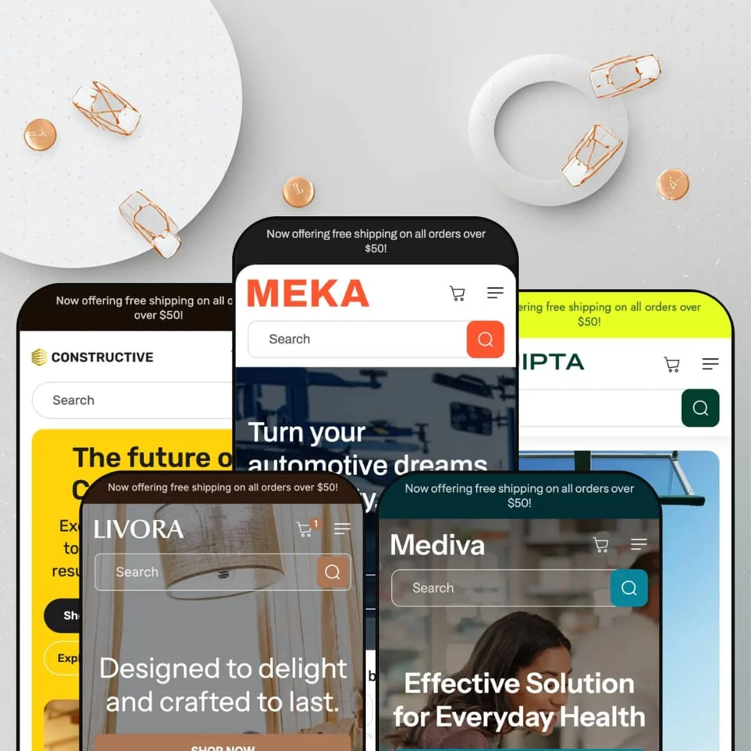
Most multi-vertical theme families share one layout and just swap the photography. Meka swaps the spec sheet too, rebuilding its comparison columns and product metadata for whichever industry the preset is dressed as. Built on Online Store 2.0 architecture, it ships five presets that each lean on the same merchandising idea: shoppers who decide by comparing attributes. Whether you sell brake calipers or magnesium capsules, the centerpiece is the same engine wearing different clothes.
A built-in comparison system, not an app rental
The product comparison table and its companion "add to compare" drawer are native to the theme, pulling spec rows from product metafields you control. Shoppers select two to four items and read them side by side on the attributes that matter, and every preset re-skins those columns for its vertical rather than hardcoding one set. For a store with 50 to 200 SKUs in a spec-differentiated category like auto parts or supplements, this replaces a paid comparison-app install plus the integration work to wire it in.
Metafield-driven merchandising that adapts per vertical
Beyond the comparison table, the theme leans on metafields for product highlights, icon callouts, and spec tabs throughout the page. The same components render warranty data for tires and ingredient lists for vitamins. That adaptability means a merchant isn't fighting a fashion theme's assumptions when selling something technical. It rewards catalogs where products carry structured, comparable attributes, the sort of detail a considered-purchase buyer reads before adding to cart.
Navigation built for deep, multi-category catalogs
Catalog discovery is a genuine strength. The mega menu nests up to four levels in the hardware and auto presets, sticky search stays available on scroll, and collection pages support filtering and infinite scroll. A merchant running hundreds of SKUs across many sub-categories, the operational reality for a parts or supplement store, gets a header that can actually map that depth instead of flattening it into a short list.
A cart that keeps selling
Compared with the minimal cart drawer Dawn ships, Meka's slide-out cart does more work: a cross-sell carousel of suggested products, an order-note field, gift-wrapping, and the free-shipping threshold message carried from the announcement bar. These pieces function as one coordinated kit at the point of purchase. For a mid-market store relying on average-order-value lifts rather than traffic volume, that cart is a place to grow each basket.
The centerpiece needs spec data to mean anything
Strip the attributes out and you're left with a good-looking category theme and an empty table. The comparison engine and spec rows only earn their keep when products carry structured, comparable data. A brand-led or story-driven seller, say a boutique apparel or beauty label that sells on aesthetic and identity rather than measurable specs, buys a lot of tooling it will never switch on.
You're paying for the engine, not a signature look
The visual language is competent but conventional category-store styling, and at this tier the value lives in the merchandising tools rather than a distinctive aesthetic. A design-led merchant in a premium or luxury positioning, where a recognizable brand look is part of the product, may find the templates too neutral to carry that identity. The look serves the catalog; it rarely surprises.
Comparison assumes a coherent catalog
The table works when products share comparable dimensions, and it fragments when they don't. A broad general-merchandise store with a heterogeneous catalog, mixing, for instance, electronics with apparel with homewares, can't populate one meaningful comparison across those product types. The feature suits a focused single-category catalog far better than a sprawling everything-store.
What it takes to launch
Expect to populate product metafields for spec rows and comparison columns, restage the mega menu for your category tree, and run a multi-section copy and imagery pass across hero, highlights, and FAQ before the demo's richness is reproducible on your own catalog.
-
What works in this preset
Open the homepage and the auto-parts intent is immediate. A faceted finder sits under the hero with Category, Item Material, and Brand dropdowns, the kind of entry point a parts buyer expects before they'll trust a catalog. Below it, the product comparison table stacks three brake products against rows for mileage warranty, tread pattern, and noise level. That table is the clearest expression of what this theme is for.
The merchandising stack runs deep here. There's a before/after image slider for showing a vehicle pre- and post-upgrade, an image-hotspot section mapped over a car diagram, a brand-logo wall, and a slide-out cart that surfaces cross-sell products with an order-note field. Product cards carry an "Add to compare" control that feeds a drawer where shoppers pick two to four items. It's a coherent buying journey for a considered, technical purchase.
Where it stumbles
The "Search by vehicle" finder looks like fitment search but doesn't behave like it. I clicked through the dropdowns and the Search button routes to the full collection rather than filtering by an actual vehicle match. For an auto-parts store, year/make/model fitment is the feature buyers care about most, and staging a finder that only mimics it sets an expectation the demo doesn't keep.
-
What works in this preset
Hardware is a natural fit for attribute shopping, and this preset knows it. The comparison table swaps in Purpose, Type, Material, and Weight, so a caliper, a hammer, and a clamp line up on the dimensions a tradesperson actually weighs. Those rows are populated with genuine spec language rather than placeholder filler.
A four-level mega menu carries the load for a deep tool catalog. Hand Tools, Power Tools, Safety Equipment, and Materials each fan out into four sub-collections, and the header keeps a sticky search within reach as you scroll. The image-hotspot section reappears over a workbench scene, tagging individual tools you can quick-view without leaving the page. For a catalog organized by job rather than by brand, that navigation depth earns its place.
-
What works in this preset
Here the theme softens into something more editorial. The palette goes warm and neutral, the hero reads "artful living," and the product slider pairs lifestyle copy about sustainable materials with shoppable lamp and pillow cards. It's the most magazine-like of the five demos.
The comparison engine adapts gracefully to decor. Instead of warranties and tread patterns, the columns become Material, Release year, Assembly, and Height, which is exactly how a furniture buyer compares two table lamps. Color swatches drive variant selection on the product page, and the cart drawer keeps its cross-sell row. I went looking for where the spec-heavy thesis would feel forced in a decor context, and it mostly holds, though it leans quieter here than in the technical presets.
-
What works in this preset
Sports gear gets the energetic treatment. The hero runs as a five-slide rotation with motivational lines, and the collection grid spans footwear, equipment, and accessories with hover-swap product imagery. It's the busiest opener of the family.
The comparison table is well-matched to athletic buyers. Activity type, warranty period, upper material, and sole-and-traction line up hiking shoes against trail runners and walkers, which is genuinely useful when fit and terrain drive the decision. Variant rendering is clean on the product page, and the compare drawer behaves the same as everywhere else. For a gear catalog spanning many activity types, this preset gives shoppers a way to narrow by use.
Where it stumbles
The slideshow hero sells mood, not product. Five rotating banners say "Train harder" and "Gear up for every adventure" without surfacing a single item, which is an odd front door for a theme whose strength is attribute-level decision-making. A merchant here would do better routing that hero space toward the comparison and finder tools the theme does well.
-
What works in this preset
This is the most recent preset, and the supplement framing suits the comparison model surprisingly well. The table fields become Description, Type, Usage, and Ingredients, so a multivitamin, a vitamin C gummy, and a CoQ10 pill sit side by side on dosage and formulation. That's a real decision aid for someone choosing between supplements.
Quantity-as-variant works cleanly on the product page, with Collagen Peptides offering 30- and 60-count options. The catalog is organized two ways at once, by goal (Immunity, Gut Health, Mental Focus) and by format (Gummies, Pills, Powders), which mirrors how supplement shoppers actually browse. I kept noticing how much of the page depends on populated metafields to read this well.
Where it stumbles
The urgency hardware fits awkwardly here. A countdown timer labeled "Handpicked for This Week" and the same hot-deals framing used in the auto preset apply pressure tactics to a wellness catalog, where trust and routine usually sell better than a ticking clock. The theme reuses one urgency playbook regardless of category, and supplements are where that seam shows.
One merchandising thesis, carried through five industries
Read all five presets together and the real identity emerges: MUUP committed to attribute-led shopping as a single idea and saw it through auto parts, hardware, decor, sports, and wellness. That consistency is more impressive than any one demo, because it shows the comparison and metafield system was designed to travel rather than bolted onto one vertical and recolored for the rest.
Content and commerce sit together in every preset
Each demo pairs a blog and guide-style sections with its transactional tools, so the theme supports editorial, search-friendly selling alongside the cart. For a merchant who wants to rank on buying-guide content and convert on the same site, that pairing is present across the family rather than reserved for one flagship preset.
Five presets, one design skeleton
The palettes and content shift between demos, but the layout DNA barely moves. Calling them five designs oversells the visual range; in practice it's one flexible skeleton in five colorways. A buyer expecting five genuinely distinct aesthetics will find a single adaptable system instead.
A single urgency playbook applied to every category
Countdown timers, stock counters, promo popups, and hot-deals urgency appear in all five verticals identically. That works for parts and gear, but it sits uneasily in wellness, where the supplement preset applies the same hard-pressure devices to a category that usually converts on trust. The theme has one persuasion mode and deploys it regardless of fit.
★ 7.8/10
Rating
-
Native comparison engine, metafield-driven spec merchandising, and deep catalog discovery give it more genuine selling tools than most category themes.
9
-
The strongest features are gated behind metafield population, so getting a store to match the demo takes real data entry, not just copy swaps.
7
-
Responsive layout with a stacking mobile menu; the comparison table is content-dense and puts the burden on careful column staging for small screens.
7
-
Lean markup with lazy-loaded imagery, though the demos run image-heavy sections that a merchant should prune before launch.
8
-
The section library is shared across all presets and adapts well per vertical, but the underlying layout repeats across the family.
8
Frequently Asked Questions
-
No. The comparison table and the floating compare drawer are built into the theme. They read from product metafields, so the work is data entry on your side, not a subscription.
-
Pick the closest vertical as a head start, but the sections are shared across all five, so you can rebuild any preset toward your category. Mediva or Constructive suit spec-heavy goods; Livora is the better base for a softer, lifestyle look.
-
You can, but it pays off best when products share comparable attributes and there's enough catalog to make comparing worthwhile. A very thin or one-off catalog gets limited value from it.
-
It's a theme section available to every preset; Meka simply stages it most prominently. In another preset you'd add and configure the same section yourself rather than finding it missing.
-
A meaningful amount. Spec rows, product highlights, and the comparison columns all pull from metafields, so plan for a population pass before your store reads as richly as the demo.
-
The theme renders the selector UI in the header, but the actual currency conversion and market logic are handled by Shopify Markets at the platform level, not by the theme itself.
This review is based on hands-on testing of the publicly available preset demos of the Meka Shopify theme as of May 30 2026. Theme features, preset availability, and performance can change with subsequent updates from the theme developer.