
The Modular Shopify theme stands out for lively, conversion-focused layouts and an interactive browsing flow. Its design system favors bold type, large hero areas, and a flexible grid that adapts to product cards, testimonials, and editorial content. Key universal capabilities visible across presets include a mega menu, a quick view modal from product grids, a cart drawer and cart page, variant handling, FAQ/accordion sections, pagination, robust header and footer structures, search, and baseline Shopify compliance.
Pros.
〰️
Pros. 〰️
✚ Quick view that speeds sampling
A consistent quick view modal lets shoppers evaluate options straight from grids. It shortens the path to cart, especially in image-first catalogs where the product card sets expectations clearly.
✚ Deep, configurable mega menu
The mega menu supports structured navigation and hero imagery. This gives merchants space for guided discovery and campaign placement without sacrificing clarity in large catalogs.
✚ Cart drawer built for clarity
The cart drawer includes order notes, a terms checkbox, and a free-shipping progress indicator. These touches keep checkout expectations transparent and reduce second guessing before payment.
✚ Flexible grids and storytelling blocks
Section options span image-forward product cards, multi-row collection grids, testimonial rotators, icon feature sections, and video or slideshow heroes. Merchants can swing from promotional energy to editorial calm while preserving a consistent shopping rhythm; badges for “Sold Out” and savings keep availability and value obvious during scanning.
✚ Lightweight campaign messaging
A scrolling announcement/ticker pattern surfaces sales and news without crowding the hero. It delivers a steady cadence for promotions and helps time-sensitive messages land while shoppers continue toward products.
✚ System pages that feel deliberate
404, empty cart, and no-results pages arrive styled rather than as afterthoughts. Shoppers get sensible guidance back to products, which helps retention during wayfinding errors.
Cons.
〰️
Cons. 〰️
− No visual swatch selector
Variant choice relies on dropdowns rather than color chips. Stores that market heavily through color may miss at-a-glance selection on tiles or PDPs.
− “Buy Now” consistency varies
The Buy Now button does not appear uniformly across all contexts. Inconsistency can cause hesitation for shoppers expecting immediate purchase options.
− Overlap in certain hero/drawer configurations
In specific stacks, hero media and overlays can visually clash, and the cart drawer can lock background scrolling in ways that feel heavy. The result is distraction rather than a broken flow, yet it deserves attention in QA.
-
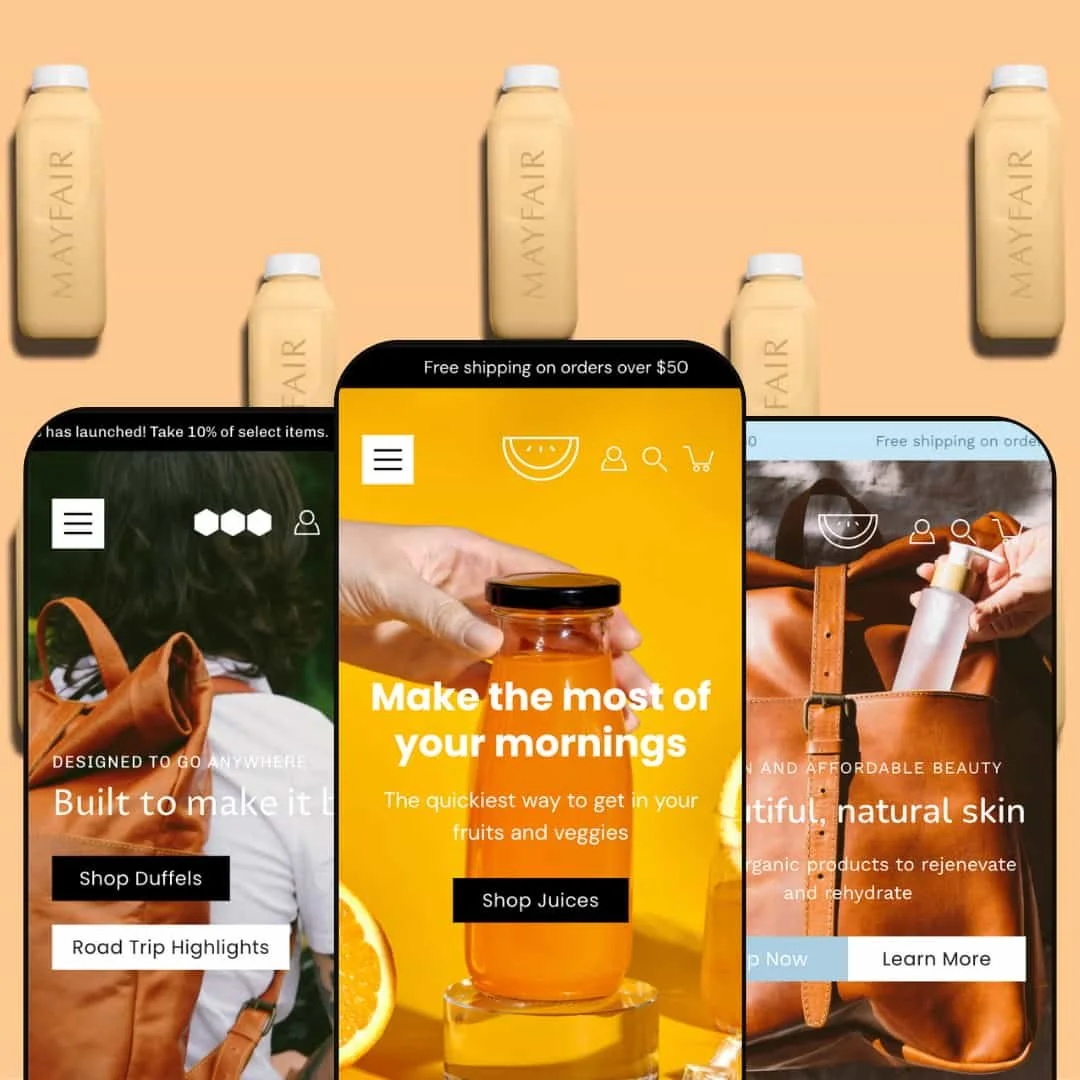
Vibrant Food & Beverage branding with a teal, yellow, and white palette sets a playful tone while keeping calls-to-action prominent. The home layout leans on image-forward presentation and crisp typography that let packaging carry the page. The result is an upbeat storefront that pushes product discovery without sacrificing clarity.
What works in this preset
Color choices and contrast make bottles and labels pop against generous white space. The palette reads fresh and energetic, aligning with juice and healthy-lifestyle positioning. Typography remains assertive but legible, so price and CTA stay easy to spot.
The overall cadence is quick and cheerful, which suits limited-time promos and seasonal flavors. Sections stack in a way that keeps attention near products rather than burying them in copy. Shoppers can skim, choose a flavor, and move forward without confusion.
Imagery does the heavy lifting. Packaging photography lands large, with section spacing that avoids clutter. Merchants who rely on bright product shots will find the visual rhythm flattering and consistent.
-
Beauty and skincare retailers get a minimalist, editorial look with crisp type and light pink accents. The layout emphasizes slides, clean overlays, and tidy section spacing that flatters product photography. Overall, Spectrum reads calm and controlled while keeping conversion cues visible.
What works in this preset
A quiet palette and generous whitespace spotlight packaging and textures. Headings guide the eye without shouting, and small captions feel at home next to close-up imagery. This aesthetic helps brands communicate ingredients and finish with confidence.
Category highlights appear in neat columns that lead from brand story to practical shopping paths. The spacing keeps each range distinct, supporting discovery without cognitive overload. It feels curated, not crowded.
Social proof sits comfortably inside the editorial rhythm. Quotes and brand statements feel like part of the layout rather than interruptions. That cohesion supports trust while maintaining a polished surface.
-
Neutral brown and cream tones point to outdoor, travel, and craft goods with a heritage feel. Long-form storytelling and material callouts fit naturally within this visual language. Blueprint reads as tactile and trustworthy, which suits higher-consideration accessories.
What works in this preset
The subdued palette lends weight to natural materials and workmanship. It pairs well with textured photography and subtle shadows that suggest durability. Copy can take a more measured pace without losing momentum.
Narrative space is built into the look and feel. Brand voice can stretch into benefits, origin, and care while the page remains approachable. This helps shoppers evaluate value beyond surface style.
Trust elements feel native to the composition. Craft cues and guarantees do not clash with the aesthetic; they reinforce it. The whole page signals quality before the cart.
Where it stumbles
Very long descriptions can push primary CTAs below the fold on mobile. It does not block purchase, yet it adds a scroll step at key decision moments. Merchants should keep top-line benefits near the button and reserve deeper detail for expandable sections.
Niche Suitability
Not Ideal For
-
Multi-product stores in food and beverage, beauty, or outdoor goods that want fast grid browsing and in-grid sampling with a strong visual backbone.
-
Shops that require tile-level color swatches or ultra-accelerated single-SKU checkout patterns will be better served by themes prioritizing those mechanics.
-
Low — Most visual and structural changes are handled in theme settings with immediate preview. Grids, hero media, testimonial blocks, and menus can be restaged without developer intervention.
Final Recommendation
★ 8.4/10
Rating
-
All essential e-commerce functions are present: quick view modal, cart drawer/page, product filtering/sorting, mega menu, variant controls, blog, testimonial and newsletter modules, styled 404/empty/no-results pages. No configuration traps, and every feature is available via settings. The one markdown: variant swatches use a dropdown selector only. Performance bugs were rare and implementation aligns with Shopify norms.
9
-
The editor exposes grid logic, badges, quick view, and header/footer blocks across presets. Cart, menu, and hero settings are easy to adjust with instant preview. FAQ, icons, and announcement banners are straightforward to stage. Complex home or collection grids may take a few extra clicks to reorder, but they do not create a learning curve.
8
-
Layouts adapt for grids, drawers, sliders, forms, and navigation with responsive touch targets. Minor overlap can appear between hero CTAs and drawer overlays in Spectrum, yet purchase paths remain intact and navigation stays accessible.
8
-
Modals and drawers respond quickly; filtering, sorting, and pagination feel smooth. Images load and resize briskly, and hero sliders transition fluidly. Cart updates and quick view open/close exhibit no visible lag.
9
-
Colors, type hierarchy, grid formats, and header/footer order can be restaged widely. Banners, product/testimonial grids, video, and accordions give plenty of creative latitude. The absence of visual swatches and occasional hero overlap keep this from a perfect score.
8
FAQ
〰️
FAQ 〰️
-
👑 Yes. The presets demonstrate support for food and beverage, beauty/skincare, and outdoor or craft goods. Stores that rely on packaging, lifestyle branding, or long-form product stories benefit most.
-
📱Yes. Navigation, grid browsing, and cart flows work across presets with responsive touch behavior. Minor hero overlap can appear in Spectrum but does not block purchase.
-
🎨 Colors, typography, grid layouts, banners, icons, mega menu sections, and FAQs can be restaged in the editor. Default’s bold grids and Blueprint’s story blocks were easy to re-arrange.
-
⚡ Quick view and cart actions open promptly. Filtering, sorting, and pagination feel fluid, even on larger grids. Progress bars and promotional tickers update without stutter.
-
👕 Yes. Variant selectors appear in quick view and on product pages with clear disabled states until options are chosen. Note that selection uses dropdowns instead of color chips.
-
🔎 Standard Shopify SEO controls for titles, descriptions, and alt text are available on pages, products, and collections. FAQ and blog layouts support indexable content.
-
💱
-
⚙️ Yes. Shopify’s multi-language and multi-currency features are supported, and header/footer areas can surface locale and currency controls.
-
🛒 Yes. The Shopify Theme Store provides live demos for Modular’s presets. Checkout is disabled in demos, but browsing and feature testing are available.
This review is based on hands-on testing of the publicly available “Default,” “Spectrum,” and “Blueprint” preset demos of the Modular Shopify theme as of November 5, 2025. Theme features, preset availability, and performance can change with subsequent updates from the theme developer.