
Modules positions itself as a flexible, story-driven storefront built on top of Shopify’s core offering. Across presets we saw a sticky header that keeps search and cart within easy reach, a predictive search overlay that handles nonsense queries gracefully, a slide-out mini cart, rich variant pickers, and consistent page dressing from content pages to a polished 404 state. First-time visitors are greeted by large hero sections with concise copy and clear calls-to-action; the Default preset leans clean and tech-forward, while Autumn embraces warm, boutique tones and serif display type.
Pros.
〰️
Pros. 〰️
✚ Variant options handled cleanly
Product pages support radio buttons, swatches and multi-option selectors, paired with a quantity stepper and dual calls-to-action. The system scales to complex SKUs—sizes, colors, technical specs—without custom code, lowering setup friction for catalogs that would otherwise sprawl. It’s the kind of polish that lets shoppers configure confidently.
✚ Predictive search speeds discovery
Tapping the search icon triggers an overlay that suggests products as you type and fails gracefully on nonsense queries. That keeps the shopper in flow and cuts dead-end frustration, especially for returning visitors who hunt by memory rather than navigation. It’s a small, high-frequency win.
✚ Integrated content & marketing modules
Out of the box, Modules supplies sections for blog teasers, testimonial sliders, countdown banners and more, and even the legal/policy pages inherit the same visual system. Merchants can ship persuasive content without assembling a layout from scratch, which shortens the path from idea to live story. Consistency keeps brand voice intact across utility pages.
✚ Cohesive visual system
From product to blog to contact, typography, color and spacing remain cohesive. That uniformity reduces design debt and prevents jarring transitions that can erode trust. It also means teams can swap imagery and reorder sections without re-styling the chassis each time.
Full-screen product viewer
On product pages an expand control launches a full-screen gallery so shoppers can scrutinize details without losing their place. For tactile categories—bags, shoes, jewelry—that closer look encourages confidence and reduces the back-and-forth of tabbing into a separate media view.
Cons.
〰️
Cons. 〰️
− No quick-add or quick-view
Collection cards link straight to product pages, so multi-item shoppers must pogo-stick in and out of PDPs. The extra taps slow basket building for high-volume stores and flash-sale flows. Apps or customization would be needed to close that gap.
− Limited navigation depth
Navigation relies on simple links; there’s no multi-column mega menu or deep nesting. For large catalogs, that limits how many pathways you can expose above the fold and can push discovery work onto search. Enterprise-scale assortments may feel boxed in.
− Promotion visibility drops on product pages
The promotion bar behavior is inconsistent, remaining pinned on the home page but not while scrolling product pages; in the other preset it was absent entirely. Offer messaging can fade right when purchase intent is highest, which blunts urgency campaigns. Merchants who rely on evergreen promos will feel the loss.
− Hero weight can drag on mobile
Large, image-led heroes and carousels add visual drama but also payload. Although images are responsive and compressed, lavish staging can still tilt performance in the wrong direction on cellular connections. Tight curation helps, but the underlying preference for big visuals remains.
-
A monochrome palette and crisp type hierarchy give Default a modern, lightweight feel. The hero banner pairs assertive copy with layered CTAs, while product storytelling encourages exploration before the hard sell.
What works in this preset
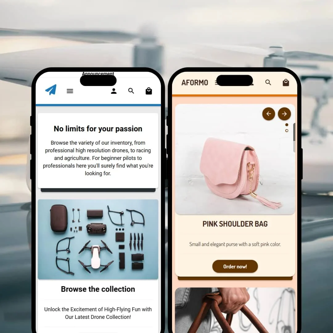
The hero composition does the heavy lifting. A bold headline (“No limits for your passion”) sits above two clear calls-to-action, and the flat-lay drone image fills the fold without clutter. That staging invites a scroll rather than a bounce, letting merchants lead with intent instead of wall-of-text persuasion. It’s a clean opening chapter for tech-leaning brands that want confidence without noise.
Default’s restrained, monochrome palette reads as deliberate rather than spare. The crisp sans serif and generous spacing give product photography room to shine. The result is a storefront that feels fast even before a page-speed report enters the chat, because the visual system stays out of the way of the merchandise.
The layout favors a single-product spotlight mid-page. When used judiciously, that feature area creates a focal point that can power a launch or seasonal push without building a dedicated landing page. It’s an opinionated rhythm—hero, browse, hero-product—that suits brands with a clear flagship.
Where it stumbles
The mid-page hero product can overwhelm. It occupies substantial vertical space, which can feel like déjà vu after the opening hero and may push secondary categories too far down the scroll. Stores with deep catalogs may want a lighter touch or to reserve the spotlight for moment-based campaigns.
Contact form styling skews too dark against the dark background. Inputs blur into the canvas, and the low-contrast look makes fields feel less approachable than the rest of the theme. A clearer border treatment would align usability with the otherwise polished surface.
-
Autumn evokes a warm, boutique vibe—soft beiges and browns, serif headlines, and content blocks arranged more like a magazine than a grid. The tone is intimate rather than industrial, with a hero carousel that encourages sampling rather than sprinting.
What works in this preset
The warm, inviting aesthetic does heavy emotional work. Soft caramel backgrounds, serif headings and generous margins establish trust for tactile goods—leather, knitwear, jewelry—where texture matters. The page feels curated rather than crowded, and the typography keeps the brand voice distinct even in utilitarian areas.
The hero carousel is staged for exploration. Vertical dots and arrow controls signal there’s more to see without demanding a click, and the slide-to-sample cadence fits lookbook-friendly catalogs. It’s an accessible way to stack seasonal stories without building out a separate landing page for each one, encouraging discovery at a comfortable pace.
Autumn’s magazine-like arrangement helps shape browsing. Sections read like spreads, which lets merchants pace collections, features and callouts with a gentle rhythm instead of a strict grid. That editorial feel supports tactile categories that sell as much on mood as on specs.
Niche Suitability
Not Ideal For
-
Brands that value storytelling and visual merchandising—electronics startups, artisan boutiques, fashion labels—will feel at home. Strong variant handling and built-in content modules support moderate catalogs that want to showcase products alongside editorial without design gymnastics.
-
Merchants with hundreds of SKUs, flash-sale operators or teams that rely on one-click add-to-cart workflows may find Modules restrictive. If your navigation needs exceed simple menus or you demand card-level quick actions, plan on apps or custom work.
-
There’s plenty here to get you close, but you’ll still invest time tuning hero sections, replacing demo imagery and validating shopping flows across devices. If gaps like quick-add matter to your model, expect either apps or developer assistance.
Final Recommendation
★ 7.0/10
Rating
-
Covers the essentials, delivers polished variant controls and useful marketing/content sections, but lacks quick-add/quick-view.
7
-
Drag-and-drop sections and consistent design simplify setup, though oversized hero sections may need tuning.
8
-
Heavy, image-led heroes and carousels can slow things down on cellular connections.
7
-
Generally smooth, yet heavy visual staging can weigh on mobile.
7
-
Modularity works for collections and testimonials, but options for immersive editorial storytelling are limited without extra work.
6
FAQ
〰️
FAQ 〰️
-
Yes. Default caters to tech with a modern look, while Autumn’s warm palette suits fashion, leather goods or artisanal items.
-
Highly. You can swap colors, fonts, section order and imagery without code, and the content modules make it easy to blend editorial with product.
-
Image-led heroes and carousels can add weight on cellular connections. Merchants who keep assets lean will have a smoother ride.
-
Yes. Product pages include radio buttons, swatches and quantity steppers, and selections update pricing dynamically.
-
Not by default. Collection cards link straight to product pages, so multi-item shoppers must hop in and out of PDPs to build a basket.
-
There’s a slide-out mini cart with standard quantity controls and remove actions. As with any theme, run routine QA across devices before launch.
-
No multi-column mega menu was present in testing. Navigation relies on simple links, which can constrain large assortments.
-
Not consistently. The promo bar remained pinned on the home page but dropped during PDP scrolls, and in the other preset it wasn’t visible.
-
Yes. An expand control opens product media in a full-screen viewer so shoppers can scrutinize details without losing their place.
This review is based on hands-on testing of the publicly available “Default” and “Autumn” preset demos of the Modules Shopify theme as of 21 September 2025. Theme features, preset availability and performance can change with subsequent updates from the theme developer.