
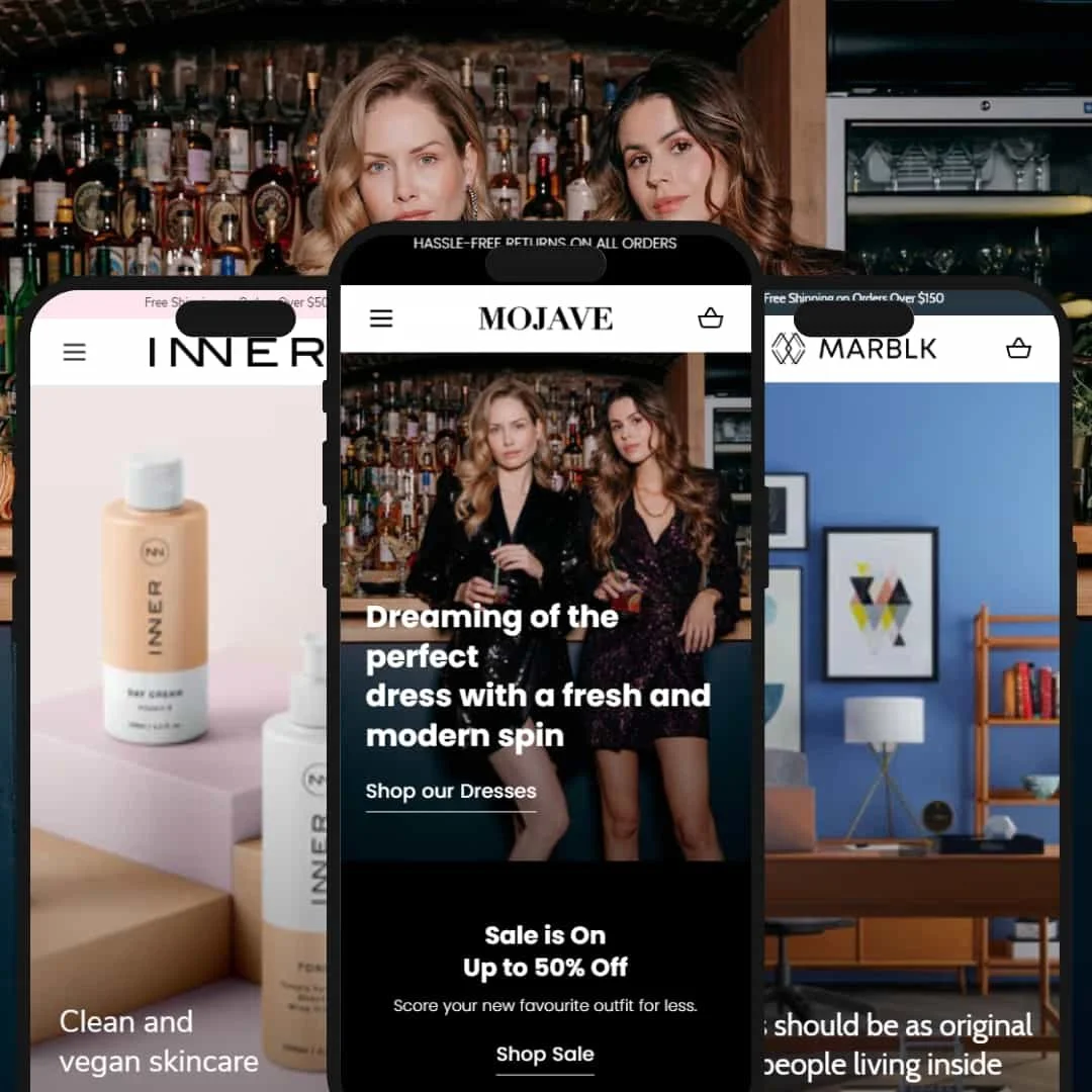
The Mojave Shopify theme targets premium e-commerce with contemporary aesthetics and conversion-minded structure. Priced at $250 and developed by DigiFist, it ships with three distinct presets: fashion-forward Mojave, cosmetics-oriented Inner, and furniture-centric Atna. With a 92% positive rating from 26 merchant reviews, Mojave positions itself as a versatile base for stores that care about polish and merchandising discipline.
Our hands-on testing found Mojave particularly strong in product presentation and interaction flow. Cart drawer behavior felt smooth, product grids responded predictably, and typography stayed clean and legible across presets. We also noted a few areas where configuration choices and preset staging can shape the outcome, which merchants should plan for during setup.
Pros.
〰️
Pros. 〰️
✚ Flexible presets, consistent core
Flexible preset options that maintain core functionality while offering distinct aesthetic approaches. Each demo re-stages the same foundation to fit its vertical, so merchants can shift tone without changing underlying mechanics. This keeps the learning curve gentle while still delivering fresh storefronts for fashion, beauty, or home.
✚ Cart and checkout flow that feels professional
The slide-out cart appears quickly, exposes quantity controls clearly, and keeps subtotals visible while shopping continues. That continuity reduces context switching and makes add-to-cart feel reliable on both desktop and mobile. The experience reads polished and lowers friction at the moment of intent.
✚ Search and discovery that scale with catalog size
Results organize multiple content types—products, pages, and editorial—so shoppers land on helpful destinations even when they start vague. The presentation remains tidy for small catalogs and still holds up for broad assortments. Discovery feels guided rather than scattershot.
✚ Predictable product-grid interactions
Product cards present prices and imagery consistently, and status badges such as “NEW ARRIVAL” or “SALE” stay readable at a glance. Hover and focus behaviors feel steady, which helps shoppers scan quickly without relearning cues on each collection page.
✚ Editorial content that earns its keep
Testimonials, brand stories, and short education blocks slot in without overpowering product lists. Rotating announcement spots surface offers without crowding the header. Brands add credibility while keeping the purchase path close.
✚ Industry calibration without custom code
Routine-friendly staging for beauty, fashion-editorial pacing, and premium presentation patterns for home show how the same system can sell different things well. That portability reduces setup risk, since a merchant can adopt a proven arrangement and tune from there.
Cons.
〰️
Cons. 〰️
− Configuration-dependent features can misfire
Elements like countdown timers and shipping-threshold nudges depend on careful setup. In testing, timers rendered “00:00:00” when not configured, which reads as broken rather than neutral. Plan a short configuration pass before publishing time-sensitive blocks.
− Variant-sensitive quick-purchase inconsistency
Products without variants can add directly from the grid, while variant items push to the product page. The shift is logical but inconsistent for shoppers who expect uniform one-click behavior. Stores leaning on rapid grid-level adds should account for this pattern in cues and copy.
− Deep option trees add taps
On items with many options, selection steps accumulate before the cart. The behavior is predictable, yet it slows momentum on small screens. Clear defaults and brief helper text help mitigate the extra work.
-
This default preset stages a fashion storefront around large imagery and high-impact storytelling. It uses airy spacing and editorial rhythm to guide browsing while keeping buying paths obvious.
What works in this preset
The homepage leads with bold hero photography that gives the collection a magazine feel. Large visuals create a premium first impression and make individual products feel elevated. Spacing between sections keeps the scroll calm, while concise copy blocks prevent visual fatigue. The result is a storefront that feels current without becoming busy.
Promotional moments appear as short, clearly framed sections rather than long ad strips. Rotating announcements surface shipping and offer details without crowding the header. When combined with simple CTAs, these spots push shoppers forward instead of pulling attention sideways. The balance between editorial panels and product showcases stays intact through the page.
Rhythm is a strength here. Visual weight alternates between wide imagery and compact product groupings so the eye keeps moving. Section titles remain brief and typographically consistent, which keeps the layout cohesive. The aesthetic reads “fashion editorial,” yet key shopping actions stay close to the fold.
-
Inner reinterprets Mojave for beauty and skincare with softer palettes and ingredient-centric messaging. Navigation mirrors cosmetics shopping patterns and keeps category entry points obvious.
What works in this preset
Short explanatory blurbs pair with clean headlines to keep benefits visible without turning the page into a long read. The layout guards legibility, which helps packaging details remain clear. Buyers get context quickly, then move into the catalog.
Category entry feels natural for skincare shopping. The first screen keeps paths obvious, and grid density remains moderate so labels and textures read well. It feels purposeful rather than generic, which supports decision speed.
Confidence cues are positioned where consideration typically slows. Policy notes and brief trust messages sit near choices instead of living only in the footer. Shoppers remain oriented while progress toward add-to-cart stays smooth.
Where it stumbles
The streamlined layout leaves less room for deep editorial content. Long-form ingredient education or science-heavy explainers will likely require separate landing pages rather than the homepage canvas. Brands that rely on narrative depth may need to extend the content model beyond default sections.
-
Atna adapts Mojave for furniture and home decor. It highlights designer attribution, supports higher price anchoring, and organizes discovery by room.
What works in this preset
Designer attribution sits close to product titles and repeats in detail zones. That reinforces brand equity and helps justify higher price points. Specifications appear where shoppers expect them, which keeps the path to a confident decision straightforward.
Pricing cues are handled with restraint. Larger typography, measured spacing, and uncluttered presentation help anchor value without crowding the page. The store reads curated rather than commodity, which suits larger baskets and slower buying cycles.
Imagery choices match the category. Product photos feel grounded and consistent, so materials and finishes remain the focus. The overall effect supports a showroom-like experience in a web context.
Where it stumbles
Products with many options can require multiple selection steps. Color, orientation, and size choices can stack before the add-to-cart moment, which slows decisions on small screens. Clear defaults and concise helper text help, but complex trees still ask for extra taps.
Niche Suitability
Not Ideal For
-
Established fashion, cosmetics, and furniture brands with catalogs above 50 items that want strong visual staging, credible editorial space, and dependable cart flows. Merchants who value adaptable presentation with consistent mechanics will get leverage here.
-
Single-product stores, dropship operations seeking minimal setup, or catalogs built around pervasive one-click grid purchasing may prefer a simpler theme. If resources for fine-tuning configuration are scarce, Mojave’s benefits may be underused.
-
Medium — Mojave rewards thoughtful preset selection, section tuning, and a brief configuration pass for promotional elements. The result is a storefront that feels premium without custom code, provided setup gets proper attention.
Final Recommendation
★ 7.8/10
Rating
-
Comprehensive feature set with industry-specific staging, though some configuration dependencies affect immediate usability. Search, cart behavior, and content integration felt consistent in testing.
8
-
Navigation is intuitive and product presentation is clear, but variant handling and certain feature setups need attention. The theme exposes complexity in approachable ways.
7
-
Layouts adapt cleanly on smaller screens, touch targets remain comfortable, and the cart drawer continues to function as expected.
8
-
Interactions felt smooth with tidy loading behavior. Timer modules and similar sections can show rough edges if left unconfigured.
7
-
Presets demonstrate genuine adaptability, each tuned to its vertical while sharing a cohesive core.
9
FAQ
〰️
FAQ 〰️
-
👑 Yes. The Mojave preset emphasizes large imagery, lookbook-like sections, and straightforward buying paths. Our testing confirmed smooth browsing and a reliable cart drawer suited to apparel.
-
📱Navigation stays clear, product cards remain readable, and cart interactions work as expected. Touch targets felt comfortable during testing.
-
🎨 Each preset offers a distinct visual approach with flexible sections and navigation structures. Branding tune-ups happen through content choices and section arrangement rather than custom code.
-
⚡ Interactive elements responded promptly, cart animations felt snappy, and page transitions stayed smooth in demos. Configuration-dependent blocks may require setup to avoid odd states.
-
👕 Yes. Option pickers behaved predictably, though items with many variants add steps before the cart. Clear defaults help keep momentum.
-
🔎 Mojave renders a clean heading hierarchy and supports meta fields through the usual editor surfaces. Core SEO setup felt straightforward in practice.
-
💱 Yes. It works with the standard multi-language and currency setup available in Shopify. Configuration happens in the Shopify admin.
-
⚙️ Built on Online Store 2.0 conventions, it worked smoothly with standard storefront features in our demos. Typical carts, search, and product organization behaved as expected.
-
🛒 Yes. In the Shopify Theme Store, click Try theme to add Mojave to your store as an unpublished trial. You can customize it in the Theme Editor and test with your products. You only pay when you publish it to your live store. You can also browse the public demo stores to preview each preset.
This review is based on hands-on testing of the publicly available Mojave, Inner, and Atna preset demos of the Mojave Shopify theme as of October 16, 2025. Theme features, preset availability, and performance can change with subsequent updates from the developer.