
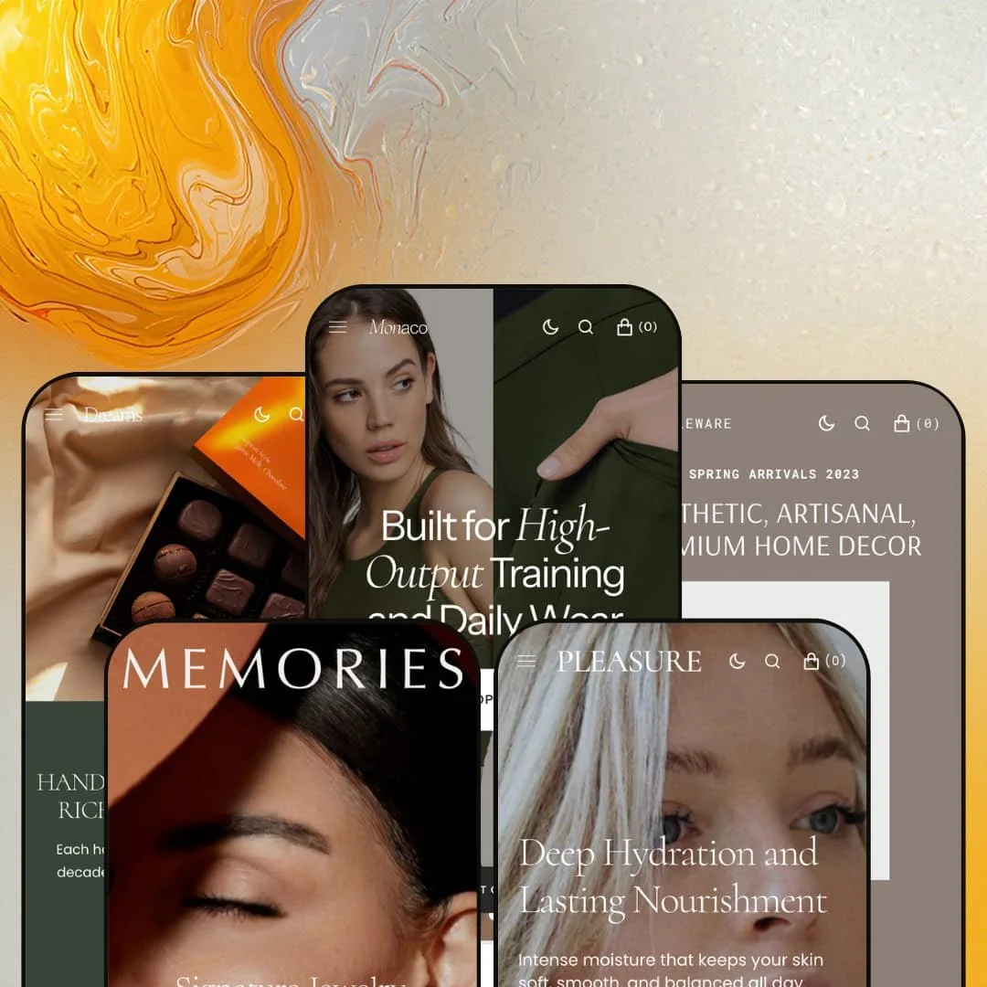
Most premium Shopify themes pick one vertical and build everything around it. Monaco ships five fully dressed storefronts instead, swinging from activewear to fine jewelry to skincare to ceramics to artisan chocolate, each pulling from one shared section library. Built on Shopify's Online Store 2.0 architecture, it treats the homepage as an editorial canvas: full-width video, lookbooks, image hotspots, and a stacked scroll of merchandising sections. The question for any buyer isn't whether Monaco looks the part — it's whether you have the imagery and catalog to fill a theme this hungry for visuals.
Five fully built verticals from a single purchase
Monaco ships five presets, and they aren't recolors of each other. Activewear, jewelry, skincare, home décor, and chocolate each arrive with their own collection structure, editorial voice, lookbooks, and product staging, native to the niche rather than reskinned from one template. The differences are real. For a studio standing up client stores or an operator running several brands from one Shopify org, that's five vertical-ready starting points without commissioning bespoke design for each.
A storytelling toolkit built for visual brands
For a brand that sells on how things look, fashion, jewelry, beauty, home, the editorial surfaces are already in the box. Lookbooks with sub-pages, image hotspots and product markers, a before/after Compare section, full-width video heroes, image collage, and image-with-text all arrive as native sections you stage rather than build from scratch. None of it is custom. I clicked into the Memories video hero and the Pleasure before/after expecting an app, and both turned out to be theme sections. For image-led, considered-purchase catalogs in apparel or beauty, this is exactly the build work the theme absorbs.
A coordinated conversion kit, no app stack required
The urgency-and-conversion sections come built in as a coordinated set: countdown timers, a scrolling announcement ticker, quick view, quick buy, sticky add-to-cart, a slide-out cart, stock counters, product badges, in-menu promos, and promo popups. The pieces are tuned to each other. Rather than wiring several apps together to get urgency, fast-add, and gentle scarcity working in one funnel, a merchant configures sections that already speak the same language. The "Item of the Week" block alone pulls a product forward with its variants and a live stock count inline. For flash-drop and restock-driven sellers running their own DTC funnel, that's the conversion layer assembled out of the box.
Per-product gallery layouts, not one fixed template
Where Shopify's own Dawn gives every product the same gallery treatment, Monaco lets you choose the layout per product: stacked scroll, vertical thumbnail carousel, horizontal thumbnail carousel, or classic thumbnails. The gallery isn't fixed. That means a serum can run a tall, scrolling ingredient story while an apparel piece uses a thumbnail grid for its colorways, each gallery matched to how that product is actually shopped. Add variant swatches, image zoom, product tabs, and a sticky add-to-cart, and the product page flexes by catalog. For merchants whose range mixes product types, say apparel colorways next to single-hero beauty SKUs, that per-product control earns its place.
Built for storytelling, not for big utilitarian catalogs
Monaco's distinctive sections all serve visual, brand-led selling: lookbooks, hotspots, before/after, image collage, magazine-style blog. A merchant running a large, spec-driven catalog where shoppers filter and compare on attributes, think electronics, hardware, or an industrial range past 500 SKUs, gets standard Shopify filtering and collection navigation for discovery and a section library that doesn't speak their language. The storytelling surfaces don't sell a parts catalog. For attribute-comparison shoppers working through a deep utilitarian range, the theme's signature features sit idle.
Five verticals, but one tonal register
The presets diverge by industry and converge on a single mood: restrained, full-width, muted, luxury-leaning. The mood never really changes. Every one of them, from chocolate to chronographs, speaks in generous whitespace, quiet type, and elevated photography, which is lovely until your brand wants the opposite. A value-driven or deal-led brand, or a loud, maximalist, youth-market label trading on energy and saturation, will be pushing against that grain the whole way. For budget-tier, discount-positioned, or high-velocity sellers, the aesthetic works in the opposite direction from the brand.
Maximalist by default
Every preset ships a long, section-dense homepage: hero, ticker, countdown, multiple product carousels, image-with-text, journal, FAQ, Instagram, newsletter, all stacked into one deep scroll. Monaco's whole design language assumes that editorial, scroll-driven homepage, and the section library exists to fill it. The demo sells maximalism. Plenty of merchants need the opposite. For single-product DTC builds and focused-funnel sellers, expect to strip the homepage down before it fits the strategy.
What it takes to launch
Plan a multi-day build. Expect full content replacement across each vertical you deploy, including hero copy, lookbook and journal articles, About narratives, and FAQ entries, plus product photography to match the theme's full-width, image-first layouts. Budget additional time for metafield population to power the Compare and product-marker sections, mega-menu and in-menu-promo re-staging, brand-name and contact-detail cleanup across the header and footer, and currency and localization configuration for your own markets.
-
What works in this preset
Land on the Monaco preset and the brief reads instantly: high-output activewear, shot full-width, sold hard. The homepage opens on a rotating hero, drops into a scrolling "season sale" ticker, then stacks a countdown banner, a sale grid, and an "Item of the Week" block that pulls a single product forward with its color and size selectors inline. I clicked through the product cards and every one carries a quick-view trigger and a sale badge, so the discount story stays visible from the grid down. It's a preset built to move stock.
Underneath the sell, real merchandising is at work. The mega menu carries featured-collection image tiles alongside its category columns, so the navigation itself promotes rather than just lists, and the customer-favorites row runs a quick-view carousel beneath it. Color swatches render on the apparel cards. For an activewear label leaning on repeat buyers and seasonal restocks, the staging holds top to bottom.
Where it stumbles
The preset stages aspiration over instruction. Performance-apparel shoppers tend to want fit and fabric detail up front, things like size guidance, technical-fabric notes, and fit-model shots, yet the homepage leads with lifestyle imagery and discount cues instead. The size-guide and product-tab surfaces exist in the theme; this preset simply doesn't foreground them. A premium athleisure brand would restage toward fit tooling before launch.
-
What works in this preset
A looping video hero opens Memories, gold pieces turning against a dark set before the headline even resolves. It's the most cinematic of the five. From there the preset moves into a split slideshow, a limited-time countdown band, and a new-arrivals carousel that paginates through rings and necklaces with quick-view on each. The palette stays disciplined: gold, ivory, deep neutrals, the kind of restraint a jewelry brand lives on. I noticed the product cards keep their sale badges subtle, a restraint that suits the category.
The storytelling sections suit high-consideration buying. A "We Are Memories" brand block carries the heritage narrative, the journal runs a deep bench of styling and sourcing articles, and an Instagram strip closes the page with social proof. Jewelry sells on aspiration and story. Memories gives both room without burying the catalog.
-
What works in this preset
Pleasure routes the skincare playbook through Monaco's sections cleanly. The hero slideshow runs claim-led headlines with supporting body copy under each, then the page steps through a new-arrivals carousel, a season-sale countdown, an "Item of the Week" serum with its 30 ml and 50 ml variants and a live stock count, and a customer-favorites row. Ingredient-forward copy threads the product blocks. The before/after Compare section, which the theme ships to every preset, is a natural fit here for showing results over time.
What sells skincare is trust, and the preset stacks it. A dermatologist-approved hero claim, a science-and-wellness brand block, a beauty-insights journal, and an FAQ accordion all reinforce credibility before the cart. The stock counter adds gentle urgency without shouting. For a routine-driven beauty catalog aimed at considered, repeat purchases, the surfaces line up well.
-
What works in this preset
Tableware leads with the product, not the lifestyle. The homepage opens on a product banner stacking ceramic bowls and candles straight into view, then runs a limited-time countdown, a save band, and two full product rows under "New Arrivals" and "Popular Picks." The catalog skews to bowls, planters, candles, and glaze variants. I went looking for the storytelling and found it lower down, in an artisan "About" block and a craft-focused journal.
The grid-forward staging fits a browse-heavy homeware catalog. Quick-view sits on every card, variant pricing like "From $24" signals options without a click, and the product rows give a deep catalog room to breathe across the page. Speckle and glaze variants read clearly on the cards. The products carry the page.
Where it stumbles
Home décor usually sells in context, and the preset under-leans on it. Room-set and styled-space imagery is what turns a single bowl into a vignette a shopper can picture at home, and Tableware's default stages products on cleaner, more isolated backgrounds than a décor brand might want. The image-collage and image-with-text sections are available theme-wide to build those room stories. The preset just doesn't lead with them.
-
What works in this preset
Dreams is the warmest of the set, and it earns it. The hero slideshow runs indulgence headlines with short descriptions and "Explore" CTAs, then the page moves through a new-arrivals carousel, a season-sale countdown, a "Favorite Picks" row, and a "For Special Moments" featured product. Gifting cues sit throughout. The footer even closes on a "Brand Essence" text block here, a reminder that the footer is build-it-yourself territory rather than a fixed strip.
The editorial depth is genuinely deep. The chocolate journal carries a dozen articles on pairing, sourcing, and tasting, the "About" block runs a craft narrative, and an Instagram collage closes with lifestyle shots. Origin-story brands have room here. The conversion sections, countdown and quick-view included, keep the indulgence buy moving.
Where it stumbles
The editorial weight can outrun a $10 bar. These are mostly low-ticket, impulse-friendly buys, and the preset wraps them in the same magazine-length homepage and deep journal a considered, high-ticket catalog would use. The storytelling is lovely; for fast, repeat, low-AOV food sales it can be more runway than the purchase needs. A confectionery brand chasing volume might trim the homepage hard.
One toolkit under five faces
What keeps Monaco coherent across such different verticals is that all five presets draw from the same section library. Read the demos side by side and the through-line is obvious: the chocolate store's image collage, the jewelry store's video hero, and the skincare store's before/after are the same sections wearing different content. That shared DNA means you can borrow across the lines, dropping one preset's hero pattern into another's build without anything looking foreign. The divergence is styling; the engine is one.
Brand-building and selling in the same scroll
Across every preset, Monaco refuses to separate storytelling from conversion. The same homepage that runs a heritage block, a lookbook, and a deep journal also runs a countdown, quick-view grids, and a live stock counter, so the editorial mood and the urgency mechanics coexist instead of trading off. They share one scroll. The magazine and the checkout sit in the same layout, and neither has to give way for the other.
Image-first by architecture
Monaco's layouts are built around large media, and they assume you have it. The design leads with full-width imagery and generous photographic space, with little graceful fallback for a text-led or asset-light brand, so a merchant without a strong lifestyle library watches the layout expose that gap rather than cover for it. It assumes strong photography. The theme is at its best when the imagery is, and it offers little cover when it isn't.
The breadth is a commitment, not a buffet
For most single-brand merchants, four of the five presets are sunk value. You buy the full family, deploy one vertical, and the others don't compound into anything unless you're an agency or a multi-brand operator reusing the theme across stores. There's nothing wrong with paying for range you won't use, but it's worth being honest that the five-preset headline mostly benefits builders, not solo shops. One store uses one preset.
★ 8.0/10
Rating
-
A deep section library, four product-gallery layouts, a full conversion kit (countdown, quick-view, sticky cart, stock counter), and editorial sections like lookbooks, hotspots, and before/after compare cover most of what a visual storefront needs.
9
-
Standard Online Store 2.0 section editing keeps day-to-day changes approachable, but the breadth of presets and the density of demo content make for a real learning curve before launch.
7
-
Responsive layouts, a slide-out mobile menu, and sticky add-to-cart carry the experience well; the image-forward design leans on disciplined asset sizing to stay quick on phones.
8
-
Media-heavy homepages with many stacked sections ask a lot of the page, though lazy-loaded imagery and a section-based build keep it manageable once artwork is optimized.
7
-
Five distinct presets, a broad shared section library, per-product gallery control, and a configurable header and footer give plenty of room to diverge from the demos.
9
Frequently Asked Questions
-
They're functional theme sections. The Product Timer counts down to a date you set, and the stock counter reflects real inventory, both configured per section rather than hard-coded into the demo.
-
No, both are native Monaco sections. The before/after Compare and the featured "Item of the Week" ship with the theme; you supply the images and product data. Reviews, wishlists, and subscriptions, by contrast, would still be separate apps.
-
Discovery runs on Shopify's standard filtering, sorting, collection navigation, and infinite scroll, all of which hold up at scale. What the theme adds on top is merchandising-led, so a very large utilitarian catalog leans on the standard tools and leaves the storytelling sections aside.
-
All five are built out to a similar depth, but they lead differently: Memories and Dreams lean hardest on editorial storytelling, Tableware is the most product-grid-forward, and Monaco and Pleasure sit in between with a balance of lifestyle and conversion. Pick by how close the staging sits to your own catalog.
-
The theme ships pre-translated interface strings in English, French, Italian, German, and Spanish, plus right-to-left support, which are theme-level touches. Translating your product content into other languages and handling regional currency run through Shopify's own localization, not the theme.
This review is based on hands-on testing of the publicly available preset demos of the Monaco Shopify theme as of June 2026. Theme features, preset availability, and performance can change with subsequent updates from the theme developer.