
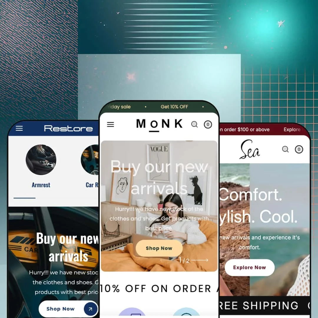
Most premium Shopify themes pick a lane: quiet brand theater or loud deal engine. Monk, a $300 Online Store 2.0 theme from Slash Themes, floors the second option, treating every scroll across its three preset demos as a fresh chance to close a sale. The pitch on the Theme Store is speed and conversion; the reality is a promo machine with some genuinely smart merchandising ideas wired into it. Whether that trade suits you depends entirely on how your brand feels about volume.
Shoppable video is built in, not bolted on
The video rail pairs playing clips with purchasable product cards attached beneath each player. On the demo, three videos each carry a live product with price and a link, which turns passive brand content into a direct selling surface. For beauty and fashion brands feeding the site from social traffic, with impulse-prone buyers and catalogs under 100 SKUs, this section replicates the watch-then-buy pattern on your own domain instead of renting it from a platform.
The cart drawer arrives as a complete conversion unit
Open the slide-out cart and the upsell work is already done. A free-shipping progress bar tracks the threshold with live messaging, an order-note field and discount line sit in the drawer, and a product recommendation rail runs inside the cart itself rather than waiting for a separate page. Accessories and consumables merchants selling sub-$50 items against a shipping threshold, to repeat or impulse buyers, get the most leverage from this single highest-intent moment in the session.
A mega menu that does real selling
The menu runs three levels deep, from category headers through sub-collections down to individual product links, and hangs an image promo tile inside the same panel. Dawn, Shopify's free baseline, gives you text columns in its menu; Monk stages a campaign in there. Multi-category stores with 100+ SKUs and cross-shop-heavy buyers can route real merchandising through navigation instead of treating it as plumbing.
The homepage doubles as a point of sale
A full buy box embeds directly on the homepage: featured-product sections ship with quantity steppers and a working add-to-cart, image-with-text blocks carry live prices and product CTAs, and a shop-the-look section feeds a product list from one lifestyle image. Together they convert editorial real estate into purchase points without forcing a click-through. Single-hero DTC brands and flash-drop operations with under 30 SKUs can run an entire campaign from the front page alone.
"Multi Vendor" is a presentation, not a platform
The multi-vendor card leads Monk's Theme Store listing, but what the theme delivers is vendor attribution on product cards plus a catalog wide enough to hold several brands. Vendor accounts, seller onboarding, and payouts live in Shopify's app layer, outside what any theme can provide. Founders planning a marketplace with seller self-service, and multi-brand operators consolidating 200+ SKUs across suppliers, should price in that distance before purchase.
The default register is a permanent sale
Rotating announcement messages, multiple marquee strips per homepage, countdown sections, promo popups. Every surface shouts. The theme's resting state assumes discount-driven urgency, baked into the staging rather than offered as one mode among several. For luxury jewelry or considered-purchase furniture brands at premium price points, week one of setup becomes an exercise in subtraction.
Technical products get prose where they need structure
The product template offers a freeform description plus generic accordion slots, and that's the full toolkit for product data. There's no spec-table block anywhere in the demos. At $300, with an automotive preset on the marquee, structured space for specifications is a fair ask. Merchants selling multi-attribute hard goods across 50 to 500 SKUs to spec-comparing buyers will be assembling that layer through metafields and custom blocks on their own time.
What it takes to launch
Expect a multi-day pass covering header contact details, cross-preset copy cleanup, mega menu re-staging, full demo-catalog replacement, and market and language configuration before launch.
-
What works in this preset
Walk into this demo and it reads like a small department store. Six categories sit under one roof: accessories, home appliances, furniture, fashion, art and crafts, beauty. Vendor names print directly on the product cards, two distinct seller identities appear in the grid, and the staging makes the multi-seller concept legible at a glance rather than burying it in copy.
The tabbed "People's pick" block is the strongest single section here. Four tabs switch the featured grid between Home Appliances, Accessories, Beauty, and Furniture without a page load, which keeps a sprawling catalog browsable from one scroll position. I scrolled through all four tabs and the merchandising logic held: each tab carries six products with hover-swap imagery, so the section behaves like four collection teasers compressed into one.
Pacing is the quiet achievement. Category circles up top, a collection grid with product counts, value-prop rows, and the tabbed picks follow each other in a rhythm where you can reach all six verticals without ever opening the menu. That matters for a preset whose whole argument is breadth.
Where it stumbles
The marketplace stage is thinner than its name. Two vendor labels and six categories gesture at a multi-seller operation without demonstrating what running one looks like: no seller-level pages are staged, no per-vendor framing exists beyond the label on the card. A merchant evaluating this preset for marketplace ambitions sees the costume, not the machinery.
-
What works in this preset
You feel the register shift immediately: one brand, one palette, one product world. Sea stages a swimwear and beachwear store where product cards flip from lifestyle shot to flat product image on hover, and category circles carry the catalog's six segments in a single strip. It's the preset that proves Monk can hold a single-brand identity when the staging commits to one.
"Do you have any offer?" That's the first entry in a homepage FAQ accordion answering discount and shipping questions before a visitor ever opens the cart, and it's a clever placement: objection handling moved upstream of the product page, where hesitant first-time buyers actually stall.
The product page is the deepest in the preset family. I clicked through a nine-image gallery with a thumbnail rail and modal zoom, picked between two variant axes rendered as button groups (three sizes by three colors), and found care, shipping, and returns folded into accordions with a recently-viewed rail underneath. For apparel with multiple angles per SKU, the template carries the load without feeling crowded.
Where it stumbles
The lifestyle staging and the promo hardware argue with each other. A "Grab you deal now" countdown sits wedged between soft editorial blocks, and the deal-engine energy that fits the other presets reads slightly off against beach-brand calm. The sections work; the tonal mix is the choice a merchant will want to re-make.
-
What works in this preset
This is the newest stage and it shows. Restore arrived as the Automobile preset in version 2.0.1 (September 2025), and its product grid is the most data-forward of the three: steering-grip cards expose variant images as clickable swatches directly on the card, so a shopper flips between four colorways from the collection page, and quick-add buttons sit on the grid for low-consideration parts.
There's also a detail merchants almost never get to see in a demo. The countdown section here displays its expired state, complete with fallback copy announcing that the offer closed. That's operational proof the section has an end-of-life behavior rather than an awkward frozen zero, and it's the sort of thing you usually only discover after your first sale ends.
Where it stumbles
Parts buyers shop by fitment, and this preset has nowhere to put it. Bolt patterns, offsets, and diameters end up crammed into product titles like "Pack of 4 Wheels 19 8.5 5X112 R1 257 Blk Et45 Cb" because the card and grid surface no structured field for technical data. The vertical is staged; the vertical's buying behavior isn't fully served.
One skeleton, three verticals, fast assembly
Read all three demos in a row and the same homepage spine repeats: hero, marquee, category circles, value props, tabbed picks, media section. That repetition is the actual product. A merchant who internalizes the formula once can stand up any of the three verticals quickly, with low decision cost, because the theme has already made the sequencing choices.
The preset family is still growing
Monk launched in April 2024 and added an entirely new vertical seventeen months later rather than coasting. A developer extending the preset lineup after launch signals continued investment in the theme as a living product, which lowers the risk that today's purchase becomes tomorrow's abandonware.
Structure is included; voice is not
Because the presets are variations on one formula, differentiation falls entirely on the merchant's assets. Photography, copy, and palette do all the identity work, and two Monk stores with mediocre assets will look like siblings. You're buying assembly speed, not a personality.
Scale is promised, never demonstrated
Every preset stages collections of roughly six to twelve products. The discovery toolkit is aimed at much larger catalogs, yet no demo shows it operating at the depth it's built for, so merchants with deep inventories are buying that performance on the feature list's word rather than on visible evidence.
Rating
★ 7.6/10
-
A wide conversion and merchandising toolkit with multi-axis variant handling and in-cart upsells; structured product-data tooling is the visible gap.
8
-
Sections assemble quickly in the Online Store 2.0 editor, but launch is as much about switching promo machinery off as turning features on.
8
-
The slide-out menu stacks three navigation levels cleanly, and collection filtering moves into a dedicated drawer on small screens.
8
-
Homepages stack marquee strips, autoplaying media, and popup layers; lean product templates and lazy-loaded imagery pull in the other direction.
7
-
Strong block variety inside one visual register, but the register itself stays fixed at high-energy retail.
7
Frequently Asked Questions
-
Monk stages a multi-category general store with vendor attribution, Sea a single-brand swimwear shop, and Restore an automotive parts store added in version 2.0.1.
-
No. The feature list flags quantity pricing as Shopify Plus only, so standard-plan merchants should exclude it from their evaluation.
-
Yes, an age verifier ships with the theme, which matters for vape-adjacent, alcohol-adjacent, or adult-leaning catalogs that need a compliance gate before browsing.
-
Button labels and theme text come pre-translated in English, French, Italian, German, and Spanish, and the theme supports right-to-left layouts; product content translation remains the merchant's job.
-
Gift wrapping and cart notes are both included, alongside in-store pickup support, so local and gifting-heavy merchants get those flows without extra installs.
-
A before-and-after image slider ships in the merchandising set, a natural fit for beauty results, detailing work, or restoration products.
This review is based on hands-on testing of the publicly available preset demos of the Monk Shopify theme as of June 2026. Theme features, preset availability, and performance can change with subsequent updates from the theme developer.