
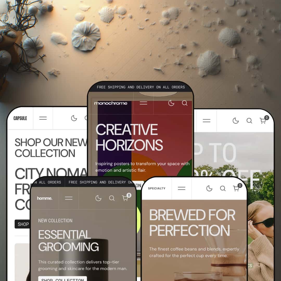
Every one of the five demo stores has a dark-mode switch sitting in its header, and the Theme Store feature list never mentions it. That omission tells you something about how Superfine positions this theme: the pitch is visual storytelling for an art store, yet the demos stage posters, men's grooming, menswear, eyewear and coffee with the same editorial rhythm and the same light-or-dark choice handed to the shopper. Under the hood it's an Online Store 2.0 build launched in April 2025 and updated eleven times since, with B2B rendering and a quick-order list arriving as recently as August 2026. Whether that editorial rhythm sells your product depends heavily on how much photography you can feed it.
A shopper-facing light and dark mode
Every demo header carries a Light and Dark toggle, and each store ships two logo files so the mark swaps with the mode rather than washing out. The developer treats it as a maintained feature, not a gimmick: release notes mention a dark-mode spinning image for the slider section and a fix for header overlay colors in dark mode. That matters when your product photography was shot on both black and white backdrops and you'd rather let the shopper pick the canvas than choose for them. For art-print and eyewear brands selling considered purchases from catalogs under 100 SKUs, it's a differentiator you won't have to build.
Why send a shopper to a product page when the homepage can close the sale?
The Featured Item section answers that question. It renders a full buy box on any page: gallery, title, price, variant swatches, stock counter, quantity stepper and add-to-cart, and in the eyewear demo the Black-or-Brown choice works right there on the front page. One section, one product, one screen. For single-hero brands running drops with catalogs under 30 SKUs, it means the campaign landing page and the product page can be the same URL.
Product cards that behave like galleries
Cards here rotate through multiple hover images, show color swatches with an overflow count, tag each product with its collection, carry a short description line and render New, Sale and Sold Out badges in the corner. It's a coherent unit rather than a feature list, because every element sits inside the same card component and switches on together. The effect is that a collection grid does a share of the product page's job. For colorway-heavy apparel and eyewear catalogs of 50 to 200 SKUs where shoppers cross-shop three or four items before committing, that's fewer clicks per decision.
Wholesale-enabled merchants get a rendering layer, not a promise
If you run B2B catalogs on Shopify Plus, the August 2026 update is the reason to look here. The theme now draws a volume-pricing table, enforces quantity rules with minimums and increments in the cart and cart drawer, shows a price range and a live unit price beside the quantity selector, and adds a Quick order list section to product pages. Combined listings and high-variant products landed four months earlier. The platform supplies the catalog logic, Monochrome supplies the storefront that displays it, and for wholesale-enabled brands with 100-plus SKUs that's the half of the job a theme can actually do.
Social proof is a poster of trust, not trust
Every demo runs the same testimonials slider: three or four hand-typed quotes, an avatar image and a job title, followed by a "They Trust Us" logo row. None of it is wired to a review engine. There are no star ratings on cards, no review count on product pages and no verified-purchase mechanism anywhere in the theme, so a merchant who wants real reviews installs Judge.me or Loox and styles around the theme's layout. It looks like trust from across the room. For mid-market beauty and eyewear brands selling considered purchases to repeat buyers, that gap is the first app you'll add.
Replenishment verticals without a replenishment mechanic
Two of the five presets sell consumables, and neither stages a subscription. Grooming and coffee are categories where the second order matters more than the first, yet the buy boxes offer a single one-time purchase and no subscribe-and-save option, and the theme lists no subscription block among its features. Shopify Subscriptions or Appstle will fill the hole. For subscription-driven food-and-drink or beauty brands built on repeat buyers, budget the integration before you budget the theme.
A discount voice baked into the defaults
All five demos put "Summer sales — Up to 50% off" as a promo line inside the mega menu, run a marquee ticker reading "up to 50% off" across the homepage and stage at least one sale banner with copy like "Final Call". That's a choice about theme character. The sections themselves are neutral, but the default rhythm assumes you're always running a promotion. For luxury-tier jewelry or eyewear merchants selling considered purchases without discounting, every one of those slots gets re-toned or removed before launch.
Online Store 2.0 at a 2026 price
Monochrome is a well-maintained OS 2.0 build. It isn't a Theme Blocks build, so nesting stops at two levels and the newer AI-assisted block generation doesn't apply, and the section library, however deep, sits on the same architectural generation as Dawn, which Shopify gives away. What $320 buys is the dark mode, the card system, the buy-box section and the B2B rendering, not a newer foundation. For agencies building multi-brand stores that expect to customize layouts deeply over the next two years, that's worth weighing against the release cadence.
What it takes to launch
Expect a multi-day copy pass across twenty-plus homepage sections per preset, product-tab content on every SKU, market and currency configuration, footer brand text and social links, plus variant re-staging for the size, grind or lens options the demos don't model.
-
What works in this preset
Scroll the poster demo and the pacing is the product. A hero with a spinning badge gives way to a sale banner, a three-image gallery, a product row, a collection grid, a marquee ticker reading "New In" and then a scroll showcase that pins a headline while imagery slides underneath it. Twenty-plus sections later you reach the footer. I noticed that none of it feels padded on desktop, because the ticker and showcase sections break up the product rows before they turn into a catalog dump.
The Featured Item section is the one I'd copy first. It plants a full buy box on the homepage, with the poster's three gallery images on the left and a title, price, description, live stock count of ten units, quantity stepper and add-to-cart on the right, so a shopper who lands from an ad never has to leave the front page to buy. For a print shop pushing one hero design per season, that's the whole funnel on one screen.
Product pages here come in three gallery flavors. The Features menu links a thumbnail-carousel layout, a grid layout and a stacked layout as live pages, each with the same four accordion tabs beneath the buy box and a stock line reading "6 in Stock" on the demo poster. Breadcrumbs sit under the gallery. The buy box itself stays short.
Where it stumbles
Posters live on size and framing choices, and this demo stages none. Every product is a single-SKU item with no A2-versus-A3 axis, no framed-or-unframed option and no price ladder, which means the variant picker the theme ships never appears in the one vertical this preset was built for. A print merchant will need to model those options from scratch before the demo's pacing means anything.
-
What works in this preset
Ambition replaced the earlier Homme preset in August 2026, and it reads like a tighter edit of the same grooming idea. Four collections, Beard, Face, Body and Hair, carry the whole store, and they repeat as a collection grid, as a linked list inside a sale banner and as the mega menu's column. A shopper is never more than one click from a category. The announcement bar runs as a ticker rather than a fixed line.
Product pages do the work grooming brands actually need. The eye-gel demo stacks a Usage tab with application steps and a pro tip, an Ingredients tab split into active, base and free-from lines, and a Shipping tab, all as collapsible accordions under a buy box that shows a single 30ml size and a three-units-left stock counter. That's the right information hierarchy for a considered skincare purchase.
The header drawer is where I found the localization work. Language and country selectors sit inside the burger menu on mobile as well as the footer, an addition the developer shipped in May 2026, and the demo exposes English, French and Spanish interface strings without any product-data translation pretending to be a theme feature.
Where it stumbles
Grooming sells routines, and this demo sells singles. There's no routine bundle, no three-step set and no cross-sell inside the buy box, so the Beard Balm page ends at a lone add-to-cart while the "You May Also Like" slot beneath it sits empty in the demo. For a category built on repeat baskets, the staging leaves the theme's cross-selling sections unused where they'd matter most.
-
What works in this preset
Colorways are handled the way apparel merchants want them handled. The Classic Blazer card shows Green, Blue and Beige swatches plus a "+1" overflow chip, each colorway is a variant rather than a separate product, and the Textured Straight-Leg Pants page renders Gray, Beige, Black and Green as swatch buttons above a stock counter. Eight gallery images sit beside the picker. Nothing here requires a sibling-product workaround.
I spent time in the collection view because a 34-product catalog is the largest of the five demos. It paginates at twelve per page across three pages, offers eight sort orders from Featured to Date, and hides its filters in a drawer, which keeps the grid full-bleed on desktop. The "New collections" section on the homepage lists ten collections as image tiles, so the menu's four-item column isn't the only way in.
You get five product-page variations to compare live. Beyond the color-swatch page, the Features menu links a grid layout, a stacked layout, a thumbnail carousel and a dropdown variant picker, each on a real product, so you can decide whether the Classic Blazer's four colors read better as swatches or as a select list before you commit.
Where it stumbles
An apparel demo without a size axis is an odd choice. Every garment I opened carries color as its only option, and the size guidance is a bulleted prose list inside an accordion rather than the size-chart treatment the theme lists among its features, so the one decision that drives apparel returns is staged as reading material. Merchants will add the size option themselves, and the picker will handle it, but the demo doesn't show you how it looks.
-
What works in this preset
Shade is the newest face of the family, having replaced Ultraviolet in July 2026, and it leans hardest on product cards as mini-galleries. The Everyday Comfort Glasses card cycles through a dozen hover images covering three colorways, the Bold Rectangular Frame card carries ten, and swatches for Brown and Black sit beneath the price. Hover, and you've seen the frame from every angle without a click.
The homepage buy box returns here with a variant picker attached. Sleek Acetate Frames renders as a Featured Item with Black and Brown swatches, a six-in-stock line and add-to-cart, backed by a ten-image gallery, which turns the eyewear demo's front page into a working product page for the hero frame.
Six product-page layouts are on show in this one demo. Grid, color swatch, stacked, thumbnail carousel, dropdown picker and default layout each get a linked product, and Classic Square Frames displays a "From $115" price to show how the cards handle multi-variant pricing. The demo credits the eyewear brand Ochis for its imagery in the footer, which explains why the photography is consistent across all sixteen frames.
Where it stumbles
Eyewear is measured before it's bought, and nothing here surfaces a measurement. No lens-width or bridge figure, no face-shape guidance in the buy box and no lens-type option on any frame, so the considered-purchase questions a sunglasses shopper asks are answered by the blog post on face shapes and nowhere else. The tab system could hold that data; the demo just doesn't put it there.
-
What works in this preset
Tasting notes on the card, not just on the product page. Each coffee card in this demo opens its description line with "Notes:" followed by three flavor descriptors, so a shopper scanning the bestsellers row can tell Cocoa Trail from Citrus Ember without opening either. That's a small copy decision with an outsized effect on a catalog where every bag looks similar.
The featured-products section pairs three lifestyle images with three coffees, and the section reads as an editorial spread rather than a product row. I clicked through to Fusion Grind and found a Flavor Profiles tab, an Ingredients tab naming ethical sourcing and small-batch roasting, and a shipping tab promising a 48-hour roast-to-ship window, all under a stock counter reading ten units.
Two gallery layouts, stacked and carousel, are demoed on Bold Horizon and Fusion Grind respectively, and both keep the bag imagery large enough that the roast label is legible without zoom. The logos row and testimonial slider from the other presets reappear here unchanged.
Where it stumbles
Coffee without a grind or weight option is coffee you can't actually sell. The Flavor Profiles tab lists light, medium and dark roast as prose bullets while the buy box offers no roast, grind or bag-size picker at all, and every coffee is a single SKU at a single price. A roaster will rebuild every product's options before launch, which is more than the polished cards suggest.
Every section is on display before you pay
Each of the five demos carries a Features menu that links all 23 homepage sections and every product-page layout as live pages, so you can audit the ticker, the scroll showcase or the dropdown variant picker on a real store before installing anything. Few theme demos let you inspect the parts list this directly. It shortens the trial considerably.
Presets get rotated, not abandoned
Two presets were swapped out within a single summer: Ultraviolet became Shade in July 2026 and Homme became Ambition in August. That's a developer curating the family rather than letting old demos decay, and it means the screenshots in older comparison posts may not match what ships today.
Localization lives in the theme layer
Interface strings ship in English, French, Italian, German and Spanish, right-to-left support has been in place since September 2025, and the selectors appear in the header drawer, the mobile menu and the footer. The theme handles exactly the part of internationalization a theme should handle and leaves market pricing and catalogs to the platform.
Five skins, one skeleton
Read all five homepages in a row and the section order barely moves: hero, collection grid, sale banner, product row, ticker, featured products, testimonials, FAQ, newsletter. Preset choice is a palette and photography decision, not a layout decision. Merchants expecting the eyewear preset to browse differently from the poster preset will find they rearrange the same blocks.
Discovery is the least-designed page
The collection template across every demo is a grid, a filter drawer and pagination, and menus top out at four collections per column. That's fine for the 12-to-34-product catalogs the demos stage. It works against merchants with 200-plus SKUs who need the browsing layer to carry as much weight as the storytelling layer.
The skeleton eats photography
Every demo requests imagery at up to 3,840 pixels wide, product cards carry as many as a dozen alternate shots, and the featured-products and scroll-showcase sections each want a lifestyle triptych. A brand with a thin photo library can't fill this layout without the gaps showing.
★ 7.6/10
Rating
-
Dark mode, homepage buy box, B2B rendering and a discount-code cart drawer cover a lot; reviews and subscriptions still need apps.
8
-
Section library is broad and every section is demoed live, but twenty-plus sections per homepage means a long editor session for first-time merchants.
7
-
Selectors and menus collapse into a single burger drawer, tickers and buy boxes stack cleanly, and hero media has mobile-specific image and video slots.
8
-
Lazy-loading is in place, but the default homepages are long and image-dense, with multi-image hover sets on every card adding weight before a shopper scrolls.
7
-
Six product-page layouts, three hero patterns and per-mode logo assets give real range; the fixed homepage rhythm limits how different two stores on this theme can feel.
8
Frequently Asked Questions
-
The toggle sits in the header and switches the full storefront, and every demo ships a separate light-mode and dark-mode logo file so the mark stays legible in both.
-
Six are demoed live in the eyewear preset: grid, color swatch, stacked, thumbnail carousel, dropdown variant picker and a default layout.
-
Yes. A discount-code field was added to the cart drawer and as a block on the cart page in July 2026, alongside the existing cart-notes field.
-
A Countdown timer section and a Before/After comparison section both arrived in version 1.3.0 in July 2026; none of the current demos stage them on the homepage.
-
Since August 2026 it renders volume-pricing tables, quantity rules and a quick-order list on product pages, but the B2B catalog itself has to come from a Shopify Plus plan.
-
Monochrome, Ambition, Capsule, Shade and Specialty. Ambition replaced Homme in August 2026 and Shade replaced Ultraviolet in July 2026, so older screenshots of the theme may show retired presets.
-
Each top-level item opens a column of collection links, a highlighted promo line and an image tile with its own call-to-action, and the mobile version rebuilds the same content inside the burger drawer.
This review is based on hands-on testing of the publicly available preset demos of the Monochrome Shopify theme as of September 11 2026. Theme features, preset availability, and performance can change with subsequent updates from the theme developer.