
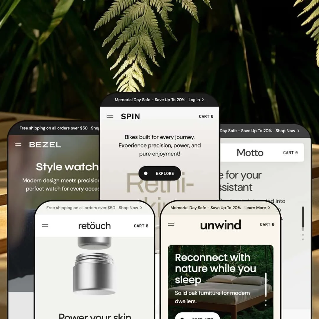
The Motto theme family by Designow offers flexible, modern storefronts tailored for hardware, cycling, skincare, furniture and watch brands. Across the presets, the first impression is polished: large hero sections, bold typography and high‑resolution imagery create a premium feel. Color swatches, sticky headers and expansive navigation make it easy to move around the store, while product grids often surface product details in overlays to shorten the path to purchase. Countdown‑style promotions and testimonial content are used to build urgency and trust. Through testing of the available demos, this review looks at how each preset balances aesthetics with ease of use and how the shared theme foundations behave in practice.
Pros.
〰️
Pros. 〰️
✚ Premium first impressions and merchandising block
Across every preset, Motto lands with a polished, modern storefront: large hero sections, bold typography and high‑resolution imagery establish a premium tone as soon as the page loads. Product grids are supported by content‑rich blocks such as compare sliders, layered testimonial sections and journal excerpts, so the experience feels more like a brand site than a bare catalogue. This makes it easier for merchants to tell a full story around their products without bolting on extra page templates.
✚ Quick‑view, sticky bars and cart drawer that speed up buying
During testing, quick‑view overlays consistently exposed key product information right from the grid, including image galleries, color swatches, variant selectors and direct add‑to‑cart buttons. Once an item was added, a slide‑out cart drawer appeared with line items, quantity controls and a free‑shipping progress indicator, reducing the need to reload full pages. On product pages, sticky purchase bars kept the item name, price and call‑to‑action within view even while scrolling through long stories or feature cards. Together, these mechanics shorten the path to purchase without forcing merchants into a hyper‑minimal layout.
✚ Urgency cues and social proof baked in
Motto makes it straightforward to layer urgency and reassurance into the storefront. Countdown bars and low‑stock messaging can appear both on the home page and product pages, giving merchants a way to highlight limited‑time offers or fast‑moving inventory. Testimonial sliders, star ratings and integrated blog sections then balance that urgency with social proof and education. Shoppers see both why they should act and why they can trust the brand.
✚ Flexible presets, consistent core
Motto offers flexible preset options that maintain core functionality while offering distinct aesthetic approaches. The Connect, Spin, Retouch, Unwind and Bezel styles all share the same underlying commerce mechanics, yet imagery, typography and color palettes are tuned to microphones, bikes, skincare, furniture and watches respectively. This means merchants in very different verticals can start from a preset that already feels close to their brand, while still benefiting from the same quick‑view, cart and product‑page patterns. In practice, that makes it easier to re‑skin the theme for new niches without retraining shoppers on how the store works.
✚ Modern Shopify foundations and mobile experience
As a Shopify 2.0 theme, Motto works with app blocks and standard Shopify SEO elements such as metadata and alt tags, so merchants are not fighting the template when they add integrations or optimise content. In testing, sticky purchase bars and the slide‑out cart behaved well on mobile screens, keeping core actions reachable even when pages ran long. While performance will always depend on image choices and apps, the base implementation felt solid on typical connections.
Cons.
〰️
Cons. 〰️
🚫 Long, section‑heavy pages that demand editing
Many of the demos, especially Connect and Unwind, stack a large number of sections on the home page, from compare sliders and multiple testimonial bands to extended blog previews. The result can be visually impressive, but it also means a lot of vertical scrolling, which may feel tiring on slower devices or for shoppers who just want to grab a specific item quickly. Merchants will need to curate and trim these pages carefully to keep the experience feeling intentional rather than exhausting. In styles that lean hard on storytelling, too many sections can start to feel more like a campaign microsite than a straightforward storefront.
🚫 Better for focused catalogues than mega‑stores
Retouch and other presets make it clear that Motto shines when the catalogue is tight and storytelling‑led. Stores with very high SKU counts or many disparate categories may find the straightforward grids and relatively small set of non‑commerce page templates limiting. Instead of endless specialized landing pages, Motto pushes merchants toward a smaller number of long, narrative‑driven layouts, which may not suit every merchandising strategy.
🚫 Image‑heavy layouts can strain weaker connections
Although pages felt responsive during testing, many sections across the presets rely on large imagery and animated sliders. On slower networks or older devices, those assets could add noticeable weight if they are not carefully optimised. Merchants who target bandwidth‑constrained markets will want to pay extra attention to image compression and the number of media‑heavy sections used on a single page.
-
The Default “Connect” style is Motto’s tech‑leaning preset, aimed at microphones, audio gear and accessories. Its vivid yellow and black palette immediately signals a high‑energy, gadget‑centric brand that feels closer to a studio gear catalogue than a general tech shop.
What works in this preset
Connect positions Motto squarely in the tech and audio space, with a punchy yellow against deep black that feels engineered for performance hardware. Background blocks, headings and buttons all pick up this contrast, so the interface stays cohesive as you scroll. Product imagery leans into close‑ups of microphones and accessories, helping shoppers quickly recognise use cases like streaming, podcasting or recording. The overall effect is purposeful and energetic rather than neutral.
On the homepage, Connect strings together a long sequence of merchandising sections that mix product highlights with review‑style quotes and editorial snippets. Because these areas appear one after another, shoppers encounter social proof and educational content as they scroll rather than seeing only rows of products. The layout gives you room to surface how‑to posts, launch stories and other gear guidance, which can make the brand feel more authoritative in a technical category. For merchants willing to invest in that kind of content, the dense layout turns the storefront into a destination rather than a simple product list.
In the header, the main product drop‑down mirrors how audio buyers actually shop, breaking the range into microphones and key accessories instead of relying on vague category labels. That makes it easy to jump straight into stands, mounts or bundles without detouring through multiple intermediate pages. For a store that carries a mix of technical gear, this kind of taxonomy lowers the risk of shoppers getting lost early in the journey.
Where it stumbles
Connect’s visual language is highly opinionated. The intense yellow‑and‑black contrast and busy hero areas can overpower very pared‑back products or brands that lean on ultra‑minimal photography. If your identity depends on calm, neutral palettes and plenty of negative space, this preset will tend to work against that positioning rather than with it.
-
Spin is designed for cycling and outdoor gear retailers, pairing clean grayscale photography with a dynamic hero treatment. It feels tuned to performance imagery and technical storytelling around bikes and accessories.
What works in this preset
Spin opens on a tall, vertical hero slider that advances like a stack of posters rather than a traditional horizontal carousel. Pagination runs alongside the content, so moving between hero states feels more like flipping through a lookbook than swiping banners. That sense of motion pairs naturally with bikes and performance gear, where movement is the core story.
The demo leans heavily on clean, mostly grayscale photography, reserving color pops for the products and a few interface highlights. This keeps attention on frame geometry, components and apparel rather than on background scenery. For premium bikes or technical accessories, that stripped‑back palette helps the storefront feel confident and focused instead of cluttered.
In navigation, Spin separates bikes, accessories and other ranges into clear, labeled clusters so visitors can hop quickly between the main categories without hunting. The way accessories are broken out gives smaller items room to breathe instead of burying them under headline bikes. On the home page, product cards funnel shoppers through prominent “Explore” calls to action rather than pushing directly for an instant purchase, which gives the experience a more editorial, discovery‑driven tone. For brands that value story and specs as much as raw conversion, that softer first click can be a deliberate fit.
Where it stumbles
Spin’s focused, monochrome aesthetic can be a mixed blessing. The cool, grayscale treatment that flatters performance bikes can make brighter, more playful product lines feel muted or out of place. Stores that rely on bold colour stories or highly varied categories may find this preset too narrow to express their full range comfortably.
-
Retouch caters to skincare and wellness brands, wrapping the store in pastels, soft curves and plenty of white space. It aims for a serene, spa‑like presentation that flatters beauty products and self‑care rituals.
What works in this preset
Retouch is the beauty and wellness face of Motto, with every page bathed in soft tonal palettes and generous white space. Rounded shapes in sections and buttons give the layout a gentle, tactile character. Product photography sits against calm backgrounds so packaging and textures stay in focus instead of fighting with the interface.
On collection pages, featured product sliders are tuned to skincare behaviour, surfacing different jar sizes directly alongside the hero image. Shoppers can see how a travel size compares visually with a full‑size product before committing to a deeper read. This makes the preset feel particularly thoughtful for routines where customers build bundles across several formats of the same formula.
The main navigation opens into a full‑screen menu built around large lifestyle tiles for Skincare and Nutrition, with supporting links to About, Journal and Contact. It feels more like a moodboard than a plain list of links, which helps position the brand as a broader wellness destination. For labels that sell both topical products and ingestibles, this split makes it clear how the range fits together.
Product detail pages go deep on narrative, pairing lifestyle photography with sections that talk through hero ingredients and usage. The tone is closer to an editorial feature than a technical spec sheet, which suits brands that frame their products as part of a ritual or self‑care routine. It also gives you ample space to explain formulation decisions without the page feeling cramped.
Where it stumbles
Retouch’s calm, almost gallery‑like grids can become a liability when a range gets very crowded. When many products share similar packaging and photography, the clean tiles start to blur together, and it takes more effort in naming and imagery to keep each item feeling distinct. Brands with sprawling, look‑alike lineups may need to work harder here than in a more utilitarian, list‑style layout.
-
Unwind targets furniture and home‑goods retailers, combining earthy photography with restful typography. It leans into room scenes and materials to sell beds and accessories as lifestyle pieces.
What works in this preset
Unwind is the furniture‑focused expression of Motto, anchored by warm, natural photography and relaxed typography. Room scenes, material close‑ups and generous spacing create a calm bedroom‑showroom feel. It immediately signals that this is a considered lifestyle brand rather than a discount outlet.
Across the home page, multiple product sliders carry the story forward. Sections like “Pick your finish” and “Products” highlight different furniture pieces and surface key variations, encouraging visitors to browse across configurations instead of treating each bed or accessory as an isolated item. For shops that sell customizable furniture, that guided discovery is especially helpful.
In the accessories collection, hovering a card swaps in a second image, often a lifestyle shot or alternate angle. This subtle movement gives shoppers a better sense of scale and context before they even click through, and it keeps the grid visually lively without crowding the layout with extra text.
Product pages lean into detail, with feature cards that explain materials, finishes and ways the pieces can be used. That written depth, combined with large imagery, helps answer many of the questions furniture shoppers typically have about durability and flexibility. For higher‑ticket items like bed frames, that extra reassurance can make a difference.
The navigation reflects how people shop for a modular bed system, separating Bed Frame, Bed Frame+ and Parts & Accessories instead of burying everything in a single generic bucket. That clarity makes it much easier for new visitors to understand that add‑ons and upgrades exist, and to find them quickly when they are ready to purchase extras. It also quietly reinforces the idea that the system can grow with a household over time.
Where it stumbles
Unwind’s layout is built around telling a long, immersive story for a flagship bed system. For brands that sell a wider mix of home goods or only a handful of pieces, that single‑product focus can feel restrictive, making it harder to give equal billing to other categories. If your business is closer to a general home store than a hero‑bed brand, you may find yourself hiding or heavily reworking several of the default sections.
-
Bezel positions itself for luxury watch and accessory brands, using a black‑and‑yellow palette reminiscent of high‑end catalogues. It is the most explicitly “luxury boutique” of the Motto presets.
What works in this preset
Bezel is Motto’s take on a premium watch boutique, pairing a deep black backdrop with punchy yellow accents. The hero sections and product grids give each watch plenty of breathing room, with crisp photography that highlights cases, dials and straps. It feels closer to a curated high‑end catalogue than a crowded online marketplace.
The main menu opens into a full‑screen overlay that mixes navigation links with large lifestyle panels for different watch collections. Simply opening the menu feels aspirational, as buyers are immediately dropped into moody wrist shots and close‑ups instead of a bare list of links. For brands where emotion and status matter, that menu treatment does a lot of the branding work.
Below the primary watch ranges, the demo also highlights straps as their own collection. Presenting these smaller add‑ons prominently encourages shoppers to think about building a small ecosystem around a favourite watch, not just buying a single piece. It is an effective way to nudge higher average order values without relying on aggressive cross‑sell pop‑ups.
Product pages are long and immersive, layering feature cards with testimonials that speak to craftsmanship and durability. That structure lets a brand unpack movement details, materials and provenance while still circling back to why a specific model is compelling. For shoppers comparing several premium pieces, this level of storytelling helps each watch feel distinct.
Where it stumbles
The main drawback that feels tied to Bezel specifically is its uncompromising black‑and‑yellow palette. While it certainly reinforces a bold, almost industrial luxury vibe, the contrast can be intense on long sessions or for shoppers who prefer softer interfaces. Brands with a more understated or romantic tone may find this treatment at odds with their identity.
Niche Suitability
Not Ideal For
-
Motto is best suited to brands that prioritise storytelling and rich product presentation. Electronics and audio labels, sporting goods and outdoor companies, beauty and wellness brands, furniture makers and luxury accessory houses can all make good use of its bold imagery, narrative sections and conversion‑focused tooling.
-
Merchants running vast catalogues with many loosely related categories, or teams that insist on ultra‑minimal layouts with very few sections per page, may find Motto too heavy. Those stores are often better served by themes built around extremely simple templates and highly granular category structures.
-
Medium — Setting up all of the storytelling sections, urgency blocks and imagery requires solid copy and assets, so the initial build is not a quick job. Once the content is ready, however, the presets and section options make ongoing adjustments relatively straightforward for a typical Shopify merchant.
Final Recommendation
★ 7.8/10
Rating
-
Comprehensive feature set including mega menu, quick‑view modals, countdown timers, sticky bars and testimonials; offset slightly by the weight of long, section‑heavy pages.
8
-
Setup is straightforward with presets, but managing long pages and multiple sections requires careful content planning
7
-
Sticky purchase bars and slide‑out carts work well on mobile; however, large images and sliders could slow loading on weak connections.
8
-
Pages load smoothly in testing but heavy imagery and animations could affect speed on slower networks.
7
-
Five distinct presets with varied aesthetics offer versatility, and section options allow further customisation.
9
FAQ
〰️
FAQ 〰️
-
👑 Yes. The Default style’s bold colors, mega menu and quick‑view modals make it ideal for gadgets and microphones, and variant swatches and countdown timers on product cards behaved as expected during testing.
-
📱The theme adapts well to different screens. Sticky bars and carts remain functional on mobile; for example, the Unwind product page’s sticky add‑to‑cart bar stayed visible while scrolling.
-
🎨 Absolutely. Each style shows distinct colour palettes, from yellow and black to pastels, demonstrating the theme’s flexibility in branding; swatches and typography can be edited via the Shopify customiser.
-
⚡ Pages felt responsive during hands‑on use, but image‑heavy sections and multiple sliders, especially in styles like Default and Unwind, can slow load times on weaker connections. Careful media optimisation is recommended.
-
👕 Yes. Quick‑view overlays and product pages include colour and size selectors, and adding multi‑variant products to the cart from the grid worked as expected in testing.
-
🔎 Motto works with the usual Shopify SEO controls such as page titles, descriptions and image alt text, and it does not introduce anything that would block their use. As always, merchants still need to populate those fields with strong content.
-
💱 Yes. International selling and currency handling are controlled through Shopify’s own Markets and multi‑currency features rather than by the theme itself, so you configure those options in your Shopify settings.
-
⚙️ As a Shopify 2.0 theme, Motto supports most apps via app blocks. Third‑party integrations were not tested in depth here, but no conflicts appeared during basic use.
-
🛒 Demos for all five presets are publicly accessible, and merchants can preview the theme inside their own store using Shopify’s standard theme trial before purchasing.
''This review is based on hands‑on testing of the publicly available “Default”, “Spin”, ‘‘Retouch’’, ‘‘Uwind’’ and ‘‘Bezel’’ demos of the Motto Shopify theme as of 2025‑12‑02. Theme features, style availability and performance can change with subsequent updates.