
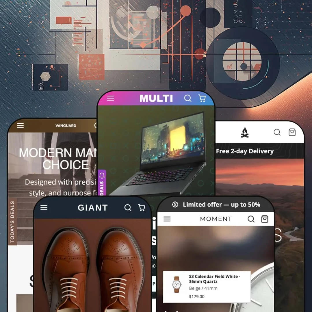
Most themes that promise to fit any store fit none of them especially well. Multi takes the opposite approach, shipping five full preset designs that each commit to a distinct vertical: electronics, outdoor gear, watches, footwear, and leather goods. It runs on Shopify's Online Store 2.0 architecture, with a section library deep enough that each demo feels purpose-built rather than reskinned. At $380, the real question is whether that range arrives with the depth to back it up.
A mega menu that scales with the catalog
Across all five presets, the theme leans on a configurable mega menu that handles multi-tier collections, image tiles, promo slots, and recently-viewed blocks. Big catalogs stay navigable. For a large multi-category store running 200-plus SKUs across many overlapping collections, whether it sells electronics, footwear, or accessories, this is the difference between a menu shoppers use and one they give up on.
A section library broad enough to replace a stack of apps
Where Dawn hands you a lean starter set of sections, Multi ships north of forty, from deal carousels and promo tiles through lookbooks, image hotspots, ranked best-sellers, and a comparison block. That breadth is the whole pitch. For a mid-market store that would otherwise assemble its homepage from separate deal, upsell, and lookbook apps, having that range arrive as one coordinated merchandising kit removes both the monthly cost and the integration glue between them.
A built-in product comparison section
The theme includes a comparison section that lays products side by side across whatever attributes you define. It bends to your catalog. For a store where buyers cross-shop on specs, say a shop carrying 30 to 200 electronics or watch SKUs, it replaces the comparison-app install and metafield wiring that would otherwise sit between you and a working spec table.
Five vertical-committed designs from one license
Multi ships five presets across five verticals from a single purchase, and each one adopts its category's conventions rather than swapping a hero image on a shared layout. Not one design in five colorways. For an agency building several client stores, or a multi-brand operator running more than one storefront, that range is the core of the value.
The breadth carries a configuration cost
Forty-plus sections and the deepest menu in its class is power, and power has a tax. Every section is another thing to populate, order, and keep current, and the menu depth that makes the demos sing has to be rebuilt around your own collections. This is not a set-it-in-an-afternoon theme. For a solo merchant or a small team without a dedicated store manager, the same range that sells the theme is also the workload you sign up for.
Its signature feature is most at home in tech
Multi markets itself for tech stores, and its standout merchandising tool, the spec-comparison section, fits attribute-driven catalogs best. The other four presets are fully realized. But the theme's identity and its most distinctive feature both point at electronics, so for a non-tech brand at mid-to-luxury pricing, a skincare or candle store for instance, you're buying a theme whose marquee capability solves a problem you may not have.
Easy to under-use at the top of its price band
At $380 the theme sits in premium territory. The value rests on range. Lean on only a fraction of the presets and the navigation depth and the math gets harder to justify, so for a single-brand store with a small catalog under roughly 50 SKUs and straightforward merchandising, a simpler theme may deliver the same result for less effort and less spend.
What it takes to launch
Plan a multi-day pass to replace demo copy and imagery, populate the product metafields the comparison and spec sections rely on, and re-stage the mega menu around your real collection structure before launch.
-
What works in this preset
Open the main menu and the whole catalog unfolds in tiers. Electronics, Components, Computers, Gaming, and Peripherals each expand into a dense grid of category tiles, every one carrying a thumbnail and a "From" price. This is the deepest navigation in the set, and on an electronics store with hundreds of SKUs spread across dozens of sub-categories, it does exactly what a big catalog needs. The depth is the point.
The electronics demo also stages a Compare Products section built for spec shoppers. It lines up the attributes a tech buyer actually weighs, from screen size and resolution through RAM, CPU, connectivity, and weight. For a store selling considered electronics where people cross-shop on numbers before they commit, a side-by-side like this earns its place on the page.
I lost count of the homepage sections somewhere past the third deal carousel. Today's Deals with badges, promo tiles split across Gaming, Professionals, and Creatives, a ranked best-seller block, category showcases, and a news feed all stack into one long, busy page. For a high-velocity electronics store that runs constant deals and drops, the "everything visible" treatment reads as a feature.
Where it stumbles
That density is a commitment, not a default. The Multi preset leans hardest into the maximalist layout of any design in the family, which suits a tech megastore but reads as a lot for a tighter catalog. A merchant with a focused electronics range who starts here begins by trimming sections rather than adding them, and that's real work before launch.
-
What works in this preset
The personality flips entirely. I clicked through, and it reads like a brand site rather than a catalog dump: Cobalt drops the giant mega menu for a clean centered header and lets full-bleed landscape heroes carry the page, stacking Limitless, Don't stop, Nature Calls, and Discovery into a single scrolling story. For an outdoor or lifestyle brand selling a curated range where mood does the selling, that shift in tone is striking given it's the same theme.
Cobalt also puts its gear brands front and center. A logo row surfaces names like Deuter, Black Diamond, and Marmot, and the product cards lead with the vendor instead of a rating. For a multi-brand outdoor retailer carrying recognizable labels, that's the right thing to emphasize.
Where it stumbles
The preset opens with four stacked editorial heroes before a single product appears. It sets a confident tone, but a returning shopper who just wants to reach the gear has to scroll past all of it first. For a conversion-focused outdoor store with a high share of repeat buyers, that's a genuine trade between brand feel and speed to product.
-
What works in this preset
The Catalog menu is organized the way a watch buyer actually shops. It nests first by audience, with Men's, Women's, Unisex, and Accessories, then by movement and material underneath: Quartz, Mechanical, Titanium, Gold, Classic, Minimalism. I noticed it threads a lot of taxonomy without ever feeling cluttered. That's harder than it looks.
Moment is also where the theme's localization interface gets a real workout. The header carries a language switcher across English, Czech, Korean, Japanese, and Spanish, sitting beside a rotating multi-message announcement bar. Because the theme ships its own interface strings translated, the storefront chrome changes with the shopper rather than only the catalog, which matters for a watch brand selling into several language markets.
-
What works in this preset
How do you make a store that sells only shoes feel big? Giant's answer is to slice one product type every way a shoe shopper thinks: by silhouette across Oxfords, Derbys, Loafers, and Dress Boots, then by material, sole, and season beneath each. The mega menu turns a single-category catalog into something genuinely browsable, which is the right instinct for a deep footwear range.
Set against the electronics flagship, Giant's homepage is noticeably calmer. There's more white space, fewer competing sections, and a product-forward layout. It dials the density down. For a mid-market footwear brand that wants a focused storefront rather than a busy one, that restraint is the selling point.
Where it stumbles
The menu repeats its full facet grid under every silhouette. Oxfords, Derbys, Dress Boots, and Loafers each open the same large matrix of material, sole, season, and use. On a smaller shoe catalog that's more menu than the inventory justifies, and a merchant will want to prune the facets down to match what's actually in stock.
-
What works in this preset
Vanguard sits between the theme's two extremes. It keeps a faceted accessories and briefcases menu, organized by material across top-grain leather, nubuck, suede, nylon, and canvas, and by use across business, travel, and compact, but it opens on a Today's Deals product carousel rather than editorial heroes. For a leather-goods or travel-accessory brand with a mid-size catalog and regular promotions, that middle path fits.
The product cards do real work for accessories. Each bag carries a five-image gallery, quick shop, and sale badges, so a shopper can turn a briefcase over without leaving the grid. For small leather goods that sell on visual detail, that multi-angle card sells the product better than words can.
Range that re-architects instead of reskinning
Read end to end, the most impressive thing about Multi is that each preset genuinely rebuilds itself around its vertical. The watch preset's gender-then-movement menu, the outdoor preset's editorial header, and the footwear preset's material-and-sole facets aren't the same layout with new photos; they're different structures for different ways of shopping. That commitment is rarer than a long preset count alone would suggest.
A section system that tunes loud or quiet
Seen across the whole family, the same toolkit stretches from the wall-to-wall electronics homepage to the airy footwear and watch demos. Its range of expression is a quieter strength than the section count, and arguably a more useful one, because it lets the theme host a maximalist megastore and a restrained boutique without either feeling like it's fighting the design.
A maintained, current codebase
The theme is on a recent version dated March 2026 and has stayed on Online Store 2.0 with ongoing updates since its 2023 launch. For a one-time purchase at this price, that continued maintenance is worth as much as any single feature, because it's what keeps the store compatible as Shopify itself keeps moving.
You inherit a system, not a look
Because the value here is range and tooling, Multi doesn't hand you a strong, art-directed aesthetic the way a tightly focused single-vertical theme does. The burden of a distinctive, coherent brand expression stays with you. Buyers who want an opinionated design to follow will find a capable toolkit instead of a finished point of view.
The presets don't quite read as one family
Taken as a set, the five demos reflect different design eras and densities rather than a single shared language. The newest presets feel current while the original flagship feels of its earlier moment, so the collection lands as a group of capable starting points instead of a unified design language. Anyone evaluating the theme through the polished newer demos should set expectations against the older one.
★ 7.8/10
Rating
-
A deep configurable mega menu, 40-plus sections, a metafield-driven comparison block, lookbooks, and promo tiles add up to an unusually broad toolkit.
9
-
The breadth means real setup time: populating sections, wiring metafields, and rebuilding the menu around your own collections is involved work.
6
-
Mobile uses a slide-out menu that preserves the nested catalog access, and product cards and carousels reflow cleanly to a single column.
8
-
Image lazy-loading and responsive image sizes are in place, though homepages with many stacked sections carry more weight to load.
7
-
Five structurally distinct presets, 40-plus sections, and editable color and type tokens give the theme a wide design range.
9
Frequently Asked Questions
-
Match the preset to the shape of your catalog rather than just your industry. Giant's style-and-material facets suit any deep single-category store, Cobalt's editorial layout suits a curated range, and Moment's audience-then-movement taxonomy suits a catalog that segments by type.
-
No. You install one preset as your starting design and build from there; the other four are alternative starting points, not modules you stack on top of each other.
-
The section is there, but it reads from product metafields, so you'll need to populate the attributes you want compared, whether that's screen size, material, or weight, before it shows meaningful rows.
-
Treat them as demo dressing. Product ratings on Shopify almost always come from a reviews app such as Judge.me, Loox, or Yotpo rather than the theme itself, so plan to install one if you want them live on your store.
-
Yes. Every preset demo includes a news or blog section along with About and Contact pages, so content marketing is built in rather than something you bolt on afterward.
This review is based on hands-on testing of the publicly available preset demos of the Multi Shopify theme as of June 25 2026. Theme features, preset availability, and performance can change with subsequent updates from the theme developer.