
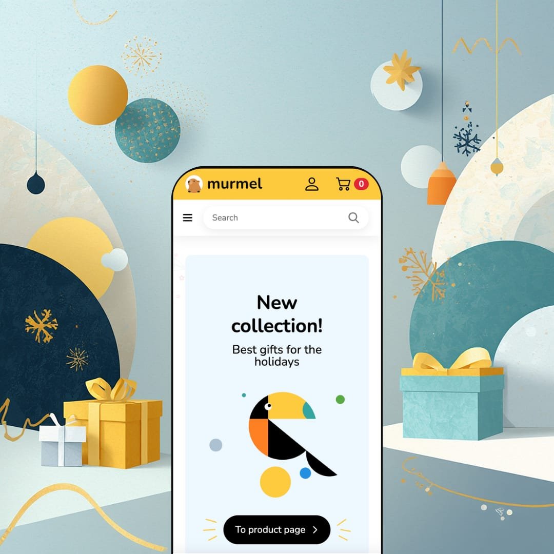
You're shortlisting themes for a kids store, and most of what comes up is a fashion theme with the saturation cranked. Murmel, a $320 Online Store 2.0 theme from Prettifyweb, takes the opposite route: it was drawn, colored, and staged for the kids-and-baby niche from the first pixel, right down to the illustrated crab waving from the promo banner. It ships as a single preset, which makes this a focused bet rather than a flexible toolkit. The real question is whether the specialization runs deeper than the palette.
Blog posts that sell instead of just informing
Every blog post can carry a "Shop the story" rail of full product cards with add-to-cart in place, and the homepage blog section mirrors the same article-and-product pairing. Content stops being a traffic dead-end and becomes a conversion surface, which changes the math on every parenting guide or gift roundup a merchant publishes. Strongest fit: content-led toy and baby brands running evergreen advice articles for research-heavy parents who read before they buy.
The buy box tells the truth before the cart does
The product page shows a stock-level indicator beside the variant picker, supports pre-order for unlanded items, and labels each swatch with its own price, so a variant that costs twice as much announces itself in the picker instead of at checkout. That transparency shortens the distance between looking and committing. Built for restock-driven toy sellers and seasonal gift merchants whose December peaks punish any ambiguity about what's in stock.
Interface strings arrive in five EU languages
Murmel ships its own UI labels pre-translated into English, French, Italian, German, and Spanish. Product content still flows through Shopify's localization tooling, but the buttons, form labels, and cart strings skip an entire translation pass. Real launch time saved for EU-based merchants selling a 50-200 SKU children's catalog across two or three language markets.
A finished visual identity for stores without a design budget
The theme ships custom illustration assets throughout, from the drawn empty-cart graphic to mascot-style imagery in the promo sections, wrapped in rounded card geometry and playful type that holds together as one coherent kid-coded system. Buying that look piecemeal would mean commissioning an illustrator. Here it's the default state, which matters most for single-brand launches under 50 SKUs with no designer on payroll.
The kids specialization is paint, not plumbing
Strip away the palette and the mascots, and the section lineup reads like any competent general-purpose conversion theme. Neither the demo nor the official feature list shows a section type that could only exist in this vertical: no size-by-age helper, no gift finder, no developmental-stage browser. Established kids boutiques with 100+ SKUs and age-segmented catalogs will find the positioning writes a check the tooling doesn't cash.
One preset, one direction, at a premium price
The $320 purchase buys exactly one preset staged for exactly one niche, and the rounded, high-color design language reads kids-first in every component, so repositioning toward minimal or premium aesthetics means fighting the theme. Dawn, Shopify's free baseline, covers a surprising share of the same conversion fundamentals while staying vertical-neutral. Multi-line merchants planning expansion beyond children's products, and cost-sensitive first-time stores, should weigh that concentration honestly.
Product pages run shallow for considered purchases
The product page stacks a gallery, the buy box, a free-text description, and a two-row specifications table, and that's the whole information architecture. For high-ticket baby gear like strollers, monitors, or car seats, where parents compare safety certifications and materials before spending serious money, there's no staged structure for layering that content. High-AOV equipment sellers serving considered-purchase buyers will need to solve content organization themselves.
Limited track record
Two years on the Theme Store, two reviews. Both are positive and both single out support responsiveness, but a sample of two says almost nothing about how the theme behaves across real catalogs, app stacks, and edge cases that only volume exposes. Risk-averse solo operators making a sight-unseen $320 decision without a developer to fall back on are taking on more uncertainty than the price tag suggests.
What it takes to launch
Expect a multi-day pass before publishing: homepage and banner copy rewrites, brand-logo and imagery replacement, mega-menu link re-pointing across the deep brand columns, metafield population for spec tables and product-card attributes, and localization defaults adjusted to your target market.
-
What works in this preset
Scrolling the demo homepage feels like walking a well-planned toy store. A slideshow hero hands off to featured products, two collection carousels, a gift-promo banner, a video block, a testimonial row tied to individual products, and a closing new-arrivals strip, so the page keeps offering a next thing to look at without ever feeling like a spec sheet. Age ranges sit directly in the main navigation, from 0-3 up to 12-16 years, which mirrors how parents actually browse this category.
Twenty-eight brand entries live under a single Clothes column, and the menu holds them without collapsing into chaos. I counted them twice because the depth surprised me for a single-preset theme. On mobile, the menu trades sprawling accordions for a drill-down pattern with a back-button at each level, which keeps long brand and category lists readable on a phone screen even when the catalog tree runs three levels deep.
The catalog template covers the workmanlike parts properly. Collection pages open with a banner pairing the collection description with an image, then run nine sort orders, a slide-in filter panel, pagination, and one-tap add-to-cart on the product cards. The cards themselves carry type, vendor, and sale badges, so the grid communicates before anyone clicks.
Where it stumbles
The age-range navigation promises more than the templates deliver. I clicked into the age collections expecting some age-specific staging and landed on the same generic grid every other collection uses. For a theme whose whole identity is the kids vertical, the demo never demonstrates what age-based merchandising could look like beyond a menu label, and that gap reads against its own positioning.
Murmel's defining character is joy: a fully drawn, kid-coded design system wrapped around one genuinely original mechanism, the shoppable blog.
The central trade-off is that this mechanism only pays out for merchants who actually publish. Without a steady content cadence, the most distinctive machinery in the theme sits idle while everything else performs like conventional, well-executed retail, bought at a single-preset price point with no second staging to fall back on.
That gives it a clear profile. Kids-and-baby stores that treat storytelling as a sales channel will get something few themes attempt; everyone else is paying premium money mostly for atmosphere.
Rating
★ 7.0/10
-
The conversion staples are all present and the article-to-cart blog system is genuinely uncommon; vertical-exclusive commerce tooling is absent.
7
-
One preset keeps decisions simple and the section editor does the rest; the sheer volume of demo content to replace and re-point adds launch friction.
7
-
Light, illustration-style imagery keeps pages lean; the homepage stacks many sections, so a fully merchandised build needs image discipline to stay quick.
8
-
The drill-down menu with per-level back buttons keeps deep brand lists navigable, and product grids reflow to single-tap purchasing on small screens.
7
-
Colors, type, and section order adjust freely, but the rounded playful identity is the theme itself, and pushing toward minimal or luxury works against every component.
6
Frequently Asked Questions
-
A slide-out drawer, complete with an illustrated empty state and a keep-shopping link back to the catalog.
-
Cards display a price range and swap the instant add-to-cart button for a "Choose options" link that routes to the product page.
-
Yes. Version 1.5 shipped in December 2025, adding navigation arrows to product media sliders, and the update cadence has stayed steady since the April 2024 launch.
-
RTL rendering is supported at the theme layer, which matters for merchants localizing into Hebrew or Arabic markets.
-
Prettifyweb maintains a dedicated GitBook manual for Murmel, linked directly from the Theme Store listing.
-
The demo product page carries a review block with a write-a-review prompt, but that's placement, not engine; the actual review functionality is app territory, and Murmel provides the hooks.
This review is based on hands-on testing of the publicly available preset demo of the Murmel Shopify theme as of June 2026. Theme features, preset availability, and performance can change with subsequent updates from the theme developer.