
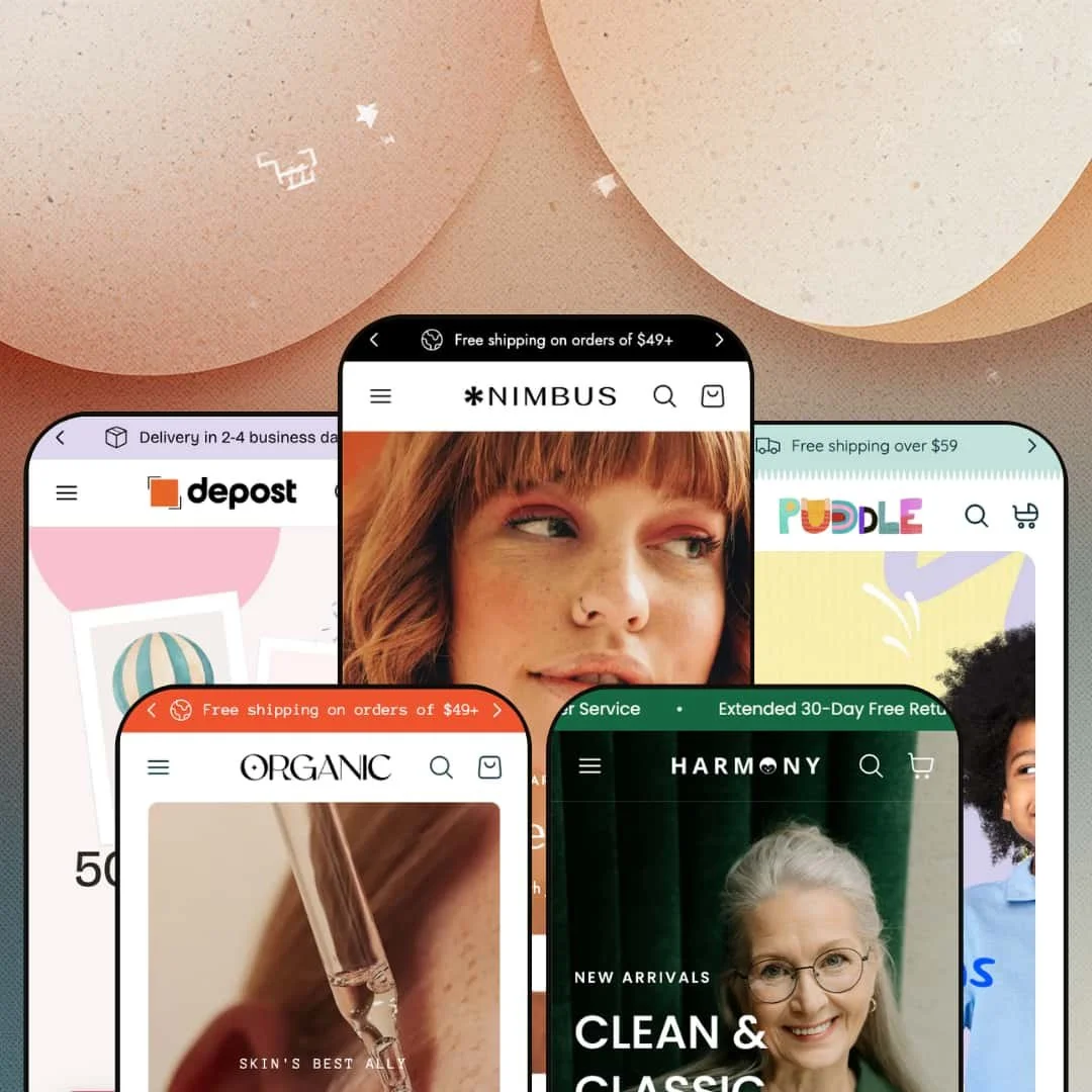
Most premium Shopify themes pick a vertical and commit. Nimbus does the opposite, shipping five preset designs that each behave like a different store (fashion, eyewear, skincare, and two more), all running on one Online Store 2.0 codebase. The real question with a theme this broad is whether the breadth is genuine depth or just five coats of paint over one skeleton. After walking through three of those presets, the answer turns out to be more interesting than cynicism would predict.
A merchandising kit that lives on the product page
The Nimbus product page bundles its conversion tools into one coordinated set instead of scattering them. On the Sadie Coat I clicked into, the page carried an up-sell add-on strip with its own variant pickers, a cross-sell row, a cart-goal savings prompt, and a back-in-stock capture, all native to the theme. For an apparel or accessories merchant running considered purchases in the mid-market tier, that's the difference between installing four separate conversion apps and configuring one section. That's real consolidation.
A mega menu that merchandises, not just navigates
A mega menu can be a list of links or a storefront. Nimbus builds toward the second: columns hold featured-collection image tiles, in-menu promo blocks, and themed groupings like Morna's luxury ladder, all from theme-level settings. A merchant with 50 to 100 SKUs across several collections, the kind cross-shopping a lot between categories, gets a navigation that actively sells instead of just routing. The result routes and sells at once.
A visual-storytelling section set, built in
Lookbook hotspots, a before-and-after slider, a press-coverage logo row, and image rollovers on product cards all ship in the box. None of it is bolted on. These are merchandising surfaces a content-led brand would otherwise stitch together from separate apps and custom sections, and Nimbus ships them in the library for every preset to draw on. Beauty and apparel brands that sell through storytelling and editorial photography get the most out of them.
Five real verticals from one license
Buy Nimbus once and you get five staged starting points across distinct industries, not five color swatches of the same store. That's rare value. The fashion, eyewear, and skincare demos I went through each solved a different merchandising problem with the same parts, and a merchant who runs more than one brand, or an agency building several client stores on a single one-time license, gets unusual mileage from a range this wide.
Built for content-rich brands, not lean ones
Nimbus assumes you arrive with a lot: strong photography, written editorial, multiple collections, a reason for both a journal and an Instagram wall. That's a portfolio, not a home page, and a brand with a thin catalog and stock imagery will spend its setup time deleting rather than building. For a small-catalog label under 30 SKUs, or a single-product DTC brand, the architecture quietly works against the goal.
Support and upkeep ride on one small studio
Nimbus comes from OranThemes, a single studio based in Hanoi, with support running through email, WhatsApp, and a GitBook manual. The published reviews are largely positive. The update cadence is steady. For a one-person shop that's plenty; for a larger operation with 500-plus SKUs and no in-house developer, betting your storefront's roadmap on one small team is a risk worth pricing in.
One staging per vertical, so niches outside the five start cold
The five presets spread across fashion, eyewear, skincare, and two more, which means each vertical gets a single interpretation. A merchant whose category isn't among the demoed five, say furniture, electronics, or food and drink, inherits the full section library but none of the vertical-tuned staging that makes the demos feel finished. They'll build their starting look from parts. For a furniture or home-goods seller, or a first-time founder wanting a launch-ready template without a designer, that's more assembly up front.
What it takes to launch
Plan a multi-day pass to replace demo copy across hero slides, FAQ entries, lookbook captions, and the About-page narrative, populate metafields for size charts and ingredient or usage blocks, restage the mega menu around your own collections, and review the five-language EU strings before launch.
-
What works in this preset
Scrolling the flagship Nimbus demo feels like paging through a lookbook that happens to sell things. A three-slide hero rotates seasonal edits, a marquee ribbon repeats the brand promises, and a category grid shows live product counts under each tile. It's confident. By the time you hit the tabbed "Hits of the Week" block, where dresses, bottoms, and tops sit in switchable panels, the page has already demonstrated several different ways to merchandise a catalog.
What kept pulling my attention was the featured-product block sitting mid-homepage. Instead of a teaser, it stages a complete product page inline: the Sadie Coat with size and color swatches, a size-chart modal, a "notify me when back in stock" capture, and an up-sell add-on strip offering a denim short, a midi skirt, and a poplin shirt with their own variant pickers. That's bold. A small banner nudges "order now to save 10%," turning the home page into a place where a shopper can size, cross-shop, and add to cart without ever clicking through to a product URL.
Then it keeps going. Below the fold there's a promo-tile grid, a surplus-sale carousel, a "how we style" lookbook with image hotspots, a press-logo row, a before-and-after slider, a journal feed, and an Instagram wall. Every one of those is a real, configurable part of the section library. The flagship just deploys nearly all of them at once.
Where it stumbles
The flagship's maximalism is a positioning choice, and it cuts against lean catalogs. The cost shows fast. A brand with twelve hero products and no editorial photography would have to delete more than it builds to make this layout feel intentional, and for a tight capsule label the density reads less like abundance and more like empty shelves dressed up.
-
What works in this preset
Morna stages its mega menu around a price ladder. The effect is immediate. One column is labeled "Luxury" and holds three lab-grown-diamond frames at $3,500 apiece, sitting a hover away from the $120 everyday sunglasses in the next column. It's the same mega-menu block the other presets use, pointed at a different merchandising job: making aspirational hero pieces visible without burying the everyday volume sellers underneath them.
The trust ribbon is where the eyewear framing gets specific. It reads as deliberate. Instead of a generic "free shipping," it cycles "24/7 Customer Service," "Extended 30-Day Free Returns," and "Vision Insurance" — that last one a detail only someone selling eyewear would think to surface, and the kind of small touch that separates a re-skinned demo from a re-considered one.
Where it stumbles
The luxury staging raises a bar the rest of the demo doesn't quite clear. The gap is real. Those four-figure frames want full-bleed editorial photography and considered copy, yet the surrounding product cards are styled for catalog browsing rather than for selling a single expensive object, so a brand genuinely working a luxury tier would need to art-direct the high end themselves.
-
What works in this preset
Esselle leads with proof. The before-and-after slider, a theme-wide section here put to its most natural use, sits high on the page and invites the visitor to drag between a "before" and "after" on skin. For a skincare or clean-beauty brand, that single drag-to-compare interaction does the persuading that paragraphs of claims usually can't, because it hands the demonstration straight to the shopper.
The whole preset reads calmer than the fashion flagship. Where Nimbus stacks section on section, Esselle gives ingredients and benefits room to breathe, leaning on usage-information and product-tab blocks that suit a considered skincare purchase. I went looking for the hard-sell countdown energy of the flagship and mostly didn't find it, which is exactly the point.
Where it stumbles
Esselle's restraint depends on assets the demo can't supply for you. The bar is high. The calm only works when your product photography is genuinely good and your ingredient copy is genuinely written, and if you drop in stock images and placeholder benefits, the airy layout turns thin instead of premium. This is the preset that punishes a rushed launch the most.
One architecture that genuinely changes costume
Reading the presets back to back, the impressive part isn't any single section but how completely the same parts re-cast themselves. The disguise holds. The fashion demo's drop-and-lookbook rhythm, the eyewear demo's price-ladder navigation, and the skincare demo's proof-first calm are the same blocks wearing entirely different intentions, and holding that range together on one codebase is the theme's real achievement.
A feature count that's deep, not padded
Padding a feature list with platform standards is easy. Nimbus's list instead runs full of things that are actually theme work: age verifier, quick order list, before-and-after slider, image hotspots, pre-order, back-in-stock, countdown, gift wrapping. Across every preset, that depth is what lets the demos read like finished stores rather than templates waiting for a developer.
The presets run heavy, and that compounds
Each demo leans on large hero imagery, multiple product carousels, and animation, and that weight is consistent from the fashion preset through skincare. Weight adds up. Lazy-loading is in place, but a merchant layering a big catalog and several apps on top will need real performance discipline to keep the homepage quick, because the richness that sells the demos is the same richness you then have to manage.
Breadth bought with per-vertical depth
Spreading five presets across five industries is the selling point and the limit at once. Range costs depth. Each vertical gets exactly one interpretation, so a merchant who wants to weigh two different looks for, say, a skincare line ends up adapting a neighboring preset rather than choosing between purpose-built options, which is a deliberate trade worth understanding before buying for one specific niche.
Rating
★ 7.8/10
-
The native set runs deep for an Online Store 2.0 theme: up-sell add-on, back-in-stock, countdown, age verifier, quick order list, before-and-after slider, and image hotspots all ship without apps.
9
-
Forty-plus sections and densely staged presets mean genuine configuration time; the power is there, but so is the learning curve.
7
-
The theme is built for mobile-first browsing, with a slide-out menu and swatch pickers sized to hold up on small screens.
8
-
Homepages lean image-heavy and animation-rich; lazy-loading helps, but the busiest presets need trimming to stay fast.
7
-
Five vertical presets and a 40-plus section library give wide creative range, though some style controls are less granular than the section count suggests.
8
Frequently Asked Questions
-
The five presets already span fashion, eyewear, and skincare, and theme-wide blocks like size charts, ingredient/usage panels, and nutritional information cover apparel, beauty, and food alike. Any vertical can run it; some just start with more staging work than others.
-
Both are built in at the theme level. The demo product page shows the back-in-stock "notify me" capture in place, and pre-order is listed among the native features.
-
That's the Morna preset staging a luxury price ladder inside its mega menu, using the same theme-level menu blocks every preset has. It's a merchandising example, not a separate feature.
-
Five, and yes. The sections are theme-wide, so you can pull any block from one preset's look into another's. The presets are starting points, not locked templates.
-
The theme ships pre-translated interface strings for English, French, Italian, German, and Spanish, so buttons and form labels render in those languages. Currency conversion and market routing are handled by Shopify itself, not the theme.
-
Yes. An age verifier is included at the theme level and configured in the theme settings, which matters for anyone selling alcohol, vapes, or other age-restricted goods.
This review is based on hands-on testing of the publicly available preset demos of the Nimbus Shopify theme as of May 28 2026. Theme features, preset availability, and performance can change with subsequent updates from the theme developer.