
Most premium Shopify themes pick a lane: fashion, electronics, food. Noire picks four. BoostifyThemes ships pet, furniture, electronics, and baby presets in the same Online Store 2.0 package, a multi-vertical bet that rises or falls on whether the demo polish keeps up with the feature ambition.
Mega menu architecture with merchandising depth across all four presets
All four presets ship a four-to-six-column mega menu with image-banner integration, category icon support, and category-level sub-navigation. Pet (Dog/Cat/Bird/Fish), furniture (Living Room/Kitchen/Dining/Storage), electronics (Computers/Audio/Phones/Home), baby (Prams/Strollers/Accessories): the same component handles all four with vertical-specific population. For merchants with 50+ SKUs distributed across 5-10+ sub-categories, this is the routing layer the catalog needs without installing a mega-menu app. The kind of theme-layer header capability that usually requires a $15-30/month app subscription or a developer engagement to retrofit onto a thinner theme.
A merchandising section library that absorbs three or four app subscriptions
Countdown timers (Noire, Lignum, Binky), tabbed product collections (all four), image-hotspot "Shop the look" sections (Lignum), testimonial blocks with attached product cards (Lignum, Neon), category-icon rows (all four), brand-logo grids (all four), and inline featured-product variant pickers (Noire) all ship as native sections. Most premium themes pick two or three of these and leave the rest to apps. For discount-led DTC brands, conversion-focused retailers, and category-heavy stores where merchandising velocity matters more than editorial restraint, the section breadth at $280 STANDARD-tier pricing is genuinely uncommon.
A multi-vertical preset family for merchants who can't fit a single-vertical theme
For merchants whose catalogs cross vertical lines (pet supplies plus baby accessories, electronics plus home goods, furniture plus decor), Noire is one of the few themes that demos how the same architecture handles four radically different industries. The visual identity shifts meaningfully between presets: pet leans bright and discount-loud, furniture leans editorial, electronics leans dark and tech-formal, baby leans soft and pastel. The underlying section library carries across all four. Single-vertical brands with a locked-in identity won't need this depth; for store owners still positioning, or running multi-vertical inventories under one roof, four-preset coverage at one purchase price is the differentiator.
Demo polish is the worst signal at this price tier
The polish gaps multiply across all four presets in ways that signal the demos aren't being maintained as the product window they should be. Typos in primary store names, sections duplicated back-to-back on the same homepage, cross-preset testimonial bleed, vertical-wrong trust-badge copy, Latin lorem ipsum left in finished sections, and character bugs in the currency selector all sit live on the demos a buyer evaluates before purchasing. For merchants who'll use the live demos as their pre-purchase confidence signal, the demo is the sales pitch, and it should be airtight.
Information density runs against editorial restraint
Each preset stacks roughly 15 to 20 sections vertically: countdown timers, tabbed collections, hotspot rows, testimonial blocks, brand logo grids, Instagram feeds, newsletter signups. For merchants whose brand depends on whitespace and editorial pacing (premium fashion, jewelry, design-led home), Noire's default rhythm is the opposite direction. It's built to populate, not to breathe. Stripping sections to achieve editorial restraint is possible, but the merchant who chooses Noire for its feature density is unlikely to be the same merchant who wants three sections on a homepage.
Cross-preset brand naming has no consistent pattern
Each preset's demo carries a different store-name pattern with no unifying convention across the family, including one with a misspelling that ships live across multiple template files. For merchants evaluating Noire's multi-vertical bet by clicking through all four preset demos before purchase, the naming inconsistency reads as low maintenance discipline. Separate from the theme's underlying capability, inseparable from buyer confidence.
What it takes to launch
Copy rewrites are needed across trust badges, testimonials, Shop-the-Look descriptions, Instagram subtitles, and announcement banners on whichever preset is chosen. Expect to author new testimonials rather than reuse the demo data, replace cross-preset placeholder copy (Latin lorem ipsum appears in five places across the four demos), and verify the currency selector configuration before going live. Plan a multi-day copy pass before any preset is launch-ready.
-
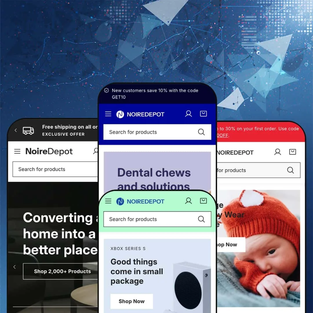
What works in this preset
The pet-store preset (NoireDepot) leans into discount staging. Two announcement bars stack at the very top (FIRST30OFF and GET10), a countdown banner sits inside the hero with "Clearance sale! UP TO 50% OFF," and a second flash-sale section with its own timer surfaces directly below the category-icon row. I noticed two countdown timers above the fold isn't a layout I'd normally recommend, but the section variety here is unusual at $280, especially for pet brands running parallel new-customer and acquisition incentives where the layered promo support is the point.
The featured-product block at mid-page does something most themes save for the PDP. It renders size and color variant pickers inline (S/M/L with Red/Green/Blue) plus quick add-to-cart from the homepage. For pet brands selling consumables and toys with low-friction reorder patterns, removing the click-through to the product page is a measurable conversion lever.
Where it stumbles
The three trust-badge tiles below the featured product all carry the same body copy: "Shop with confidence and have your favorite electronics delivered right to your doorstep." This is a pet store. The electronics copy was clearly pulled from the Neon preset and never rewritten before this demo went live.
The Instagram block at the bottom of the homepage ships with Latin lorem ipsum ("Vestibulum sagittis justo leo...") as its description. It sits live on the demo a buyer is evaluating before purchase.
-
What works in this preset
Where Noire stacks announcement bars, the Lignum furniture preset (NoireDepot Furniture) opens with a three-icon utility row at the very top: Free Shipping / Special Deals / Get NoireDepot App. Below it, the hero is a three-slide carousel rotating "Converting a home into a better place," "Furnishing For Blissful Living," and "Home Decor Inspirations," fully populated with mobile-specific image assets that ship alongside the desktop slides. That's the right level of attention to mobile-first hero composition at the $280 tier.
A Shop-the-Look section appears mid-page with three hotspot-style product call-outs (Pendant light LED, Gallery Picture Frame, Compact Wooden Storage Bed). For furniture and home-decor brands where shoppers buy by room rather than by SKU, this is the right merchandising spine, and it's native rather than app-driven.
Where it stumbles
Latin lorem ipsum shows up in three separate places on this single demo: the trust-badge row ("Sed iaculis tortor magna..."), the Shop-the-Look description ("Duis rhoncus justo nisl..."), and partially in the testimonial structure. For a $280 demo, that's the kind of thing that makes the theme look careless before a buyer ever gets to its actual capability.
The testimonials section ships three identical copies of one testimonial reading: "I definitely like the feel in my ear its different and comfortable to say the least." This is a furniture store. The earphone testimonial came straight from the Neon electronics preset without ever being verticalized.
-
What works in this preset
Three category cards open the homepage instead of an announcement bar or top utility row: "XBOX SERIES S," "Best affordable laptops," "Top 10 tech gadgets to watch." Below them, a featured-product spotlight built around the Bang & Olufsen Beosound A1 carries an "Innovation Product" banner treatment, using the same section position Noire's pet preset uses for inline variant pickers. I'd steal that trick for any electronics retailer running editorial product spotlight on the homepage rather than the PDP.
The "Best Designed Smartphone Now at $199.00" and "Best Home Audio & Theater Devices Shop from only $29.00" horizontal product strips carry an anchor-pricing CTA in the section header itself. For electronics retailers running price-anchored merchandising on category landing zones, this format does the work without an app dependency.
Where it stumbles
"Trusted by 100,000+ customers" runs as a section header with a Latin lorem ipsum subtitle directly underneath. The trust claim is precise; the supporting copy is placeholder Latin. Either ship without the headline or finish the copy underneath it.
-
What works in this preset
The baby preset (NoireDebot Baby) runs three announcement bars stacked at the top (FIRST30OFF, GET10, and "Free shipping on all orders over $50"), and eight category icons sit directly under the hero (Prams, Bath, Car Seats, Feeding, For Mum, Nursery, Playtime, Baby Wear). For DTC baby brands where the new-customer incentive, returning-customer code, and free-shipping threshold all matter at once, the layered announcement architecture surfaces all three without requiring banner rotation, and the eight-icon row gives shoppers the use-case routing they expect from a category-driven baby vertical.
A unique "Shop by categories" section near the bottom of the homepage renders four category tiles (Prams, Nursery, Baby Feeding, Baby Wear), each with a category image header and bulleted sub-category links underneath. I found myself wishing the other three presets had this section configured too. It's a navigation pattern more common to large multi-vertical retailers than to single-brand baby stores.
Where it stumbles
The "Sale Clearance" countdown section appears twice on the same homepage, back-to-back, with identical products and the identical "Valid til Mar 30, 2024" expiration date. Beyond the duplication, that date is over a year stale on a demo presented as the current sales pitch.
The store name itself is "NoireDebot Baby," a typo of "NoireDepot" appearing in the browser tab title, footer copyright row, and meta tags. This is the developer's primary baby-vertical demo, and the brand name on it is misspelled.
Architectural consistency across radically different verticals
The same section library renders a pet store, a furniture catalog, an electronics shop, and a baby retailer with credible vertical-specific feel. Most multi-preset themes ship vertical variants of the same store type; Noire's four presets are four genuinely different stores. For BoostifyThemes, this is the theme's clearest differentiator at the $280 STANDARD tier.
Header capability depth as a theme-layer asset
Multi-announcement-bar rotation in Noire and Binky, top utility icon row in Lignum, image-supported mega menu across all four, category-icon rows directly under the header. These are theme-layer header capabilities that vary per preset configuration. For merchants who use the header as their primary promotion and routing layer, the depth here is well above the price tier's typical baseline.
Section-library breadth as the default merchandising posture
Countdown timers, image hotspots, tabbed collections, testimonial-attached-product blocks, category-icon rows, inline featured-product variant pickers, brand-logo grids: all native, all configurable across all four presets. For merchants whose merchandising stack would otherwise depend on three or four app subscriptions, Noire absorbs the work into the theme itself.
Demo-polish gaps signal under-investment in the maintained demo
The polished demo is the buyer's only pre-purchase window into the theme. Typos in store names, duplicated sections, expired countdown dates, Latin lorem ipsum, cross-preset copy bleed-through, and currency-selector character bugs across multiple presets all sit live on the demos a buyer evaluates. The actual capability of the theme outruns what the demos communicate; that's itself a problem, because buyers won't get past the demos to discover it.
Dense vertical layout as the default rhythm
Every preset stacks roughly 15-20 sections in heavy vertical sequence with little whitespace discipline. For brands whose aesthetic depends on restraint, this isn't the theme, and the section count makes the homepage page-weight heavier than the architecture would otherwise demand.
Limited review volume relative to theme age
Seven reviews after 18+ months in the Theme Store is a thinner public signal than the $280 price tier typically carries. The reviews that exist are all positive, but the volume itself remains modest for buyers wanting a deeper dataset at this maturity.
★ 7.4/10
Rating
-
Native section library covers countdown timers, hotspots, tabbed collections, testimonial-with-product, category-icon rows, and image-supported mega menus across all four presets without app dependencies.
9
-
Four verticals to wade through during preset selection, multiple announcement-bar layers to configure, and significant copy work required to remove demo placeholder text before launch.
6
-
Mobile-specific hero image assets ship with each preset, the mobile menu uses a back-button stacking pattern with category sub-navigation, and the cart icon stays thumb-accessible in the upper-right across all four presets.
8
-
Heavy homepage section count in every preset. Lazy-loading is configured, but each preset stacks 15+ sections including countdowns, tabbed collections, brand-logo grids, and hotspot rows, which adds page weight beyond what the feature need alone justifies.
6
-
Four meaningfully different visual identities ship in one purchase, and the section library supports rearrangement across radically different merchandising postures.
8
Frequently Asked Questions
-
Yes. The same mega-menu, tabbed-collection, countdown-timer, and testimonial-with-product sections render across all four presets with vertical-specific population. The visual identity shifts but the structural section library is shared.
-
The Shop-the-Look section is configured live on the Lignum furniture demo with three product hotspots (Pendant light, Picture Frame, Storage Bed). The component is part of Noire's shared section library and can be added to the other three presets, but they ship without it active.
-
Yes. The Noire pet preset runs two announcement bars and the Binky baby preset runs three, but each banner is an independent section. They can be reduced to one or removed entirely from the theme editor without code changes.
-
Both features require a Shopify Plus subscription at the platform level, not just the Noire theme. Standard and Advanced Shopify plans won't surface either feature regardless of theme choice.
-
Substantial. Each preset carries vertical-specific testimonial text, Latin lorem ipsum in some sections, trust-badge copy from other verticals, and demo product names that need replacing with the merchant's actual catalog. Plan a multi-day copy pass before any preset is launch-ready.
-
The theme ships with a slide-out cart drawer as the default, with sticky-cart support enabled in the theme settings. The drawer behavior is configurable to use the standard cart page instead per the Theme Store feature listing.
This review is based on hands-on testing of the publicly available preset demos of the Noire Shopify theme as of May 23 2026. Theme features, preset availability, and performance can change with subsequent updates from the theme developer.