
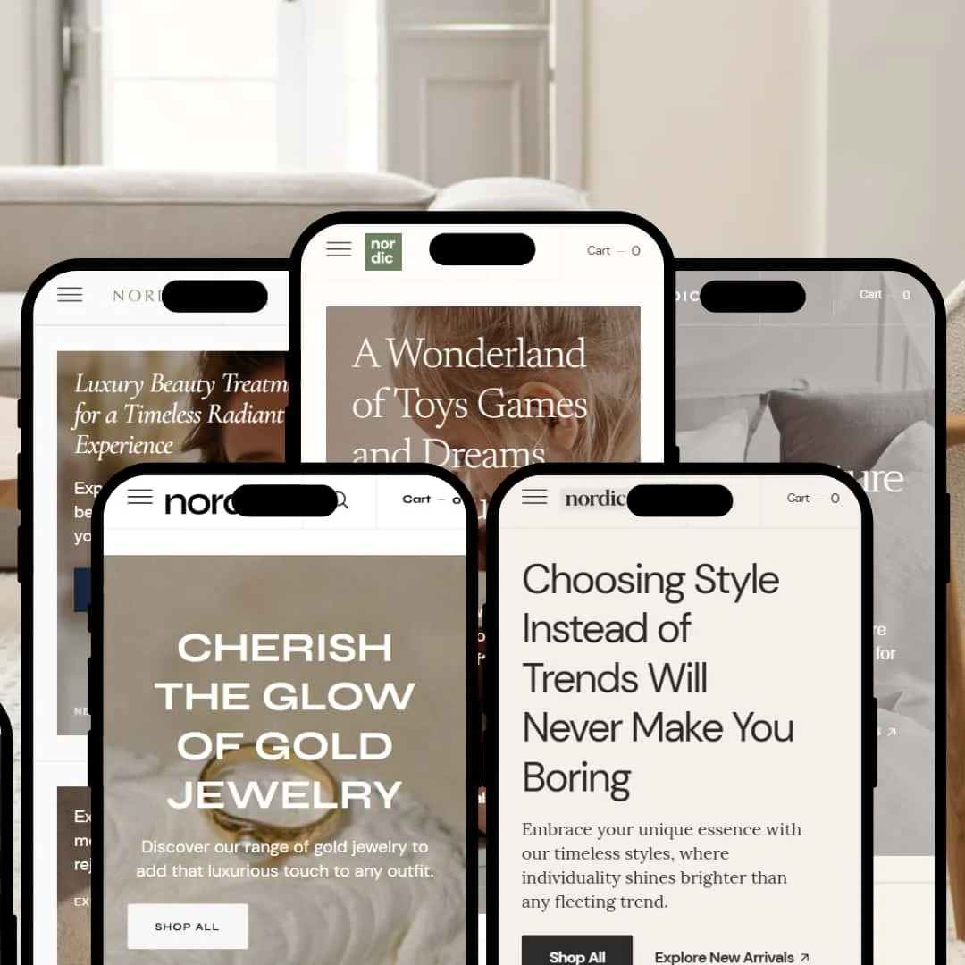
The Nordic Shopify theme is a minimalist, editorial-focused theme designed for brands that prioritize strong visual storytelling. With five distinct presets—White Oak, Clean, Slate, Charcoal, and Sage—it offers different aesthetic starting points, from clean and spacious to dark and moody. This review is based entirely on hands-on testing of the live demos, digging into the real user experience beyond the marketing copy.
Pros.
〰️
Pros. 〰️
✚ Smooth, App-Like Interactions: The slide-out cart glides in without page jank, hover animations are fluid, and menus open instantly. This polished performance builds shopper confidence and enhances brand perception, which can support a higher average order value (AOV).
✚ Seamless Quick View Modal: The theme includes a well-implemented Quick View feature, accessible from collection pages. It opens a clean modal that allows shoppers to select variants and add products to the cart without leaving the page, streamlining the buying process and reducing friction.
✚ Built-in "Shoppable Story" Features: The theme provides powerful, app-like modules for contextual selling, including "Shop the Look" image hotspots (seen in Clean & Sage) that let users add products to their cart directly from lifestyle images. This streamlines the path to purchase and can significantly increase conversion rates.
✚ Superior Visual Storytelling Canvas: Across all presets, the theme's structure prioritizes large-format imagery, elegant typography, and generous white space. This provides an exceptional canvas for brands to tell compelling visual stories, which is critical for justifying premium price points.
Cons.
〰️
Cons. 〰️
− The Minimalist Trap (Strategic Weakness): Nordic's greatest strength—its pristine minimalism—is also its biggest strategic risk. The design relies heavily on professional, high-end photography and a strong brand aesthetic. For merchants without these assets, the theme’s clean, spacious layouts can appear empty, unfinished, or cheap rather than intentional and luxurious, ultimately damaging brand credibility.
− Basic Filtering UI: While functional, the theme's presentation of collection filters is rudimentary across all presets, using simple text links. It lacks modern UI elements like price range sliders or visual color swatches, which hinders usability for stores with many variants and can frustrate shoppers trying to narrow their choices.
-
The White Oak preset embodies a classic, high-end retail aesthetic with its balanced layout and traditional navigation.
⊕ Pros
✚ Refined Product Grid Focus: On hover, the grid image subtly zooms while the product title and price appear below. This clean effect avoids overwhelming the user with buttons, keeping the focus squarely on the product visuals; it feels intentional and high-end.
✚ Elegant Collection Header: Collection pages feature a large, page-width banner image with the collection title elegantly overlaid. This built-in design creates a strong, editorial-style entry point that enhances the perceived value of the product line.
✚ Distinct "New" & "Sale" Tags: The product tags are presented as small, underlined text labels (e.g., "New arrival") rather than typical solid-color badges. This unique typographic approach integrates seamlessly with the preset's minimalist design.
✚ Clear Informational Hierarchy on Product Pages: Product information is organized into clean, expandable accordion sections for details like "Materials" and "Shipping & Returns." This keeps the page tidy and allows shoppers to pull information as needed, reducing initial clutter.
⊖ Cons
− Understated Add-to-Cart Button: The product page "Add to Cart" button is a simple outline style. While aesthetically pleasing, it lacks visual weight and can get lost, potentially slowing down the conversion path for decisive shoppers.
− Basic Footer Layout: The footer is a simple four-column text layout. While functional, it lacks any engaging elements like an Instagram feed integration or a visually distinct newsletter sign-up block, feeling like a missed opportunity for engagement.
-
The Clean preset is the most spacious and airy of the collection, using an offset grid and ample negative space to create a modern, gallery-like feel.
⊕ Pros
✚ Unique Asymmetrical Product Grid: The homepage features a distinctive staggered grid that breaks the traditional column-based layout. This built-in design choice is highly effective for creating a memorable, high-fashion aesthetic that makes products feel like curated artifacts.
✚ Animated Text Ticker Section: A scrolling text ticker provides a dynamic, eye-catching way to announce promotions or brand slogans. The smooth, continuous motion adds a modern touch without being distracting.
✚ Extremely Minimalist Product Pages: The product page de-emphasizes everything but the image and a small, fixed-in-place purchase block on the right. This is a bold, built-in design choice that works exceptionally well for single-product focus or designer pieces.
⊖ Cons
− Price Obscurity: On collection grids, the price is not visible by default. The user must hover over a product to see the price, which adds a layer of friction for price-conscious shoppers and hinders scannability.
− Disconnected Mobile Experience: The striking asymmetrical grid on desktop collapses into a standard single-column layout on mobile. This change, while necessary for usability, causes the preset to lose its most unique design feature on smaller screens.
− Low-Contrast Newsletter Form: The footer's newsletter sign-up is a simple input field with light grey placeholder text, offering very little visual incentive to subscribe. It lacks the prominence needed to be an effective lead-capture tool.
-
Slate offers a content-first approach, blending commerce and editorial content seamlessly with a design that feels like a modern digital publication.
⊕ Pros
✚ Prominent Predictive Search Bar: The search bar is featured as a persistent, clickable text field in the header, unlike the simple icon in other presets. It opens a full overlay with instant, image-rich search suggestions, providing a superior search experience that encourages discovery.
✚ Integrated Blog & Commerce Homepage Design: The homepage demonstrates a built-in design that expertly balances large-format articles/blog posts alongside product grids. This unique layout makes it ideal for brands that rely heavily on content marketing to sell their products directly from the landing page.
✚ Split Image & Text Section: This preset includes a well-designed section that pairs a large image with a detailed text block, complete with a button. It’s perfect for founder stories, brand manifestos, or detailed feature callouts.
⊖ Cons
− Center-Aligned Menu Complexity: The centered logo splits the navigation menu into two halves. While stylish, this can be slightly less intuitive for users accustomed to a standard, single-block navigation menu, especially if there are many menu items.
− Hidden Cart Notes: The ability to add a note to an order is hidden behind a small text link in the slide-out cart drawer. Shoppers providing gift messages or special instructions could easily miss this, potentially leading to support requests.
-
The Charcoal preset delivers a bold, dark-mode experience tailored for brands with a strong, edgy, or luxurious identity.
⊕ Pros
✚ Striking Dark-Mode Design: The preset's built-in dark aesthetic is flawlessly executed. The typography, spacing, and contrast ratios are all thoughtfully designed to be legible and luxurious on a dark background, enhancing the perceived value of the products.
✚ Image-Focused Product Gallery: The product page features a full-height, single-column image gallery. As you scroll, the product information on the right remains sticky, allowing the user to view all images without losing sight of the purchase options.
✚ Immersive Full-Screen Menu: Clicking the hamburger icon opens a full-screen overlay menu with large, clear links. This interaction feels premium and app-like, making navigation a focused, intentional act that reduces distraction.
✚ Before & After Image Slider: This preset includes a fantastic built-in "Before & After" slider section. It's a highly effective tool for showcasing transformations, which can significantly boost conversion rates for visual-impact products.
⊖ Cons
− Potential for Low-Contrast Text: While the main headlines are clear, some of the smaller, secondary text (like product descriptions or footer links) has lower contrast against the dark background, which could present readability challenges and harm the user experience.
− Hamburger Menu on Desktop: This preset uses a hamburger menu icon on all devices, including desktop. This hides the navigation options behind an extra click, which can slow down exploration and increase bounce rates for first-time visitors.
-
Sage offers a soft, wellness-oriented design that feels calming and trustworthy, perfect for brands in the health, beauty, and self-care spaces.
⊕ Pros
✚ Soft, Rounded UI Elements: Buttons, form fields, and product containers have slightly rounded corners. This subtle but consistent design choice gives the entire preset a softer, more approachable, and modern feel that aligns perfectly with wellness niches.
✚ Integrated Press/Logo List Section: The theme includes a dedicated, well-designed "As Seen In" logo section. This is a crucial trust-builder for new brands and is implemented cleanly, which can increase conversion rates.
✚ Multi-Column Section with Icons: Sage features a versatile section that combines icons with text columns. This is perfect for highlighting key benefits (e.g., "Vegan," "Cruelty-Free," "Organic") in a visually scannable way, effectively communicating value propositions.
⊖ Cons
− Overly Subtle Product Options: On product pages, variant options like "Size" are displayed as simple dropdown menus with a thin border. They lack the visual prominence of buttons or swatches, making them easy to overlook and potentially slowing the purchase decision.
− Standard Grid Lacks Personality: Unlike the more adventurous presets, Sage uses a very standard, symmetrical product grid. While functional, it doesn't have a strong, built-in design personality, requiring high-quality photography to avoid looking generic.
− Faint "Add to Cart" Notification: After adding a product to the cart, the only confirmation is the slide-out cart itself. There is no accompanying "Item Added!" text pop-up, which can leave a user momentarily wondering if their click registered.
Niche Suitability
Not Ideal For
Final Recommendation
-
This theme is perfect for design-conscious brands with a strong visual identity. High-end fashion, home goods, cosmetics, and editorial-driven businesses that want a premium, content-rich platform will feel right at home with Nordic.
-
Discount stores, drop-shippers with massive catalogs, or businesses without high-quality, professional photography should be cautious. The minimalist design requires strong visuals to succeed and may not be suitable for brands competing on price or volume.
-
High. To make this theme shine, you need a clear brand strategy, high-resolution lifestyle photography, and a good eye for design. This is not a "plug-and-play" theme for beginners; it's a powerful canvas for a well-prepared brand.
★ 7.8/10
Rating
-
The theme includes unique, high-value features like image hotspots and before/after sliders. It cleanly presents Shopify's standard features, including filtering, though the demo's filtering UI is basic, relying on standard Shopify configuration.
8
-
For the end-user, it's very intuitive. For the merchant, the high dependency on stellar creative assets means more effort is required to achieve the intended look.
7
-
The experience is fluid and responsive. However, some presets lose their unique desktop layouts on mobile, and sticky CTAs are not universally present.
8
-
Interactions are fast and animations are smooth across all tested presets. The slide-out cart and predictive search load instantly without any noticeable lag.
9
-
While Shopify's sections offer flexibility, the core identity of each preset is strongly baked into its built-in design (e.g., header layout, grid style). It's less of a blank slate and more of a strong starting point.
7
FAQ
〰️
FAQ 〰️
-
👑 Yes, the Clean and Charcoal presets, with their strong focus on high-impact visuals and minimalist product pages, are exceptionally well-suited for showcasing a single hero product.
-
📱Yes, it is fully responsive. Testing showed a smooth and functional mobile experience, though some unique desktop layouts, like the asymmetrical grid in the Clean preset, simplify to a standard mobile view.
-
🎨 The theme is highly customizable through Shopify's theme editor for colors, fonts, and sections. However, the fundamental layout and aesthetic of each preset are quite distinct, making it best for brands that already align with one of its core designs.
-
⚡Performance feels excellent. Interactive elements like the slide-out cart, menus, and search overlays are fast and fluid, with no observable lag during testing.
-
👕 Yes, it supports Shopify's standard product variants. However, their presentation is minimalist (simple dropdowns or text labels), and it does not feature visual color swatches out of the box.
-
🔎 The theme supports all of Shopify’s native SEO features, like customizable meta titles, descriptions, and image alt text. The clean, content-first structure is also beneficial for on-page SEO.
-
💱 Yes, a functional language and currency switcher was observed in the footer of the demos. This allows merchants to use Shopify Markets to sell internationally.
-
⚙️ Yes, as with any modern Shopify theme, it is built to integrate with apps from the Shopify App Store. The demos showcase standard sections, implying compatibility with app blocks.
-
🛒 Yes, you can add the theme to your Shopify store and customize it with your own products and branding in a trial mode. You only pay for the theme if you decide to publish it.
Disclaimer: This review is based on hands-on testing of the publicly available "White Oak," "Clean," "Slate," "Charcoal," and "Sage" preset demos of the Nordic Shopify theme as of June 2025. Theme features, preset availability, and performance can change with subsequent updates from the theme developer.