
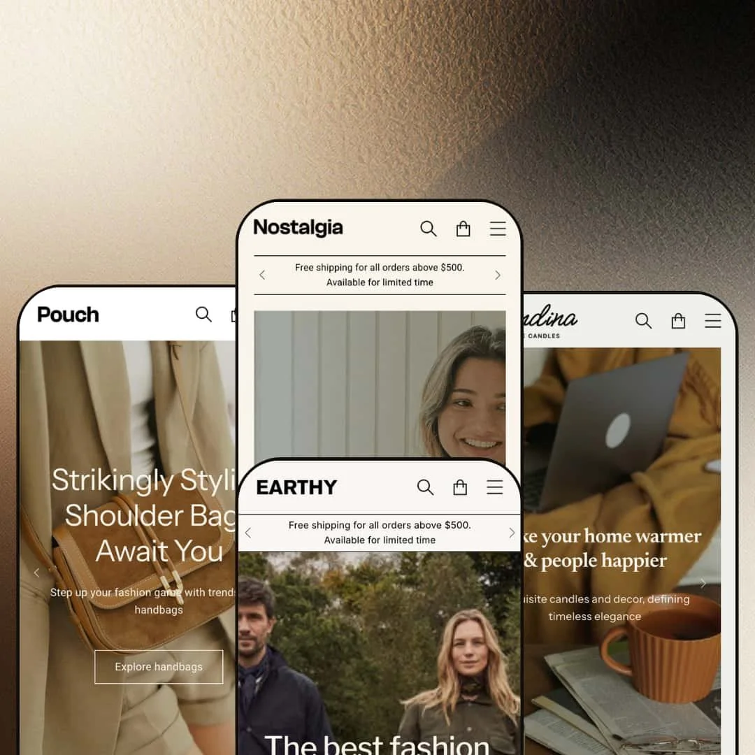
Most Shopify themes commit to a single vertical and build every section around it. Nostalgia goes the other way: it ships four ready-made presets that dress one shared section library. In the demos that library is staged as a women's-fashion boutique, a sustainable-menswear label, a luxury leather-goods brand, and a Nordic homeware-and-candle shop. The bet is that a single restrained, editorial design system can carry all of them, which reads as a strength when your brand fits that register and a liability when it doesn't, and under the styling it's an Online Store 2.0 build from AgniHD at $250.
Four presets across four retail worlds
Nostalgia ships four ready-made presets that target very different businesses: a women's-fashion boutique, a sustainable-menswear label, a luxury leather-goods brand, and a Nordic homeware-and-candle shop, all from one license. The practical payoff is reach. An operator running more than one storefront, or an agency building for clients across apparel and accessories, can cover several brand types without buying or learning a separate theme each time. It suits multi-brand operators and agency builders working across apparel and accessory catalogs rather than a single-store merchant who only needs one look.
An editorial section library with room to tell a story
The strongest sections are the storytelling ones: large image-and-text lookbook blocks, collection-card mosaics, a magazine-style press row, and a scrolling brand marquee, all available to any preset. For a brand whose products are bought on feeling rather than spec, that's a lot of narrative real estate handed over ready-made. Lifestyle and considered-purchase sellers (apparel, accessories, home goods where the buyer weighs look and story before price) get the most from it. That's the sweet spot.
A product page stocked for apparel selling
On a product page the theme assembles a full fashion-retail toolkit as one unit: a thumbnail image gallery, a two-axis color-and-size picker, a live stock counter ("14 in stock" on the jumper I opened), a size-guide modal, a product-info and care-instructions accordion, a trust-badge row, and a related-products strip. None of it needs an app. Treated together, these are the pieces an apparel merchant would otherwise assemble from separate installs, which makes the page a real head start for variant-driven catalogs. Stores selling apparel or footwear (multiple colors and sizes, mid-market pricing, size-anxiety at checkout) get the closest fit.
Multi-category sellers get real navigation headroom
Multi-category catalogs have room to work in the header here. Every preset ships a three-column mega menu that mixes text links with featured image tiles, so the top nav can route shoppers into merchandised landing spots rather than plain category lists, which pays off once you have more collections than a single row can hold. The Pouch demo splits it by Men's, Women's, and bag type; the Nostalgia demo threads featured shirt and jumper tiles into the dropdown. The nav does real work. Apparel and accessory brands with several curated ranges (seasonal plus evergreen lines, many collections to surface) get browsing structure without a menu app.
The aesthetic commits hard to quiet, editorial lifestyle
It has one register. Every preset speaks the same restrained language: muted palettes, large photography, generous whitespace, storytelling over urgency. That consistency is deliberate, and for the wrong brand it's a wall, because a high-energy, promo-loud store (flash-sale outlets, deal-driven impulse categories, bright youth brands that want noise and movement) has to fight the theme's calm to get anywhere. The design is built to whisper, not shout, and merchants who need a loud, conversion-dashboard look are pushing uphill the whole way.
Positioned for curated catalogs, not sprawling ones
Curation is the assumption. The Theme Store files Nostalgia under a "some (11–100+)" catalog size, and the demos bear that out with curated hero products, mosaic collections, and image-first browsing built for ranges you can merchandise by hand. A store with a very large, utilitarian catalog (500-plus SKUs, spec-driven products, buyers who scan and filter rather than browse by image) sits outside that sweet spot, and the theme's strongest sections do the least work for a shopper who just wants to filter down to a part number. Standard filtering exists; the theme simply isn't shaped around it.
Breadth without depth in any one vertical
Nothing here is category-built. Because the same section library dresses fashion, eco-apparel, and accessories, no single preset ships tooling made for a specific category, so there's no jewelry ring-sizer, no food subscription-and-nutrition setup, and no furniture dimension or room-planner, just a general-purpose lifestyle theme wearing different clothes. A merchant who wants turnkey, category-specific features for a specialized vertical with its own selling conventions will find versatility where they wanted depth. The trade is range for specialization, and it only bites if you needed the specialization.
What it takes to launch
Budget a multi-day pass to replace demo copy, imagery, and sample data across the presets: hero and campaign captions, shipping-threshold banners, store-locator addresses and inventory, product descriptions and tabs, and social and contact links, plus restaging the deep mega menu around your own collections and, if you sell into the EU, working through the theme's five bundled language sets.
-
What works in this preset
I clicked in and the homepage reads like a curated boutique. A three-slide hero rotates through dress campaigns, then hands off to a collection-card mosaic (Jumpers, Shirts, Shorts & Skirts, Maxi dresses) and alternating image-and-text lookbook blocks that walk you through jumpers, cotton loungewear, and seasonal picks. Product grids sit throughout with quickview and color-and-size swatches on the cards. It feels considered.
The navigation carries real depth for a fashion catalog. The Shop menu opens into a three-column mega menu (All products, Curated lists, Explore products) capped with two featured image tiles that point at shirts and jumpers, so a shopper can jump from the header straight into a merchandised landing spot instead of a bare collection list. That header pattern recurs in every preset, and it earns its space here.
"Winter collection '23" headlines one campaign band. That seasonal cadence runs through the whole preset: a hero campaign, a sale banner, a season-specific collection block, a testimonial strip, and a blog row all stack to build momentum toward a launch. For a label that merchandises around drops and restocks, the rhythm fits without much rethinking.
Where it stumbles
The whole preset assumes a seasonal fashion tempo. A store selling an evergreen catalog with no launch calendar inherits campaign heroes, a sale banner, and season-titled collection bands built for a rhythm it doesn't run, and turning those slots into always-on merchandising takes deliberate editing rather than a quick swap. Steady, restock-driven ranges get less from the staging than a drop-driven label would.
-
What works in this preset
Earthy trades the boutique brightness for something quieter and pricier-looking. Prices climb into the $179 to $329 range, product names lean on recycled and organic materials, and the palette settles into muted greens and oatmeals that suit a sustainability story. It reads upmarket.
This is the preset where I saw the section library put through its paces. It stages a countdown-timer offer block, an "As seen in" press row built from magazine tiles and pull-quotes, and a full featured-product block dropped right on the homepage with a working size-and-color picker and add-to-cart. Those sections belong to the theme as a whole. Earthy just puts more of them on display at once, stacking countdown, press row, and product embed into a single scroll while the other demos stay sparser.
Two different collection layouts appear on the same page. One is a six-tile category grid with product counts (Cardigans, T-Shirts, Overshirts and the rest), the other a stacked "collections list" with large imagery, so a merchant can compare two ways of routing shoppers into the catalog before deciding which fits. Sale and sold-out badges render on the cards where relevant.
Where it stumbles
The storytelling copy does a lot of heavy lifting here. Large text blocks carry the vintage-and-sustainability narrative, and a brand that doesn't have that kind of story to tell will find those same blocks demanding paragraphs of brand voice to keep them from reading as filler. The preset rewards merchants who arrive with a real origin story and gives less back to those who don't.
-
What works in this preset
Pouch is the outlier, and I found it the most convincing of the three. It stages a luxury leather-goods brand: handbag photography (credited in the footer to Léo et Violette), a scrolling marquee that repeats "Timeless collection · Made in Italy · Since 2013" behind star dividers, and feature-icon rows spelling out genuine leather, durable, soft, lightweight. The whole thing whispers heritage.
Bags don't need size grids, and the preset suits that. Product cards stay clean with quickview and price, most items carry a single variant, and the merchandising leans on collection mosaics and editorial image blocks instead of swatch-heavy grids. The mega menu splits into Men's Bags, Women's Bags, and bag types, which is the right cut for an accessories catalog organized by use rather than size.
Prices run from roughly $120 to $540. That spread, paired with the scarcity-flavored copy and the small hero-product count, frames the store around curation and high average order value. It's a boutique posture, and the preset commits to it.
Where it stumbles
The layout assumes a short, high-value catalog. A dozen or so hero bags at premium prices is what the staging is tuned for, so a merchant running a large, lower-priced accessories range (phone cases, small leather goods, hundreds of SKUs) inherits a design built for scarcity and browsing-by-desire rather than fast volume filtering. Curation-first stores are the fit; high-turnover ones less so.
-
What works in this preset
A short film loops behind the first screen, candles glowing while the headline promises a warmer home and happier people. Scandina styles the shared library as a Nordic homeware-and-candle shop: warm neutral tones, hygge-flavored copy, and a product mix of candles, gift sets, aprons, and baking molds. Below the hero, collection tiles route into Home decors, Gift sets, and Aprons, each with a short line of description. The mood is cozy and gift-forward.
I scrolled into a tabbed product block that flips between Aprons and Biscuits without reloading the page, a tidy way to show two ranges from one slot. Further down, a service-promise row lines up worldwide shipping, secure payment, careful packing, and around-the-clock support as reassurance icons. A percentage-off offer band and a featured gift-set banner give the page its promotional beats. Small touches, but they add up.
The narrative blocks come out in force here. A brand-story block introduces the maker and its warmth-and-craft mission, a lookbook invites shoppers to picture the pieces in a real room, and a three-post journal closes the page with candle-care and styling reads. For a homeware label that sells on atmosphere, that's a stack of warm, ready-made storytelling to fill with your own voice. The pitch is mood, start to finish.
Where it stumbles
This preset is staged as a gift shop. Its strongest beats assume present-buying, from curated gift sets and holiday bundles to warm, occasion-driven copy, so a homeware brand selling everyday functional pieces for the buyer's own home inherits a layout tuned to gifting rather than routine restocking. Pointing that gift-forward staging at plain self-purchase merchandising takes real reframing of copy and collections.
One hand behind four storefronts
They cohere. Look at the presets side by side and they read as siblings, not a sampler: the same typographic restraint, spacing, and image-led composition hold whether you're looking at dresses, overshirts, or handbags, so what you get is a coherent design system rather than four unrelated skins bolted to one engine. That coherence is the part that's hard to fake, and it signals the presets came from a single point of view instead of a moodboard grab-bag.
What you see is close to what you can build
Little is hidden. Between them, the four presets exercise most of the section library in public, with mega menus, slideshows, countdown blocks, featured-product embeds, press rows, marquees, testimonial bands, and collection mosaics all staged and working across the demos. That matters because it shrinks the guesswork: a buyer can watch the theme's real range before committing instead of trusting a feature checklist. The demo is the sales pitch, and here it shows the goods.
One register, no dial
The mood never shifts. The flip side of that coherence is a lack of range, because every preset is a variation on the same quiet, editorial temperature, and there's no version that pushes toward high-energy retail, dense information design, or a harder commercial edge. A merchant who wants a different temperature has to build it against the grain rather than select it from the family, which is a real limit when the four options are effectively four cuts of one mood.
The payoff is rented until you furnish it
Assets carry these demos. They look expensive largely because they're wearing professional photography and, in places, borrowed product copy credited to outside labels like oliveclothing and Léo et Violette. Strip those out and the same editorial sections that make the demos sing become large empty frames waiting on your own high-resolution imagery and written brand story. This is a theme that gives back what you put into it, and it asks for a lot up front.
★ 7.4/10
Rating
-
A broad, theme-wide merchandising library: mega menus, slideshow, countdown, featured-product blocks, press rows, and a product page carrying variants, a stock counter, a size guide, and tabs. Reviews, wishlist, and subscriptions still sit with apps.
8
-
Standard Online Store 2.0 section editing with published documentation, offset by demos that carry heavy curated content to replace and a deep mega menu to restage before launch.
7
-
Responsive composition with a collapsing mobile menu and mobile-specific asset handling; the image-led sections reflow into a clean single-column read.
8
-
Pages run image-forward with several large hero and editorial visuals, balanced by lazy-loading and a restrained section count per template.
7
-
Four presets plus a shared section library give real layout choice, though everything stays inside one quiet editorial register.
7
Frequently Asked Questions
-
Yes. All four presets share one section library, so pick the preset whose layout rhythm matches how you merchandise (curated hero, then mosaics and story blocks) and swap in your own products; you're really choosing a layout, not the vertical printed on the label.
-
It uses a two-axis picker (color, then size) with a size-guide modal and per-variant availability, plus a live stock count on the page. That combination suits apparel and footwear that run several colorways per style.
-
It's built into the theme, and the Earthy demo stages it as an offer block. You won't need a third-party timer app to run a promo countdown.
-
Yes. The product page can surface Shopify's local-pickup availability with named store locations, and the theme renders that widget natively on the page.
-
Treat the demos as styling references rather than a starting catalog. Plan to replace essentially all copy, imagery, and sample store data, which is why the setup effort lands at medium-high.
-
Yes. Recent releases added right-to-left language support, combined-listing compatibility, and high-variant product handling in late 2025.
This review is based on hands-on testing of the publicly available preset demos of the Nostalgia Shopify theme as of July 1 2026. Theme features, preset availability, and performance can change with subsequent updates from the theme developer.