
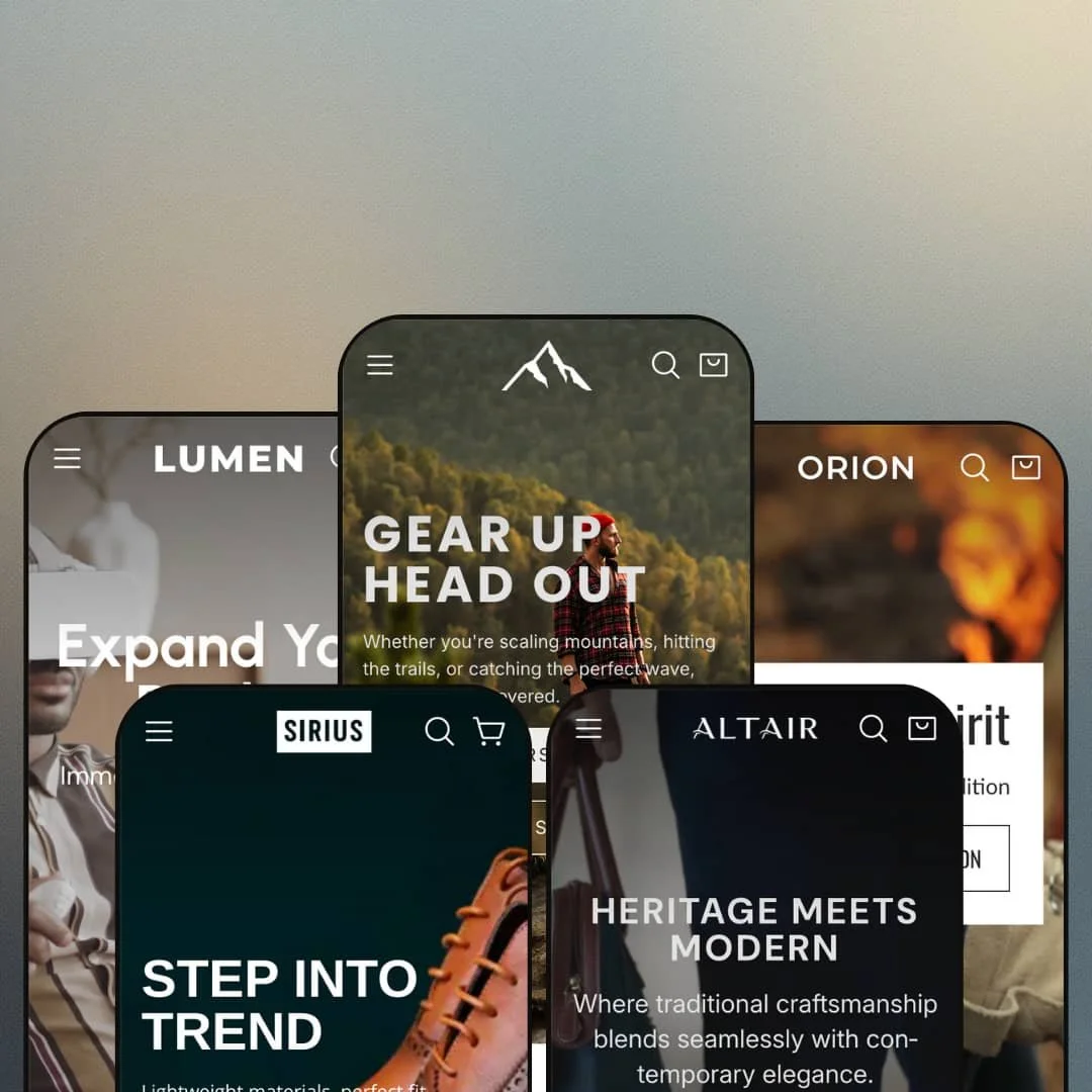
Nova is built for stores that want the homepage to feel like a campaign landing page, not just a grid of products. You get five presets that lean into different industries and aesthetics, but they share a consistent “story first, shop second” rhythm. The common thread is big visuals, bold typography, and sections that try to push visitors toward curated collections instead of dumping them into a catalog.
Pros.
〰️
Pros. 〰️
✚ Flexible presets, consistent core
flexible preset options that maintain core functionality while offering distinct aesthetic approaches. That shows up clearly in how Default, Lumen, Orion, Altair, and Sirius can feel like different storefronts without changing the overall browsing logic. If you sell in more than one “style world,” Nova is set up to let you re-skin the experience without rebuilding the entire structure from scratch.
✚ Variant-first browsing to cart flow
Nova’s demos consistently emphasize a browse-first flow that can lead into variant selection and cart updates without making the site feel like constant page-hopping. When product cards surface “Choose Options” style entry points, the experience feels designed for shoppers who want to keep scanning. The slide-out cart behavior supports that by turning “add to cart” into a quick checkpoint instead of a hard stop.
✚ Storytelling modules that keep shoppers moving
The theme’s section vocabulary is clearly built for brand narrative. Full-bleed hero banners, parallax-style cards, lifestyle-led grids, and campaign-like copy blocks show up repeatedly across presets. When staged well, that structure keeps the visitor progressing through a guided experience instead of bouncing between random pages.
✚ Interactive merchandising and promotion moments
Across the presets, Nova demonstrates ways to make browsing feel more “shoppable” than static. Hotspot-style images in Lumen and Orion act like interactive lookbooks, while countdown-based promotional blocks (shown in Lumen and Sirius) add urgency to featured deals. These are the kinds of modules that can turn a homepage into an actual sales tool, not just a brand statement.
✚ Content and credibility staging
Nova’s demos also treat content as part of merchandising. Sections like Lumen’s Journal and Orion’s “Insights & Time” show that blog-style content can be staged alongside product discovery, which is useful for categories where buyers want education. Even within product sliders, visual signals like swatches and rating-style cues are used to communicate variety and confidence quickly.
Cons.
〰️
Cons. 〰️
🚫 Media-heavy builds demand optimization
Nova’s presets lean on large images, motion, and full-screen sections, and that visual ambition can come with a cost. When pages are built like lookbooks, load time and perceived responsiveness depend heavily on how well media is optimized. If performance is your top priority, you’ll likely need a more disciplined approach to imagery than the demos suggest.
🚫 Long-scroll layouts can delay buying moments
Many of the presets are staged to tell a story before they reveal a dense set of products. That can be a benefit for premium brands, but it can also slow down shoppers who arrive ready to compare items quickly. The theme works best when your audience enjoys browsing, not when they want a fast “search, pick, buy” loop.
🚫 Contrast can hinge on imagery choices
Several presets rely on overlays, blur effects, or dark palettes, and that means text legibility can vary by background photo. Orion’s blur-heavy look and Sirius’s dark editorial style both show how mood can compete with clarity. If your brand needs copy to be immediately readable, you’ll need to be intentional about background imagery and overlay strength.
-
The Default preset is staged for outdoor and adventure brands, using earthy tones and rugged photography to sell a lifestyle before it sells a SKU. It feels like a storefront that wants you to browse collections and editorial sections, then commit.
What works in this preset
The strongest part of the Default demo is how it uses full-screen hero storytelling to guide your first clicks. The parallax-style banners and big headlines (including “Conquer the Outdoors” and “Sky is the Limit”) are framed like campaign ads, and the buttons are styled to stand out clearly against the photography. If your brand relies on aspiration and “where will this product take me?” messaging, this staging fits that job.
In this preset demo, shopping cues are surfaced directly inside collection browsing. Product cards show pricing, sale badges, and color swatches up front, and the card overlay leans into a “Choose Options” moment when you hover. The result is a browsing flow that feels more like “keep scanning” than “stop and re-open pages for every decision.”
Navigation is also staged as a wide, multi-column Catalog experience in this demo. The Catalog entry opens into a visually dense layout with grouped links and promotional images, which suits the “lots of categories, lots of sub-categories” feel of an outdoor shop. It’s a presentation style that favors exploration and quick jumps over minimalism.
Default also spends time building reassurance. The demo uses value-style icon messaging (such as “We test it ourselves” and “Eco-focus”) to reinforce credibility and brand principles, and the footer is built as a dense navigation hub instead of a tiny legal strip. The overall staging says “this is a serious brand” rather than “this is a quick one-product funnel.”
Where it stumbles
In this demo’s quick selection experience, some of the variant labeling is small enough that it can feel fiddly when you’re choosing between similar swatches or sizes. It still communicates the options, but the UI leans more toward clean visuals than big, forgiving tap targets. If your products have many near-identical variants, you may want to be careful about how those labels are presented.
The stock messaging in the Default demo is also a bit generic. “In Stock” and “Low Stock” signals exist, but without specific quantities, the urgency can feel vague rather than persuasive. It works as a reassurance layer, but it doesn’t fully capitalize on scarcity the way some shoppers expect.
-
Lumen is staged as a sleek electronics storefront, with dark gradients and modern typography doing most of the “premium” signaling. It’s the most futuristic-looking preset in the set, and it pushes feature storytelling harder than straightforward category merchandising.
What works in this preset
The visual language is the headline feature here. Blurred backgrounds, neon-tinged gradients, and a palette leaning into dark blues and violets give products a “high-tech showroom” feel. Bright product shots pop against the darker staging, which is a strong fit for laptops, audio gear, and gaming accessories.
Lumen’s demo also highlights an interactive “Perfect Setup” moment. A living room scene is staged with small hotspot icons placed on objects, and hovering those hotspots reveals product tooltips that link out to product pages. It’s a good way to sell a bundle without forcing a “bundle product” structure, especially for setups where “this item plus that item” is the real conversion story.
This preset demo leans into urgency with a countdown-driven promotional section. The timer is presented alongside a hero product and a quantity selector, so it feels like a featured deal rather than a random widget dropped into the page. For stores that run timed promos or seasonal pushes, this is one of the clearest “campaign merchandising” moments in the entire theme set.
Lumen’s parallax-style feature cards are used to sell benefits, not just show photos. Sections titled “Music Everywhere,” “Designed for Success,” and “Cinema at Home” pair imagery with descriptive copy, which makes the demo feel like it’s selling outcomes and experiences. That approach is often a better fit for electronics than a pure product grid because the purchase is frequently justified by use case.
The demo also surfaces content sections as part of the shopping atmosphere. “Journal” appears as a front-page content block, and product carousels are staged with signals like star-style rating visuals and color swatches to communicate variety at a glance. It’s positioned as a brand that wants to educate and reassure, not just transact.
Where it stumbles
The hotspot-driven setup section is engaging, but the markers are visually subtle. In busy backgrounds, the icons can blend in enough that a visitor might never realize they are interactive unless they intentionally explore the scene. If you rely on that section, the staging will benefit from very deliberate imagery and placement.
The countdown block creates urgency, but the demo doesn’t clearly state what the timer represents. A countdown works best when visitors instantly know whether it’s a sale ending, a limited-time bundle, or availability pressure. Without that context, the timer still adds energy, but it can also add a small layer of confusion.
Lumen also stacks a lot of effects and sections into one long narrative. The layered parallax cards and animations create a premium look, but they also increase the feeling of “scroll commitment.” For older devices, the combination of motion and large visuals is the type of presentation that can feel heavier than simpler storefronts.
-
Orion is staged for luxury watches and accessories, with blurred overlays and lifestyle imagery doing most of the persuasion. It reads like a lookbook with product entry points rather than a “shop the catalog” homepage.
What works in this preset
Orion’s most distinctive staging choice is its mini-story structure. The demo uses lifestyle photography and blur-heavy overlays to create an aspirational narrative around watchwear, with editorial-style cards including “Urban Icon” and “Timeless Minimalism.” It’s a format that’s designed to make a visitor pause, absorb the mood, and keep scrolling.
The “Customer Favorites” block is presented as a tabbed browsing section in this demo. Tabs like New, Women, Urban, Sports, and Classic make it feel like you can flip through curated categories without leaving the page. It’s an effective way to introduce variety while keeping the visitor in a single, controlled flow.
Orion also stages a shoppable hotspot moment through a horizontal watch lineup image. Small cart icons are placed over the lineup, and clicking an icon links directly to the related product page. It’s a more “fashion editorial” version of interactive merchandising, and it fits the category well.
The preset leans into education and brand depth through content placement. “Insights & Time” surfaces blog-style articles about watch history and materials, which fits buyers who want reassurance and expertise. It’s not just selling watches; it’s trying to sell taste and knowledge.
Where it stumbles
Because Orion relies so heavily on blur effects and image overlays, readability can depend on the exact image behind the text. In some sections, the blur lowers contrast enough that headlines lose sharpness and quick scanning becomes harder. That isn’t a deal-breaker for a luxury lookbook vibe, but it’s something you’d want to watch if your copy needs to be instantly legible.
-
Altair is staged as heritage luxury for bags and leather goods, with refined typography and textured close-ups emphasizing craftsmanship. It feels like a premium catalog that wants to guide shoppers into curated product families.
What works in this preset
Altair’s hero staging is designed to sell craft. Slogans like “Heritage Meets Modern” and “Luxury in Your Hands” are paired with leather close-ups and clean typography, which reinforces the idea that material quality is the product. The demo’s visual pacing is calmer than Lumen, but it still feels premium.
The “Special Collections” section is presented as a strong category entry point. Instead of burying navigation in text links, the demo uses large photographic tiles for groups like Tech Bags, Briefcases, Messenger Bags, and Accessories. That makes it easier to push shoppers into the “right” family of products without forcing them to guess where they belong.
Altair also uses video as a lifestyle anchor. A full-width clip of a man carrying a bag through city streets adds motion and context without turning the store into a constant animation festival. It’s staged as brand atmosphere rather than a gimmick.
On product pages in this demo, merchandising is presented with a premium feel. The layout uses a vertical thumbnail-style gallery alongside clear option selection, and “Pairs well with” style recommendations are positioned as part of the buying journey. It supports up-selling without making the page feel cluttered.
The typography and spacing do a lot of work in this preset. Generous margins, serif-style headlines, and earthy colors create a slow, considered browsing experience, which is exactly the behavior premium leather brands usually want. The staging encourages “read and admire,” not “rush and click.”
Where it stumbles
In the New Arrivals slider, the color swatch dots are visually tiny. If a bag comes in multiple similar shades, a small dot can fail to communicate the range clearly, which forces shoppers to click into product pages just to understand what exists.
Some of the darker overlay sections also trade clarity for mood. In areas like “Your Daily Companion,” white text sits over a darker overlay that can blend into the background depending on the underlying image. The demo still feels premium, but certain headings would benefit from stronger separation for quick readability.
-
Sirius is staged as a modern men’s footwear boutique, built around dark backgrounds, bold headings, and lots of editorial segmentation. It’s confident, masculine, and strongly category-driven in its visual language.
What works in this preset
Sirius leads with tone. The demo uses multiple hero-style sections, including “Step into Trend,” “Always,” and “Shoes That Speak,” each pairing stylish photography with strong headlines. It’s a clear example of how the theme can be pushed into a high-impact fashion editorial look.
Category orientation is staged in a visually organized way in the New Arrivals section. Footwear types like Loafers, Brogues, and Derbys are presented as distinct groupings, which helps visitors understand the store structure quickly. Instead of feeling like one long shoe list, it’s staged as a guided set of choices.
Urgency is emphasized through a prominent countdown banner. “Upgrade Your Walk” is presented as a central promotional moment with a live countdown, which adds pressure without needing the store to scream “sale” everywhere. In a footwear store where launches and drops matter, that staging fits.
Sirius also uses collage-style blocks to create mood segmentation. “Modern Classic” and “Elegance in Motion” combine lifestyle images and text blocks, essentially creating style chapters within the homepage. Later sections like “Metropolis Style,” “Leave Your Mark,” and “Born for Bright Moments” continue the same idea: sell the setting and identity first, then let products follow.
The bottom-of-page category carousel is a practical touch. A row of image links to collections like Moccasins, Derbys, Loafers, and Oxfords gives visitors a clear “jump to what I want” option without needing to retrace the entire scroll. It’s staged as a visual navigation shortcut rather than a plain link list.
Where it stumbles
The dark palette can work against readability when text sits over busy imagery. Sirius is intentionally moody, but white-on-dark can still lose contrast in certain scenes, which slows scanning for visitors who are trying to move quickly.
Niche Suitability
Not Ideal For
-
Nova is strongest for brands with a mid-sized catalog that sell through aesthetic, narrative, and curated collections, especially in outdoors, electronics, accessories, leather goods, and footwear.
-
If you run a high-volume store that depends on dense product grids, fast comparison shopping, and minimal scroll, a simpler, more utilitarian storefront approach may fit better.
-
Medium. You get a lot of section variety and strong preset starting points, but matching the demo polish requires careful image selection, consistent typography decisions, and thoughtful story structure.
Final Recommendation
★ 7.0/10
Rating
-
Nova is staged around merchandising tools like variant-first “Choose Options” entry points, predictive-style search overlays, and strong navigation patterns. It also demonstrates interactive modules such as hotspots and countdown promotions that support campaign-style selling.
7
-
The theme appears flexible through its section variety, but that flexibility increases setup decisions. Building a coherent homepage narrative will take planning, not just dragging sections into place.
7
-
The demos rely heavily on large visuals and long pages, which makes image discipline especially important for phone shoppers. If you keep media optimized and avoid over-stacking sections, the experience should translate cleanly.
8
-
The combination of big images, animations, and long-scroll layouts can feel heavier than simpler themes. Merchants will likely need to optimize media to keep pages feeling snappy.
6
-
The five presets demonstrate wide stylistic range, from rugged outdoor to neon tech to heritage leather. The theme’s section vocabulary supports substantial brand shaping without needing an entirely different theme.
7
FAQ
〰️
FAQ 〰️
-
👑 Yes. The Default demo is built around campaign-style outdoor imagery and bold calls to action like “Conquer the Outdoors,” which fits brands that sell lifestyle as much as gear.
-
📱The theme’s biggest mobile factor is media weight. Since presets like Default and Sirius rely on large hero images and long scrolling, optimized imagery and thoughtful section length will matter most.
-
🎨 Nova is heavily brandable through preset styling and section pacing. You can see the contrast clearly when you compare Altair’s serif, heritage feel with Lumen’s dark gradients and futuristic look.
-
⚡ It’s not staged like a lightweight theme. Lumen’s layered effects and Nova’s general reliance on high-resolution visuals mean perceived speed will depend on how carefully you manage media.
-
👕 Yes, the demo flow is variant-aware in how it routes shoppers into selection moments. For example, Default’s browsing emphasizes “Choose Options” style entry points before adding items into the cart experience.
-
🔎 Nova leans on Shopify’s standard SEO setup rather than pitching unique, theme-specific SEO tools. Your core work will still be titles, meta descriptions, image alt text, and clean information hierarchy.
-
💱 Yes. Nova works with Shopify’s language and multi-currency configuration through Shopify Markets, and the setup depends on your Shopify admin settings rather than a preset-specific capability.
-
⚙️ Generally yes, since Nova is a standard Shopify theme structure. The practical consideration is layout: product pages and homepages are section-rich, so app blocks should be placed intentionally to avoid visual clutter.
-
🛒 Yes. Nova provides live demos for each preset (linked above), and Shopify’s theme install flow typically allows you to preview and configure before committing to a purchase.
This review is based on hands-on testing of the publicly available preset demos of the Nova Shopify theme as of 25 December 2025. Theme features, preset availability, and performance can change with subsequent updates from the theme developer.