
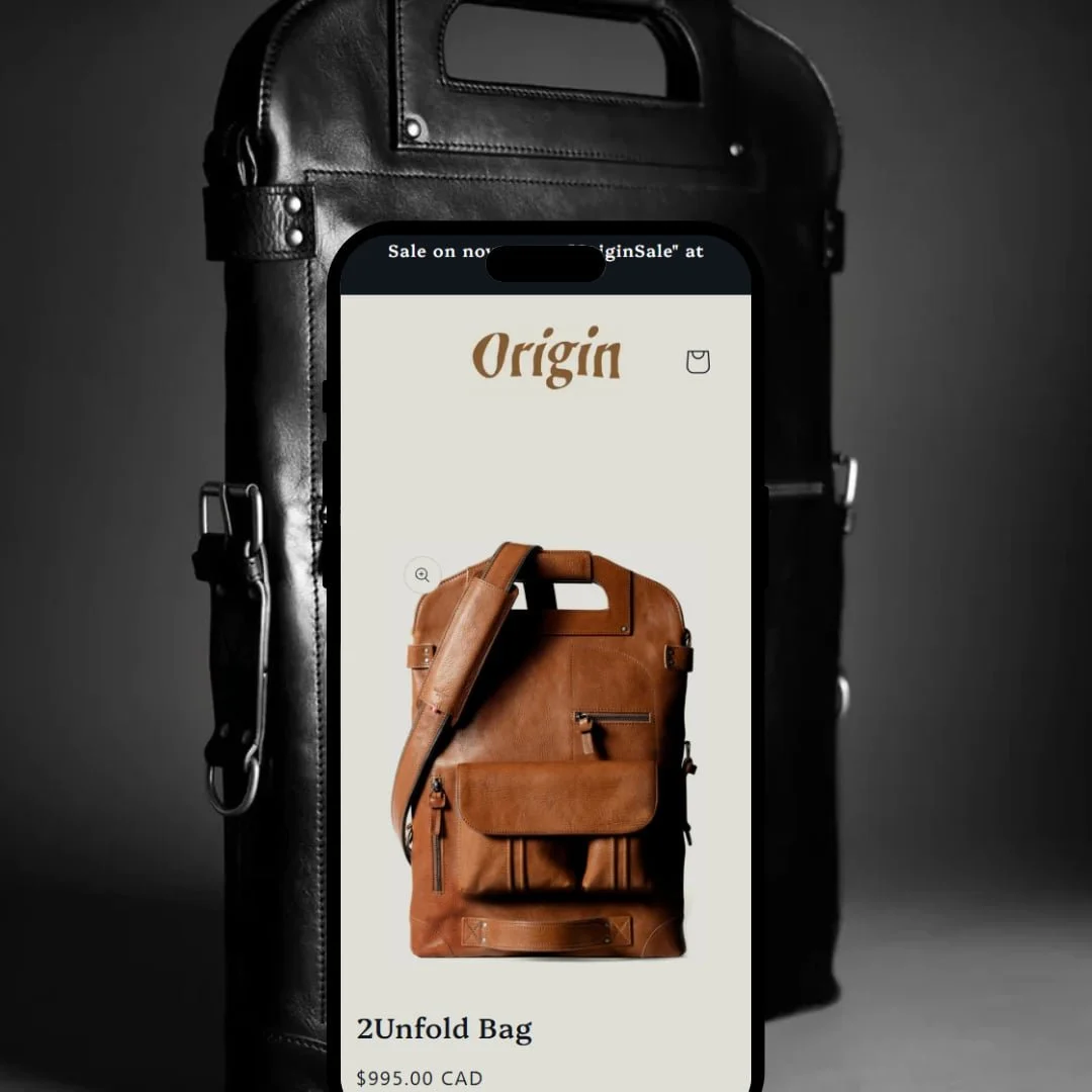
Origin presents a minimalist, editorial storefront that opens on a product page rather than a traditional home grid. The demo leads with a versatile leather bag, neutral colours, generous whitespace and quirky typography—an intentionally quiet stage that feels more like a curated catalogue than a typical storefront. The header is stripped back to only search and cart, and there are no sliders or auto-playing banners to distract from the hero product. This overall posture signals a theme built for brands that sell fewer, higher-consideration items and want their product story to do the heavy lifting.
Pros.
〰️
Pros. 〰️
✚ Snappy slide-out cart with in-drawer controls
Add-to-cart reliably opens a smooth cart drawer that includes quantity steppers and a note field, so shoppers can make quick adjustments without losing context. This keeps momentum high between product detail and checkout and reduces the likelihood of back-and-forth page loads.
✚ Predictive, full-screen search overlay
Tapping the magnifying glass launches a full-screen search surface with live suggestions, helping shoppers find products or editorial content from anywhere. Because it overlays the current view, it acts like a command palette—quick, legible, and low-friction for returning users.
✚ Clear variant swatches with sale cues
Colour options appear as clean, circular swatches and can display subtle sale labels where relevant. This helps shoppers parse options at a glance and reduces mis-selections, especially on mobile where drop-downs are slower to scan.
✚ Integrated editorial flow (“Journal”)
Product pages hand off naturally to related long-form posts, and the blog listing uses large hero imagery and concise excerpts. For content-forward brands, that bridge turns storytelling into a practical pre-purchase path rather than a separate reading detour.
Cons.
〰️
Cons. 〰️
− No quick-add or quick-view on cards
Collection and search listings don’t offer card-level add or modal previews, forcing a full product-page trip for each item. That’s fine for tight catalogues but slows list-based browsing when shoppers want to compare or build a cart rapidly.
− Long descriptions with no tabs/accordion
Product detail is presented as a single, extended block without tabbed or accordion breaks. On smaller screens, that means more vertical travel and fewer scannable anchors for specs or shipping info.
− Search results mingle products and articles
Results pages blend items with blog posts in one list, without an obvious way to separate content types. That keeps discovery broad but risks momentary confusion when a shopper expects only products while skimming.
-
A spare, product-first canvas: the Default preset lands shoppers directly on a product page and keeps them there with a clean, two-column hero and unfussy typography. The effect is focused and slow-paced—in a good way—for brands with a story to tell around a single hero SKU or a tight collection.
What works in this preset
Product-centric landing, by design. Instead of a foyer-style home page, the demo opens on a single product with price, swatches, and purchase controls immediately visible. This funnels attention into one narrative and reduces the chance that shoppers get lost in a grid before understanding the value of your flagship item. For boutiques with one hero or a small family of products, this is a deliberate acceleration of the product story.
Two-column hero composition that reads like a spread. A large product image anchors the left side while name, price and purchase controls sit to the right. The composition feels like a magazine layout and gives imagery the space to sell, which helps luxury or craft-led brands that benefit from tactile, close-up photography. It’s an aesthetic choice that supports persuasion without additional widgets.
Neutral palette, whitespace, and no motion gimmicks. The preset’s restrained colours and generous spacing keep cognitive load low and make the product feel like the only thing that matters. The absence of sliders or auto-playing banners avoids the “promo wheel” effect and keeps the narrative linear, which is especially helpful on mobile where attention is more fragile. The result is a calmer path to add-to-cart for shoppers who already have interest.
Where it stumbles
Navigation that hides when you need it. There’s no prominent main menu up top; core links sit at the bottom, so explorers must scroll or backtrack to find Journal or Contact. For first-time visitors this can feel like a locked door, increasing the chance of pogo-sticking when they want to peek at policy or content pages mid-browse. Minimalism helps the story—but here it also impedes wayfinding.
Small header icons on mobile. With such a pared-down header, the search and cart icons become tiny tap targets. While we did not test on a physical device, the sizing observed in the demo suggests a higher chance of mis-taps on smaller screens, adding friction to two of the most important actions in the funnel.
A single-product default that’s specialized. The preset’s choice to load straight into one product page is a strong editorial stance, but it assumes your catalogue can support that narrative. Multi-category stores will need to build a more conventional home page to surface breadth, otherwise shoppers may miss the bigger picture entirely.
Niche Suitability
-
Boutique or craft-led brands selling a handful of premium items—think handmade leather goods, artisanal fashion or limited-run accessories. The product-first landing and magazine-style composition let imagery and copy do the selling without distractions.
Not Ideal For
-
Larger catalogues and multi-category assortments that need overt wayfinding and breadth cues from the first screen. Without a clear top navigation and an index-style home page, category discovery can feel buried.
-
Brands selling a small number of premium products that reward careful viewing and coherent storytelling. If your catalogue is focused and your photography strong, Origin’s global mechanics amplify that clarity.
-
Retailers with broad assortments, fast list-building needs, or navigational complexity that demands persistent menus and card-level actions. Those stores will feel more at home in a catalogue-first theme.
-
You’ll likely craft a conventional home page and expose top-level navigation to surface breadth, and you may add custom quick-add if it’s essential to your model. The upside: the base experience is already fast and coherent; your work is focused on structure, not fixes.
Final Recommendation
★ 7.6/10
Rating
-
Covers essentials (slide-out cart, predictive search, order notes) but lacks quick-add.
7
-
Minimalist layout and clear typography streamline the journey, but hidden navigation slows exploration.
8
-
Smooth interactions and polished transitions; small header icons and long descriptions may hinder on very small screens.
8
-
Pages and cart interactions load quickly; animations feel polished.
9
-
Elegant but rigid; strong defaults favour quiet brands over highly modular layouts.
6
FAQ
〰️
FAQ 〰️
-
It’s a conscious editorial choice of the Default preset to pull shoppers straight into a single product story, which suits hero-SKU brands and slower, more narrative buying.
-
Yes—but you’ll need to build a conventional home page and surface clear top navigation so shoppers can see breadth without scrolling to the footer. The preset out of the box emphasises depth over breadth.
-
The header icons are quite small, which may increase mis-taps; consider adjusting sizes in theme settings during setup and test on physical devices.
-
Yes. Add-to-cart opens a smooth drawer with steppers and a note field so shoppers can adjust without leaving the page. This keeps momentum high between product detail and checkout.
-
Search launches a full-screen overlay with live suggestions. It’s quick to access from anywhere, though results pages can mix products and articles in one stream.
-
No. Collection and search listings require a trip to the product page for each item, which slows comparison-heavy shopping.
-
Variants use clean, circular swatches and can surface subtle sale cues. It makes scanning options faster than drop-downs, especially on phones.
-
It’s integrated. Product pages hand off naturally to long-form posts, turning storytelling into a practical pre-purchase path rather than a separate reading detour.
This review is based on hands-on testing of the publicly available Default preset demo of the Origin Shopify theme as of 25 September 2025. Theme features, preset availability and performance can change with subsequent updates from the theme developer.