
Most premium Shopify themes pick a vertical and commit. Outsiders picks five (apparel, jewelry, vinyl and books, designer toys, and coffee) and dares you to buy in on the breadth. It's an Online Store 2.0 theme from Maltese developer Segment, priced at $380, and the question I kept asking as I clicked through the five preset demos was whether any single vertical earns its keep, or whether the breadth thins everything out. The answer turns out to be uneven, and that unevenness is the story.
Five vertical presets from a single license
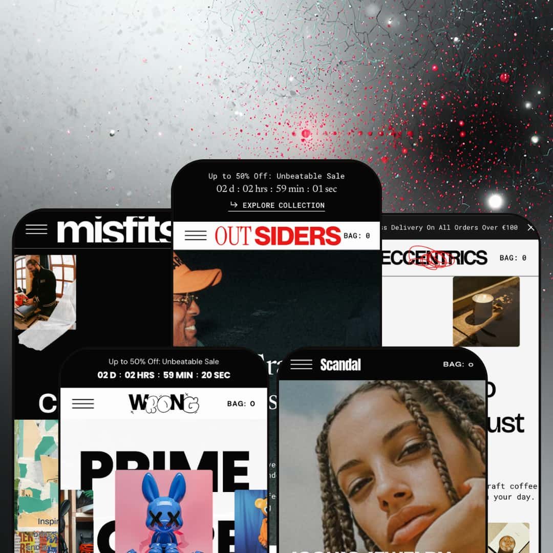
For multi-brand DTC operators running two or three Shopify storefronts at the Premium tier, Outsiders ships a genuine multi-vertical preset family: apparel (Outsiders), jewelry (Rebels), vinyl and books (Misfits), designer toys (Wrong), and coffee (Eccentrics). These aren't recolors. Each preset's homepage uses a different section sequence and a different supporting tool set: Misfits gets a brands logo carousel and lookbook hotspots, Eccentrics surfaces a subscription banner grid plus a wholesale steps section, Wrong leans on scroll-showcase and multicolumn icon callouts. One license replaces what would otherwise be three to five separate Premium-tier theme purchases for operators running storefronts across genuinely different verticals.
Conversion-feature stack runs as a coordinated kit
The conversion stack works as one bundle. Not a checklist. Countdown timers ship as both an announcement-bar element and as a standalone homepage section (Outsiders preset uses the bar; Wrong stages a countdown banner mid-page with a "Grab the Deals" ticker running above it). The cart drawer integrates a free-shipping progress bar, a discount-code field exposed by default, an order-notes textarea, and a "Notify Me" restock-alerts hook on every Featured Product render across the five-preset family. Stock counter, age verifier, promo popups, promo tiles, trust badges, and sticky cart on mobile round out the kit. For brands running flash-promo cadences at mid-market price tiers with under 200 SKUs, this kit replaces three or four conversion-focused apps that would otherwise need separate subscriptions and theme-side wiring.
Editorial section library supports magazine-style storytelling
Thirty-four named sections per preset cover narrative ground most Premium themes don't reach. The list isn't generic. Lookbook with product hotspots (staged in Misfits), Animated image collage (Misfits' top), Multi-slider with image-and-content panels (Outsiders' Sidewalk/Pavement/Stride collaborations, Wrong's Minique/Collectra/Mythos collaborations), Scroll showcase (Wrong's mid-page five-image roll), Brands logo carousel (Misfits ships 14 brand SVG logos), Tabs with editorial imagery, Testimonials, Steps with form modal, Before/After image slider, Banner grid, Multicolumn icon callouts. The library reads like a magazine builder, not a catalog frame. For lifestyle, fashion, and food-and-drink brands running editorial-driven merchandising (where the homepage carries story weight, not just product carousels), the section breadth supports narrative depth without custom Liquid work.
Pre-translated theme UI for five European languages
The theme UI ships translated in English, French, Italian, German, and Spanish. Headers, form labels, button text, error messages, and storefront chrome render natively in those five languages without manual translation work. Right-to-left CSS support is shipped. For European-market merchants running multi-language storefronts at the Premium tier, this is a genuine architecture-level contribution that avoids the day-one Liquid-translation pass other themes force on you.
Online Store 2.0 architecture at a Theme-Blocks-era price tag
Outsiders is an OS 2.0 theme launched July 2024, which puts it one architecture generation behind the current Horizon-era Theme Blocks family. The practical difference: OS 2.0 limits block nesting to roughly two levels and doesn't support AI-block generation; Theme Blocks supports nesting up to eight levels and is the architecture Shopify is actively expanding through 2026. For merchants planning multi-year roadmaps with AI-assisted theme editing at the Premium tier, paying $380 for the older architecture means you'll likely re-platform within two to three years to stay on the current frontier. It's an architectural decision worth pricing in.
No native omnichannel surfacing for physical-retail brands
The features list and the five preset demos show no In-Store Availability widget, no Shopify Markets-wired location selector on product pages, no "Pick up in store" indicator, no in-store inventory display. The Eccentrics preset positions itself as a multi-location coffee brand with three store cards in the "Our Stores" section, yet the product pages don't surface per-location stock or pickup options. For omnichannel brands with physical retail locations, this gap matters at the conversion layer because shoppers planning to pick up locally need that information on the product page, not a separate Stores page.
Vertical specialization is uneven across the preset family
The Outsiders and Rebels presets feel built for streetwear and jewelry; the Misfits, Wrong, and Eccentrics presets feel applied to vinyl-books, designer toys, and coffee with varying conviction. Misfits stages subscription onboarding as a marketing form rather than a commerce product. Wrong wears the collector aesthetic without shipping collector tools. Eccentrics earns it back partially with subscription and wholesale tooling. For collectible-niche merchants with structured-attribute catalog needs (edition numbers, rarity tiers, condition grading), the Wrong preset wears the costume but doesn't ship the tools.
What it takes to launch
Expect a multi-day copy and configuration pass before launch: currency-and-region defaults need correction across the preset family, brand-name and location strings need alignment per chosen preset (multiple preset footers carry copy that doesn't match the preset's positioning), placeholder content in support modals and stock-alert prompts needs replacement, featured-product titles and descriptions need to be re-matched, and outdated blog publication dates require regeneration. Agency engagement isn't required; an in-house copywriter plus a Shopify admin can clear it in two to three days.
-
What works in this preset
Hero plus banner grid plus tabs all dial in on streetwear without overplaying the costume. The three-slide hero rotates editorial commercial photography ("Bold Graphics & Oversized Fits", "Trendy Streetwear for Those Who Live It", "Limited-Edition Wear & Accessories for Authentic Style") and the mid-page Tabs section pulls four brand pillars (Community, Skateboarding, Brand Vision, Beyond Borders) into a swipeable image-tab pattern that earns its space.
Mega menu carries the visual weight here. Categories like Hoodies, Tops, Bottoms, Hats, and All Clothing tile out as image cards inside the panel, not just text links. The "Outsiders x Sidewalk / Pavement / Stride" multi-slider section runs three collaboration stories with full-bleed editorial hero images and per-card CTAs to Contemporary Edge, Modern Looks, and Timeless Classics collections. It's the section doing the heaviest narrative work on the page.
Bottom of the homepage closes with a five-card "Stay Connected / Stay Free / Stay Involved / Stay Creative / Stay Outside" image grid and a Stories blog of five posts. For an apparel brand wanting editorial weight at the bottom of the funnel, this is where the preset earns its position.
-
What works in this preset
I clicked through this preset and found the hero treats jewelry editorially. A wide image-with-text ("Iconic Jewelry, Defined by Attitude") sits above a three-up Collection grid for Necklaces, Rings, and Bracelets rather than the typical product carousel. The Collapsible-with-image section runs four collaboration stories (REBELS X SPITFIRE, REBELS X RENEGADE, REBELS X TRAILBLAZER, REBELS X MAVERICK) with editorial photography per card, and two product grids stack between collaboration storytelling and the final slideshow.
Mid-page slideshow ("Seasonal Essentials / Fresh Finds / Timeless Staples") and the "Our Story" slideshow (three narrative slides about brand origins) both work for jewelry's identity-driven buying behavior. The animated GIF banner in the middle of the page adds energy without breaking the rhythm. Most premium themes avoid animated GIFs in the homepage rhythm; here it lands.
Image-driven ticker cards close the section ahead of the footer ("you matter", "Explore Boundless", "Live Unscripted", "Craft Originals", "Pioneer Spirit", "Embrace Wild"). The pattern reads as brand-attitude callouts rather than promotional tiles, which fits jewelry's identity-led commerce model.
-
What works in this preset
Misfits leans hardest into editorial section variety across the five-preset family. The Animated image collage at the top surrounds the "Crossfade VINYL" hero with eight rotating shots; the Lookbook section mid-page uses three product hotspots ("Chart Toppers", "Rebel Sound", "Boundless Thought") layered over editorial imagery; the Steps section walks visitors through a three-step subscription onboarding ("SELECT SUBSCRIPTION TYPE / PERSONALIZE / ENJOY THE PERKS") that opens a "Become a Member" modal. For a niche retailer selling identity-anchored physical goods, the page reads like a magazine.
Brands logo carousel ships 14 rotating SVG logos in two-pass swap. The Testimonials section runs eight mini-reviews tagged with customer-type roles (Customer / Worker / Subscriber), and the four-up Stories blog grid closes the page. Section combinations give the niche an editorial weight that most jewelry or fashion presets don't bother to reach for.
Tabs section sits mid-page with editorial imagery ("True Origins / Sound Bonds / Vinyl Legacy / Next Tracks") and the slideshow before testimonials runs three narrative slides on creative process. For a vinyl-and-books retailer wanting to position itself as a curator rather than a store, the section combinations support that frame.
Where it stumbles
The Steps subscription onboarding opens to a contact-form modal, not a subscription product wired to recurring billing. I went looking for the subscription product behind the modal and found a form, not a commerce path. For a vinyl-and-books niche where physical-product subscriptions (cover-club, book-of-the-month, vinyl-of-the-month) define commercial models, treating membership as a marketing form rather than a Recharge/Bold/Appstle-wired product undersells the niche.
-
What works in this preset
Banner grid pattern up top sets a collector frame (Prime Figures / Rare Drops / Modern Collectors / Characters), and the Multi-slider ticker section ("Outsiders x Minique / Outsiders x Collectra / Outsiders x Mythos") treats designer toys as collaborative drops rather than catalog items. The five-card icon Multicolumn ("Masterful Creations / Boundless Imagination / Artisanal Touch / Sculptural Wonders / Heritage Craftsmanship") closes the page with category-as-attribute callouts that fit how collector audiences actually browse.
Scroll showcase mid-page rolls five editorial images with no product overlay, which keeps the brand feel premium without forcing add-to-cart pressure. The Featured Product render uses seven gallery images for one figure (Monochrome Hopper) and the variant picker supports multi-color swatches across keychain and figurine SKUs. For collectibles priced between $35 (Sunny Surfer Ghost keychain) and $175 (Blue Bloom Rug), this gallery depth helps.
Image banner ("For the Real Ones") and the Tabs section ("Community / Roots / Brand Vision / Beyond Borders") both work to brand-position rather than product-push. For a designer-toy brand wanting to read as gallery-adjacent rather than retail, the structure earns its keep.
Where it stumbles
The preset's vertical positioning is aesthetic rather than tool-led. No edition-number display, no rarity tagging, no condition grading, no collector-style comparison surfacing. Designer-toy buyers specifically use these surfaces to evaluate purchases, and the preset gives them none. The Wrong preset reads like a fashion-store layout dressed in toy product imagery.
-
What works in this preset
Eccentrics treats coffee as a subscription business, not just a product catalog. The mid-page three-step onboarding ("Choose Blend / Place Order / Enjoy Freshness") sits below the product grid; a separate three-up Subscriptions banner ("Combo / Filter Coffee / Espresso Coffee") leads visitors to a dedicated subscription page; and the About menu surfaces "Subscriptions" as a primary navigation item. It's the only preset of the five to treat subscriptions as core architecture instead of a sidebar.
Wholesale steps section runs three numbered cards (Wholesale Pricing / Dedicated Support / Premium Equipment) that open into a Contact Us form modal. For a coffee brand operating retail and B2B in parallel, the preset bakes the dual-channel pitch into the homepage rather than hiding it inside a B2B subsection.
"Our Stores" simple-slider section pulls three physical store locations with address plus descriptive text. For coffee brands running brick-and-mortar in parallel with online retail, this is a legitimate omnichannel section. Testimonials runs four customer quotes with image-tab navigation, and the Insights blog grid closes the page with four coffee-craft articles.
Where it stumbles
The Wholesale section opens to a Contact Us form, not a wholesale-pricing engine or an account-tier-aware variant. For coffee brands actually running B2B wholesale, this is a marketing teaser, not a wholesale workflow. Treating wholesale as a contact-form modal at the $380 tier is a structural decision that limits the preset's real B2B utility.
Section reusability across verticals
Across all five presets, the same library of roughly 34 sections reconfigures into apparel, jewelry, vinyl-and-books, designer-toy, and coffee verticals through image and copy swaps, not through preset-specific code. A merchant who outgrows one vertical or pivots brand strategy can move with the theme rather than away from it. This is a property only visible when you've read all five presets in sequence.
Featured Product homepage embed as a universal conversion pattern
Every preset stages a full product-page render (gallery, variant picker, Add-to-Cart, Notify Me) directly inside the homepage flow. Most Premium themes treat the homepage and the PDP as separate zones; here they fuse. It's a single in-stream conversion entry point baked into the structural decisions of the theme, not a section-by-section optional add-on.
Light/Dark mode persistence across the preset family
All five presets ship a Light/Dark toggle in the header, and the staging varies by preset: Wrong and Eccentrics default to Dark, Outsiders and Rebels default to Light. The toggle is preset-aware, persistent per visitor session, and consistent across the family. Most Premium themes ship one mode or commit to one default; the universal toggle here gives brands genuine atmosphere control.
Breadth product, not vertical winner
The theme's value lives in breadth, not depth. Every preset stages the same section library applied to a different niche, but across all five presets there isn't a single "this is THE theme for X" specialization. It's a horizontal product. For merchants picking based on a signature-tier moat capability in their specific vertical, the answer here is "good enough at five things" rather than "best at one."
Structural sameness underneath preset variance
Reading the five presets in sequence, the mega menu structure (Shop / Collections / About / Features), the footer architecture (3 columns plus newsletter), and the Featured Product homepage embed are all identical. The variance is at the section content and image layer, not at the structural layer. Merchants wanting genuinely differentiated preset shells get visual differentiation, not architectural differentiation.
★ 7.4/10
Rating
-
Conversion stack runs deep (countdown, Notify Me, sticky cart, free-shipping progress bar, age verifier, promo popups, stock counter, cart notes). Plus 34 sections per preset, lookbook hotspots, before/after slider, brands logo carousel. Breadth is real.
8
-
Mega menu architecture and shared structural shell mean training on one preset transfers to any other. High section count adds decisions per page. Demo polish gaps slow first-day setup.
7
-
Mobile menu uses a multi-level accordion pattern with sub-menus collapsing under Shop/Collections/About/Features. Cart sits top-right for thumb access. Mobile-specific banner files are present in the markup, and section breaks render cleanly on small screens.
7
-
The homepage loads multiple full-resolution editorial images, eight-image animated collages, a 14-logo brand carousel, and a Featured Product full-PDP render. DOM weight on Misfits and Eccentrics is heavier than on the leaner Outsiders preset. Image lazy-loading attributes are in place.
7
-
Light/Dark mode toggle, 34 section types per preset, image-rich mega menu, four gallery patterns per PDP (Grid, Stacked, Thumbnails carousel, Horizontal carousel), color swatch plus button-group variant pickers, three filter layouts. Breadth supports vertical-specific staging without custom Liquid.
8
Frequently Asked Questions
-
Yes. The section library is preset-agnostic. Multi-slider, Animated image collage, Tabs, Steps, Testimonials, Lookbook, and Before/After all work across niches. Preset names are starting points, not constraints.
-
The aesthetic is collector-friendly, but the tool set is generic. No edition-number display, no rarity tagging, no condition grading. Designer-toy merchants will need supplementary apps and metafield work for collector-specific surfacing.
-
The Steps section opens to a contact form, not a subscription product. Wiring to recurring billing requires a separate app (Recharge, Bold, or Appstle) and theme-side integration work. Out of the box, the presets stage subscription as marketing, not commerce.
-
OS 2.0 supports drag-and-drop section editing with roughly two-level block nesting. Theme Blocks (Horizon-era themes) supports up to eight-level nesting and AI-block generation. For merchants planning multi-year stays on heavy customization, the architecture difference matters at the roadmap level.
-
It's a toggle. Wrong and Eccentrics default to Dark; Outsiders and Rebels default to Light. Merchants set default mode in the theme editor and the toggle persists per visitor session.
-
Segment is based in Valletta, Malta. The Theme Store entry advertises a 15-minute response window, 24/7, including during trial periods. Theme Store reviews currently sit at 100% positive across 21 reviews, with several reviews specifically calling out support responsiveness.
-
Currency-and-region defaults need correction across the chosen preset, brand-name strings need alignment per the named preset's positioning, the placeholder copy in stock-alert and support modals needs replacement, and outdated blog publication dates from 2024 need regeneration. Plan two to three days of content and configuration work before launch.
This review is based on hands-on testing of the publicly available preset demos of the Outsiders Shopify theme as of May 2026. Theme features, preset availability, and performance can change with subsequent updates from the theme developer.