
Palo Alto is a Shopify theme built for merchants who want narrative structure instead of a glossy template. It does not try to overwhelm the viewport with effects or flourishes. Instead, it leans on established editorial mechanics — hierarchy, pacing, scannable headlines — to guide users toward products in a way that feels intentional rather than promotional.
Across the demos we tested, Palo Alto was at its best when the page behaved like an edited story: a clear thesis in the hero, then supporting evidence in imagery, then a call to action only when it genuinely made sense. This rhythm makes the theme feel more like a curated publication than a generic ecommerce shell. In practical terms, that means shoppers are not asked to “hunt” for meaning — structure does the heavy lifting.
Pros.
〰️
Pros. 〰️
✚ Quick-add and quick-shop that match product complexity
Grid cards reveal fast purchase options, and the theme adapts gracefully to single-variant simplicity or multi-option selection. Shoppers can add quickly when choices are simple and make confident selections via overlays when options matter, keeping momentum intact.
✚ Polished cart-drawer workflow with helpful extras
The slide-out cart offers quantity controls, order and gift notes, a free-shipping progress cue, and cross-sell prompts. This reduces context switching and makes small adjustments feel effortless, nudging visitors toward checkout without losing their place.
✚ Storytelling sections that connect content to commerce
Between video heroes, lookbooks, journal layouts, and interactive visuals, Palo Alto encourages merchants to narrate the “why” behind the product. That narrative layer strengthens brand perception while preserving short paths to “Add to cart.”
✚ Merchandising widgets that create timely urgency
Countdowns, badges, and promotional banners are presented as reusable sections rather than one-off hacks. The effect is a storefront that can pivot to campaigns quickly while keeping structure and consistency intact.
✚ Design flexibility across distinct aesthetics
Five presets cover looks from urban minimal to pastel-playful without sacrificing the underlying mechanics. Teams can evolve brand expression over time while retaining familiar shopping patterns that customers already understand.
Cons.
〰️
Cons. 〰️
− Hover-dependent discoverability for fast adds
Key affordances on product cards can hide behind hover timing and placement. New visitors may need extra cues or copy to realize that quick purchase is available from the grid.
− Overlays vs. page routes aren’t always consistent
Some quick-buy and cross-sell triggers open a full product page rather than an overlay. These small detours add friction in long browse sessions and can reduce multi-add flow on desktop.
− Image-heavy experiences demand careful media discipline
Full-bleed photography and large hero blocks can challenge perceived speed on weaker connections. Sensible image sizing and prudent section selection help maintain snap.
− Search suggestions feel basic
The search overlay emphasizes suggestions and a link to results over fully predictive behavior. Power users may prefer richer instant results when scanning large catalogs.
-
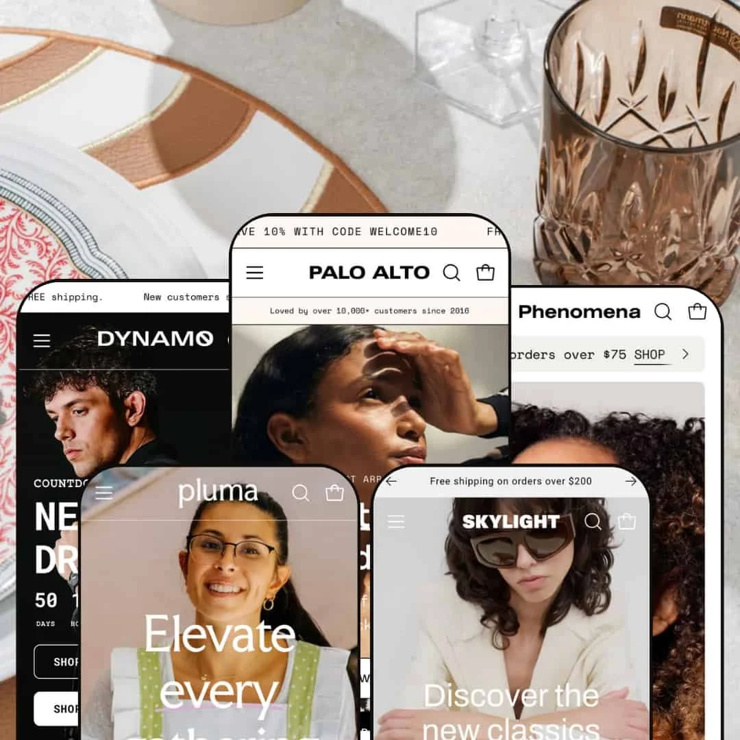
What works in this preset
The Default preset leans into a bright, promotion-forward aesthetic that puts seasonal offers and featured collections front and center. A bold hero and an always-visible call to action set an energetic pace for the page, while testimonial and category storytelling sections build trust and momentum. Editorial blocks are spaced to feel airy rather than crowded, keeping attention on imagery and CTA rhythm. The overall composition makes it easy for fashion catalogs to spotlight drops and time-limited campaigns without sacrificing clarity.
-
What works in this preset
Dynamo embraces a rugged, utilitarian feel with dark backdrops and assertive type, amplifying products built for travel and durability. Editorial sequences—short copy, big imagery, and concise explainer panels—sell function and story in equal measure. A condensed navigation approach suits gear catalogs that want focus on hero narratives rather than a wide-open header.
Where it stumbles
The dark styling can reduce contrast for small labels and fine UI details, which may add a beat of friction during scanning. Cross-sell presentations feel lighter than in other presets, offering fewer on-the-spot add opportunities when momentum is high.
-
What works in this preset
Skylight delivers a magazine-style layout with refined photography and generous editorial spacing. A signature image-hotspot section lets shoppers open a mini quick-view for featured items, preserving immersion while enabling fast purchase. Journal and article templates support tagging, sharing, and comments, giving content teams room to work. A lookbook page presents editorial imagery with direct “Shop Now” links that lead straight to product pages.
-
What works in this preset
Phenomena orients itself toward beauty and wellness with soft palettes and ingredient-centric storytelling. A “Shop the Look” sequence uses hotspots to rotate featured items and open quick-shop, letting customers assemble routines without leaving the flow. Product pages surface ingredient details, usage guidance, and helpful icons that set expectations at a glance. These elements support guided discovery for shoppers comparing shades, formats, and routines.
Where it stumbles
The homepage can feel busy on smaller screens, so curation of sections and media density pays dividends.
-
What works in this preset
Pluma brings a playful, pastel tone that pairs well with home goods and décor. A segmented control near the top lets shoppers toggle between Bestsellers and Sale, surfacing curated sets without scrolling. Editorial sections celebrate design and craft, creating a friendly, upbeat mood that invites browsing.
Where it stumbles
This preset’s cart drawer omits cross-sell modules, reducing timely upsell moments. Product pages likewise keep the focus narrow, which can force discovery of complements through manual navigation rather than inline prompts.
Niche Suitability
Not Ideal For
-
Fashion, footwear, beauty, and home-decor brands that value storytelling and curated shopping journeys. Teams seeking a premium look with flexible sections, mega-menus, and inline cross-sell will feel right at home.
-
Single-product or minimalist brands that want ultra-simple layouts and persistent, always-visible add buttons may find the theme too expressive. Stores that require uniform overlay behavior for every multi-variant item might prefer a stricter add-flow model.
-
Medium — Initial setup asks for thoughtful media, section curation, and campaign configuration to shine. Once dialed in, most promotions and edits run through reusable sections without developer overhead.
Final Recommendation
★ 8.0/10
Rating
-
Wide range of merchandising tools (mega‑menu, quick‑add, quick‑shop, countdowns, cross‑sell), robust product page options and flexible content sections.
9
-
Theme editor settings are comprehensive but require careful configuration; hover‑dependent interactions may confuse beginners.
7
-
The theme remains responsive with slide‑out menus and cart drawers; however, hover‑based quick‑adds are hidden on touch devices, requiring taps.
8
-
Large images and videos can slow down some presets; preloading helps, but merchants should optimize media.
7
-
Five distinct presets, numerous sections and customizable styles support a wide range of brands—from utilitarian to luxury to playful.
9
FAQ
〰️
FAQ 〰️
-
👑 Yes. The Default and Skylight demos showcase apparel, shoes, and accessories with quick-add grids, timed promotions, and editorial sections that link inspiration to purchase.
-
📱Yes. Navigation collapses cleanly and the cart drawer works on small screens. Because hover interactions are absent on touch, shoppers often enter product pages to finalize options.
-
🎨 Palo Alto provides dozens of sections for banners, product grids, storytelling, and forms. Colors, typography, spacing, and layouts can be adjusted in the theme editor, with five presets to jump-start styling.
-
⚡ General responsiveness is good, but media-heavy pages benefit from disciplined image sizing and careful video use. A leaner section mix keeps pages feeling snappy.
-
👕 Yes. Product pages handle swatches, sizes, and quantity steppers, and quick-shop panels surface variant choices when needed. Some triggers may still route to product pages depending on context.
-
🔎 The theme outputs clean markup and exposes title/description fields. Journal, lookbooks, and FAQs support content strategies that help with search visibility.
-
💱 Localization is configured in Shopify Markets; when enabled there, selectors appear in the storefront and the theme reflects those settings..
-
⚙️ Palo Alto follows Shopify’s standard architecture, so common apps for reviews, subscriptions, and merchandising generally slot in without special work.
-
🛒 Yes. You can preview all five presets in live demos on the Shopify Theme Store, and Shopify’s free trial lets you install and customize before publishing.
This review is based on hands-on testing of the publicly available “Default,” “Dynamo,” “Skylight,” “Phenomena,” and “Pluma” preset demos of the Palo Alto Shopify theme as of 10 November 2025. Theme features, preset availability, and performance can change with subsequent updates from the theme developer.