
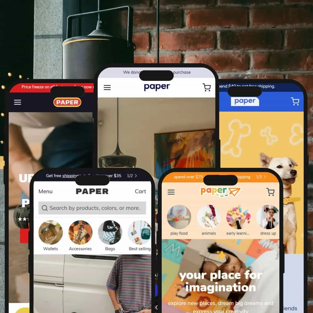
Paper is a Shopify theme designed for brands that want maximum flexibility and modern commerce UI out of the box. The theme was tested across five official presets—Default, Parts, Parade, Postcard, and Pull—with every key e-commerce component reviewed on desktop, mobile, and tablet. At first glance, Paper’s sharp typography, clear color hierarchy, and strong content blocks make the landing experience inviting and conversion-focused. Call-to-action buttons are visually bold in each demo, and every homepage hero or grid leads visitors quickly toward a product, search, or category click.
Pros.
〰️
Pros. 〰️
✚ Quick-add flows that feel instant
Across testing, product-card interactions—including add from grid and variant-aware states—were consistently snappy. Shoppers spend less time waiting for drawers to catch up and more time adding items, which encourages confident browsing and painless cart building.
✚ Search that guides you as you type
Predictive, as-you-type search surfaced products and supporting content quickly in every preset. The immediacy reduces dead-end queries and helps visitors jump to relevant categories or articles without detours.
✚ Multi-image previews that reduce page hopping
Cards commonly reveal a second image or short clip on hover/tap, so shoppers can verify style or fit before committing to a product page. That subtle previewing keeps momentum high, especially on dense collections.
✚ Editorial and commerce play nicely together
Paper makes it easy to mix storytelling with selling. Blog modules, testimonials, and content-rich blocks sit comfortably beside shoppable grids, which helps brands build trust without sacrificing conversion-oriented layouts.
✚ Mobile polish and accessible states hold up
Navigation, drawers, and tap targets stayed predictable and touch-friendly during testing. The consistent behavior reduces mis-taps and keeps checkout paths smooth on smaller screens.
Cons.
〰️
Cons. 〰️
− Edge-case business models still need add-ons
Event ticketing, course booking, and other atypical flows aren’t native here. Those use cases will lean on third-party apps or custom work to feel cohesive.
− Complex B2B workflows require configuration
Advanced tax considerations, POs, or quote-driven processes aren’t turnkey. Brands with heavy operational requirements should plan for additional setup and possibly development to align Paper with internal workflows.
− Aesthetics depend on strong assets
Out-of-the-box layouts look their best with high-quality imagery and real copy. If your library is thin or inconsistent, the design can read generic until content catches up.
-
A modern, all-purpose presentation that leans into clean typography, bold CTAs, and an immediate route to featured merchandise. The composition pairs a dominant hero, a compact trust-badge cluster, and a first-screen featured collection to frame a straightforward DTC landing.
What works in this preset
The homepage favors a classic “hero + trust + featured collection” stack that feels familiar yet polished. That layout keeps the shopper anchored: the banner sets intent, the badges confer confidence, and the grid provides an instant path to add-worthy items. Content-led product cards sit comfortably in between, letting lifestyle imagery do the persuading without crowding the page.
Typography and color choices carry a neutral, brand-ready tone. Headlines are assertive, while link and button treatments are easy to scan across sections. The result is a preset that takes on a merchant’s branding quickly without forcing a heavy aesthetic.
-
A utilitarian, catalog-heavy look tailored to technical assortments and spec-driven shopping. Visual hierarchy favors dense product rows, information blocks, and confidence cues that mirror B2B patterns.
What works in this preset
Collection and search grids are composed to foreground practical details. SKU-level attributes, inventory hints, and price placement are surfaced in the card itself, minimizing the need to click through for basics. This staging feels purpose-built for industrial, hardware, and home-improvement assortments where the “can it do the job?” question comes first.
Trust and feature callouts slot neatly into the layout. Badges like “Lifetime guarantee” or shipping reassurance live close to cards and headers, so decision support sits where the eye already travels. The tone is plain-spoken by design, and it’s effective.
Where it stumbles
On mobile, the density that makes Parts efficient can tip into visual heaviness on very large collections. Without careful curation, the homepage can prioritize rows of products at the expense of storytelling, which some merchants may want to push higher.
-
A playful, kid-centric look that frames the homepage like an interactive gift guide. Color-blocked sections, large iconography, and “shop by age/brand” pathways lead the browsing experience.
What works in this preset
“Shop by Age” and similar taxonomy callouts are promoted to prime real estate, turning the homepage into a guided chooser. Big, friendly icons and badges serve as confident tap targets on both desktop and mobile, making it easy for gift-givers to self-select their lane without reading dense copy.
Seasonal energy and urgency cues are baked into the staging. Cartoon badges, celebratory headings, and limited-time language sit alongside bundles and featured picks so the page reads as festive rather than purely commercial. Even FAQ and newsletter blocks adopt the tone, keeping the voice consistent from top to bottom.
Where it stumbles
The saturation and volume of color can overwhelm if a catalog grows very large or if imagery is mixed in quality. Brands aiming for a calmer or more adult mood may find themselves re-theming the palette and trimming decorative elements.
-
A gallery-style preset with crisp typography, neutral tones, and an editorial sensibility. Its grid and sections are composed for art, prints, photography, and collections where curation matters.
What works in this preset
“Shop by orientation” CTAs—portrait, landscape, square—provide immediate conceptual sorting that maps neatly to how art is purchased and displayed. It’s a small design choice with outsized impact, reducing friction for shoppers who arrive already thinking in wall space. The neutral palette and measured type scale keep the focus on artwork rather than the frame of the site, which strengthens the curated, gallery-first impression.
Where it stumbles
The refined editorial staging can under-sell highly technical products that depend on spec-first presentation. Brands wanting louder, high-saturation palettes may also plan on retuning color to avoid a muted, gallery-only vibe.
-
A pet and lifestyle-leaning look that elevates “bundle & save” and recurring purchase paths. Navigation and homepage blocks are choreographed around building higher-value carts fast.
What works in this preset
Bundles aren’t a sidebar idea here—they’re the headline. The homepage and top navigation prioritize mix-and-match flows and featured combos so shoppers meet value propositions immediately. It’s a clear nudge toward bigger baskets without feeling aggressive.
The subscription choice is staged as an inline toggle rather than a detour. That placement keeps momentum: shoppers can opt into repeat delivery on the way to the cart rather than pausing to decipher a separate flow. Microcopy like “Why it’s healthy” and “Why choose us” backs it up at the point of decision.
Where it stumbles
With very large catalogs, the repeated emphasis on bundles can start to feel samey unless the content is rotated thoughtfully. Brands that rely on deep storytelling may also find fewer editorial modules in the default composition.
Niche Suitability
Not Ideal For
-
Any merchant needing a rapid, no-compromise Shopify storefront with universal quick-add, flexible grid layouts, and a conversion-optimized UI that blends editorial and shopping.
-
High-complexity B2B, service-first, or custom-model brands that depend on non-standard checkout, work orders, or booking engines.
-
Low to Medium
Most DTC and lifestyle brands can go live by swapping demo content and tuning sections; the heavier lift begins only when matching unusual operational models.
Final Recommendation
★ 8.8/10
Rating
-
Every standard feature functions seamlessly: quick add, grid, mega-menu, variant selector, speedy cart. Most “nice to haves” are present.
8
-
Onboarding is intuitive for merchants, and customers move through the shop easily.
9
-
No critical mobile bugs detected across presets; interactive elements are touch-friendly.
10
-
Pages load promptly, animations and drawer states feel lag-free.
9
-
Only niche or high-complexity use cases will need custom code or specialized apps.
8
FAQ
〰️
FAQ 〰️
-
👑 Paper adapts readily to DTC, art and décor, lifestyle and gifting, pet supplies, technical goods, and multi-category retail. Its grids and storytelling blocks support both visual and catalog-heavy shops.
-
Most merchants can publish a fully functional shop by replacing demo content with brand images, collections, and copy. No coding is required for launch, though strong photos and headlines meaningfully improve results.
-
Your store’s uniqueness depends on images, copy, and color choices. The section system lets you reorder and restyle almost everything, so the same preset can feel distinct once real content is in place.
-
Paper’s collection layouts and product cards scale smoothly for complex catalogs, and variant selectors behaved reliably across grids and PDPs during testing.
-
Yes. The section builder and custom blocks allow rich landers, bundle-oriented merchandising, trust banners, FAQ accordions, and customer content—all drag-and-drop for typical pages.
-
Subscriptions and bundle-forward merchandising are supported in-theme. For bookings, ticketing, or gated/member-only access, you will need additional apps.
-
For local regulations (taxes, legal compliance), use Shopify’s native admin or apps as needed.
-
Look elsewhere if your primary flow is service booking, event ticketing, wholesale with advanced quoting/portal, or you demand highly custom layouts/animations not supported by standard sections. If you lack high-quality photos and copy, expect to invest in content to avoid a generic look.
-
Quick add felt consistent and lag-free across testing, and quick-view interactions maintained momentum on both desktop and touch devices. Mobile tap targets and cart transitions stayed predictable, which kept the path to checkout smooth.
This review is based on hands-on testing of the public Main, Folk, Clay, and Tiny demos of the Mono Shopify theme, observed on 15 September 2025. Theme features, preset availability, and performance can change with updates from the developer.