
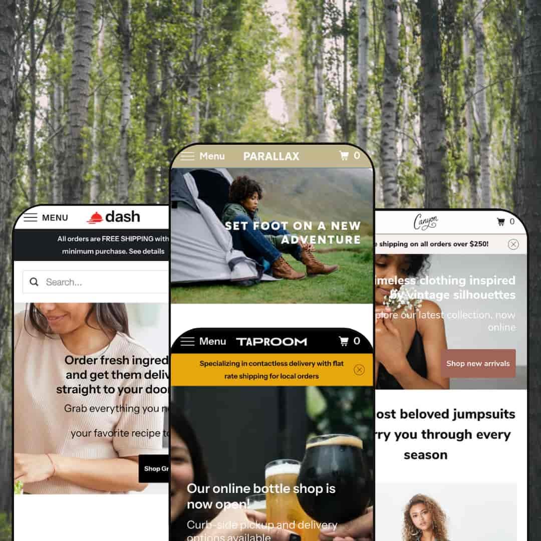
Parallax is a premium theme built around full‑width imagery and subtle scrolling effects that create a sense of depth. Across the demos it delivers a sticky header, predictive search overlay, quick‑shop modals, and a slide‑out cart drawer, with product pages that handle single or multi‑variant items and surface recommendations to drive discovery. Narrative sections such as “Our Story,” plus multiple sign‑up prompts, give merchants simple ways to blend content and commerce. The review below focuses on how each preset stages these ideas for different niches.
Pros.
〰️
Pros. 〰️
✚ Quick‑shop that flows into a slide‑out cart drawer
Across the demos, the quick‑shop modal supports no‑variant, single‑variant, and multi‑variant items, then routes adds into a slide‑out cart. This reduces context‑switching and helps shoppers build baskets without bouncing between pages.
✚ Solid product page fundamentals plus recommendations
Product pages cover sale pricing, variant selectors, and sharing, then finish with “You may also like” blocks. The structure keeps essential decisions front and center and gives a gentle nudge toward cross‑sell.
✚ Predictive search overlay with clear results
A header search opens a predictive overlay and routes to results pages with sensible presentation for matches and zero‑result states. Shoppers get feedback as they type, which shortens the path to relevant items.
✚ Narrative blocks and sign‑up prompts that support brand building
“Our Story” sections, blog teasers, and multiple newsletter placements are available across presets. These give merchants low‑effort tools to pair content and commerce without custom code.
✚ Flexible presets, consistent core
Parallax adapts to outdoor gear, food and beverage, and fashion through changes in palette, typography, and imagery while keeping cart, search, and product mechanics stable. That consistency lets teams swap styles without retraining on core shopping flows.
Cons.
〰️
Cons. 〰️
🚫 No native lookbook or “shop‑the‑look.”
There isn’t a built‑in editorial lookbook or a shop‑the‑look module; fashion merchants who rely on outfit storytelling will need an app or custom section to stage those experiences. This affects cross‑sell opportunities that depend on styled sets.
🚫 Inconsistent quick‑shop handoff in some demos
In Madrid and Vienna, adding from quick‑shop does not always open the cart drawer immediately, which creates small breaks in the flow. Merchants should test add‑to‑cart behavior during setup and align the handoff.
🚫 No native subscription or booking modules
Recurring orders and reservations are not built in. Stores that rely on subscriptions or tastings will need apps to complete those flows.
🚫 Apparel size charts not provided as a pop‑up by default
Size guidance requires metafields or an app. Apparel merchants should plan for this before launch.
-
The Aspen preset leans into earthy hues and expansive landscape photography. Parallax image sections set the tone for outdoor gear and adventure‑minded storytelling.
What works in this preset
Parallax hero with overlay CTA. The opening section uses layered imagery that moves at different speeds on scroll, which naturally draws the eye to the call‑to‑action and sets an aspirational mood for exploration. The mechanic suits category‑led shopping where a single, confident action leads deeper into the catalog. It establishes an outdoorsy brand tone before any copy explains it.
Outdoor‑first visual language. Earthy colour choices and quiet typography keep attention on large hero photos of trails, tents, and outerwear. The restraint lets pictures do the heavy lifting, so shoppers can evaluate style at a glance before committing to product pages. This calm treatment keeps the grid from feeling like an ad collage and makes the catalog feel intentional.
Category grid tuned to outdoor use cases. Cards for Clothing, Tents, and Cookware make the route into core categories obvious without crowding the page. Because the grid echoes the same photographic mood as the hero, it reads as guidance rather than a sales wall. It’s a gentle way to get visitors moving toward the right part of the store.
-
Taproom targets breweries and hospitality brands. Mustard yellows, dark accents, and a split focus on beverages and food give it a tap‑house personality.
What works in this preset
Circular menu grid built for small bites. A compact food menu uses round icons and quick‑add styling to showcase ready‑made dishes alongside drinks. The pattern feels playful and speeds small add‑ons, mirroring how customers sample in a real taproom. It keeps the homepage varied without turning into a long price list.
ABV/IBU details on beer pages. Product pages surface transparency cues craft buyers expect, such as alcohol by volume and bitterness units. Those specifics help regulars compare bottles and give newcomers context, all without leaving the page. It’s a small detail that supports confident selection.
Dual merchandising across food and drink. The layout comfortably mixes a bottle spotlight with weekly dishes, showing the preset can handle dissimilar product types without visual conflict. It’s a practical way to sell experiences and packaged goods side by side. The page stays coherent because the colour system and typography tie both halves together.
-
Dash is framed for meal‑kit and grocery‑box services. Light neutrals, friendly icons, and a “how it works” narrative lower the barrier to first purchase.
What works in this preset
Step‑by‑step service explainer. A three‑column section (“You Choose, We Deliver, You Cook… or Just Eat!”) spells out the flow in seconds. It reduces friction for shoppers who are new to meal‑kit models. Clarity here also cuts the number of support questions at the top of the funnel.
Weekly meal‑kit grid that reads like a menu. Large, appetizing photos anchor each tile and give equal weight to the dish name and image. The composition encourages quick scanning across a small selection, which suits limited weekly drops. It feels curated rather than warehouse‑like, so the grid invites browsing.
Separate merchandising for pantry items. A colourful hero leads into a distinct grid for condiments and spices, which prevents the food story from blending into one mass. The separation helps customers jump between big‑ticket kits and small add‑ons without losing context. It’s an easy way to raise average order value with low‑consideration items.
Trust‑building accents. A partner‑logo strip near the footer and short testimonials create low‑effort social proof that complements the service explainer. Those cues reassure first‑timers while leaving the page calm. Nothing fights for attention unnecessarily.
Where it stumbles
Long pages with many rows of meals can require considerable scrolling on desktop. That pacing may hide items below the fold if content is over‑packed, so merchants should edit ruthlessly and keep highlights tight. The preset looks best when the weekly selection stays focused.
-
Canyon brings a boutique‑fashion vibe with airy spacing and soft colours. The demo spotlights jumpsuits, dresses, and rompers with a clear sustainability message.
What works in this preset
Jumpsuit carousel with swatches. A horizontal carousel presents “most beloved” pieces and shows colour options directly on the card, which helps shoppers preview variants quickly before committing to a product page. It’s a tidy way to surface variety without adding grid density. For capsule collections, this keeps decision‑making light.
In‑page spotlight card with Add to cart. A featured product block includes a mini description and a direct add button, creating a quick path for impulse buys inside the browsing flow. That reduces page‑to‑page shuffling and keeps attention on the featured look. It pairs well with limited‑run drops.
Lightweight visual system that flatters small assortments. Soft tones and generous white space frame each piece as a hero, so the page reads like a boutique rack rather than a warehouse grid. The spacing prevents fatigue when shoppers scroll through a concentrated set of items. It’s well‑matched to brands that release tight capsules.
Where it stumbles
The product carousel cannot be paused. Fast scrollers might miss items if they swipe quickly, so merchants should keep the number of featured products modest in this slot. It works best as a highlight reel, not a full catalog.
Niche Suitability
Not Ideal For
-
Brands that sell a visual story—food and beverage, outdoor gear, boutique fashion—and value quick add flows, a tidy cart drawer, and straightforward product pages.
-
Shops that depend on built‑in subscriptions, reservations, rich lookbooks, or very complex category hierarchies may prefer a more specialized theme or custom work.
-
Medium — Most sections (parallax image blocks, quick‑shop, announcement bars) are configurable without code, but strong photography is essential. Expect to budget for apps if you need subscriptions, reservations, or apparel size guides.
Final Recommendation
★ 7.4/10
Rating
-
Robust quick‑shop, predictive search, and flexible sections are present; native subscriptions or bookings are not.
7
-
The editor makes it simple to toggle sections; merchants should verify quick‑shop handoffs for consistency.
8
-
Touch‑friendly menus and the cart drawer hold up across devices.
8
-
Parallax effects and large images load efficiently, though very long pages can stretch initial load.
7
-
Four presets cover diverse industries; merchants can tailor colours, fonts, and layouts without code.
7
FAQ
〰️
FAQ 〰️
-
👑 Yes. The Taproom and Dash demos include sections for featured bottles, weekly dishes, meal‑kits, and pantry items.
-
📱Yes. All demos adapt cleanly to smaller screens with sticky headers, slide‑out menus, and a usable cart drawer.
-
🎨 There are extensive settings for colours, fonts, and section layouts. Parallax sections, announcement bars, and quick‑shop can all be enabled through the editor.
-
⚡ Images and sections load smoothly in testing; very long pages may benefit from additional optimization.
-
👕 Yes. Quick‑shop supports size, colour, or pack options and product pages provide clear selectors.
-
🔎 The theme uses Shopify’s built‑in SEO features such as clean URLs and meta fields; content and alt text optimization remains a merchant task.
-
💱 Yes. It inherits Shopify’s native multi‑currency and translation features, configured in Shopify settings rather than the theme.
-
⚙️ Yes. Because Parallax follows Shopify conventions, common apps for reviews, subscriptions, or bundles generally install without conflict.
-
🛒 You can preview Parallax on your own store via the Theme Store. The public demos referenced here show core features in action.
This review is based on hands‑on testing of the publicly available “Aspen,” “Madrid,” “Vienna,” and “Los Angeles” preset demos of the Parallax Shopify theme as of 16 November 2025. Theme features, preset availability, and performance can change with subsequent updates from the developer.