
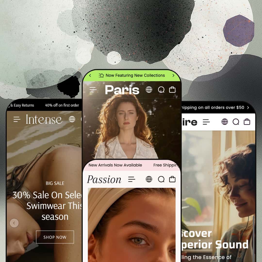
Most budget themes ship one look and hope you don't peek behind it. Paris hands you four: a Parisian fashion build, a high-contrast swimwear store, an electronics layout, and a soft skincare preset, all under one $100 license. Built on Online Store 2.0, it leans on a single shared section library that has to stretch across catalogs with almost nothing in common. The real question is whether that range holds once you look past the staged demos.
Four production-grade presets across four verticals
Paris ships four complete builds, fashion, swimwear, electronics, and skincare, each with its own navigation, homepage composition, and product staging. That isn't four color swaps. Each preset is a different storefront skeleton you can install and restyle rather than assemble from blank sections, which is unusually generous at the $100 mark. For an agency or multi-brand operator launching mid-market stores across categories, it's four starting points from one license.
A shoppable product module that drops the full buy box onto the homepage
Small-catalog merchants live and die on clicks to purchase, and this is where Paris helps most. The theme can embed a featured product directly into the homepage with its complete variant picker, rendering a multi-axis Size and Color matrix, per-variant stock states, a quantity stepper, color swatches, compare-at pricing, and add-to-cart inline. A shopper configures and buys without a page change. For a store under 100 SKUs trading on impulse, that shortened path is worth more than another hero banner.
A dual-style mega menu that matches the catalog, not the other way around
The header carries two distinct mega-menu architectures: a text-column style with nested featured products and promo tiles, and an image-panel style built on large lifestyle tiles. One suits a deep apparel or electronics catalog where shoppers hunt by category; the other suits a tighter, image-led range where browsing is visual. Both are live across the presets. A merchant picks the navigation shape that fits how their buyers actually shop.
A coordinated merchandising kit wired in at the theme level
Beyond layout, Paris bundles a working conversion toolkit as a single unit: countdown timers, quick view, quick buy, a slide-out cart with cart notes and gift wrapping, cross-selling, recently-viewed, in-menu promos, pre-order, and an age verifier. These travel with whichever preset you choose. For an early-stage DTC brand on a budget, it covers the merchandising basics without stacking paid apps on day one.
Social proof is static, not verified
The trust sections across the presets are hardcoded testimonial blocks: a name, a quote, a fixed star row, none of it tied to actual orders. Product cards carry no rating display. I went looking for a review mechanism and found styling, not data. Verified, review-driven social proof is app territory, so a beauty or supplement brand in a trust-dependent, considered-purchase vertical will install and wire in a review app such as Judge.me or Loox before the storefront earns real credibility.
Bundle and upsell merchandising is manual
Cross-selling here is recommendation-based, and nothing more. The skincare preset's bundles are individual bundle products a merchant has to create and price by hand, and tiered quantity pricing is gated behind Shopify Plus rather than offered to every store running the theme. There's no dynamic bundle-builder or automatic quantity-break engine in the theme itself. A subscription-led or replenishment beauty brand wanting kit-building or tiered pricing will add an app and the integration work that comes with it.
Non-fashion verticals inherit a more promo-driven skeleton
The signature Parisian editorial voice is fullest in the fashion and skincare builds. The blocks themselves don't change. The electronics and swimwear presets lean harder on sale bands, marquees, and discount banners to generate energy, so a mid-market tech or hardware merchant who wants the restrained, editorial feel will rebuild more sections to get there. The capability is the same across presets; the design character isn't evenly distinguished, and reaching a distinct identity in the busier verticals is real merchant work.
What it takes to launch
Expect a multi-day pass across hero and section copy, demo-product replacement, price and currency normalization, metafield population for product detail, and per-preset brand naming before any of the four builds is launch-ready.
-
What works in this preset
The Paris build is the one the theme is named for, and it carries the editorial identity hardest. I clicked through a homepage that opens on a two-image fashion hero, then moves into a tabbed "Bestsellers" block where Athleisure, Everyday, and Evening Wear each swap in their own product set without a page reload. Product cards carry color swatches and a quick view trigger. It reads like a real boutique.
A before/after image slider sits midway down, pairing a styled "after" shot against a plainer "before" to sell the transformation angle. That section alone signals the theme is thinking past flat product grids. For an apparel store built on lookbook-style storytelling, single-brand and considered-purchase by nature, it gives the merchandiser something to work with beyond a hero and a collection list.
Navigation is where this preset shows its depth. The mega menu runs the text-heavy style: stacked columns of collections with featured products nested inside, plus a promotional image tile and an Instagram block tucked into the panel. A shopper browsing a wide apparel catalog with 100-plus SKUs can reach a named product in two hovers, which is exactly the navigation shape a fashion catalog wants.
-
What works in this preset
Bold is the whole brief here, and Intense commits. The preset opens on a split promo hero (a "Big Sale" panel beside a "Trendy" one), then runs an animated marquee band, a best-seller grid with multi-color swatches, and a four-up category gallery that swaps imagery on rollover. For a swimwear or beachwear label leaning on flash-sale energy and impulse-buy behavior, the high-contrast styling fits the product.
What separates this preset from Paris is the menu treatment: the same mega-menu system renders as image panels rather than text columns. Three large lifestyle tiles, fewer words. It's the second of the theme's two menu styles, and seeing both live across presets makes the "dual menu" claim concrete rather than marketing.
Where it stumbles
The urgency stack is loud to the point of working against itself. A multi-message announcement marquee, a full-width "Enjoy 50% Off" scrolling band, a countdown section, and percentage banners all compete inside the first two scrolls, so the product grid ends up fighting the promotions for attention. A brand selling considered, mid-to-luxury swimwear, or any restock-driven label that wants to read as premium rather than as a clearance outlet, will dial most of that back before launch.
-
What works in this preset
Here's the surprise of the bunch. Desire drops the fashion vocabulary entirely and rebuilds as an electronics store, headphones, speakers, VR visors, cameras, and the section library follows without complaint. I scrolled past a dual-slide hero, a trending-collections strip, and long lyrical copy blocks before hitting the part that earns its place.
That part is an embedded product module sitting right on the homepage. It renders a live product with its full buy box: a gallery thumbnail strip, a Size and Color variant matrix, per-variant availability (several combinations show as sold out), a quantity stepper, an add-to-cart button, and social share links. A shopper can configure and add without ever leaving the landing page. For a small-catalog electronics shop trading on impulse purchases, that's a genuine conversion shortcut.
Completeness is the other thing Desire gets right. It's the one preset that puts the blog section to work, with three featured posts feeding a news index, and it pairs that with the deepest footer of the set: four link columns, a newsletter, and a payment row. A tech merchant with a modest catalog gets close to a working store on install day.
Where it stumbles
The preset gives prime real estate to long mood-copy sections about "the power of sound." That voice suits a lifestyle-audio brand chasing emotion. It underserves a spec-driven electronics shopper who is scanning for drivers, battery life, and connectivity, and who hits three paragraphs of poetry instead. Repositioning those blocks toward specs is a layout decision the merchant will want to make early.
-
What works in this preset
Passion is the calm one. It rebuilds the theme as a skincare brand with a slideshow hero, soft serif headings, and French section labels (Maison de Beauté, Haute Beauté, Signature Beauté) that lean into the Parisian framing more comfortably than the gadget preset ever could. Quick view sits on every card. The restraint is the point.
The merchandising here favors trust over urgency: tabbed product edits, compare-at pricing on bundle products, a collection showcase with live item counts, and a shoppable Instagram strip. For a beauty or wellness label built on repeat-buyers and considered, ingredient-led purchases, the quieter pacing reads as more credible than a countdown clock would. It's a different emotional register from Intense, built from the same blocks.
The section library is genuinely vertical-agnostic
The most telling thing about Paris isn't that it has four presets, it's that the same underlying blocks, tabbed product edits, image hotspots, before/after sliders, marquees, and the embedded product module, recompose convincingly from linen dresses to wireless headphones to serum bottles. That portability is an architecture decision, and it's the reason the range doesn't collapse into one aesthetic wearing four hats.
Depth that sits above its price bracket
Taken as a whole, the feature surface, dual menu system, embedded buy box, full conversion toolkit, blog, lookbook, and four staged storefronts, reads well beyond what the $100 tier implies. A merchant comparing Paris to alternatives in its price range is getting a STANDARD-tier feature set at a BUDGET-tier price, and that ratio is the strongest argument the theme makes for itself.
Each preset starts from a working store
Across all four demos, the build arrives with populated navigation, an About and Contact page, footer columns, and (in the electronics preset) a blog. The starting point is a functioning storefront to edit down, not a blank shell to build up, which shortens the distance between install and a credible launch.
Motion leans on scrolling marquees almost everywhere
Every preset reaches for animated marquee text bands as its default energy device, sometimes several per page. It's lively, and on a flash-sale swimwear store it works. On a brand chasing quiet luxury or clinical credibility, the constant horizontal scroll reads as busy and slightly dated, and taming it is one of the first things a premium-positioned merchant will do.
The default conversion model is urgency-first, not trust-first
The theme's instinct is to push: countdowns, percentage banners, sale marquees, limited-time framing. That serves impulse categories well. Brands selling high-consideration or high-trust products, where reassurance and proof move more units than scarcity, will reshape that emphasis rather than inherit it, because the out-of-box defaults pull in the opposite direction from how their buyers decide.
Rating
★ 7.8/10
-
Broad theme-wide toolkit, an inline product module with a full variant matrix, and a two-style mega menu cover most merchandising needs without apps.
8
-
Preset install delivers a working store on OS 2.0 sections; the offset is a real demo-data and copy cleanup pass before launch.
8
-
A slide-out mobile menu with stacked accordion nesting and responsive product grids carry the layout down to phone width cleanly.
8
-
The homepages run image-dense and stack multiple animated marquee sections, which adds weight even with lazy-loading in place.
7
-
The section library recomposes across four verticals; the ceiling is a shared editorial template family that takes work to differentiate store-to-store.
8
Frequently Asked Questions
-
Yes. The electronics and skincare presets rebuild the same blocks into convincing non-apparel stores, with the gadget preset shipping the most fully built-out demo of the four.
-
Presets are styling and layout starting points within one theme, so you choose one as your base and customize from there rather than running all four at once.
-
No native one. The testimonial sections are static, and verified star ratings on products require a review app you install separately.
-
It's most comfortable for small-to-mid catalogs; the homepage merchandising and the inline product module shine under roughly 100 SKUs rather than for sprawling, filter-heavy inventories.
-
Plan for a Medium-High effort: demo products, sample prices, currency settings, and per-preset copy all need replacing before launch.
-
It's a real, theme-level section you can deploy on any preset, alongside the rest of the conversion kit like quick view and the slide-out cart.
This review is based on hands-on testing of the publicly available preset demos of the Paris Shopify theme as of June 6 2026. Theme features, preset availability, and performance can change with subsequent updates from the theme developer.