
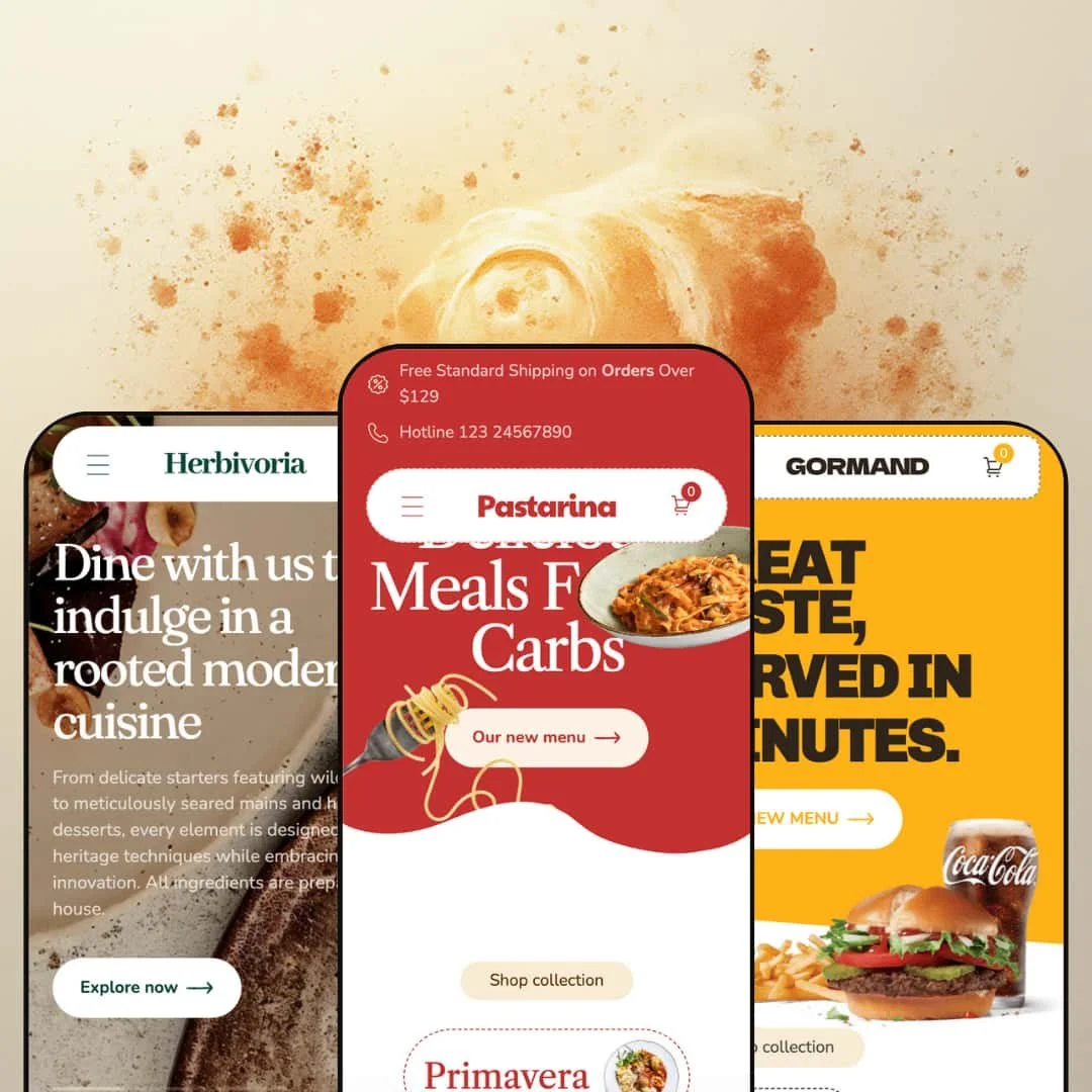
Pastarina is a culinary-focused Shopify theme built for food brands that want their storefront to feel like a menu, not a generic product catalog. Across the three presets, the theme leans heavily on big photography, punchy headline typography, and a “browse first, decide fast” rhythm with lots of visual sections. The consistent through-line is a shopping flow that’s designed to keep customers moving: browsing cards, opening quick product details, and adding items without turning every click into a full page change.
Pros.
〰️
Pros. 〰️
✚ Food-first product pages that answer buyer questions
Pastarina’s product presentation is built around the kind of detail food shoppers look for, not just a name and price. In the demos, product pages are staged with structured explanations, expandable information blocks, and nutrition-style tables that make the offering feel considered. The shopper impact is confidence: customers can decide with fewer “what am I actually getting?” questions left unanswered.
✚A shopping flow designed to keep momentum
Across the demos, the buying journey is staged to reduce back-and-forth. The theme leans on quick product inspection, sticky purchase controls on product pages, and a cart drawer that keeps your place while you adjust quantity, add notes, or continue shopping. The result is a storefront that feels more like ordering than browsing, which is a strong match for food and meal-service businesses.
✚ Variant-sensitive behavior that avoids bad adds
The demos show a clear distinction between simple items and products that need choices. Single-SKU items can be added quickly, while multi-option items are routed through an option-selection step instead of forcing a blind add. For shoppers, this reduces the chance of adding the wrong configuration, and for merchants it means fewer friction points that can lead to cart abandonment.
✚ Merchandising patterns that encourage bigger baskets
Pastarina supports “build the order” selling well, especially when the staging leans into it. Combo sections, a portion-builder style block, and an “Offer” style upsell area in the cart drawer demonstrate how the theme can surface add-ons without feeling like a bolt-on app experience. The practical benefit is higher order value when you pair the theme’s sections with a clear upsell strategy.
✚ Distinct preset aesthetics built on the same core structure
Default, Buncheeze, and Gourmet feel genuinely different in tone: classic premium Italian, playful fast food, and refined organic dining. Even so, the underlying shopping structure stays consistent, so a merchant can choose a “skin” that matches the brand without sacrificing the core shopping flow. That’s useful if you’re building multiple brands or want a theme that can evolve visually over time.
Cons.
〰️
Cons. 〰️
🚫 The add-to-cart path can be easy to miss beside “Buy it now”
In the demos, the primary call-to-action is visually dominant, while the cart-add action can be represented in a smaller control next to it. That hierarchy can encourage fast checkout, but it may also cause hesitation for shoppers who want to keep browsing after adding an item. Merchants using this theme should be deliberate about which action they want to lead with.
🚫 Visual richness requires careful curation
Pastarina’s demos are image-heavy and section-rich, which is part of the appeal, but it can also create visual fatigue if everything is left turned on. Gourmet, in particular, shows how a strong story stack can become crowded if the section order isn’t curated. To keep the experience smooth, merchants will need to be intentional with section selection and disciplined with imagery.
🚫 Social proof is light in the demo defaults
Testimonials appear as a slider in the demos, but they’re presented more as quotes than as “proof.” There are no visible rating cues or stronger trust signals staged alongside the testimonials in this draft’s demos. If reviews and credibility are a major conversion lever for your store, you’ll likely want to strengthen that layer beyond what the demos emphasize.
-
The Default preset stages Pastarina as a premium Italian meal service with a richer, traditional colour story and an illustrated, hand-made feel in its typography choices. It’s the most “classic restaurant” of the three demos, and it leans into a promotional storefront vibe rather than an editorial magazine vibe.
What works in this preset
In this preset demo, the hero section is staged as a straight shot to shopping. You get a crisp headline, a clear call to action, and a visual style that reads like a high-end menu cover. The impact is immediate: it encourages a first-time visitor to click into products instead of lingering at the top of the page.
The Default homepage is also staged around urgency and offers. The demo surfaces time-sensitive messaging and a countdown-style promotion, which shifts the tone from “browse when you feel like it” to “there’s a reason to decide now.” If your sales strategy relies on limited-time pushes, this demo shows how Pastarina can support that kind of pacing without feeling like an app overlay dumped on top of the theme.
Browsing in the Default demo is framed as curated exploration. Category thumbnails and sale-forward presentation help scanning feel structured, like you’re flipping between sections of a menu. Even when you’re looking at a grid, the staging prioritizes quick recognition of what’s discounted or featured, which helps a shopper decide what to click next.
Navigation in this preset demo is presented as a wide dropdown experience that fits the “full menu” metaphor. Instead of forcing everything into a tight header, it reveals categories in a more expansive layout. The shopper benefit is straightforward: it feels easier to jump between sections without relying on backtracking, especially when the catalog is staged as multiple “menu areas.”
Where it stumbles
The Default demo’s lower-page call-to-action styling gets visually loud. The bold red “act now” style strip near the bottom competes with the rest of the page, and it can feel like a second hero jammed into the footer zone. If a merchant keeps that section, it’s the kind of element that needs disciplined copy and a single clear goal, otherwise it risks pulling attention away from whatever the shopper was about to do next.
-
Buncheeze shifts Pastarina into a fast-food and street-food register. The palette is brighter, the typography feels more playful, and the staging is built to look like you’re ordering something fun and immediate rather than browsing a refined collection.
What works in this preset
The Buncheeze demo uses its hero and early sections to communicate “order now” energy. The visual language is bold, with burger-and-snack imagery doing most of the persuasion work before you read the details. This is the kind of staging that suits brands that win on appetite and impulse, because the page pushes you to keep scrolling and pick something.
This preset demo also puts a lot of emphasis on browsing via movement and highlights. Instead of feeling like a static storefront, it introduces the menu with a slider-style rhythm that nudges you from one featured item to the next. The result is that a shopper can get a “top hits” overview quickly, which is useful for brands that don’t want customers to overthink the first decision.
The most distinctive piece of Buncheeze staging is the portion-builder style block. In the demo, visitors can select a size and add extras like fries or sauce, then add directly from the same section. That presentation matters because it models upselling as part of the ordering moment, not as a separate step that happens after the customer has already decided.
The cart experience in this demo is also staged to encourage bigger baskets. Beyond the standard cart view, the drawer surfaces a separate “Offer” tab with combo or bundle suggestions. The shopper impact is subtle but real: it creates a natural “while you’re here” moment that feels native to the ordering flow rather than a hard interrupt.
Where it stumbles
In this preset demo, navigation is tucked behind a hamburger-style control rather than being laid out as visible top-level categories. That choice isn’t a missing capability, it’s a presentation decision, but it does change the browsing feel. A first-time visitor may need an extra beat to discover the full menu structure, especially if they’re the kind of shopper who scans navigation before scrolling.
The Buncheeze footer staging is very minimal and the page ends quickly after its call-to-action. That can be fine for a single-location food brand running tight, campaign-like pages, but it leaves less obvious room for the extra confidence-building links many stores want near the bottom. If a merchant relies heavily on “end-of-page reassurance,” the demo’s default staging would likely need more structure there.
The testimonial area in this demo is also styled in a way that can feel generic. It presents quotes in a slider format, but the visuals lean more toward illustrations than “real customer proof.” If social proof is a major conversion lever for the brand, the demo staging suggests you would want to invest in stronger credibility signals than what’s showcased by default here.
-
Gourmet takes Pastarina in a more refined direction with muted greens, elegant serif typography, and an airy layout that feels closer to a restaurant journal than a menu board. It’s the preset that most clearly targets premium dining, farm-to-table shops, and brands that want sophistication without looking sterile.
What works in this preset
The most immediate win in the Gourmet demo is the overall mood control. The palette and type hierarchy create a calm, premium pacing, and the page breathes more than the other presets. If a merchant sells higher-priced items or wants to present food as craft, this staging supports that because it avoids the “rush-order” feeling.
Navigation in this preset demo is staged as a clean, multi-column dropdown with imagery, but the styling reads more restrained than the Default version. It feels less like a busy menu board and more like an editorial table of contents. The shopper benefit is that browsing looks intentional and upscale, which matches the brands this preset is trying to attract.
The Gourmet demo also includes a word-collage style typography section that’s meant to be more brand-forward than product-forward. It’s the kind of staging that works for merchants who want visitors to remember the name and aesthetic, not just the item they clicked. Used well, it gives you a “signature” moment on the homepage that doesn’t rely on product discounts to be memorable.
A featured product highlight section is staged in a full-bleed, highly visual way, and it encourages customization before you even leave the homepage rhythm. The demo’s “Fig, Rosemary & Olive Pizza” presentation is a good example of this: it’s framed less like a simple product teaser and more like an ordering moment embedded in the storytelling. For shoppers, it lowers friction because you can mentally commit to the item while still on the homepage.
Gourmet is also the only demo in this draft that clearly stages a blog-style journal grid on the homepage. That changes how the store feels, because it gives the brand a content lane that sits alongside shopping rather than feeling like a separate, forgotten page. For merchants who want to lean into recipes, sourcing stories, or seasonal menus, the preset shows how the theme can make that content look native.
Where it stumbles
In this preset demo, the quick-view eye icon can blend into the product card depending on the imagery behind it. The issue here is not whether quick viewing exists, it’s discoverability in the way the demo stages it. If a merchant wants shoppers to rely on quick interactions, this preset’s visual subtlety may need stronger contrast choices.
The Gourmet homepage staging is also dense. Between sliders, typography moments, journal cards, and multiple content blocks, it’s easy for the page to feel like “a lot” on a first visit. The upside is flexibility, but the tradeoff is that merchants will need to curate the section stack carefully so the story doesn’t drown out the shopping path.
The footer and testimonial staging in this demo is fairly lightweight relative to how premium the rest of the page feels. Testimonials rotate through only a handful of quotes and don’t show extra trust markers like ratings or customer imagery in the way some shoppers expect. It’s not broken, but it can leave the store feeling less “proven” than the refined design suggests.
Niche Suitability
Not Ideal For
Final Recommendation
-
Pastarina is best for restaurants, meal services, and food merchants who want a storefront that feels like ordering from a well-designed menu. If your products benefit from structured explanation and you like staging bundles, combos, or add-ons, the theme’s demo flows fit that business style well.
-
If you want a minimalist storefront, sell products that don’t need food-style storytelling, or prefer a very sparse page structure with little visual staging, Pastarina may feel like too much theme for the job. Brands that win purely on speed and simplicity may be better served by a more stripped-back layout approach.
-
Medium — the demos show a lot of sections and strong visuals, but that means you’ll need good imagery and disciplined page curation. Plan to spend time refining your calls to action and building credible social proof.
★ 7.0/10
Rating
-
Strong demo evidence of quick shopping flow, structured product storytelling, and upsell-friendly merchandising patterns like bundles and cart offers.
7
-
The experience is intuitive once you’re in the menu, though some demo-staged navigation choices and CTA hierarchy may need tightening for clarity.
7
-
Sticky purchase controls reduce scrolling, but the demo styling leans on icon-based interactions, so merchants should confirm comfort and clarity on smaller screens.
7
-
The theme’s value is visual richness, and that can add page weight if imagery isn’t optimized. Selective section use and disciplined media choices matter.
6
-
Three demos show distinct brand directions while keeping the same core shopping structure, which is a practical kind of flexibility for food niches.
8
FAQ
〰️
FAQ 〰️
-
👑 Yes. The demos show food-style product pages with structured details and option selection that suit portion-based or menu-based selling.
-
📱The demos emphasize keeping purchase actions accessible with sticky controls on product pages. Because the staging uses large imagery and small icon controls in places, it’s worth checking how your content feels on smaller screens.
-
🎨 The three demos already look like different brands, which suggests the theme can carry distinct palettes and typography moods. The page is built from repeatable sections (hero blocks, featured areas, story-style content), so you can shift tone without rebuilding the entire structure.
-
⚡ In desktop testing the demos felt smooth, but the visual approach is media-forward. If you use the same kind of large photography and sliders, image optimization and careful section selection will matter.
-
👕 The demos show clear handling of products that need choices versus products that don’t. That reduces accidental mis-orders and keeps the shopping journey cleaner.
-
🔎 The demos don’t surface special theme-specific SEO controls, but the Gourmet preset stages a journal grid that supports content publishing. For most stores, you’ll still rely on Shopify’s standard SEO fields and your content strategy.
-
💱 Yes, through Shopify Markets configuration. In this draft’s demos, language and currency switching appeared in the storefront experience rather than requiring a separate add-on.
-
⚙️ Yes. The theme behaves like a standard Shopify storefront, and the cart and product layouts leave obvious places where review or upsell apps typically appear. As always, you’ll want to test any cart-drawer-related apps against the exact cart flow you plan to use.
-
🛒 Yes. Pastarina has live preset demos you can browse before committing, and you can trial the theme in your own store workflow before making a final decision.
This review is based on hands-on testing of the publicly available preset demos of the Pastarina Shopify theme as of 28 December 2025. Theme features, preset availability, and performance can change with subsequent updates from the theme developer.