
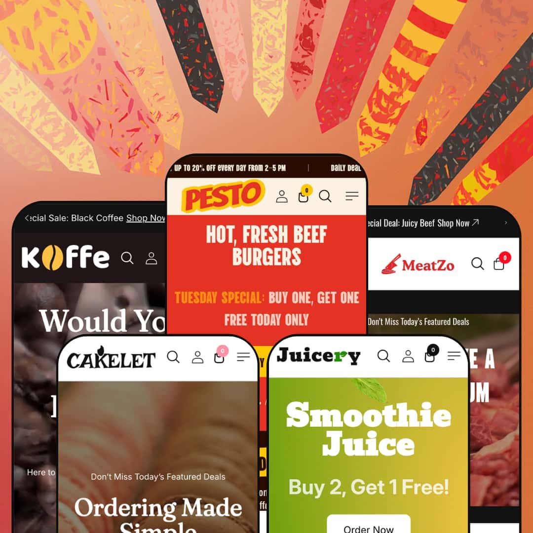
Most themes that ship five presets scatter them across unrelated industries to cast the widest net. Pesto refuses that math. All five of its demos (restaurant, coffee shop, juicery, bakery, and butcher) sit inside food and drink, and the section library is shaped to match, right down to a category-organized menu board for laying out a structured food menu. Built on Shopify's Online Store 2.0 architecture, it commits to one lane and furnishes it well.
A menu board built for how food actually sells
Dawn hands you a product grid and leaves the rest to apps. Pesto ships a category-organized menu board that lays products out like a printed menu, grouped by section, with variant pickers and prices sitting inline on every row. It bends to the vertical. Across the presets it adapts without complaint, from burgers and sizes in the restaurant to grind and weight in the coffee shop to cut and weight in the butcher, and for a café, cloud kitchen, or butcher counter selling a structured menu rather than a flat catalog, this one section does work that would otherwise mean a custom build or a paid add-on.
A conversion kit that runs without a single app
A merchant who lives on urgency and repeat promotions is the obvious buyer here. None of it needs an app. The theme bundles the whole deal-making toolkit natively, with countdown timers, promo popups, three-up promotion banners, and a rotating announcement bar that cycles daily-deal messages, all editable from the section editor, and the restaurant preset alone stacks a sale slideshow, a countdown, and a discount popup without reaching for an extension. For a takeaway brand or a seasonal-drop juice bar that schedules offers around weekends and holidays, that's a meaningful chunk of conversion tooling sitting inside the purchase price.
Video treated as a first-class merchandiser
Food sells on appetite, and Pesto leans hard into motion. Four of the five presets open on a full-width video hero, and the restaurant adds a carousel that plays short clips of individual dishes next to their names, while product pages accept video in the gallery alongside stills. Stills undersell food. An appetite-driven brand working with sizzling cuts, pour shots, or frosting closeups, where a flat photo loses the sell, gets native video across heroes, carousels, and galleries without installing a media app.
Built for a business with a counter, not just a warehouse
Several smaller choices add up to a theme that assumes a physical location. None of them is flashy. Every preset's footer carries an opening-hours block, the coffee and juice demos wire a hotline-order panel into the header, and in-store pickup sits among the cart options. A single-location café or bakery that takes phone orders and offers counter collection gets choices that map to how the business genuinely runs, in a way a warehouse-first theme wouldn't think to.
Five presets, one industry, zero range outside it
The focus cuts both ways. The menu board, the opening-hours footer, the food-attribute variants, and every demo photo assume you sell something edible. A boutique selling apparel, a beauty brand, or a homewares shop gets no reusable starting point here, and even a food merchant who later adds non-food lines such as branded mugs, aprons, or gift hardware will find the section library has no vocabulary for them. It's a deliberate trade, but it narrows the buyer pool sharply.
The demo sells deals harder than it sells food
That's the honest problem with the default staging. Open most of the presets and urgency hits first: a sale banner, a countdown, a discount popup, sale badges on nearly every card. A merchant chasing a premium or minimal position, like a single-origin coffee house, an artisan patisserie, or a chef-driven restaurant, will spend real time stripping the promotional furniture back before the storefront reads considered rather than clearance-bin. The pieces are individually toggleable, so it's fixable, but out of the box the theme reaches for the coupon before the craft.
"Subscription ordering" is a promise the theme keeps in an app
The Theme Store copy pitches subscription ordering as part of the package, but recurring billing isn't something a theme can do on its own; it lives in a subscriptions app and Shopify's platform layer. A coffee roaster wanting subscribe-and-save on its house blend, or a meal-prep brand selling weekly boxes, will read that line and still need to install and wire up a subscriptions tool to deliver it. The theme gives you the storefront surfaces. The recurring-revenue engine is on you.
What it takes to launch
Plan a full copy pass before launch across hero captions, menu-board entries, About-page narrative, testimonials, and footer contact blocks, plus real product photography, a pricing sanity check, and currency and market reconfiguration to replace the demo defaults. Populating the category and menu structures with your own products is the bulk of the work; budget two to three days for a single preset.
-
What works in this preset
"TUESDAY SPECIAL: BUY ONE, GET ONE FREE TODAY ONLY." That headline rides a two-slide hero the moment the restaurant demo loads. Subtlety isn't the goal. The featured-menu grid swaps in a second photo on hover, the product cards carry Size and Spices options inline, and a countdown clock ticks toward a seasonal sale further down the page, so a fast-casual brand that runs a new promotion every week gets staging built for its rhythm.
I scrolled past the burger grid into a section labeled MENU BOARD, and this is where the preset earns its restaurant credentials. Appetite does the selling here. It lays the catalog out the way a printed menu would, grouped under Burgers, BBQ, Side Dishes, and Pizzas, with prices and variant pickers sitting right next to each item so a diner can read the whole menu and choose a size without opening a single product page. A video band lower down plays short clips of actual dishes rather than stock footage.
Where it stumbles
By the time I reached the footer I'd passed a sale slideshow, a countdown, a three-up promo banner, and a discount popup. The promotions crowd the food. A first-time visitor meets three different offers before seeing what's actually on the menu, and for a brand whose draw is the cooking rather than the couponing, that ordering quietly works against the pitch.
-
What works in this preset
A phone number sits at the top of the coffee demo, wired to a "Hotline Order" panel that slides out from the side. The pace is unhurried. It's a small touch with a clear audience: a neighborhood café that still takes orders by phone, paired with a looping video hero, a proper Blog dropdown in the navigation, and a collection grid that breaks the catalog into Cappuccino, Mocha, Cold brew, and the rest, each tagged with its item count.
The menu board returns here as "CozyCup," and the variant options tell you the theme was built with real coffee retail in mind. Coffee sells by weight and grind. Each item offers a Grind axis (whole bean, coarse, medium, fine) and a Weight axis (50g, 500g, 1kg), the exact choices a roaster needs to sell the same bean five different ways, and it costs nothing extra to deploy.
-
The Drink & Juice preset ("Juicery") uses a bright, clean, and vibrant design to appeal to health-conscious consumers, smoothie bars, and juice companies.
⊕ Pros
✚ Benefit-Oriented Homepage Icons: The homepage prominently features icons highlighting health benefits (e.g., "Good for skin"), a smart, built-in marketing tactic that resonates perfectly with the target audience for juices and smoothies.
✚ Clean and Minimalist Product Page: The product page is uncluttered, focusing on a large image and key dietary preference selectors (e.g., "Lactose-free"), which streamlines the selection process for health-conscious shoppers.
⊖ Cons
− Requires High Merchant Diligence: The product page description is a nonsensical copy-paste from a different product type (sunglasses), requiring the merchant to be extra vigilant in replacing all demo content to avoid looking unprofessional.
− Generic Footer Promises: The demo includes generic retail promises like "Free World Delivery Order Over $100," which may not be applicable to a fresh juice business and feel like untrustworthy placeholder content.
-
What works in this preset
The cleanest demo of the set belongs to the bakery. It feels considered. Right under a video hero, a four-icon strip lays out delivery, payment, returns, and support promises, and the "About Our Cake" block tells a thirty-year heritage story without the placeholder filler that creeps into some of the other presets, while a Team Member section introduces the cake designer, pastry chef, and lead baker by name and photo.
I noticed the language selector here includes Arabic, which means the theme carries genuine right-to-left styling rather than a handful of translated interface strings. Small signals, but real ones. The footer also offers app-store badges as a built-in block, a nod to bakeries that run a companion ordering app.
The cleanest demo of the set belongs to the bakery. It feels considered. Right under a video hero, a four-icon strip lays out delivery, payment, returns, and support promises, and the "About Our Cake" block tells a thirty-year heritage story without the placeholder filler that creeps into some of the other presets, while a Team Member section introduces the cake designer, pastry chef, and lead baker by name and photo.
I noticed the language selector here includes Arabic, which means the theme carries genuine right-to-left styling rather than a handful of translated interface strings. Small signals, but real ones. The footer also offers app-store badges as a built-in block, a nod to bakeries that run a companion ordering app.⊖ Cons
− Inauthentic Social Proof: The testimonials section uses the same names and job titles as the Meat preset demo, a content error that completely undermines the feature's credibility and requires immediate replacement.
− Potentially Misleading Service Icons: The demo features generic e-commerce icons like "14 Day Returns," which is likely inapplicable to fresh, perishable baked goods and could create confusing customer expectations.
-
What works in this preset
The butcher demo opens on a video of premium cuts and then does something the other demos don't bother with: it counts. A stat band tallies thirty-plus product types, more than a thousand deliveries, and fifteen years of experienced butchery, the kind of numbers a meat business leans on to signal it's been trusted for a while. Testimonials lower down link each quote to the exact cut the reviewer ordered. That turns social proof into a shopping path.
The butcher demo pushes the menu board to its limit, running well over a dozen cuts under Poultry, Goat, Veal, and Duck tabs, each with its own Type and Weight options. The list does a lot. A customer can build a 750-gram order of turkey without ever leaving it, which is the fullest expression of the theme's signature section anywhere in the five demos.
Where it stumbles
That same menu board is also where the preset overreaches. Loading twenty-plus items into one tabbed section makes for a wall of near-identical rows that punishes scanning, especially on a phone, and a working butcher would likely split it into a few shorter collections instead. The capability is fine; the staging is greedy.
Built for food, not adapted to it
Read all five presets back to back and the food-nativeness shows in the small decisions: grind-and-weight options for coffee, cut-type pickers for meat, category menu boards, opening-hours footers. Nothing feels bolted on. The library was clearly designed for these verticals rather than retrofitted from a general-purpose theme, which is why no single preset reads like a compromise made to force the demo to work.
Five concepts covered by one purchase
The presets aren't five coats of paint on one demo. A food entrepreneur weighing different ideas can prototype a coffee bar, a juice stand, and a cake studio each on a layout actually built for it, all from one $260 license, rather than bending a single generic starting point to three jobs. That kind of coverage is rare in one theme.
An Online Store 2.0 theme in a Horizon era
Pesto sits on the previous architecture generation. It isn't current-generation. Customization runs through sections with conventional nesting, not the deeply nested blocks and AI-assisted block generation that the Horizon family introduced, so a buyer who specifically wants the newest editing model won't find it here, even though what's on offer is mature and stable.
Tuned for a tight menu, not a deep catalog
Every preset is designed to showcase a focused, appetite-forward selection, with hero-led layouts, curated grids, and menu boards doing the heavy lifting. Curation is the whole idea. A food business carrying hundreds of SKUs, like a specialty grocer or a large online butcher, works against that grain, since the design language is built to flatter a short menu even though the filtering underneath it functions perfectly well.
★ 7.4/10
Rating
-
A deep food-vertical toolkit (menu board, grind/cut/weight variants, native countdowns and popups, video sections) covers the storefront well, though reviews and subscriptions still depend on apps.
8
-
The Online Store 2.0 section editor and 30-plus sections are approachable, but the demos ship heavy with placeholder content and the menu boards need real product data before they read right.
7
-
Each preset ships a slide-out mobile menu and dedicated mobile artwork (the rotating border graphics have phone-specific versions), and add-to-cart stays reachable on small screens.
8
-
Large PNG hero art, full-width video heroes, and video carousels push the page weight up; lazy-loading and leaner section counts on the bakery and coffee presets keep it in check.
7
-
Five presets and a 30-plus section library give real range inside food, but the vocabulary is food-and-promo shaped and the nesting is OS 2.0 rather than Horizon blocks.
7
Frequently Asked Questions
-
Likely yes. The sections are food-general rather than locked to each demo, so a deli, a food truck, or a bakery-café hybrid can mix the menu board, collection grids, and opening-hours footer to suit. The presets are starting points, not fixed templates.
-
It's built from your own products and collections, with variant options surfaced inline, so editing a product or its price updates how it appears on the board. You arrange the categories; Shopify keeps the data in sync.
-
In-store pickup sits among the theme's cart options, so a counter-service café or bakery can offer collection alongside shipping without an extra tool.
-
The theme ships with a European translation set (English, French, Italian, German, Spanish) as a base. Any language outside that, including right-to-left languages like Arabic that the theme does style for, needs adding yourself before launch.
-
You set the end date and time, so it's built for scheduled promotions like a weekend sale or a holiday push, not a perpetually resetting urgency clock.
-
Yes. The announcement bar, promo banners, popups, and countdowns are individual sections you can edit or switch off, so dialing the storefront toward a quieter, more premium feel is a matter of turning pieces off.
This review is based on hands-on testing of the publicly available preset demos of the Pesto Shopify theme as of June 2026. Theme features, preset availability, and performance can change with subsequent updates from the theme developer.