
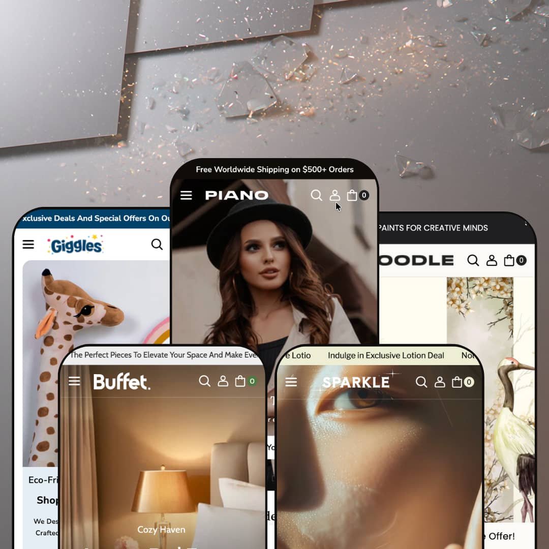
Most Shopify themes commit to one storefront personality and build everything around it. Piano takes the opposite bet: it ships five fully dressed verticals (fashion, beauty, toys, furniture, and wall art) under a single $160 license. Built on Online Store 2.0, it reads less like a theme than a five-in-one starter kit, and the real question is whether spreading that wide leaves any of the five feeling thin. I clicked through all five demos to find out.
Five storefronts, one license
If you're a small operator who flips between product lines, or an agency staging multiple client niches from a single purchase, the math here is unusual. One theme covers five businesses. Piano hands you fashion, beauty, toys, furniture, and wall-art demos that each arrive fully built rather than as token color swaps. For a solo founder testing which vertical to commit to, or a multi-brand shop running several storefronts on a tight tooling budget, that breadth removes the usual pressure to buy a separate theme per concept.
Mega menus that do real merchandising
The header navigation isn't a flat link list. Across every preset, the mega menu nests category columns alongside featured-product tiles, collection image cards, blog-post thumbnails, and in-menu promo blocks. That lets a shopper jump from a top-level "Shop" hover straight to a specific product or a styled collection without a single page load. For a catalog in the 100-to-500-SKU range split across many sub-categories, like a furniture store dividing living-room, dining, and home-office lines, that navigation depth carries a real share of the discovery load.
A featured-product block that works like a mini product page
Several presets drop a full product module right onto the homepage, and it's more capable than a typical spotlight. It earns its space. It carries a multi-image gallery with lightbox zoom, a working variant picker (color swatches in the furniture demo, Framed-or-Canvas buttons in the art demo), a quantity stepper, a live stock counter, and an expandable shipping-and-returns panel. For an impulse-leaning catalog with a clear hero product, say a single-SKU beauty launch or a seasonal toy headliner, that block compresses the route from landing to cart into one screen.
Three product-page layouts, not one
Tucked inside the theme's own feature menu are three distinct product templates: a default layout, a complementary-products layout, and a full-width-media layout. Pick the frame that fits. That's a genuine structural choice rather than a styling toggle, and it lets a store match the page to the product instead of forcing every item through one mold. A shop carrying both single-image wall prints and multi-angle furniture, or any mixed catalog where some products need spec-heavy pages and others need a clean editorial frame, can assign templates per product type.
Breadth comes at the cost of depth
Covering five verticals means none gets the specialist tooling a dedicated theme would build in. The section library is broad. There's no native subscription-and-replenishment flow for a skincare line selling refills, no true fit-and-size system for apparel beyond a basic size chart, and no room-dimension or AR tooling for furniture. For a subscription-driven beauty brand banking on repeat auto-ship buyers, or a wholesale-enabled furniture seller who needs spec-rich product data, the theme gets you a handsome storefront but hands the vertical-specific machinery back to you.
Social proof leans on apps
The testimonial blocks scattered through the demos, the star ratings and customer quotes, are static theme sections with fixed content. Verified product ratings still need a third-party app. They look like reviews, but none is wired to a real review engine. For a beauty or wall-art shop where buyer confidence rides on accumulated reviews, and where considered purchases hinge on what other customers said, that's an extra install and an extra subscription stacked on top of the theme price.
The default voice is loud
Out of the box, the presets sell hard. That suits a discount-driven shop. Countdown timers, animated stock counters, scrolling sale marquees, BOGO banners, and "limited time" urgency are wired into the staging before you touch a thing. For a premium single-brand label trying to read as restrained and considered, a lot of the launch work turns out to be subtraction rather than addition, peeling urgency widgets back out until the storefront stops shouting.
What it takes to launch
Expect a multi-day pass per chosen preset: replacing demo imagery and copy across hero slides, mega-menu promos, lookbooks, and testimonial blocks; resetting the demo's default currency and inventory states to your own; populating product metafields for any spec-driven sections; and trimming the dense default section stack down to the storefront you actually want.
-
What works in this preset
Land on the fashion demo and it moves like a lookbook. It reads as fashion. A three-slide editorial hero rotates through styled shots, a deep apparel mega menu fans out into tops, bottoms, dresses, and accessories, and product cards swap to a second image on hover. It's the most conventional of the five, and for womenswear that's no bad thing.
The cart drawer is where it quietly earns its keep. Checkout never makes you leave the page. It opens with a free-shipping progress bar, a cross-sell "You might like" row, and inline quantity controls, so the whole path to checkout stays inside one sliding panel.
Where it stumbles
Clothing is the most crowded category on Shopify, and this preset stages itself on imagery alone, leaning on slideshows and grids rather than the size-and-fit cues apparel shoppers hunt for. The theme's size chart exists, but the demo doesn't put it to work, so an apparel merchant will be wiring fit guidance, model measurements, and return-friendly sizing in themselves before launch.
-
What works in this preset
A full-width video hero is the first thing that loads, and for beauty that instinct is right. Beauty sells on motion. Skincare lives on texture, and the Sparkle demo opens with footage instead of a static banner, then layers in a "Most Loved in Makeup" carousel with quick-add and a curated testimonial wall beneath it.
The mega menu goes past links into a shoppable panel. The header sells, too. Its "Trending" column embeds live product tiles with prices while a "Blogs" column surfaces skincare articles, so the navigation doubles as a discovery surface for a routine-building shopper.
Where it stumbles
Beauty is exactly the vertical where the theme's before-and-after slider and its ingredient-and-usage fields should be front and center, yet the Sparkle demo deploys neither. Both are theme-wide capabilities, so the job is staging them rather than adding them: a skincare merchant will need to build out ingredient breakdowns, usage steps, and before-after results to match what beauty buyers actually scan for.
-
What works in this preset
This is the demo the others wish they were. Giggles is the most fully furnished of the five, stacking a shop-by-age image grid, a lookbook hotspot, an Instagram feed, a trust-badge row, and a featured product that pairs a countdown with a live stock count. If you want to see the theme running at full tilt, start here.
The cart adds an order-instructions notes field on top of the free-shipping bar and cross-sell row. It's a small touch that matters. For a toy shop fielding gift messages and personalization requests, that one field saves a support email down the line.
-
What works in this preset
Scrolling the furniture demo, I hit something the others don't have: a guided three-step "Find Perfect Furniture" selector that walks a shopper from décor to furniture to style. Furniture browses by room. It suits a category where people shop by space and aesthetic rather than by SKU, and a tabbed "Inspired Spaces" story section plus a deep product gallery round out a layout built for slow, considered browsing.
Product galleries here run deep. It shows the product from every angle. The accent chair carries twenty images with lightbox zoom alongside a five-way color swatch picker, and for high-consideration furniture where a buyer wants to see everything before committing, that gallery depth pulls real weight.
Where it stumbles
Furniture is a high-ticket, slow-consideration purchase, and at this price the theme stops short of the spec tooling the category leans on. There's no native dimension table, materials-and-care matrix, or side-by-side comparison view, so a furniture seller will be loading that detail into metafields and custom blocks themselves to answer the questions a $1,300 sofa raises.
-
What works in this preset
An artist-journal section anchors the art demo, profiling named makers with short bios beside their work. Art sells on story. It's a smart move for a category that trades on provenance as much as on the image, and a "Crafting on Canvas" editorial band plus a deal-of-the-day carousel with slider controls give the storefront a gallery-meets-shop rhythm.
I clicked into the homepage product module and found a Framed-or-Canvas style picker sitting beside the gallery and a stock count. It handles format choices cleanly. For a print shop selling the same artwork in several formats, that variant-on-the-front-page setup is exactly the right reach.
Where it stumbles
Art and prints live and die on size, yet the demo foregrounds format (framed versus canvas) without giving print dimensions equal billing. The theme's product options can carry size variants, so this is a staging decision rather than a ceiling: a print seller will want to surface dimensions as prominently as format before going live.
Capability parity, whichever vertical you pick
The quietly impressive thing across all five demos is that no preset is a stripped-down tier. You inherit the whole toolkit. The toys storefront and the beauty storefront draw from the same deep section library, and choosing wall art over fashion doesn't cost you the lookbook, the video sections, or the homepage product module. Whatever vertical you land on, the full kit comes with it.
Content marketing is wired in everywhere
Every preset treats the blog as a first-class surface rather than an afterthought. It's content-ready by default. Article thumbnails sit inside the mega menus, recent-post sections anchor the lower homepage, and several presets add editorial story blocks (an artist journal in the art demo, a crafted-stories panel in the furniture demo). A store that plans to publish for SEO has those surfaces ready to fill from day one.
Five designs, one skeleton
Read all five demos back to back and the sameness shows. The running order barely changes. Slideshow hero, collections grid, featured product, lookbook, testimonials, blog, newsletter, from fashion to furniture to art the skeleton holds, and the presets differentiate through imagery, color, and type far more than through layout architecture. "Five designs" is closer to one well-built design wearing five outfits.
Personality comes from your photos, not the theme
Because adaptability is the whole point, the layouts stay deliberately neutral, built to host whatever imagery you pour in. The upside is flexibility. The downside is that the theme doesn't stake out a strong art-directed identity of its own, so a storefront's visual personality ends up resting almost entirely on the quality of the merchant's own photography and styling.
★ 8.0/10
Rating
-
An unusually broad section library: deep mega menus, a homepage product module, lookbooks, video, countdown and stock-counter tooling, plus three product-page templates.
9
-
Standard Online Store 2.0 editing, but the dense demos make setup mostly re-staging and subtraction rather than a quick swap.
8
-
Dedicated mobile hero and lookbook assets appear across presets, and the menu collapses into a stacked slide-out pattern.
8
-
Homepages run long, with many sections, autoplay video, and large imagery; lazy-loading helps but the default stacks are heavy.
7
-
Five presets and three product templates draw from one shared section library; the demos deploy it differently, but the toolkit is the same everywhere.
8
Frequently Asked Questions
-
Pick whichever is structurally closest to your catalog and rebuild from there. Because all five share the same section library, you can repurpose the furniture preset for a homewares or appliance store, for example, without losing any tooling.
-
No. The demo currency is just the sample store's setting; your own store displays whatever currency you configure. You reset it during setup like any other demo default.
-
Yes, an age-verification gate is one of the theme's built-in features, useful if you sell anything with a minimum-age requirement.
-
Yes. The theme includes dedicated fields for ingredient or nutritional information and usage details, so consumable and skincare catalogs can present that data natively.
-
It includes pre-translated theme text for five EU languages (English, French, Italian, German, and Spanish). The actual language switching on your storefront is handled by Shopify Markets, not the theme itself.
-
Yes, a before/after slider is part of the merchandising kit, handy for skincare results, renovation shots, or any product where the transformation is the selling point.
This review is based on hands-on testing of the publicly available preset demos of the Piano Shopify theme as of May 31 2026. Theme features, preset availability, and performance can change with subsequent updates from the theme developer.