
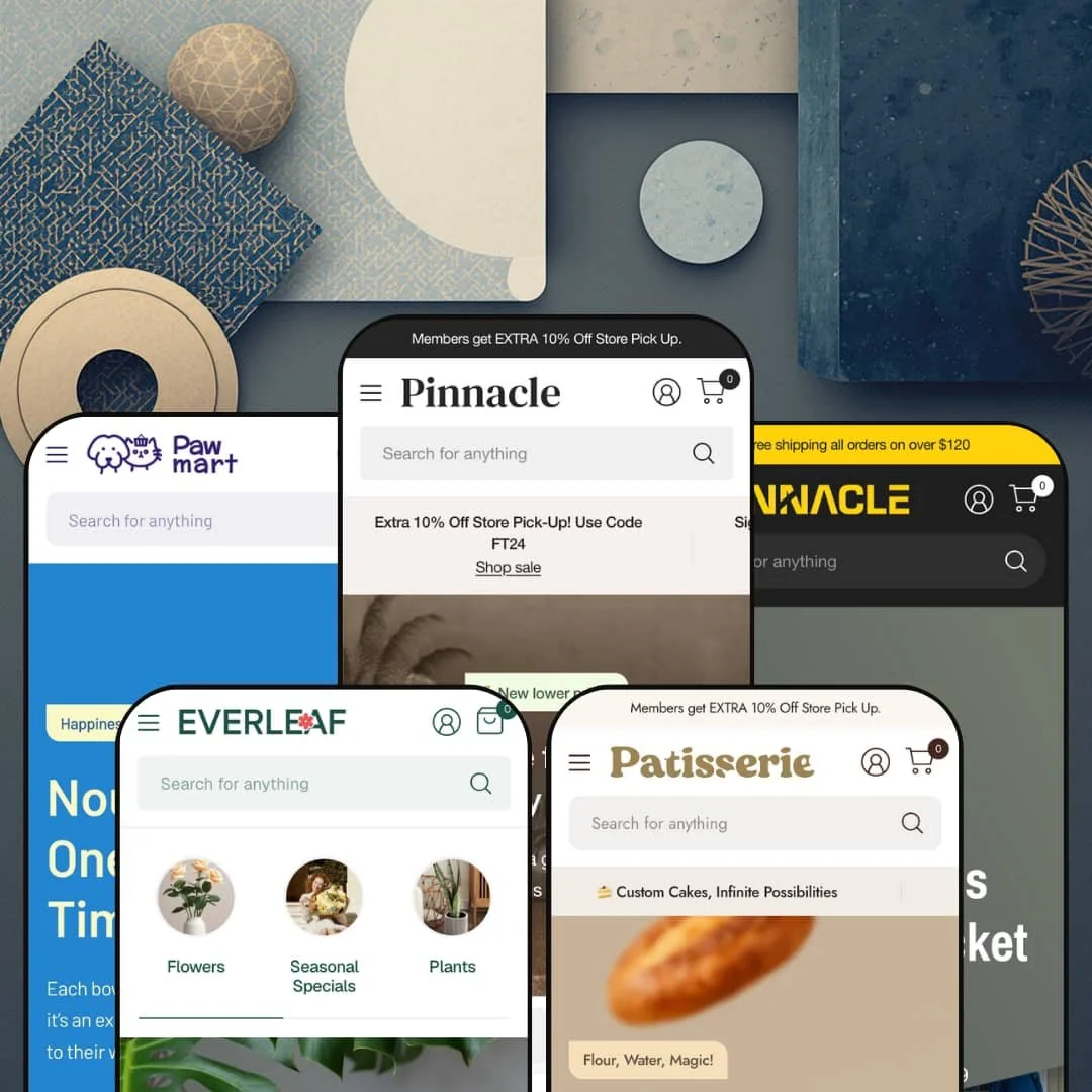
Most premium Shopify themes pick one vertical and build everything around it. Pinnacle takes the opposite bet, shipping five finished storefronts — furniture, hardware, pet, bakery, and florist — from a single Online Store 2.0 codebase. The question that follows you through every demo is whether one section library can serve catalogs this different without feeling stretched thin.
Variant-linked products that swap without a reload
Pinnacle ships combined listings natively: child products that share an option like color are linked, and selecting a variant swaps the page through the Section Rendering API with hover prefetching, so the transition lands instantly instead of triggering a full page reload. It feels instant. For a store that lists each colorway as its own product, a pattern common across furniture, apparel, and homeware, this stitches a fragmented catalog back into one coherent experience. Merchants with 50 to 200 SKUs and color-driven variants get the cleanest payoff.
For multi-category sellers, the building blocks come ready
If you run more than one kind of store under one roof, this is where Pinnacle earns its price. The range is the point. The section library spans 30-plus block-rich sections and four distinct mega-menu styles, enough raw material to build a furniture showroom and a brand-led tool shop from the same install without either looking like a compromise. Multi-brand operators and holding-company catalogs spanning several product types get the most from that breadth.
Food and consumable detail handled in the product layer
On the bakery preset, the product page carries an allergen field and a grain-type selector wired through product options, with an image-zoom gallery sitting alongside the detail. It belongs in the catalog. That puts ingredient and dietary information where a food shopper looks for it, without sending people to a separate page for something the catalog should carry. Bakeries and specialty-food sellers, along with beauty or supplement brands surfacing formulation detail on considered, repeat-purchase items, are the natural fit.
Editorial merchandising that suits lifestyle catalogs
One photo, many doors. The lookbook and image-hotspot sections pin several shoppable products onto a single styled photo, and they show up staged differently in furniture room-sets and in the florist's mood imagery, proving the section bends across very different aesthetics. For brands that sell a feeling before a product, this turns one hero image into multiple entry points without forcing everything into a grid. Home, decor, and plant or gift sellers leaning on aspirational photography will use these hardest.
The defaults are built to sell hard
Pinnacle's design language assumes you want urgency. Even Everleaf, the preset built to feel like a calm lifestyle magazine, still ships a countdown block and Buy-now promo tiles beneath its editorial imagery, which tells you the commercial motifs are baked in below the surface of every design rather than confined to the loud ones. For a luxury or minimalist single-brand store with a small, considered-purchase catalog, launching means subtraction: turning defaults off before turning anything on. Quiet is not its default.
Most of the engine assumes a real catalog behind it
The engine wants volume. The breadth that justifies the price, vendor-brand directories, multi-axis variants, and metafield-driven product detail, only switches on when a sizable, structured catalog feeds it with the tags and fields those sections expect. A single-product DTC brand or a store under roughly 20 SKUs will light up a fraction of the section library while paying the full premium-tier price for the rest. Single-hero-product sellers and tiny boutique catalogs are the clearest mismatch.
It is Online Store 2.0, not the newer block generation
Pinnacle is built on Online Store 2.0, the JSON-template generation, rather than the newer Theme Blocks architecture with its deeper nested-block composition. Few merchants reach that ceiling. In practice it means section-and-block customization tops out at the shallower nesting Online Store 2.0 allows, which most stores never hit but which agencies and long-horizon builders planning heavily bespoke layouts eventually will. At this price and in 2026, buyers comparing architecture generations should know which one they are getting.
What it takes to launch
Expect a multi-day pass before launch: a full copy and imagery sweep across hero, promos, and product detail; metafield population for allergen, spec, and ingredient fields; vendor and brand tagging for the directory sections; mega-menu staging; and a market and currency configuration step so the storefront reflects your regions rather than the demo defaults.
-
What works in this preset
Land on the furniture demo and the first thing you meet is a hero that doubles as a product finder, with Department, Category, and Type dropdowns stacked over the banner image. It is a lot of merchandising up top. Below it, a tabbed bestsellers block switches between Living Room, Dining, Home Decor, and Outdoor without reloading the page, and a row of media-grid promos pushes seasonal discounts in different sizes.
The mega menu is where this preset shows off. I clicked into Shop and found full category columns sitting beside a highlighted-products panel that pushes three side tables with live prices, the kind of in-menu promo that turns navigation into a second storefront. A "Product of the week" block lower down embeds a complete variant picker, Color and Material, with sold-out combinations greyed out, directly on the homepage.
Where it stumbles
Furniture is a considered purchase, and this homepage is built to move fast. It moves fast. The hero alone stacks a product-finder widget over the banner, and the page keeps layering sections well past the point where a sofa shopper has decided to slow down and compare carefully. The browsing rhythm a big-ticket buyer wants is the one thing the busiest preset doesn't give them.
-
What works in this preset
Hardware lives and dies by brand trust, and Bastion leans into it hard. The "Shop by Brand" section stacks Bosch, Dewalt, and Milwaukee as logo cards, each unfurling three linked products beneath it, so a contractor loyal to one battery system can navigate by manufacturer instead of category. That is the right call here. Quick view sits on every product card, which suits a buyer comparing six cordless drills without leaving the listing to click into each one separately.
A spec-callout strip runs through four tools with torque and motor figures, and a slideshow hero rotates two limited-stock promos. The depth is real. I noticed the brand mega menu splits into Cordless, Corded, and Outdoor columns, each one deep enough to act as a full category tree in its own right rather than a simple dropdown.
Where it stumbles
The spec-callout block is staged with marketing lines like "high-powered brushless motor" rather than the structured spec tables a tool buyer scans. The surface is there; the comparison data that would make it sing is left for the merchant to populate. For a hardware catalog, that is the difference between a banner and a buying aid.
-
What works in this preset
Pawmart is the playful one, and it wears it openly with emoji-led section headers and a Halloween promo strip. The tone is consistent. The brand mega menu organizes vendors into Food, Toys, and Supplies columns and tucks a "Purrfect Deals" promo image into the corner, so discovery stays visual rather than turning into a wall of text links. Category tiles carry live product counts, which quietly tells a shopper how deep each aisle goes.
A row of service icons covers grooming, delivery, vet care, training, and gifting near the footer. Vendor data does the work. I scrolled past a Featured Brands logo wall and a tabbed food-and-toys grid, both of them pulling from vendor tags rather than hand-built lists, which means the sections refill themselves as the catalog grows.
-
What works in this preset
"Flour, Water, Magic!" reads the first slide, and Patissiere commits to that warmth with a softer, slower layout than the others. It feels handmade. The header drops the mega menu for a single Cakes dropdown with a featured-product list, a quieter entry that fits a bakery's smaller catalog and unhurried browsing. A brand-story block scrolls "Delight in Every Bite" as a marquee under an ESTB. 1986 banner.
Lower down sits an embedded product block complete with an image-zoom gallery that opens a loaf to full screen. That is the bakery touch. I went looking for how a food preset earns its keep beyond pretty photos and found product options doing quiet work behind the styling, holding the kind of detail a shopper actually reads before buying something they will eat.
-
What works in this preset
Everleaf is the newest and most editorial of the five, and it reads like a lifestyle magazine that happens to sell plants. Calm is the point. A full-width video hero plays under "Wake Up to Natural Beauty," collection tiles replace a dense menu, and a testimonial wall stacks six customer quotes near the footer to carry the social proof. The commerce sits lighter here, with carousels of bouquets and a wedding-flowers editorial block doing the selling.
Product videos, the testimonial section, and the collection-tile navigation are all theme-wide pieces; Everleaf simply deploys them with restraint. Same parts, different voice. I clicked the video hero expecting an image and got motion instead, which is the clearest single signal of how far the same section library can bend toward mood when a brand wants atmosphere over urgency.
One toolkit that reads native in five different rooms
Seen back to back, the most quietly impressive thing about Pinnacle is consistency of character: the same components carry a furniture showroom, a tool shop, a pet store, a patisserie, and a florist without any one of them looking like a reskin of the rest. None of them feel recycled. The color and type tokens, the section spacing, and the card styling all bend to the vertical instead of stamping a single identity across all five, which is the real argument for buying breadth over a single-purpose theme.
Maintenance you can see in the component set
The cadence is current. The recent version history adds a mobile-menu parent-link setting, a toggle that suppresses empty collection sections so they cost nothing to render, and locale files for Korean, Polish, and European Portuguese with proper plural rules, the sort of upkeep that keeps a component set fresh rather than dated. For a store you plan to run for years, that trajectory matters as much as any single feature on the spec sheet.
The conversion toolkit is the same in every preset
Whichever design you start from, the merchandising muscle comes with it: quick view, product badges, a free-shipping progress bar, stock counters, and cross-sell blocks are theme-wide rather than bolted onto one demo. You choose an aesthetic without trading away commerce features. A merchant picking the calm florist preset gets the same conversion surfaces as one picking the maximalist furniture build, which means the design decision and the commerce decision stay separate.
Navigation is where the real work hides
The single heaviest setup surface across all five presets is the menu system. The map is on you. Each demo wires a different multi-tier structure, mega menu, brand columns, in-menu promos, and category trees, and getting from the demo's information architecture to your own catalog's is the longest pole in the launch tent. The theme hands you discovery power, then asks you to design the map yourself.
Every staged vertical sells a physical product
All five presets are physical-goods retail, and that is a quiet limitation once you notice it. It runs one way. There is no staged starting point for a service business, a digital-product seller, a booking-driven studio, or a subscription-first brand, so merchants outside physical retail inherit the section library with none of the vertical fit the demos hand everyone else.
★ 8.0/10
Rating
-
Combined listings, multi-axis variants, metafield-driven product detail, and a 30-plus section library cover almost every merchandising need without reaching for apps.
9
-
The power comes with weight; five presets, deep mega menus, and metafield wiring mean a real learning curve before the storefront matches the demo.
7
-
Dedicated mobile hero assets and a slide-out menu with a parent-link tap setting show mobile was designed, not adapted as an afterthought.
8
-
Lazy-loaded imagery and a restrained base help, but the busiest presets stack so many sections that the heaviest homepages carry real weight.
7
-
Five genuinely distinct verticals from one install, four mega-menu styles, and section staging that adapts its tokens per preset give unusual range.
9
Frequently Asked Questions
-
Start from the preset whose structure matches your catalog, not its theme. A brand-led catalog maps cleanly onto Bastion's vendor directory, a small image-driven range fits Patissiere or Everleaf, and a deep multi-category catalog fits the Pinnacle build.
-
No. Video sections and product video are theme-wide, and Everleaf just chooses to lead with one. You can drop the same video hero into any preset you start from.
-
A lot. The lookbooks, hero finders, and mood blocks assume strong, consistent imagery and look bare with placeholder shots, so budget for photography before launch.
-
No, that is a threshold you set, and the demo value is a placeholder. The free-shipping progress bar recalculates against whatever amount you configure.
-
A theme license covers a single store, so multiple storefronts need multiple licenses. What one purchase gives you is all five presets to choose between on that store.
-
Both are available, and the demos lean on quick view for fast browsing on the hardware and pet presets. For detail-heavy products you can send shoppers straight to the full page instead.
This review is based on hands-on testing of the publicly available preset demos of the Pinnacle Shopify theme as of May 30 2026. Theme features, preset availability, and performance can change with subsequent updates from the theme developer.