
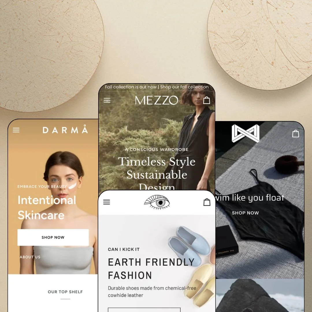
Most themes that launched in 2016 are coasting on maintenance updates. Pipeline spent the past year becoming one of the first themes to ship Shopify's nested blocks, folding five nested-block sections into a 40-plus section library on its Online Store 2.0 foundation. Groupthought's $360 family spreads its four presets across womenswear, footwear, skincare, and swimwear, with version 8.2.0 landing as recently as this August. The question is whether a nine-year-old codebase wears the new architecture naturally or like a retrofit.
Size selection happens on the card, not the product page
Product cards render the real size run as tappable buttons: XS through L on knitwear, half sizes from 7 to 12 on footwear, 90g or 18g jars on skincare. No modal, no detour. For a shopper who already knows her size, the distance between seeing a product and having it in the cart collapses to one tap, which is precisely where collection-page conversion gets won or lost. Apparel and footwear merchants with size-driven catalogs of 50 to 100+ SKUs and restock-driven or repeat-buyer sales patterns get the most out of this.
The cart drawer answers the shipping question early
Why do so many carts hide shipping costs until the final step? Pipeline's slide-out doesn't: it stacks a free-shipping progress bar, a seller-notes field, and a full shipping estimator with country, province, and postal-code inputs. Surprise fees kill carts. Putting the estimate at the moment of doubt, rather than two screens later, is the single most buyer-friendly decision in this theme, and it works identically whether the drawer is staged for cashmere or swimwear. Brands shipping internationally at mid-market price points to considered-purchase buyers should weigh this feature heavily.
Menus that merchandise instead of listing links
The mega menu accepts product tiles with working quick add, full-bleed collection imagery, and lookbook entries as first-class blocks, so a dropdown can close a sale before a page even loads. It turns navigation into shelf space. For multi-category stores with 100+ SKUs and cross-shop-heavy buyers who bounce between departments, that shelf space compounds on every single session.
A section library that's still growing in year nine
Forty-plus sections, five of them built on Shopify's nested-block architecture, and a changelog that added editor section categories and the new customer sign-in button in August 2026. That's rare longevity. Single-brand operations planning a multi-year build around evergreen sales patterns are buying active development here, not a preserved artifact, and the nested-block sections specifically allow layout depth that flat two-level sections can't reach.
The social proof is set dressing
Press-logo bars appear in three demos, the skincare build hand-types "Rated the #1 clean beauty skincare brand" and "Over 3000 trustpilot reviews" as plain copy, and no review engine anywhere collects, stores, or displays an actual customer rating. None of it is load-bearing. Every trust signal the demos flash is something you would rebuild with a review app and your own data, and until then the theme gives you presentation surfaces with nothing behind them. Skincare and beauty brands selling considered-purchase products, where reviews carry most of the buying decision, should budget for that gap before launch.
Deep color ranges become catalog administration
The flagship demo publishes its signature knit as fifteen separate colorway products, cross-linked so every product page lists the other fourteen and every card can announce "15 colors available". Those connections are merchant-maintained data. Each new colorway, rename, or discontinuation means touching the sibling links across the whole family, which stays manageable at ten styles and turns into genuine upkeep at a hundred. Apparel brands with 100+ SKU catalogs running seasonal or drop-model release calendars should plan ownership of that workflow before committing to the pattern.
Prose where structured data could be
This kept bugging me across all four demos: product depth is hand-typed rich text, with ingredient lists as paragraphs, fit notes as free copy, and routine steps as writing rather than data. Nothing is staged as reusable, structured fields. At $360, aimed at verticals where composition, ingredients, and care details repeat across dozens of near-identical products, a merchant maintains that entire layer by hand, and the absence of staged spec-table patterns that read from product data will be felt at every catalog update. Skincare and food-adjacent brands with 50+ SKUs and recurring regulated product details are the ones who'll notice.
What it takes to launch
Expect a multi-day pass across demo copy replacement, cross-preset brand naming, translation-string completion, filter-value and variant-data normalization, and promotional re-staging before any preset is launch-ready.
-
What works in this preset
Browsing the flagship demo feels like flipping through a lookbook that happens to be shoppable. Three named lookbooks, Fringe, Shoreside, and Wayfarer, run as standalone pages, feed the navigation, and resurface as homepage campaign blocks. A "Shop the look" strip goes further: it pairs a ribbon top, trousers, and suede ankle boots as one outfit, each with its own purchase path directly beneath the image.
One product-page detail made me sit up. "The fit" slideshow shows three models at 5'2", 5'5", and 5'10", each labeled with the size she's wearing, so a shopper can triangulate her own fit against real bodies instead of a flat chart. It's a small section. For knitwear, where drape and length decide returns, it carries a surprising share of the page's persuasion work, and the sizing modal beside the picker backs it up with hard measurements.
The buy area itself is disciplined. Icon rows state fabric composition, model height, and care in one glance, an accordion set holds description, care, and shipping copy, and a live stock line reads "Only 45 left in stock" under the size picker. Nothing screams. The urgency is factual rather than theatrical, which suits the price point of the staged catalog.
Where it stumbles
For a demo pitching timeless, always-wearable luxury, an unusual share of the homepage grids lead with sold-out knitwear, including pieces in the best-sellers row. Scarcity reads differently when it looks accidental.
-
What works in this preset
Petra answers a question I didn't expect a shoe demo to answer: what if the homepage just sold the product? A full buy module sits mid-page with a complete image gallery, thumbnail rail, the entire size run, and an add-to-cart button. No product page required. That's a genuine landing-page pattern for a single-hero release, and Petra stages it as casually as a banner.
The rest of the page reads like a magazine that takes orders. Editorial photographs carry embedded product pins, "Shop Black" and "Shop Terra," that open quick views without leaving the scroll, a press-logo bar and a factory-floor video handle credibility, and the layout stays airy throughout. I clicked through this demo well past the point of due diligence.
Card-level details fit the vertical. Savings render as concrete amounts, "Save $55" rather than a percentage, and the quick-add rail runs the full half-size range from 7 to 12, which is exactly the granularity footwear needs at the grid level.
Where it stumbles
The homepage buy module, the preset's boldest section, is staged with every size showing sold out or unavailable. The theme's best conversion argument demos in a state nobody can buy from, and that's a staging choice the preset didn't need to make.
-
What works in this preset
The badge vocabulary is the first thing worth stealing. Cards carry custom text labels reading "just added," "selling fast!", "back in stock," and "bestseller," which gives a skincare shelf merchandising states far beyond a generic sale sticker. Labels are short. Used across a 30-to-60 product catalog, they quietly answer the "what should I try first" question that stalls first-time skincare buyers.
Where Pahoa earns its vertical is routine storytelling. Numbered morning and evening routines walk step by step, each entry naming a product with how-to-use copy and a shop link, the product page adds "Helps with" chips for Brightening, Hydrating, and Soothing, and a Key Ingredients block pairs every ingredient with a what-it-does and why-it-works explanation. That structure sells regimens, not units, and regimens are where skincare margins live.
Navigation mirrors how people actually shop the category: a Skin Type branch splits Normal, Dry, Oily, Mature, and Sensitive alongside the product-type tree, and the product page runs a quantity stepper suited to repeat purchasing. Small adjustments, right vertical.
-
What works in this preset
Phantom is the only preset that raises its voice. An "Annual Fall Sale" countdown ticks down days, hours, and minutes above a full-width campaign image, and the cart drawer pins a discount code reminder right where the checkout button lives. As a template for a drop or seasonal sale event, the staging is coherent from banner to cart.
The near-black canvas is the actual feature. Swim photography glows against it, three-value swatch chips (Ink, Envy, Tartan) sit directly on cards, and a showroom section with a street address and opening hours signals that this brand exists off-screen too. The whole preset trades on contrast, and when the imagery is strong, the effect is striking in a way the lighter presets never attempt.
Where it stumbles
That canvas is also a commitment. Mediocre photography has nowhere to hide against near-black, and the preset's entire effect rises or falls with the depth and consistency of the image library a brand can actually feed it.
One grammar, four registers
The same card, cart, and menu machinery reads restrained in the womenswear demo, punchy in footwear, clinical in skincare, and moody in swim, and the difference comes almost entirely from color tokens, typography, and section ordering. That's the useful kind of flexibility. It means a rebrand or a second store is a re-skin, not a re-platform.
The four demos are the feature tour
Every preset draws on the same theme-wide library, but each demo chooses a different emphasis: editorial lookbook staging in one, homepage selling in another, regimen storytelling in the third, urgency in the fourth. Read together, they map far more of the theme than any single demo admits. A buyer who only opens the flagship will underestimate what they're purchasing.
The luxury pitch and the promo grammar pull apart
The listing positions Pipeline for luxury brands, yet three of four demos run discount codes, countdowns, or savings badges somewhere in the journey. A quiet, full-price brand can absolutely build here, but it will spend part of setup switching that voice off rather than turning anything on.
Photography is the price of entry
Image-tile menus, shoppable editorial spreads, lookbook pages, a near-black canvas: the architecture assumes a deep, art-directed image library across every preset. Thin photography will read thinner here than it would in plainer layouts, and no amount of section configuration compensates for it.
★ 8.0/10
Rating
-
Card-level size selection, homepage buy modules, an estimator-equipped cart, and a 40+ section library cover most of the conversion stack natively; the review layer is the visible gap.
8
-
Section categories in the editor (added in 8.2.0) and four ready registers speed staging; the colorway-linking and badge systems reward planning content before entering it.
8
-
Slide-out navigation collapses the deep menu trees cleanly, and on-card size buttons keep the purchase path short on small screens.
8
-
The demos run image-heavy by design, but lazy-loaded media and lean page construction keep browsing brisk across all four presets.
8
-
Four visibly distinct identities from one codebase, plus nested-block sections that permit layout depth flat sections can't.
8
Frequently Asked Questions
-
Five of Pipeline's sections use Shopify's newer nested-block architecture, letting you place blocks inside blocks instead of working within the flat two-level structure of standard Online Store 2.0 sections.
-
Yes. Pre-order is in the feature set, and the womenswear demo badges pre-order items directly on collection cards.
-
Storefront interface strings come pre-translated in English, French, Italian, German, and Spanish; translating your own product content remains your work.
-
Countdown timers, per-product stock counters, promo popups, and custom card badges like "selling fast!" all ship in the theme; the swim demo stages a full sale countdown above the fold.
-
Groupthought runs a dedicated documentation site at pipeline.groupthought.com, and the version notes on the Theme Store listing are current to August 2026.
-
The listing targets catalogs from 11 to 100+ products, and the menu and lookbook architecture keeps larger ranges navigable as long as someone curates the edits.
This review is based on hands-on testing of the publicly available preset demos of the Pipeline Shopify theme as of August 2026. Theme features, preset availability, and performance can change with subsequent updates from the theme developer.