
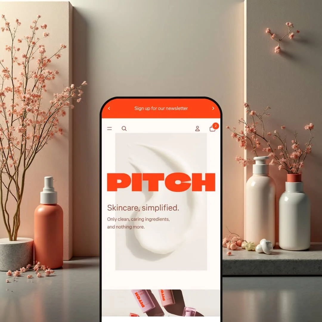
Pitch is a contemporary Shopify theme staged for beauty and personal-care brands that want a strong first impression without clutter. Opening the Default demo drops you into an oversize PITCH wordmark layered over a minimalist cream backdrop, with just enough texture to keep it from feeling flat. The first screen pairs a bold orange accent with soft neutrals and a clean serif hierarchy, which naturally pulls attention toward the primary navigation and the next scroll.
Pros.
〰️
Pros. 〰️
✚ Quick add that respects variant choice
Pitch’s quick-add flow is built for speed without guessing. Single-variant items can be added immediately, while products with options prompt a selection step rather than silently adding the wrong version. In practice, that makes browsing feel faster and more confident, because the theme doesn’t push shoppers into “fix it in the cart” behavior.
✚ Mega menu that supports visual browsing
The “Shop” navigation opens into a multi-column layout that mixes text links with large visual tiles for major categories like Skincare and Makeup. Mechanically, that reduces the number of clicks needed to reach a collection, and it also helps shoppers self-sort quickly based on what they’re actually here for. The result is a menu that feels more like a storefront map than a list of links.
✚ Search overlay that encourages fast pivots
Search opens in a full-screen overlay and surfaces results quickly, with additional cues like trending searches and a clear path to view a fuller results page. This kind of treatment matters because it keeps people in motion: searching doesn’t feel like “leaving the page,” it feels like a native part of browsing. For shoppers who already know what they want, it shortens the path to the right product.
✚ Blog and page layouts that feel finished
Pitch’s blog index and article pages are staged with large feature imagery, clear headings, and comfortable spacing. That same clean layout approach carries into informational pages like About. If content is part of your brand’s strategy, the theme’s presentation makes posts feel like an extension of the storefront rather than a bolted-on section.
✚ Cross-sell sections that blend into the shopping journey
Cross-sell modules show up in product contexts (like a “pairs well with” style slider) and in cart contexts, using the same product-card language as the rest of the site. The mechanic is simple, but the impact is meaningful: complementary items are presented as part of a routine, not as a pop-up interruption. That makes add-ons easier to consider without breaking the shopper’s flow.
Cons.
〰️
Cons. 〰️
🚫 No-results search still looks busy
When a query returns no matches, the interface communicates “No results found,” but unrelated products can still remain visible. The mechanic creates mixed signals, because the shopper is told there are no results while still being shown product cards. A cleaner empty state with clearer next steps would reduce confusion.
🚫 Blog posts don’t push sharing or continued reading
Blog articles are formatted cleanly, but they don’t naturally guide a reader to share the post or continue to another article. Without built-in sharing cues or related-post pathways, content can feel like a dead end. Merchants focused on content distribution will likely want to extend this with an app or customization.
🚫 Newsletter placement can feel repetitive in the demo
The newsletter sign-up block is highly visible and repeated across pages in the demo. The mechanic is familiar, but its prominence can start to feel heavy-handed if a shopper visits multiple pages in one session. For some stores, toning it down or making it less frequent would keep attention on products and content.
-
The Default preset is aimed squarely at modern skincare and makeup brands that want an editorial look with warmth. It blends warm oranges, deep reds, and soft pinks with large lifestyle photography, so the page feels like a campaign landing page rather than a product grid.
What works in this preset
The hero treatment is the clearest design decision in the entire preset. That oversized PITCH wordmark sits confidently across the first viewport, and the minimal cream background gives it room to breathe. Mechanically, it’s doing two things at once: establishing brand identity instantly and creating a clear visual “top” of the page that feels intentional.
The color system is also doing real work instead of just decorating the page. The orange accent reads as a functional cue for attention and action, while the softer neutrals keep the layout from feeling loud. Because the palette leans warm rather than stark, product photography tends to look inviting and “skin-forward,” which fits skincare and makeup especially well.
Typography stays clean and legible, with a clear hierarchy that supports quick scanning. Headings have enough size and spacing to feel premium, but body copy remains short and conversational. That combination makes the preset feel calm even when there are multiple sections stacked on the page.
Finally, the preset’s biggest “mechanic” is restraint. Large imagery and generous white space reduce visual noise, so the shopper’s focus naturally stays on the product story you’re trying to tell. For a curated line of serums, moisturizers, or cosmetics, that pacing can make the store feel more considered and less transactional.
Where it stumbles
The same boldness that makes Default memorable can also make it narrower in vibe. The warm, orange-forward direction is a strong stylistic choice, and brands aiming for a cool-toned clinical look or a minimal black-and-white aesthetic will spend more time rebalancing colors and swapping imagery to avoid fighting the preset’s mood.
Default also puts a lot of weight on photography. Because sections are spacious and image-led, inconsistent product images or weak lifestyle assets will show more than they would in a tighter, text-heavier layout. It’s not a dealbreaker, but it does raise the bar for visual consistency.
Niche Suitability
-
Brands selling skincare and makeup that want an editorial, campaign-style storefront. Default’s large imagery and warm palette work especially well when you’re telling a simple product story with a curated lineup.
Not Ideal For
-
Stores that want a utilitarian, information-dense presentation or that don’t have strong photography to support an image-led layout. If your brand needs a radically different visual mood, expect extra design work to get there.
Final Recommendation
-
Pitch is best for small-to-medium beauty brands that want an editorial storefront with fast browsing tools baked into the experience. If your product line is curated and your photos are strong, the theme’s spacing and visual hierarchy support a premium feel without making the shop complicated.
-
If you sell a very broad catalog that depends on dense, attribute-driven navigation, or if your brand needs a strictly utilitarian look, Pitch’s presentation may feel too style-led. Stores that need content-heavy layouts everywhere may also want a theme that pushes information density more aggressively.
-
Medium - the theme gives you a polished structure, but it rewards strong photography and thoughtful content. You’ll likely want small refinements to search and blog behaviors if those areas are central to your strategy.
★ 7.0/10
Rating
-
Strong shopping fundamentals like quick add, a visual mega menu, a rich search overlay, and built-in content templates. The main friction points are the busy no-results search state and lightweight blog engagement features.
6
-
The browsing experience is straightforward and feels guided, especially through navigation and search. A few presentation choices (like the demo’s repeated newsletter block) can be distracting without adjustment.
8
-
The layout uses clear hierarchy and generous spacing, and core flows rely on simple icon-led interactions. Nothing in the demo suggests the experience would be fragile on touch devices, assuming typical Shopify configuration.
8
-
Pages feel quick to move through, and interactive elements like quick add and search respond without noticeable lag during hands-on use.
8
-
You can change colors, fonts, and section order, but Default’s staged look is strongly warm-toned and image-led. Getting a radically different visual direction may take extra styling work.
6
FAQ
〰️
FAQ 〰️
-
👑 Yes. The Default demo is staged like a skincare and makeup brand, with an editorial hero and warm palette that suits serums, moisturizers, and cosmetics.
-
📱In general, Shopify themes are built to be responsive, and Pitch’s layout and spacing look designed for touch-first browsing. The overall interface relies on clear icons and roomy sections rather than tiny links.
-
🎨 The demo’s warm palette is just one styling direction. You can adjust colors, type, imagery, and section order to match your brand identity.
-
⚡ In hands-on use, pages and overlays respond quickly, and key interactions like quick add and search don’t feel sluggish. The browsing flow stays smooth because actions don’t constantly force full-page context changes.
-
👕 Yes. Product pages support options like color swatches and selectors, and the quick-add flow prompts option selection for products that need it instead of blindly adding a default variant.
-
🔎 You get Shopify’s standard SEO fields for titles and meta descriptions, and the theme’s blog layout makes it easy to publish readable content. For advanced schema or automated SEO workflows, an app is still the typical route.
-
💱 Yes. Pitch works with Shopify Markets for multi-currency and Shopify’s translation tools for multiple languages, with setup handled in your Shopify admin rather than inside the theme itself.
-
⚙️ Yes. Pitch follows common Shopify patterns for product pages and content templates, so typical integrations like reviews, subscriptions, and email capture tools should be compatible.
-
🛒 Yes. The live demo lets you explore the theme’s shopping flow and content layouts before purchase, and Shopify’s theme trial workflow allows testing in your own store setup before committing.
This review is based on hands-on testing of the publicly available preset demos of the Pitch Shopify theme as of 26 December 2025. Theme features, preset availability, and performance can change with subsequent updates from the theme developer.