
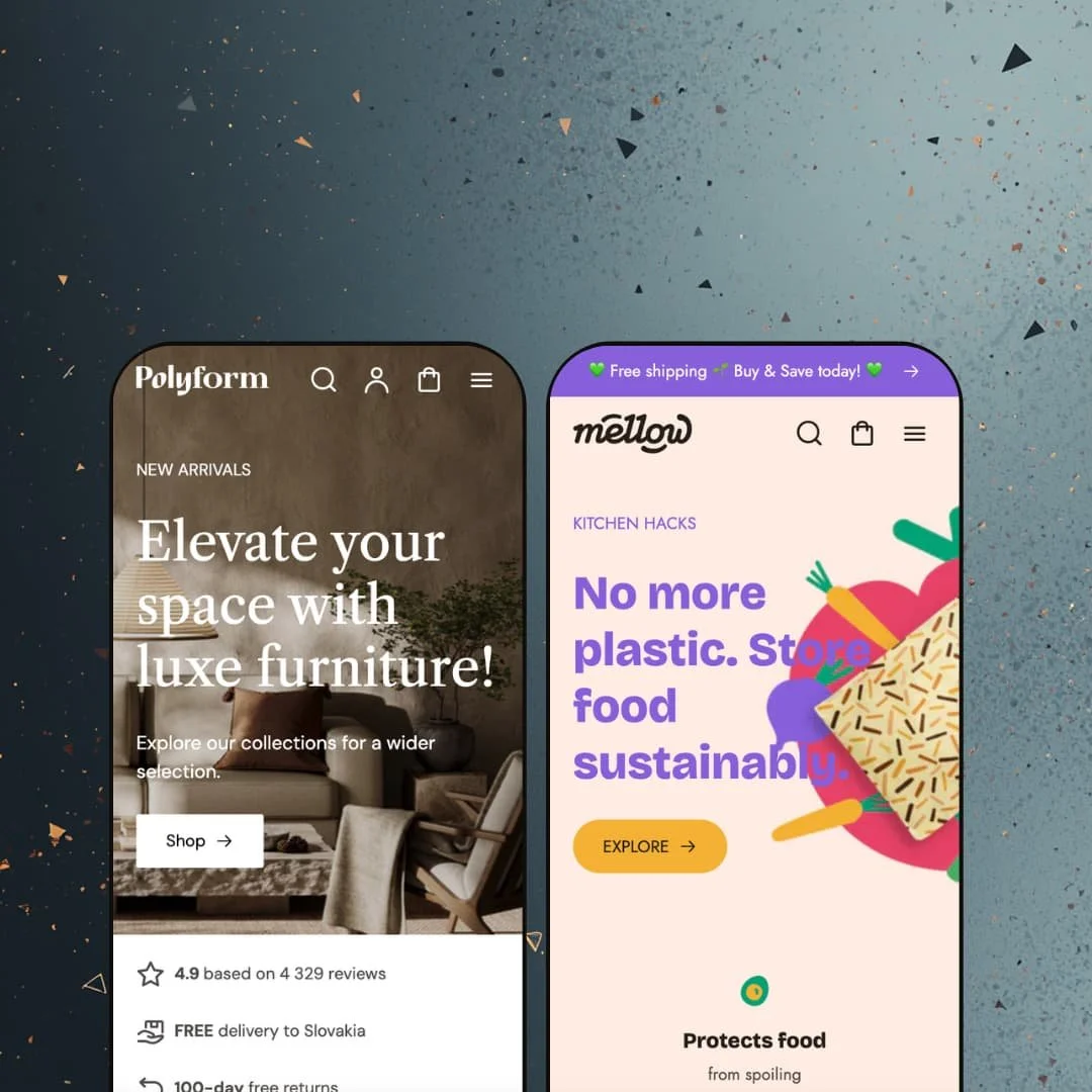
Most themes that promise to suit any catalog end up suiting none in particular. Polyform makes the opposite bet. Its two demos are so unalike that they read like separate products: one is a furniture showroom moving €1,800 sofas, the other an eco-kitchen shop selling €4 beeswax wraps by the multipack. For a $320 Online Store 2.0 theme, that range is the entire pitch, and I went into both demos to see whether it holds up or just spreads thin.
Real range, not a recolor
The same theme renders a furniture showroom and an eco-kitchen shop without either looking like the other in a recolored skin. Swatch-heavy €1,800 sofas and €4 beeswax multipacks each get a layout fitted to their economics, because the underlying sections reorganize instead of merely restyling. The library bends, not just the colors. For a merchant choosing one theme to cover a multi-brand operation spanning very different product types, that range is the reason to shortlist it.
Built for European selling out of the box
A brand selling into several European markets gets real groundwork here, not a token gesture. The theme ships pre-translated interface strings across English, French, Italian, German, and Spanish, renders a clean country and language selector in both demo headers, and includes right-to-left layout support. For a mid-market merchant whose customer base spans the EU and who would otherwise hand-build that header plumbing, it is a head start. The continental focus is baked in, not bolted on.
A product page that handles complicated variants
Both demos run the same product-page kit, and it holds up under real variant load. A furniture armchair shows image-based color swatches with per-variant in-stock and sold-out states, while a beeswax wrap stacks a size button group over a six-way color picker, with a thumbnail gallery and a size-table image alongside. The variant handling is the standout. Collapsible metafield accordions for dimensions, care, and shipping plus a product-level FAQ keep the detail from tipping into clutter. For catalogs with multi-axis variants and specification-heavy products such as furniture, apparel, or anything sized, that page earns its keep.
Storytelling sections that suit a slow sell
Polyform's section library leans editorial in a way that helps high-consideration catalogs. A before/after image section, lookbooks with shoppable hotspot links, hosted product video, press-logo testimonial rows, and image-with-text brand blocks all ship as theme sections, and both demos use them heavily. The point is persuasion. For considered-purchase brands (furniture, premium home goods, sustainability-led labels) where the buyer weighs the decision before clicking, those blocks do the convincing.
Two presets, and neither may be yours
Versatility has a cost, and here it is coverage. Polyform ships exactly two demos (furniture and eco-kitchen), so a merchant in apparel, jewelry, electronics, or beauty does not start from a near-match — they adapt a home or food base toward a vertical it was never built for. The flexibility is genuine. But you are buying a kit, not a finished room. For a small team hoping to launch fast in a vertical outside home or food, that gap is real adaptation work before go-live.
A thin review history
Polyform carries a perfect score on a very small sample: 100% positive across four Theme Store reviews. Four ratings, however glowing, do not tell you much about how the theme behaves across hundreds of edge-case catalogs or how support scales under load. For a risk-averse merchant making this their first paid theme, or anyone who weights peer validation heavily, the data is simply too sparse to lean on yet. It is not a red flag. It is an absence of signal.
The social proof is decoration until you build it
Both demos lean on credibility cues that are static content blocks rather than live data: benefit bars, a review-score counter, and a press-logo testimonial row. They are persuasive in the demo and empty on a fresh install, because the theme renders the trust UI while review capture itself stays app territory. The proof is a slot to fill. A first-time Shopify merchant comparing themes on demo polish should know the difference between staged credibility and a clean install before buying.
What it takes to launch
Expect a multi-day pass to replace demo copy and imagery across the hero and editorial blocks, populate the per-product metafields behind the dimensions, care, and shipping accordions, re-point the mega menu to your own collection structure, and stage real translations if you sell across the EU languages the theme supports.
-
What works in this preset
You land on the furniture demo and the navigation does the heavy lifting before you scroll. The Furniture mega menu splits into Categories, Shop by Room, and Shop by Collection, then drops two promotional image tiles into the same panel, one for a summer sale and one for a sustainability story. The header earns its space. Bigger furniture catalogs live or die on findability, and this layout treats discovery as the first job, not an afterthought.
The homepage stacks a countdown-timer section, a four-icon benefit bar, and a tabbed product picker that swaps between Sofas, Beds, Armchairs, Pouffes, and Rugs without a page reload. Each tab pulls a different collection into the same grid. For a showroom-style catalog with a handful of categories, that tabbed block is a tidy way to show range above the fold. It keeps the scroll short.
Then there is the storytelling layer. Editorial three-up blocks, a collection slideshow tagged Contemporary / Modern / Classic, and a press-logo testimonial row give the furniture brand room to sound established rather than transactional. These are the sections that make a considered-purchase catalog feel worth its price tag. A sofa that costs €1,800 sells on narrative.
Where it stumbles
For a theme sold on versatility, this preset commits hard to furniture. The room-based mega menu, the fabric-care accordion, the dimensions block — they are tuned for sofas and beds, not borrowed easily by a different store. A merchant outside the home vertical gets inspiration here, not a starting point they can keep. I came away seeing a furniture theme, not a universal one.
-
What works in this preset
What changes most between the two demos is rhythm. Mellow drops the multi-row furniture layout for a single full-bleed hero, a benefit bar built on eco claims, and a hosted product video showing the wraps in use. The product picker reappears here as pack-size tabs (Sets, Wraps, Bags, Gift Cards) instead of furniture categories. Same block, different job.
Product cards carry animated rollover images and color-swatch overflow indicators, so a multipack shows its pattern options before you click. The catalog is built on low-price, high-repeat consumables, and the grid is tuned for browsing volume rather than savoring single items. It moves fast. That suits an impulse-friendly, repeat-purchase basket.
I kept noticing how much editorial the eco vertical gets. A before/after section, a lookbook with shoppable hotspot links, a five-quote testimonial carousel, and image-with-text blocks carry the sustainability message between product rows. The eco angle sells on story. For a brand built on a behavior change rather than a single product, that content layer is the persuasion.
Where it stumbles
The flip side of all that storytelling is length. Mellow's homepage threads story blocks between every product row, which is lovely for a first-time visitor and slow for a repeat buyer who just wants to reorder wraps. A consumables shop lives on return visits. The editorial cadence is built for discovery, less for the regular who already knows what they want.
One toolkit, two genuinely different stores
Reading both demos back to back is what sells the theme. The mega menu restructures from room-based browsing in the furniture store to purpose-and-size browsing in the kitchen shop, and the same tabbed product block becomes category tabs in one preset and pack-size tabs in the other. That reconfiguration, not the color palette, is the real evidence that Polyform can carry unrelated catalogs. It is the rare versatility claim that the demos actually back up.
The feature list is actually deployed
Listing features is easy. Staging them is the harder part. Across these two demos, the substantive sections (before/after, lookbook hotspots, countdown, tabbed pickers, product video, product-level FAQ) all show up working, in context, doing a job rather than sitting idle on a spec sheet. The capability list and the live demos line up, which is not always a given.
Breadth bought at the price of depth
The same design philosophy that makes Polyform adaptable also keeps it general. Its sections are flexible containers, so vertical sharpness (a fashion fit-finder, a furniture room-planner, food subscription logic) is something you build on top rather than inherit. It is a canvas, not a costume. For a merchant in a specialized vertical, that means strong bones and a real tailoring job ahead.
The polish is proportional to the work you put in
Both demos are content-dense by design, which is where their appeal lives and also where the upkeep hides. The editorial blocks, hotspot lookbooks, and per-product accordions reward stores that keep feeding them fresh copy and imagery, so a thin catalog or a one-person team will feel the maintenance load over time. The theme rewards investment. It will not fake polish for you.
Rating
★ 8.0/10
-
A deep, genuinely deployed section set: before/after, lookbooks with hotspots, countdown, tabbed pickers, product video, and a product-level FAQ all appear staged and working across both demos.
9
-
Standard Online Store 2.0 JSON sections make editing approachable, but the content-dense layouts mean meaningful setup before the theme looks like its demos.
7
-
The mobile menu uses a back-button stacking pattern through the multi-level mega menu, and the product galleries and swatch pickers carry over cleanly to small screens.
8
-
Both homepages lazy-load imagery and keep their section counts in check, though the editorial density, rollover animations, and hosted video on the Mellow demo add weight.
7
-
The headline strength: the same section library reorganizes into two unrelated store identities, from a furniture showroom to an eco-kitchen shop, without reskinning artifacts.
9
Frequently Asked Questions
-
Start from whichever demo's catalog economics match yours, not the industry label. High-AOV, variant-heavy items map to the Polyform furniture preset; low-price, high-repeat, bundle-driven catalogs map to Mellow. You will re-point the navigation either way.
-
Yes. The beeswax wrap page runs a size button group above a six-way color swatch picker, with the gallery and a size-table image alongside, so two-axis variants render without a third-party add-on.
-
It can be, with a caveat. The mega menu, filtering, and tabbed pickers scale to deep catalogs, but the per-product accordions and editorial blocks mean more content to maintain per SKU as the catalog grows.
-
Theme-side, it ships pre-translated interface strings in five EU languages, renders the country and language selector in the header, and supports right-to-left layouts. The currency and language switching itself runs at the Shopify platform level, not from the theme.
-
Both are native theme sections. The furniture demo stages the countdown for a sale, and the Mellow demo uses the before/after image section in its wrap story, so neither needs an add-on.
-
No. It is an Online Store 2.0 theme with JSON templates and section editing, updated as recently as version 4.4.0, rather than a Horizon-era nested-blocks theme.
This review is based on hands-on testing of the publicly available preset demos of the Polyform Shopify theme as of June 6 2026. Theme features, preset availability, and performance can change with subsequent updates from the theme developer.