
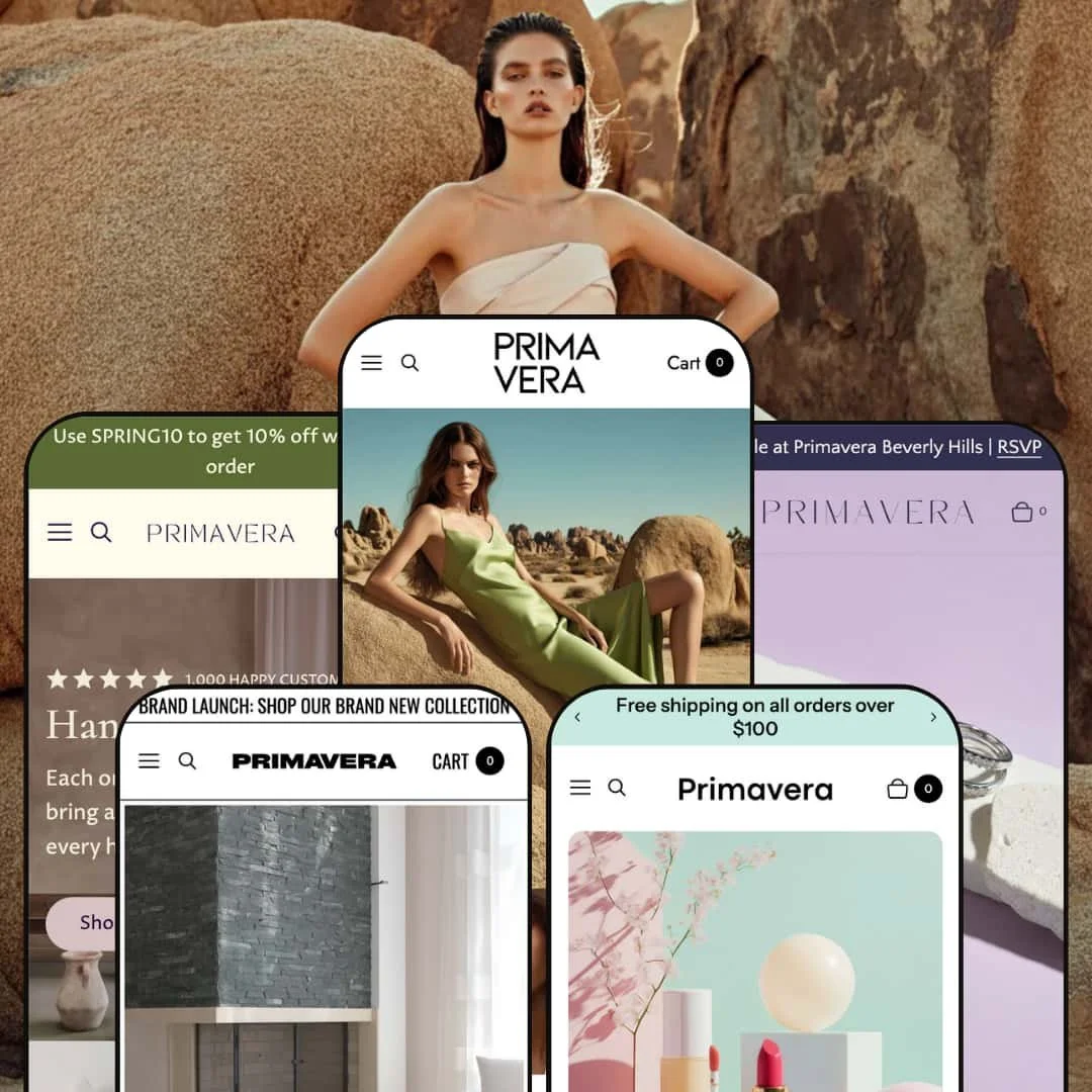
Primavera positions itself as a high‑end boutique theme built for jewellery, fashion, and cosmetics brands. Across its five presets (Default, Savoir, Gloss, Gala, and Composition), the theme delivers polished layouts with large imagery, subtle animations, and a strong emphasis on storytelling. During testing, I noted a consistent set of interactive modules, including image‑rich mega menus, slide‑out carts with upsell offers, variant‑aware quick‑add behavior, before/after sliders, and ingredient hotspot sections, suggesting Primavera is designed to support a wide range of product types and merchandising strategies.
Pros.
〰️
Pros. 〰️
✚ Flexible presets, consistent core
flexible preset options that maintain core functionality while offering distinct aesthetic approaches. The five demos cover jewellery, high‑fashion apparel, cosmetics, fine‑art storytelling, and home décor, and each one commits to a specific visual mood. For shoppers, that means the brand experience can feel highly tailored to the category, even when the underlying interaction patterns stay familiar across the theme.
✚ Polished storytelling layouts
Primavera’s presets are built around large imagery, restrained typography, and editorial pacing, which helps premium brands sell lifestyle and values, not just products. When the visuals do the heavy lifting, shoppers are more likely to browse as if they are reading a lookbook. That can increase trust and perceived quality, especially for higher‑consideration items.
✚ Variant‑aware quick add and quick view behavior
Across the demos, product cards use compact add controls that support both simple and multi‑variant products, opening a mini selection panel when options are required and adding directly when they are not. This keeps shoppers in the browsing flow instead of forcing a product‑page detour for every item. For stores with many variants, it can reduce friction at the exact moment a shopper decides to buy.
✚ Cart drawer upsells and threshold messaging
Primavera uses a slide‑out cart drawer that shows a running subtotal, a free‑shipping progress threshold, and upsells such as gift packaging, free gift boxes, or installation services. By keeping the cart visible without a full page change, it encourages shoppers to adjust quantities or add extras without losing context. This setup supports higher‑intent cart behavior while maintaining the theme’s premium tone.
✚ Merchandising modules for education and events
The theme includes interactive modules such as countdown timers, before/after sliders, and ingredient hotspots that can be used to sell benefits, results, or time‑limited moments. These tools help brands explain “why it matters” directly on key pages rather than relying on long blocks of text. For shoppers, that can make complex products feel easier to understand and more compelling to purchase.
✚ Visual navigation and guided search overlays
Primavera pairs image‑rich navigation with a full‑screen search overlay that surfaces popular searches and collections, then routes shoppers to dedicated results and no‑results states. This approach supports discovery without cluttering the header with too many options. The practical benefit is speed: shoppers can either browse visually or search quickly, depending on intent.
Cons.
〰️
Cons. 〰️
🚫 Subtle purchase triggers and inconsistent cues
Several demos rely on very small add controls that can be easy to miss, and misclicks can pull shoppers into a product page instead of the intended quick flow. There are also moments where an add action shows minimal feedback, such as a brief spinner with little context. For shoppers, that uncertainty can feel like the site did not register their action, which raises hesitation at checkout‑adjacent moments.
🚫 Pop‑up interruptions during first impressions
The newsletter pop‑up behavior is aggressive in the demos, appearing immediately and repeating until dismissed. That can disrupt the first scroll, especially for visitors who are still deciding whether the brand feels trustworthy. When the opening experience is interrupted, some shoppers will simply close the site rather than fight through overlays.
🚫 Heavy media can slow first loads on weak connections
Primavera’s look is built for high‑resolution photography, video sections, and interactive visual modules, and that weight can slow initial loading on poor connections. The draft testing notes also suggest limited support for low‑resolution loading placeholders and that caching strategies appear absent. For shoppers, the consequence is straightforward: the first impression can feel slower than the design warrants if the connection is not ideal.
🚫 Small‑screen layout quirks
While the theme generally maintains legibility on smaller screens, the demos show cases where spacing shifts or labels overlap when layouts reflow. Even small overlaps can erode the “premium” feeling that Primavera is aiming for. For mobile shoppers, these issues create friction not because the site is unusable, but because it stops feeling as polished as the desktop presentation.
-
The Default preset targets upscale jewellery brands and leans hard into a premium, gift‑ready mood. The landing hero balances a close‑up of rings against a portrait, then anchors the page with a single “Discover Collection” call to action that feels intentionally restrained.
What works in this preset
The opening hero is built like a jewellery campaign ad, not a generic storefront header. By pairing a tight product close‑up with a human portrait, Default signals “luxury” quickly, and it does so without piling on extra copy. That visual restraint suits shoppers who expect a refined boutique experience rather than a discount‑driven pitch.
Below the hero, Default shifts into a compact “Shop the collection” moment that feels curated rather than crowded. The early product presentation stays focused on a small set of items, which is a natural fit for jewellery lines that are designed to be browsed slowly. For shoppers, this can make the first scroll feel like a guided edit instead of an endless wall of options.
Category discovery is handled through mosaic‑style banners that point toward the core jewellery families (necklaces, earrings, rings, and bracelets). The grid‑like structure keeps the page moving and gives the impression of a carefully merchandised boutique floor. For a brand with a smaller range, this layout can reduce decision fatigue because the next step is always visually clear.
Default also mixes in editorial sections that highlight sustainability commitments and a journal preview. That kind of brand storytelling makes sense in jewellery, where buyers often want reassurance about values and craftsmanship before they commit. Even without adding more products on screen, these blocks give shoppers more reasons to trust the brand behind the pieces.
Where it stumbles
Default’s design prioritizes atmosphere and narrative pacing over fast scanning. Shoppers who want dense, list‑like browsing can end up doing more scrolling than they would in a utilitarian catalogue layout. That trade‑off is consistent with the preset’s boutique positioning, but it is still a real consideration for stores with wide assortments.
-
Savoir reimagines Primavera for high‑fashion apparel with a more dramatic, editorial tone. The hero pairs split imagery with a bold serif headline and a darker header treatment, creating the feel of a fashion magazine spread rather than a classic shopfront.
What works in this preset
Savoir’s first impression is all about contrast and mood. The darker header and split‑screen imagery immediately signal “fashion editorial,” which can help the brand feel more premium and intentional. For shoppers, that tone can make the storefront feel like a lookbook instead of a standard apparel grid.
The early “New In” presentation keeps the page focused on seasonal browsing. Dresses, scarves, and boots are surfaced quickly, so the shopper’s first scroll reinforces what the store sells. Even without heavy explanatory copy, the mix of product types makes the assortment feel styled, not merely stocked.
Savoir also leans into oversized visual blocks that encourage exploration of accessories and the broader range. Rather than forcing the shopper to decide between many small choices at once, it uses large imagery as a directional tool. That approach fits boutiques that want shoppers to browse outfits and vibes, not just item names.
A standout staging choice is the oversized, hero‑style feature built around a single garment (the Sequin Midi Dress in the demo). The layout treats one product like a headline story, which can work well for drops, best‑sellers, or “wear it now” campaigns. It reinforces a high‑fashion mindset where the product is presented as part of an editorial narrative.
The closing rhythm matters here too. Alternating lifestyle imagery and a repeating PRIMAVERA logo row give the page a runway‑show cadence, reinforcing the brand’s identity as the user scrolls. For boutiques, that kind of repetition can make the experience feel more cohesive and deliberate.
Where it stumbles
On the hero‑style product feature, the description sits below the fold, which adds friction for shoppers who want details before they commit to an item. That extra scroll is not a deal‑breaker, but it can slow decision‑making in apparel, where shoppers often check fit and fabric notes early. In practice, this means Savoir rewards browsers who enjoy the editorial pacing, while more utilitarian shoppers may feel delayed.
-
xGloss targets cosmetics and skincare, and its layout feels designed for “hero product” merchandising. The opening headline (“Beauty Essentials” in the demo) is paired with video and still imagery, then followed by horizontal storytelling that matches how beauty brands often sell routines and results.
What works in this preset
Gloss starts with motion and polish. By combining a video element with still photography, it creates a more dynamic first impression than a static hero alone. For beauty shoppers, that movement can reinforce the idea of texture, finish, and routine even before a product page is opened.
Immediately below, the “Our Philosophy” carousel introduces four featured products and frames them as the core of the brand’s lineup. The horizontal flow feels like a shelf or vanity tray, which is a natural fit for cosmetics merchandising. Labels like “Bestseller” or “SPF” help the featured items read like highlighted picks, not just random SKUs.
Gloss also leans into promotion and positioning with a dedicated banner offering 15% off All Makeup via a coupon code. The banner is paired with a horizontally scrolling strip of ethical promises (upcycled ingredients, vegan and cruelty‑free, recycled packaging), which keeps value statements in constant motion. That combination supports two common beauty goals at once: give shoppers a reason to act now and remind them why this brand is “better” than the default alternative.
Category icons for Face, Eyes, Lips, and Shop All provide a clean way to segment browsing. In cosmetics, shoppers often enter with a specific category in mind, and these icon‑based jumps can reduce the amount of scrolling needed to get oriented. The effect is a homepage that feels more like a curated counter with clear departments than a generic storefront.
Where it stumbles
Gloss includes moments where the interface can create mixed signals. The #PRIMAVERA gallery area uses quick‑add‑style icons over images that are not actually products, which can confuse visitors who expect every card to behave like a purchasable item. When a gallery looks shoppable but is not, shoppers can lose confidence in what is clickable and what is purely editorial.
The horizontal product carousel also relies on manual scrolling, and the lack of clear left or right arrows makes it easier to miss that more items exist off‑screen. That is a small usability gap, but it matters most when the carousel is positioned as a core merchandising moment. If shoppers do not realize it continues, they may treat the first visible products as the full selection and move on too quickly.
-
Gala (Artistry) evokes a fine‑art gallery experience, with full‑bleed artwork, minimal text, and a muted neutral palette that reads museum‑like. It is the most editorial of the presets, favoring ambience and pacing over a “shop first” feel.
What works in this preset
Gala’s hero is built to feel like an exhibition opening rather than a storefront banner. Full‑bleed artwork paired with sparse typography makes the page feel premium and quiet, which can be a strong match for brands selling art‑inspired collections. For shoppers, this can create a sense of discovery, as if they are being invited into a curated world rather than pushed toward immediate conversion.
As the user scrolls, Gala keeps the editorial tone by weaving stories and product moments together. Jewellery cards appear among large lifestyle images, which can make the storefront feel like an ongoing narrative instead of a product grid with decoration. That interspersing helps brands that sell on concept, not just on attributes.
The preset also introduces lifestyle categories (the Houseplants moment in the demo) without breaking the gallery vibe. The shift feels like a curated exhibit room rather than a hard navigation jump, which can keep the browsing experience cohesive. For a lifestyle brand, this makes it easier to present multiple product families under one artistic umbrella.
Gala includes a philanthropic “giving back” section, which reinforces brand identity and values. In a preset that already reads as premium and intentional, that kind of story block can feel credible rather than performative. For shoppers, it provides a narrative reason to choose the brand beyond pure aesthetics.
Where it stumbles
Navigation in Gala is intentionally minimal, which means shoppers may need to scroll extensively before they reach the products that match their intent. That slow reveal can be immersive, but it can also frustrate users who arrive with a specific item type in mind. If the shopper’s goal is “find and buy,” the preset’s “wander and absorb” pacing may feel like an obstacle.
The preset also blurs the line between editorial content and product content. When the difference is not obvious at a glance, shoppers can hesitate, especially if they are not sure whether they are reading a story or looking at something they can purchase. For brands that want more transactional clarity, this is the main trade‑off of the gallery approach.
-
Composition brings an editorial look to home décor and fine art prints, built around asymmetry, white space, and calm neutral tones. The hero uses an off‑center collage with an overlay card highlighting a featured item (Multi Dining Table and price in the demo), which immediately frames the page as curated interior storytelling.
What works in this preset
Composition’s asymmetrical collage hero is a clear staging signal. Instead of treating the header like a standard billboard, it layers interior scenes and then adds an overlay product card that feels like a magazine caption. For home décor shoppers, that “editorial spread” approach can increase perceived quality because it presents products as part of a styled environment.
The page continues with sectional layouts that mix product blocks with lifestyle photography of interiors. The rhythm is slow and deliberate, and the generous white space supports the calm, gallery‑like tone. This pacing suits décor shopping, where buyers often want to imagine how an item will live in a room rather than compare technical specs immediately.
Composition also uses curated “spotlight” moments that read like design features. Blocks such as the Bestsellers moment and the décor‑themed hero sections keep the page feeling like a guided tour of a collection. For brands with a strong point of view, this can help products feel intentionally selected rather than simply listed.
Deeper down, the demo introduces a video placeholder and then transitions into a “Latest collection” introduction with a Shop All call to action. A minimalist slider of artworks (including Two Dots Painting) continues the gallery tone and keeps the presentation uncluttered. That restraint can help art prints and décor feel premium by avoiding the visual noise that often comes with dense grids.
Throughout, the copy emphasizes craftsmanship and materiality, which matches the interior‑design positioning. When combined with the soft neutral palette, it creates a calm shopping environment that feels designed for browsing and inspiration. For the right brand, this is exactly the tone that supports higher‑consideration purchases.
Where it stumbles
Composition’s editorial styling is a commitment, and it will not suit every merchant. If the store’s priority is straightforward, fast purchasing, the magazine‑like pacing can feel like extra friction because it asks the shopper to scroll through story blocks before reaching the full assortment. This preset is best treated as a curated showroom, not a utilitarian storefront template.
Niche Suitability
Not Ideal For
-
Primavera is best for premium brands selling jewellery, fashion, cosmetics, art‑inspired collections, prints, or home décor who want storytelling, atmosphere, and curated pacing to be central to the experience. If your merchandising strategy relies on hero moments, education modules, and a boutique aesthetic, the theme’s design language supports that approach well.
-
Merchants with very large catalogues, wholesale or B2B needs, or stores that depend on rapid “scan and buy” behavior may find Primavera’s editorial pacing too slow. If your store wins on speed and density rather than ambience, you may want a theme that prioritizes utility over narrative flow.
-
Medium — Setup requires careful curation of imagery and copy to maintain the theme’s editorial look. Plan time to configure promotional and education modules and to test the quick‑add flow on your highest‑traffic products.
Final Recommendation
★ 7.6/10
Rating
-
rimavera integrates quick‑add purchasing flows, countdown sections, before/after sliders, and image‑rich navigation. Search and results states are presented cleanly, but the theme’s strongest demos lean into curated, editorial browsing rather than dense product listing.
8
-
Navigating and adding to cart is generally intuitive; however, subtle icons and pop‑ups may confuse first‑time users. Merchants will need to familiarize themselves with variant behaviors in the quick‑add flow.
7
-
The theme adapts well to smaller screens, maintaining legibility and preserving interactive elements like quick‑add and sliders. Some headings and hotspot labels overlap on smaller screens, but overall usability remains strong.
8
-
Page transitions and carts load quickly, yet heavy use of high‑resolution images, video backgrounds, and interactive visual modules can slow the first load on slower connections. Caching strategies appear absent.
7
-
The range of presets covers jewellery, fashion, beauty, art, and décor, and the theme editor likely offers extensive section options. Nevertheless, the overall look remains elegant and minimalistic, so brands seeking bold, unconventional layouts may need additional customization.
8
FAQ
〰️
FAQ 〰️
-
👑 Yes. The Default preset emphasizes fine jewellery with a luxury, image‑driven presentation and gift‑ready positioning, which suits high‑end accessories.
-
📱The mobile layouts maintain immersive imagery and interactive modules, and key purchase flows remain usable on smaller screens. Some hotspot labels and headings can overlap in tighter layouts, but the overall experience stays smooth.
-
🎨 Merchants can swap imagery, adjust colors, choose different preset layouts, and enable or disable sections such as countdown timers, upsells, and visual storytelling modules. Fonts and typographic hierarchy can also be customized.
-
⚡ Core pages load quickly and the cart drawer responds fast. However, heavy use of high‑resolution images, video backgrounds, and interactive visual modules can slow the first load, so optimizing assets is recommended.
-
👕 Yes. Quick add and quick view flows provide option selectors when variants exist, and simple products can be added without extra steps. The behavior is presented consistently across the demos.
-
🔎 The theme does not expose SEO settings directly in the demo, but its structured layout and clean navigation support technical SEO fundamentals. Merchants can add meta titles and descriptions through Shopify’s standard product and page fields.
-
💱 Yes. Multi‑language and multi‑currency are handled through Shopify Markets, and Primavera should display the appropriate selectors when Markets and the theme’s language or currency options are enabled. The demos simply did not have those switchers turned on.
-
⚙️ Yes. Primavera supports app blocks and common app embed patterns through the theme editor, which allows integration with reviews, subscriptions, and marketing tools.
-
🛒 You can preview the theme’s presets through live demos and explore the theme editor during a Shopify free trial. Purchases come with a single‑store license, allowing further testing before publishing.
This review is based on hands‑on testing of the publicly available preset demos of the Primavera Shopify theme as of 13 December 2025. Theme features, preset availability, and performance can change with subsequent updates from the theme developer.