
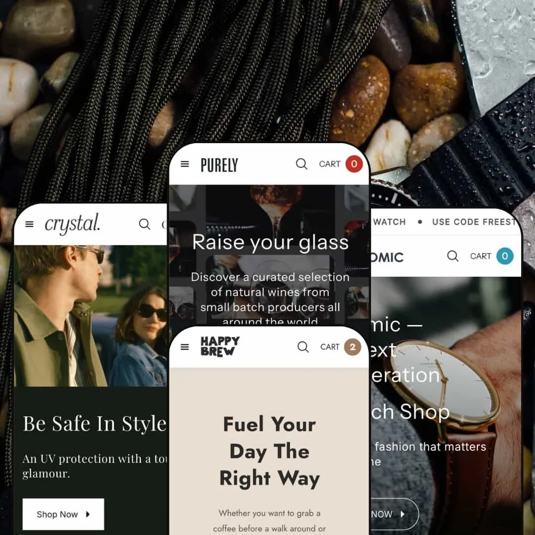
Purely is a visually led theme built around confident typography, generous spacing, and large product photography. The four demos feel meaningfully different on the surface, with each preset leaning into its niche through copy, imagery, and section sequencing. At the same time, the shopping mechanics presented in the demos feel consistent from preset to preset, which makes the overall experience easier to learn as a shopper. The result is a theme that prioritizes brand atmosphere first, then supports conversion with a cohesive set of purchase flows.
Pros.
〰️
Pros. 〰️
✚ Flexible presets, consistent core
flexible preset options that maintain core functionality while offering distinct aesthetic approaches. The demos show meaningful shifts in tone and merchandising voice without forcing shoppers to relearn the basics each time. This balance is especially valuable for merchants who want a niche‑fit look while keeping a familiar path to purchase.
✚ Quick-buy flow that consistently routes into a cart drawer
Across the demos, adding an item from shopping contexts repeatedly leads into a cart drawer rather than forcing a full page jump. The cart drawer presentation shown includes practical elements like quantity adjustment, item removal controls, a subtotal view, and a clear path to checkout or viewing the full cart. For shoppers, the impact is momentum: it keeps them oriented and encourages adding one more item without losing context.
✚ Cart drawer depth that supports upsells and notes without feeling separate
The cart drawer content shown in the demos goes beyond a simple item list and repeatedly includes structured add‑ons like “you may also like” suggestions alongside a space for order notes. This kind of cart design can support higher average order behavior by making add‑ons feel native to the checkout path. It also helps merchants who need customers to leave instructions without requiring a separate checkout step.
✚ Product page structure emphasizes clarity and follow-through
The demos repeatedly present product pages with clear purchasing controls, quantity adjustment, and secondary content that supports decision‑making. In multiple presets, the layout also introduces persistent buying affordances such as sticky add‑to‑cart behavior, which helps keep the primary action available as shoppers scroll. The shopper impact is straightforward: fewer “scroll back up” moments and a more guided path from curiosity to purchase.
✚ Media presentation supports closer inspection
In the demos, product imagery is presented in a way that encourages inspection, including a gallery layout with thumbnails and lightbox-style viewing when images are engaged. This is especially important for categories like accessories where finish, detail, and texture can drive confidence. It also reinforces the theme’s overall emphasis on visual persuasion.
Cons.
〰️
Cons. 〰️
🚫 No quick view modal is demonstrated in the demos
The draft testing consistently describes quick actions as adding to cart rather than opening a true quick view modal for product details. For shoppers, this means comparison browsing stays more “page-based,” especially when they need to verify details before committing. If your audience expects fast in-grid previewing, this is the biggest structural gap shown in the demos.
🚫 Visual-first pacing can reduce immediate product density
Purely’s demos consistently prioritize large imagery and editorial breathing room, and some presets lean into that more than others. The shopper impact is a slower ramp into pure catalog browsing, which can be great for brand-building but less ideal for speed shoppers. Merchants with very large assortments may need to be deliberate about how quickly they surface browsing entry points.
🚫 Some sections appear to load progressively during scroll
In the draft, certain sliders and content blocks are described as showing brief placeholder states as the page is scrolled. This is not presented as breakage, but it can create momentary visual friction when moving quickly through the homepage. For shoppers, the impact is minor but noticeable: a slightly less “instant” feel when scanning fast.
-
The Default demo is staged as a wine shop with a moody, premium tone built from dark backgrounds, bottle photography, and headline typography that reads as editorial rather than purely transactional. The first impression leans into celebration and occasion shopping, so the page feels like a curated tasting room more than a catalog.
What works in this preset
The hero presentation sets the tone immediately with wine imagery and a clear call to action that feels aligned with gifting and hosting. The copy and imagery work together to suggest “occasion-first” shopping, which can be helpful when the assortment is easier to choose by mood than by specification. That framing makes the homepage feel intentional rather than busy.
Category naming and merchandising cues reinforce the wine-store identity throughout the page. Sections like the “bestsellers” framing and the way products are presented as specific vintages keep the demo grounded in the category. Even without deep reading, the layout signals what kind of store this is and what kind of products you should expect.
The mid‑page lifestyle content emphasizes social settings and celebration, which fits the category and supports higher perceived value. That kind of staging can make even a small assortment feel like a complete brand world. If you sell products where taste and storytelling drive purchase, this preset’s tone supports that goal.
Where it stumbles
The darker, more atmospheric styling is opinionated, and it can feel heavy if your brand relies on bright clinical minimalism or playful color. If your products are best sold through crisp comparison shopping, the editorial mood may slow that down. This is less a flaw than a mismatch risk if your category demands speed and density.
-
Bean shifts the theme’s visual language into warm coffee culture, using café imagery and an inviting, earthy palette. The opening feels energetic and lifestyle‑forward, positioning the store around daily ritual and comfort rather than luxury ceremony.
What works in this preset
The collage‑like hero treatment and coffee photography create a strong “roaster” identity right away. Instead of presenting the store as a strict grid, the page reads more like a brand landing page, which can be effective when you want shoppers to buy into a vibe before choosing a product. The tone is friendly and accessible rather than formal.
Merchandising choices lean into coffee behaviors and routines, which helps the preset feel native to its niche. The demo’s product naming and framing reinforce that the assortment is meant to be explored as blends and origins, not just generic SKUs. That kind of staging supports discovery shopping and repeat purchasing patterns.
The overall page composition prioritizes lifestyle scenes and themed sections before it feels like a “catalog.” For brands that rely on story, that sequencing can make the store feel more premium and intentional. It also gives room for content and education to live alongside products.
Where it stumbles
Because the homepage is more editorial in how it presents the store, shoppers who arrive wanting an immediate wall of products may need one extra navigation step to get into pure browsing mode. If your acquisition strategy depends on landing directly on dense product listings, this homepage emphasis may feel indirect. The preset is strongest when you want to lead with brand mood first.
-
Sight presents Purely as a boutique eyewear store with a clean, contemporary feel and a noticeable green‑accent direction. The above‑the‑fold presentation reads as fashion‑oriented, with messaging designed to feel like a brand campaign rather than a department store.
What works in this preset
The hero messaging is direct and safety‑adjacent while still styled like fashion, which is a useful balance for eyewear. It communicates purpose without losing the boutique feel. That positioning can be helpful if you sell products that sit between function and style.
The homepage staging leans into how people actually shop eyewear, surfacing frame‑shape language early. Even as a demo choice, that framing makes the site feel tailored to the category rather than a generic storefront dressed in glasses. It’s a strong example of niche‑appropriate merchandising.
The social/community presentation is also foregrounded, reinforcing the idea of eyewear as identity and styling. That kind of staging can make the store feel current and brand‑led. It supports a shopping mindset closer to “pick a look” than “select a part number.”
Where it stumbles
The green‑accent direction and boutique cadence are specific, and they may not translate cleanly to brands that need a more rugged, sport‑performance tone. If your eyewear positioning is technical first, the fashion‑forward staging could feel too soft. This preset shines when style is part of the purchase motivation.
-
Atomic frames the theme as a modern watch shop with restrained luxury cues and a crisp, minimal brand voice. The homepage pacing is calm and showroom‑like, using clean whitespace and product‑forward photography to communicate precision.
What works in this preset
The first impression is confident but not loud, which fits watches and premium accessories. The design relies on clarity, product photography, and short statements rather than dense persuasion. That approach works when the product itself is meant to carry the story.
The demo’s brand world includes physical‑store language and location framing, which adds a showroom sensibility to the shopping experience. It makes the store feel like a real retail brand rather than a purely online catalog. For merchants with offline presence, this staging can be a useful pattern to emulate.
The content rhythm emphasizes craftsmanship and brand ethos, which aligns with higher‑consideration purchasing. Instead of rushing shoppers into comparison, the site encourages browsing and confidence building. That’s a good match for categories where trust and taste matter.
Where it stumbles
The restrained pacing and airy layout can feel almost too quiet if you’re selling high‑energy, feature‑heavy products that benefit from immediate spec callouts. If your brand is bold, sporty, or aggressively promotional, you may need a louder visual cadence than this preset’s default mood. It is best suited to premium understatement.
Niche Suitability
Not Ideal For
-
Purely is best for merchants who sell products that benefit from strong photography and brand atmosphere, and who want a cohesive shopping flow across multiple niche‑oriented presets. It fits boutiques and premium consumables especially well, where the store needs to feel curated rather than purely functional
-
If your store depends on dense comparison shopping or you rely heavily on quick preview modals to move shoppers through many SKUs, the demos suggest you may want a theme that foregrounds that behavior. Brands that are intensely spec‑driven or deal‑driven may also prefer a more information‑dense default layout.
-
Medium — The demos look polished out of the box, but the theme’s impact depends heavily on strong imagery and disciplined merchandising. Expect to spend time curating sections and copy so the editorial pacing supports shopping rather than delaying it.
Final Recommendation
★ 7.0/10
Rating
-
The draft demonstrates a consistent quick-buy path into a cart drawer and a product page structure designed to support purchase decisions, but it does not demonstrate a true quick view modal experience.
7
-
The demos present familiar patterns and a consistent path to purchase across presets, which reduces learning overhead for shoppers. The main effort is editorial setup rather than complex interaction.
7
-
This review is based on desktop demo behavior, but the UI patterns shown emphasize persistent actions and drawer-based flows that typically translate cleanly. The score reflects the clarity of the interaction model rather than a measured mobile audit.
7
-
In the draft, the demos appear responsive during browsing and purchase flows, with only minor mentions of progressive loading in certain sections. Nothing described suggests systemic slowdowns or broken interactions.
7
-
The four demos show substantially different visual identities while keeping the underlying shopping journey recognizable. That combination suggests strong flexibility for merchants who want niche alignment without rebuilding core behavior.
7
FAQ
〰️
FAQ 〰️
-
👑 Yes. The demos show clear niche staging: wine in Default, coffee in Bean, eyewear in Sight, and watches in Atomic. If your products benefit from strong imagery and a curated tone, the theme’s demo patterns translate naturally.
-
📱The draft testing focused on desktop demos, but the key interaction model described relies on direct purchase actions and drawer-based confirmation. In practice, merchants should still validate tap targets and scrolling behavior on real devices, but the interaction style shown is not inherently desktop‑only.
-
🎨 The demos demonstrate meaningful shifts in palette, imagery style, and merchandising voice without changing the fundamental shopping journey. That suggests the theme can support strong branding variation as long as you supply cohesive photography and consistent copy.
-
⚡ Based on the draft’s demo interactions, the theme feels responsive during browsing and add‑to‑cart flows. Some sections are described as loading progressively as you scroll, which may create brief placeholder moments, but it is not described as blocking shopping.
-
👕 The draft includes examples of products with variant-style selection behaviors in the coffee and eyewear demos. The product pages are described as presenting clear purchasing controls alongside selection interfaces where needed, supporting straightforward option picking before purchase.
-
🔎 The draft describes a storefront that includes standard informational and content-oriented pages and sections such as blog-style content blocks and structured navigation. As with any Shopify store, SEO outcomes will depend more on your product content, collection structure, and apps than on the demo’s surface styling alone.
-
💱 Languages and currencies are configured through Shopify Markets and your storefront settings, with the theme responsible for presenting the selector elements when you enable them. In other words, this is a configuration choice rather than a preset-specific feature claim, and you should plan to set it up in your theme header according to your markets.
-
⚙️ App behavior depends on how the app integrates, but the demos emphasize drawer-based cart flows and quick-buy behaviors. If you use apps that modify cart behavior, promotions, or checkout messaging, test them carefully with the cart drawer path described in the draft to ensure they behave as expected.
-
🛒 Yes. This review is based on publicly available demos for each preset, and those demos provide a practical preview of the shopping flow and styling direction. Merchants should still validate key flows in their own store context with their products and apps.
This review is based on hands‑on testing of the publicly available demos of the Purely Shopify theme as of 2025-12-10. Theme features, style availability, and performance can change with subsequent updates.