
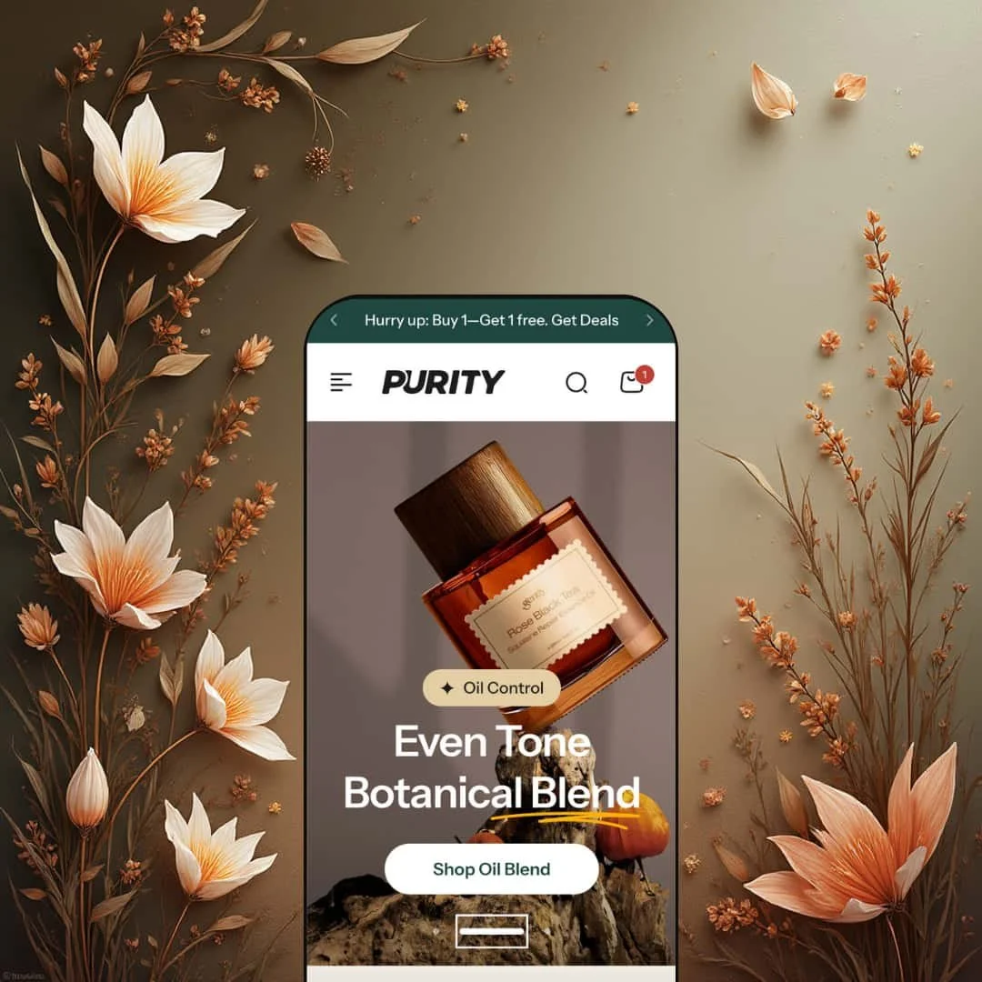
Purity is a premium, beauty-first Shopify theme that’s clearly built for brands selling skincare, cosmetics, and routine-driven products. In the Default demo, the look is polished and modern, with big photography and confident typography doing a lot of the heavy lifting. It feels more like a brand editorial than a bare-bones product catalog.
Pros.
〰️
Pros. 〰️
✚ Mega-menu navigation that supports discovery
Purity supports a multi-column mega-menu header with sub-categories and promotional imagery, as shown in the Default demo’s navigation. For shoppers, that’s a practical win because it reduces the number of clicks needed to move across routines, concerns, or product families. For merchants, it’s a way to keep a growing catalog organized without turning the header into an overwhelming list.
✚ Search overlay that stays focused on shopping
The demo’s search icon opens a slide-out overlay that surfaces suggestions and product results while shoppers type. When you move into the full search experience, results are separated into products, articles, and pages rather than mixed together. That structure is helpful for content-led beauty brands, because it lets shoppers land on the right type of result without breaking their browsing momentum.
✚ Quick add and quick view designed around variants
On product cards, single-variant items can be added directly, while multi-variant products push shoppers into a “Select Options” path that opens a quick-view modal. In that modal, shoppers can review images, pricing, variant swatches, quantity controls, and the Add to Cart and Buy Now actions. The practical benefit is speed: customers can confirm key details without leaving the collection or homepage context.
✚ Cart drawer incentives and a more detailed cart page
Purity uses a cart drawer that does more than simply list items. In the demo, it includes a free-shipping progress bar, a countdown timer, a discount code field, and upsell products, which turns the cart into an active persuasion step. For shoppers who prefer a full cart page, the theme also supports add-ons like gift wrap, a shipping estimator, special instructions, and a sticky order summary, which keeps checkout prep clearer on larger orders.
✚ Bundling and cross-sell tools built for routine shopping
Purity includes a Build Your Bundle flow where shoppers choose multiple items and add them as a discounted set, with a side cart showing totals and an “Add All to Cart” action. On product pages, cross-sell placements like “Pairs well with” and related suggestions reinforce the idea of buying a regimen rather than a single item. For beauty and skincare, that’s the kind of built-in merchandising that can raise order size without relying entirely on apps.
✚ Product and content templates that lean editorial
Product pages in the demo combine a full-screen lightbox gallery, benefit callouts, and collapsible accordions for product information, usage, and ingredients. A sticky add-to-cart bar stays present as shoppers scroll and can collapse down to an icon to keep the page less crowded. Beyond products, Purity also supports branded content pages like About Us and a Help Center with topic-based accordion FAQs, so the store doesn’t feel like it “changes voice” when shoppers leave the homepage.
Cons.
〰️
Cons. 〰️
🚫 Media-heavy pages can slow first impressions
In the Default demo, the homepage leans on large hero imagery, multiple sliders, and animated sections, and on slower connections the first screen briefly stayed blank before the hero appeared. That moment matters, because it’s the window where impatient visitors decide whether to stick around. Merchants will likely need to compress media and remove unused sections instead of copying the demo at full weight.
🚫 The bundle builder needs clearer guidance during selection
The bundle builder requires shoppers to pick at least three items, but the demo doesn’t clearly show a progress indicator as selections are made. Without that feedback, it’s easy for a first-time shopper to wonder why the “Add All to Cart” button remains disabled. The flow works once you understand it, but the initial “what am I missing?” moment is unnecessary friction.
🚫 Multi-variant quick add introduces a second step
For multi-variant products, shoppers hit “Select Options,” then choose a size or shade in a modal before adding to cart. That extra step is understandable, because variants need a selection, but it still slows down rapid browsing compared with single-variant items that add instantly. Merchants with shade-heavy catalogs should expect that difference and design product grids with it in mind.
🚫 A large section library can create clutter if not curated
Purity ships with a deep section set, and the Default demo uses a lot of it in one long homepage. The upside is flexibility, but the downside is that a “turn everything on” build can look busy and lose clarity. The theme reads best when the page is edited down to a smaller set of modules that support a single, obvious shopping path.
-
The Default preset is staged for contemporary skincare and cosmetics brands that want an editorial look without giving up on conversion basics. In the demo, the vibe is premium and minimal at first glance, then steadily more content-rich as you move down the page, which suits brands that sell on routine, education, and trust.
What works in this preset
The opening sequence is straightforward and sales-minded. You get a large hero image, a tight headline, and a clear call to action that quickly points shoppers toward a next step. It’s a clean “here’s what we do, here’s where to start” approach, rather than a hero that’s all mood and no direction.
Right under that, the demo uses icon-based value propositions to build confidence early. It’s the kind of placement that makes sense for skincare, where shoppers often want reassurance before they commit. In this preset staging, those trust cues appear before the homepage gets into deeper storytelling, which helps the page feel grounded.
The product merchandising also has more structure than a simple grid. In this demo, “Our Top Sellers” is handled as a multi-tab feature, and the products carry extra signals like ratings and badges. That combination reads as curated and intentional, which can make browsing feel faster because shoppers aren’t starting from a blank slate.
Purity’s promo blocks lean into an editorial rhythm, not just “banner, grid, banner, grid.” The collage-like moments and collection highlights break up the scroll and keep the page from feeling like a long spreadsheet of products. Used well, that variety can keep attention longer, especially for brands that rely on visual storytelling.
A lot of the demo’s personality comes from education-forward sections. The shade slider, community stories carousel, testimonials, and routine-builder-style content make the store feel like it’s guiding shoppers through a regimen. In this preset demo, those modules are staged as part of the main shopping journey, which fits categories where the “why” matters as much as the “what.”
Even the long-scroll practicality is handled with care in the demo staging. The announcement bar stays fixed, and there’s a floating back-to-top arrow that makes a section-heavy homepage easier to manage. Small touches like that don’t sell products directly, but they reduce friction when the page is doing a lot.
Where it stumbles
The Default demo throws a lot at the shopper in one continuous flow: products, promos, carousels, and story blocks stacked back-to-back. That can be impressive on first view, but it also makes hierarchy easier to lose if a merchant copies the demo’s density without trimming. When too many sections compete, shoppers may browse passively instead of following a clear path.
The more editorial modules add polish, but they also raise the “content commitment” for the store. If your catalog is simple or you sell a narrow range of products, this preset’s default pacing can feel like more narrative than you need. It works best when the merchant treats the demo as a toolkit and keeps only the sections that genuinely support the brand’s strongest messages.
Niche Suitability
-
Beauty, skincare, and wellness brands that want an upscale look paired with guided shopping. It’s especially strong for stores that rely on routines, ingredient education, and credibility cues, because the Default demo is staged to support that kind of journey.
Not Ideal For
-
Minimalist storefronts or merchants with a single-product catalog. The Default demo is designed to feel comprehensive and editorial, and that style can be overkill if your strategy is intentionally stripped-down and product-led.
-
Purity is a strong fit for beauty, skincare, and wellness merchants who want to combine storytelling with conversion tools like quick add, bundling, and cart upsells. If your brand relies on education, routines, and credibility cues, the theme’s module library is built to support that kind of shopping journey.
-
If your goal is an ultra-minimal storefront that stays lightweight and product-first with very little editorial content, Purity may be more structure than you want. Merchants selling a narrow catalog, especially a single hero product, may find a simpler theme easier to keep clean and fast.
-
High — Purity gives you a lot of sections and configurations, so a good build depends on restraint and thoughtful curation. The editor and ready-made blocks speed up setup, but the theme rewards planning rather than improvisation.
Final Recommendation
★ 7.8/10
Rating
-
Purity comes loaded with shopping and merchandising tools: mega menus, quick add and quick view, smart search behavior, bundle building, upsells, and dynamic carousel-style sections. It’s designed for stores that want to sell products and a routine at the same time
8
-
The editor feels approachable because so much is built as ready-to-use modules. The catch is volume: there are enough options that merchants will need time to learn what matters and what to cut.
7
-
In the demo, the experience translates well to smaller screens, with swipe-friendly carousels and a cart drawer flow that doesn’t feel cramped. Navigation behavior stays consistent, which helps on long, section-heavy pages.
7
-
The demo shows how quickly a media-rich homepage can feel heavier at first load. Once the page is up, interactions remain smooth, but merchants should treat image compression and section discipline as part of the build.
8
-
Purity’s variety of sections, plus its product-page layouts and editorial content templates, gives merchants a wide creative range without forcing them into custom development. It’s flexible, but it still maintains a cohesive premium look.
9
FAQ
〰️
FAQ 〰️
-
👑 Yes. The Default demo is clearly staged for skincare and cosmetics, with sections like a shade selector slider and routine-forward merchandising that suits brands selling more than a single item.
-
📱The mobile experience in the demo feels smooth and modern, with navigation that stays practical and carousels that are comfortable to swipe through. The cart drawer interactions also translate well on smaller screens.
-
🎨 Yes. Purity provides theme editor controls for typography, colour palettes, and section layouts, so you can reshape the look without custom code. You can also enable or disable modules depending on how editorial or minimal you want the storefront to feel.
-
⚡ Interactions like quick view and the cart drawer feel responsive once the page is loaded. The homepage can load heavier at first because it relies on large images and animated modules, so optimising media and trimming sections matters.
-
👕 Single-variant products can be added directly from product cards. Multi-variant items show “Select Options,” which opens a quick-view modal where shoppers pick size or shade before adding to cart.
-
🔎 Purity follows Shopify’s standard approach to SEO-friendly structure like headings and metadata. The theme also mentions elements like breadcrumb navigation and rich snippet support, but merchants still need strong content and image alt text to get the most out of SEO.
-
💱 Yes. This is handled through Shopify Markets, where you can enable multi-currency and multi-language settings. In the demo, the language and currency switcher icons are not visible by default, but they can be enabled through your store’s Markets configuration.
-
⚙️ In general, yes. Purity is designed to work with common Shopify apps, and its product and cart layouts are typical places where reviews, wishlists, and upsell apps integrate. As always, test any heavy third-party scripts because they can affect performance.
-
🛒 You can explore the theme through the official demo and install it from the Shopify Theme Store. Shopify also allows a trial period where you can customise a theme before paying, as long as you do not publish it.
This review reflects hands-on testing of Purity’s public demo in the Default preset on 7 January 2026. As with any Shopify theme, the demo, feature set, and performance can shift over time as the developer updates the product.