
Rad is a modern Shopify theme aimed at high‑end retailers. It uses bold typography, full‑width images and sliding panels to build immersive shopping experiences. Across its presets the theme shares several hallmark interactions, including a slide‑out cart drawer with cross‑sell suggestions and a search overlay that leads into an integrated results page, alongside quick‑add overlays, collapsible product tabs, and sticky navigation designed to keep customers browsing without feeling bounced between pages.
Pros.
〰️
Pros. 〰️
✚ Seamless buyer journey
Rad’s panel‑driven shopping flow keeps customers in context while they browse and buy. The slide‑out cart drawer supports edits like quantity changes and removals without a full page jump, and it can surface cross‑sell suggestions at the moment of intent. When quick‑add overlays are staged prominently, shoppers can move from grid discovery to cart with fewer interruptions, which can be especially helpful for variant‑heavy catalogs.
✚ Integrated search experience
Search is treated as a first‑class interaction rather than a small utility tucked into the corner. The overlay presentation matches the theme’s broader use of sliding panels, and the transition into a structured results view feels like a continuation of browsing. For shoppers, that consistency reduces hesitation and makes search feel natural even in visually minimal layouts.
✚ Adaptable navigation
Rad supports deep navigation structures that can be staged to match very different brand moods. The Default demo presents navigation as a sidebar with a multi‑column expansion, while Nine frames it as a full‑screen vertical menu with nested drawers. For merchants, this flexibility means you can keep the same underlying navigation ambition while changing how it feels to the shopper.
✚ Rich storytelling sections
Interactive and editorial sections are baked into how Rad is meant to be used. Lookbook‑style hotspots, campaign‑driven hero compositions, and slider‑based merchandising create a storefront that can sell a lifestyle, not just products. When paired with strong imagery, these sections build brand narrative without requiring walls of copy.
✚ Detailed product pages
Product pages are structured to support confident buying, especially for products where details matter. Variant controls, quantity adjustment, and collapsible tabs keep information accessible without overwhelming the page. Recommendation blocks and “you may also like” style merchandising extend sessions by giving shoppers clear next steps after they understand a product.
Cons.
〰️
Cons. 〰️
🚫 Incomplete out‑of‑the‑box staging
The demos show that some sections can look uneven if they are not fully populated. A lookbook‑style hotspot that opens into an empty state interrupts trust and makes the experience feel unfinished, even when the mechanism itself is strong. Merchants should treat interactive panels as “must configure” elements rather than assuming the default state is shopper‑ready.
🚫 Blog functionality is basic
Rad’s blog presentation can look polished, but the underlying engagement depth is limited compared with more content‑first themes. Posts do not surface built‑in engagement features such as comments or related‑post modules in the demo experience, which can reduce repeat reading behavior. Merchants leaning heavily on editorial marketing may need to supplement the content layer with additional structure or tools.
🚫 Reliance on visuals
Both presets are designed around high‑quality imagery, with large heroes, generous spacing, and minimal text in key areas. That can be a strength for premium brands, but it also raises the bar for photography and art direction. Without strong visuals, the same layouts can feel empty rather than elevated.
-
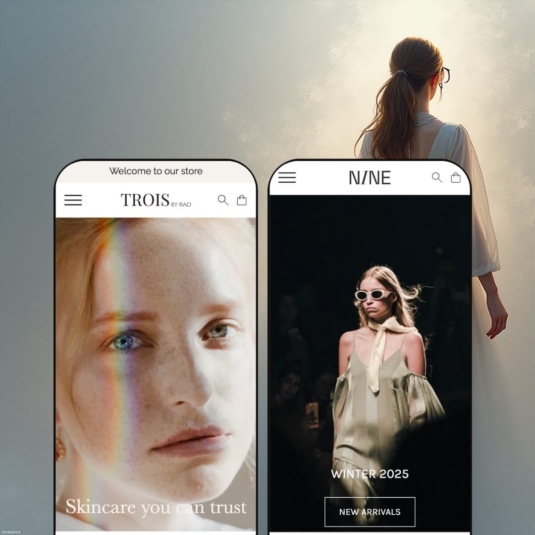
Rad’s Default preset targets beauty or wellness brands. The landing page pairs soft cream tones with high‑contrast typography and a prominent banner promoting a new collection, so the first impression feels calm but still premium. Navigation in this preset demo is staged as a vertical sidebar with deep category links, while secondary icons for cart, search, and account sit on the opposite side.
What works in this preset
In this preset demo, the collection grid is staged for shopping from the card rather than treating every product as a click‑through. Hovering over a product card for a short moment surfaces an overlay that lists size options alongside an Add to cart button. The result is a grid that feels immediately transactional, especially for shoppers who already know the variant they want. It also keeps the browsing rhythm intact because the decision point happens in the grid, not only on the product page.
The cart experience in this demo is framed as a right‑hand drawer that appears as soon as an item is added. The drawer surfaces product details, a quantity stepper, and a remove control, so shoppers can edit the cart without leaving what they were doing. Cross‑sell suggestions are presented inside the drawer, which nudges add‑ons at the exact moment of purchase intent. Because the main page stays visible behind the panel, the cart interaction reads like a continuation of browsing, not a detour.
Search is presented as an overlay interaction in this demo, keeping the storefront’s “panel‑first” rhythm consistent. Clicking the search icon opens the overlay, and typing a query carries you into a dedicated results view rather than dropping a small dropdown that feels disconnected. That staging makes search feel like a primary navigation path instead of a utility tucked into the header. It is especially aligned with the preset’s minimal hero copy, where discovery is expected to come from navigation and search, not long editorial blocks.
The Default demo also leans hard into a sidebar‑driven navigation mood. The “Shop” link expands into a multi‑column menu that lists collections and includes an image card, which reads as a lifestyle cue rather than a purely functional menu. Because the expanded navigation behaves like a slide‑out layer, the main page stays present and the experience avoids the “hard cut” feeling of full page navigation. Paired with the announcement bar and the fixed feel of the top UI, this demo keeps store controls accessible while still looking clean.
A standout staging element in this demo is the “Shop the look” hotspot treatment. A white dot overlay placed on a lifestyle image opens a panel intended to surface complementary products, which immediately signals a lookbook‑style shopping pattern. Even before you evaluate the specific products, the interaction tells shoppers that outfits or routines can be shopped as a set. For beauty and wellness brands, that can map naturally to bundles, routines, or multi‑step regimens.
Product pages in this demo are built with a “detail without clutter” approach. Variant selectors and a quantity stepper are staged as core controls, while collapsible tabs hold supporting information like details, how‑to guidance, and ingredients so the page stays scannable. Social share icons are present for shoppers who treat products as recommendations, not just purchases. A recommendation carousel and a “You may also like” section reinforce the preset’s preference for guided browsing rather than a single‑product dead end.
Where it stumbles
In this demo staging, the “Shop the look” hotspot opens into a panel that reads as unconfigured. The panel displays a message indicating there are no products to display, which interrupts the otherwise premium feel and can create a moment of uncertainty. The mechanism itself is compelling, but the empty state is shopper‑visible and makes the section feel unfinished if replicated without careful setup.
The content experience in this demo is less developed than the merchandising experience. The blog listing presents large image cards with minimal excerpts, which keeps the look consistent with the preset’s visual minimalism but can make posts feel light on substance at a glance. For merchants who rely on longer educational content, the presentation may require more intentional structuring so articles feel as “designed” as the storefront. As staged here, the blog reads more like a gallery feed than a journal built for deep reading.
-
The Nine preset is tailored for fashion and apparel retailers. It evokes a high‑fashion magazine with a black‑and‑white palette, runway imagery, and editorial layouts that prioritize mood over utility at first glance. A split hero section highlights seasonal campaigns, while a full‑screen vertical menu lists collections and thematic edits for a strong “catalog” feel.
What works in this preset
This preset demo opens with a runway‑style visual statement. The landing page features a full‑width slideshow and a horizontally scrolling product slider, with arrows used as the primary wayfinding cue. That staging encourages shoppers to browse as if they are flipping through a lookbook rather than scanning a standard homepage. It also supports campaign‑driven merchandising, where the story and the season lead, and products follow.
Nine’s demo presentation leans into editorial pacing throughout the page. Split banners, oversized headlines, and quote‑style call‑outs create the feeling of a fashion journal rather than a product directory. Sections like “Our Story” and ingredient‑style spotlights are staged to pull shoppers into brand narrative, even when the store is primarily selling physical products. The effect is that the homepage reads like a curated feature, not just a list of promotions.
On product pages in this demo, a sticky mini cart bar appears after you scroll past the main add‑to‑cart area. It surfaces price, quantity, and a ready add‑to‑cart control at the bottom of the screen, keeping purchase action within reach during long scroll sessions. This staging is particularly aligned with editorial product pages that mix imagery and details, because it reduces the need to scroll back up to commit. The shopper impact is a smoother path to checkout without flattening the page into a pure sales layout.
Navigation is presented here as a full‑screen vertical menu with depth. Selecting a top‑level item opens a drawer with sub‑collections and thematic groupings, which fits the “edits” concept common in fashion merchandising. The vertical menu itself becomes part of the visual identity, not just a tool, because it occupies meaningful screen space and reinforces the magazine‑like structure. For larger catalogs, this staged hierarchy can make the store feel organized even when the assortment is broad.
Search behavior in this demo keeps the same layered‑panel language used elsewhere. The search drawer slides over the page and returns you to a structured results grid that feels consistent with the rest of the experience. Because the UI treatment matches the navigation rhythm, shoppers do not need to learn a new pattern to switch from browsing to searching. The net effect is that discovery feels cohesive, even when the styling is intentionally dramatic.
The blog presence is also staged as part of the brand experience. “The Edit” page displays journal‑style articles with photography, tags, and a subscription call‑to‑action that reads like a fashion publication feature page. This supports stores that treat content as a marketing channel, not a secondary tab in the footer. In this demo, the blog is integrated into the aesthetic rather than feeling bolted on.
Where it stumbles
In this preset demo, product cards prioritize imagery and browsing cues over purchase controls. Hovering over cards reveals arrow icons to cycle through alternate images, but the staged interaction pushes shoppers into product pages before they can add items. That makes the grid feel elegant and editorial, but it also slows down high‑intent shopping when someone is trying to buy multiple SKUs quickly. The presentation is consistent with the magazine mood, yet it can introduce friction for utilitarian shoppers.
The preset’s impact is highly dependent on photography. The runway‑led hero and the editorial sections assume high‑quality images that can carry a page with minimal text support. If a merchant’s catalog lacks strong visuals, the same layout can feel sparse rather than premium. In this demo, image quality is doing a large share of the persuasion.
The vertical navigation and the density of editorial sections can push content lower on smaller screens. This is not an error so much as a structural consequence of giving navigation and story blocks significant visual weight. Merchants using a similar layout may need to think carefully about which message is truly above‑the‑fold for their audience. Otherwise, key product discovery moments can arrive later than expected.
The product slider in this demo relies on manual arrow navigation rather than advancing on its own. For shoppers who do not naturally interact with sliders, this can reduce how many products they see without extra effort. It is a small point, but it matters because the preset is using the slider as a core merchandising device. As staged here, it rewards active browsing more than passive discovery.
Niche Suitability
Not Ideal For
-
Rad is a strong fit for beauty, lifestyle, and fashion merchants who want a premium storefront that feels immersive, uses panel‑based shopping interactions, and leans into story‑driven merchandising. Brands with strong photography and a clear aesthetic will get the most out of the preset styling differences.
-
Stores that need a content‑heavy publication experience or want a highly utilitarian, grid‑first shopping flow as the default presentation may find Rad less aligned. Merchants without strong imagery may also struggle to achieve the same polish without significant creative effort.
-
Medium — The building blocks are strong, but the most compelling sections need deliberate configuration to avoid empty states and to keep navigation, storytelling blocks, and merchandising panels coherent. Achieving the intended premium feel also depends on curating high‑quality photography and maintaining consistent art direction across pages.
Final Recommendation
★ 7.0/10
Rating
-
Rad delivers a modern set of shopping interactions, including quick‑add overlays when staged, a slide‑out cart drawer with cross‑sell placement, deep menu structures, and editorial sections that support storytelling. The main drawback is that demo readiness is uneven, with certain interactive elements showing visible empty states if not configured.
6
-
Navigation patterns are clear once a shopper is in the flow, and the cart drawer keeps purchase actions close at hand. The theme relies on layered panels and rich sections, so merchants need to invest time in setup and content decisions to ensure the experience feels intentional rather than busy.
7
-
The slide‑out panels and sticky purchase controls translate cleanly to smaller screens in the demo experience. The main watch‑out is structural: large imagery and vertical navigation choices can push key content lower, so cropping and section pacing matter more than in minimalist themes.
8
-
Animations and panel transitions are smooth in the demos. Load time and perceived speed will largely depend on image optimization and how many large hero assets and slides are staged on the homepage.
8
-
Rad offers numerous configurable sections such as sliders, story blocks, and lookbook‑style components. Merchants can adjust typography, colors, and layout choices, but the overall design language is distinctly modern‑luxury, so extreme stylistic pivots may feel less cohesive.
6
FAQ
〰️
FAQ 〰️
-
👑 Yes. The Default demo’s neutral palette and clean product framing are well suited to serums, creams, and other small goods where photography needs room to breathe. When the quick‑add overlay is emphasized, it also supports variant‑based buying without forcing every shopper into a product page first.
-
📱Yes. The core interactions shown in the demos, including slide‑out panels and sticky purchase controls, remain usable on smaller screens. The biggest mobile consideration is visual: the Nine demo’s large hero imagery benefits from careful cropping so the campaign message stays clear.
-
🎨 Merchants can modify colors, typography, imagery, and section order through the theme editor. Both demos show story‑driven blocks and lookbook‑style components that can be rearranged to fit a brand narrative. The default direction leans modern luxury, so big tonal shifts may require more careful design choices to keep cohesion.
-
⚡ Panel transitions and animations appear smooth in hands‑on demo use. Real‑world speed will depend heavily on image sizes and the number of large hero assets and slides a merchant chooses to stage. Compressing photography and being selective with sliders will help maintain snappy browsing.
-
👕 Yes. Product pages include clear variant selectors and quantity controls, which helps shoppers configure items without confusion. The Default demo also stages variant selection inside the quick‑add overlay, allowing size choice before adding to cart when that shopping pattern is desired.
-
🔎 Rad does not introduce specialized SEO tooling, so optimization relies on how a merchant structures pages and content. The theme’s clean sectioning and structured layouts support straightforward page organization for search engines. For most stores, the practical SEO work will still be writing strong titles, descriptions, and image text.
-
💱 Yes. Languages and currencies are handled through Shopify’s native multi‑language and multi‑currency setup, so Rad is compatible with Shopify Markets configurations. Any language or currency switcher presentation is a configuration choice, not a preset limitation.
-
⚙️ Yes. Rad is designed to work alongside Shopify apps in the normal way. The slide‑out cart and panel behaviors are theme features, and additional apps like reviews or subscriptions can be layered on as needed. As always, merchants should sanity‑check how any app’s UI fits the theme’s panel‑based patterns.
-
🛒 You can preview theme demos before committing, and Rad provides preset demos to show how Default and Nine look and behave. The demo links included in the preset sections above are the most direct way to evaluate the staging choices. If you are comparing presets, focus on which presentation style best matches your catalog and content plan.
This review is based on hands‑on testing of the publicly available preset demos of the Rad Shopify theme as of January 6, 2026. Theme features, preset availability and performance can change with subsequent updates from the theme developer.