
Most premium Shopify themes ship three color variations of one niche. Redefine ships three different niches. Built on Online Store 2.0 by Hanoi-based Xotiny and priced at $320, the theme bundles a home-goods preset, a beauty preset, and a stationery preset into one purchase, three industries sharing the same engine. Whether that's brilliant range or three half-themes wearing one badge is what this review settles.
Three-industry positioning in one license
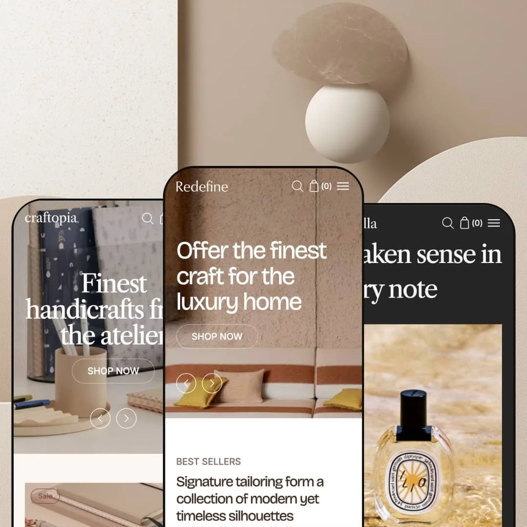
Redefine's central pitch is that the three presets cover three different verticals (home goods as Redefine, beauty as Scentella, stationery as Binderia) rather than three color schemes of one niche. For agencies building stores across multiple client industries, or for merchants operating multi-brand portfolios across one Shopify Plus organization, that's a real licensing efficiency. The trade-off, worth naming up front, is that no single preset is the deepest implementation in its category; vertical-specialist themes will outclass any one of the three on niche-specific merchandising. For generalists, the breadth wins; for vertical leaders, it doesn't.
Cart layer built as a system, not a default
The cart in Redefine is configured rather than declared. Merchants pick drawer, full page, or popup as the cart experience; the cart page (if chosen) is built with the same section library as any other page, so cross-sells, trust banners, and Custom Liquid blocks all drop in; the free shipping progress bar is wired into Theme Settings with a single threshold input; and the cart drawer carries notes, discount codes, and a shipping calculator natively. For brands selling small-ticket items where average order value uplift matters more than basket size, this is the kind of cart layer that usually requires installing two or three apps to assemble.
Mega menu with three layout types and content-rich blocks
The header mega menu carries three distinct structural types, and each accepts product blocks, collection blocks, promotional imagery, and linked CTAs. That's enough to merchandise inside navigation, not just route shoppers around it. A "New for Autumn" product tile sitting alongside category links, or a campaign banner sharing the panel with collection routing, both ship without app dependencies. For brands that treat the header as a top-of-funnel conversion surface, this is the right toolkit.
Native conversion features instead of an app stack
For PDP-heavy brands where conversion lives in the gallery and the buy button, the product page ships the right native pieces: a stacked or carousel gallery (the stacked variant auto-scrolls when a variant is selected), a sticky add-to-cart bar added in version 1.2, a wishlist toggle on product cards also added in version 1.2, a complementary-products block, and swatch filtering on the collection page. None of these need a separate app. Brands wanting subscription billing, advanced loyalty mechanics, or deep review-and-rating UGC will still reach for apps, but the everyday conversion stack sits in the theme.
Three presets at a Premium price point where competitors typically ship more
At $320, Redefine sits in the Premium tier, where comparable themes in the same price band typically ship four to six preset variations. Three is on the lower end. For merchants wanting to preview multiple visual directions inside their chosen industry before committing, the absence of in-vertical variants (say, a second beauty preset with a different palette alongside Scentella) will feel constraining from setup onward. The three-industry strategy is itself the trade-off: range across verticals instead of depth within one.
Mega menu assignment relies on position numbers
The documented setup pattern asks merchants to assign a mega menu to a navigation link by entering the link's position number into the Menu Assignment Location setting. Reorder your top navigation and you have to remember to update that position number too. For agencies handing stores off to merchant teams who will iterate on menu order without thinking about hidden dependencies, that's the kind of fiddly coupling that breaks navigation silently a month after launch.
Classic customer accounts only
The customer-account template structure (Customer account, Customer addresses, Customer login, Customer register, Customer reset password) is the classic Shopify accounts UI rather than the newer customer-accounts experience Shopify rolled out for order tracking, account-side apps, and B2B routing. For merchants planning loyalty programs, repeat-buyer journeys, or any account-page personalization downstream, this is a door the theme leaves closed.
Limited merchant review history at a Premium price
Eighteen months after launch, the Theme Store carries five reviews on Redefine. All five are positive, which is genuinely good, but the sample is small relative to the $320 commitment. Buyers leaning on social proof to validate a Premium-tier purchase should weigh the thinner review history accordingly, particularly when other themes at this price tier carry hundreds of reviews each.
What it takes to launch
Pick your one preset (home, beauty, or stationery) and budget time to replace the demo product copy, the FAQ entries, the About-page narrative (Redefine ships three About templates to choose from), and the mega menu staging. The position-number assignment for the mega menu means double-checking the navigation order after any menu reshuffle. If you're using the Stacked product gallery, populate variant images per color or scent so the auto-scroll behavior surfaces the right shot when shoppers swap variants.
-
What works in this preset
The Redefine preset itself is the home-goods staging, image-led, gallery-first, with lookbook and hotspot sections doing genuine merchandising work. I scrolled through it and the editorial register is consistent: large-format imagery, generous whitespace, and a sidebar menu that sits as a static section rather than collapsing into a hamburger. For home-decor brands selling rugs, ceramics, lighting, and soft goods, the framework fits without much wrestling.
What lifts this preset above generic home-goods staging is the merchandising stack underneath the hero. Featured collection blocks, testimonials, image-with-text-overlay, image hotspot, and video sections are all available, and the demo wires several of them into one continuous editorial flow. The mega menu in this preset uses one of three available layout types, with product blocks and a promotional image column merchandising inside the navigation itself.
Where it stumbles
The framework leans hard on photography. Merchants showing up with mid-tier product shots will watch the editorial register flatten fast, because the staging is built to amplify image quality rather than compensate for it.
-
What works in this preset
Scentella is the beauty and fragrance preset, and it leans where you'd expect: softer palette, ingredient-driven product information, and the merchandising rhythm that perfume and skincare brands typically need. The "Ingredients or nutritional information" capability flagged in the Theme Store feature list earns its keep here, paired with the collapsible blocks the product page exposes for routine steps, application notes, and usage guidance.
The product page in this preset runs the stacked gallery layout, which auto-scrolls to a variant's image when shoppers swap a color or scent. For fragrance and skincare brands with strong visual storytelling per SKU, that's a small UX detail that adds up across a session. Underneath the gallery, the complementary products block handles the "pair with" merchandising that beauty buyers expect, and the swatch filter system carries through to the collection page for color-and-finish filtering.
Where it stumbles
Beauty buyers expect star ratings displayed prominently, and any review stars surfacing on the demo are almost certainly powered by Judge.me, Loox, Yotpo, or a similar reviews app rather than the theme itself. Plan to budget a reviews app from day one if Scentella is the preset you're picking.
-
What works in this preset
Binderia is the stationery and office preset; the name nods to bookbinding, and the staging follows a cleaner, more pragmatic register than the other two. Where Scentella sells mood and Redefine sells image, Binderia sells specification. The "Product specifications with image" section the theme documents (a tabular layout for dimensions, materials, weight) is the obvious anchor here, where buyers of notebooks, planners, pens, and desk goods need exact measurements before they commit.
Two things lifted this preset above the typical office-supply staging when I worked through it. The timeline section (built on the Multicolumn and Multirow sections per Xotiny's documentation) reads as a brand-story spine that craft-stationery brands actually use. The in-store pickup feature on the Theme Store list pairs cleanly with this vertical, where many independent stationery operations run physical boutiques alongside the online store. The free shipping progress bar in the cart drawer becomes a genuine AOV nudge here, where order values tend to sit in the $20-50 range.
A genuine three-industry play, not a cosmetic one
The home, beauty, and office presets aren't reskins of each other. The merchandising mix shifts meaningfully across them: Redefine emphasizes hotspots and lookbooks, Scentella surfaces ingredient tables and routine collapsibles, Binderia leans on specification tables and the timeline section. That's range with intent, not aesthetic shuffling.
Cart and header layers built like Premium-tier work
The cart drawer system, the free shipping bar, the sections-based cart page, the three mega menu types, and the content-rich navigation blocks all line up with what a $320 price tag should buy. These are the layers where mid-tier themes thin out, and Redefine carries them through.
Native conversion features instead of an app stack
Sticky add-to-cart, wishlist on product cards, complementary products block, swatch filtering, quick view, and the countdown section all sit in the theme rather than the app layer. For merchants trying to keep the third-party tab clean and the page weight predictable, that matters at this tier.
Preset count vs. tier expectation
Three presets at the Premium tier is fine if cross-industry range is what you value; it's thin if you want multiple stylistic variations within your single industry. Where you fall on this trade-off should drive the buy decision more than any other factor.
Account experience left at "classic"
Skipping the newer customer-accounts UI in a Premium theme that launched in late 2024 is a deliberate trade-off that closes some doors merchants may want to keep open later, particularly around loyalty, order-tracking apps, and B2B account routing. The 100% positive review rating across five reviews is encouraging context, though a small sample relative to the price; buyers leaning on social proof may want to track future review accumulation before committing.
★ 7.6/10
Rating
-
Cart system, mega menu architecture, product page features, and section library all sit at Premium-tier depth, with the wishlist and sticky add-to-cart being native rather than app-dependent.
8
-
The theme editor follows familiar OS 2.0 patterns, but the mega menu position-by-number assignment and the need to navigate three industry presets during setup add friction.
7
-
A back-button stacking pattern in the mobile menu, mobile-specific slider behavior on the product gallery regardless of desktop layout, and a thumb-accessible cart drawer all read well on smaller screens.
8
-
The homepage runs cleanly with image lazy-loading and a controlled section count; the stacked gallery layout on product pages reportedly benchmarks marginally faster than the carousel alternative per Xotiny's own documentation.
7
-
Four collection layouts, two product page layouts, three mega menu types, four alternate home templates (Home-1 through Home-4), and three About-page templates give meaningful staging room without forcing custom Liquid work.
8
Frequently Asked Questions
-
All three. Redefine exposes the choice in Theme Settings under Cart, and the cart page (when chosen) accepts the same section library as other pages, so cross-sells, trust banners, and Custom Liquid blocks drop in.
-
Native. The wishlist for product cards was added in version 1.2 (February 2025) and lives in the theme itself rather than requiring a separate app install.
-
No. The customer-account template structure ships as the classic Shopify accounts UI (login, register, addresses, order history, reset password). Merchants planning to use the newer accounts experience for order tracking or account-page apps should weigh this before committing.
-
By entering the link's position number into the mega menu's Menu Assignment Location setting. If you reorder your top navigation later, you'll need to update that position number to match, or the mega menu will surface on the wrong link.
-
They share. The same section library (including the countdown, timeline, collapsible-with-image, product specifications with image, and the three mega menu types) is available across all three presets. The presets differ in staging, color tokens, and which sections each one emphasizes by default.
-
Stacked displays all product images simultaneously and auto-scrolls to the relevant image when a variant is selected; Xotiny's documentation notes it benchmarks marginally faster for speed scores. Carousel uses a slider on desktop. Both layouts fall back to a slider on mobile regardless of the desktop choice.
-
At the platform level by Shopify Markets, not by the theme. Redefine's contribution is the rendering of the country and language selectors in the header and footer; the underlying translation and currency conversion is platform-handled and works the same way across any Shopify theme.
This review is based on hands-on testing of the publicly available preset demos of the Nexa Shopify theme as of May 2026. Theme features, preset availability, and performance can change with subsequent updates from the theme developer.