
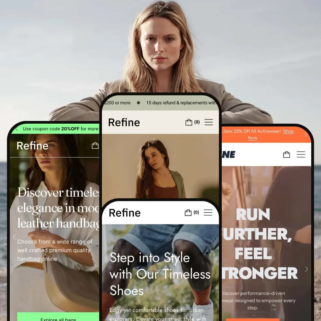
The Refine Shopify theme package delivers a premium, design-forward experience with its four distinct presets: Active, Default, Timeless, and Modern. Each style is built on a shared, feature-rich foundation designed for merchandising and conversions. This review moves past the marketing bullet points to provide a hands-on analysis of what it’s actually like to use this theme, based entirely on real-world testing of its demo stores.
Pros.
〰️
Pros. 〰️
✚ Superior User Experience Features: The theme-wide implementation of the slide-out cart, mega menu, and quick view is exceptionally smooth and fast. This creates a seamless, friction-free shopping flow that can reduce cart abandonment and improve session duration.
✚ Polished Interactive Elements: Subtle animations and hover effects are used consistently across all presets. This attention to detail contributes to a high-end, custom-built feel, which enhances brand perception and can support a higher Average Order Value (AOV).
✚ Clear and Clean Product Pages: Across the presets, product pages are consistently well-organized. Features like visible stock counters and tidy accordion tabs for product details create a clear, trustworthy presentation that reduces user friction.
✚ Always-Accessible Navigation: The sticky header is a constant in every preset, keeping the menu, search, and cart in view at all times. This makes key information highly accessible and streamlines the path to purchase, which can directly lower bounce rates.
Cons.
〰️
Cons. 〰️
− Strategic Flaw: The "Minimalist Trap": The theme's biggest strength—its clean, photo-driven design—is also its primary liability. All presets lean heavily on professional, art-directed photography to look premium. The risk for buyers is that using average, inconsistent, or low-budget product photos will make a store look amateurish, undermining the very reason for buying a premium theme and potentially damaging customer trust.
− Strategic Flaw: "Niche Rigidity": Refine's presets are highly stylized and opinionated. This is powerful if your brand perfectly aligns with one of the four aesthetics, but it creates significant inflexibility. A merchant trying to force a different style onto a preset will struggle, creating user friction that could negatively impact mobile conversion rates.
-
The Active preset is all about energy and movement, making it a perfect fit for fitness, sportswear, and lifestyle brands.
✚ Engaging Video Hero: The homepage immediately pulls you in with a full-width, autoplaying video background that doesn’t lag. Its clear headline and prominent call-to-action button create a powerful first impression that can lower bounce rates.
✚ Effective Merchandising Sections: The preset uses visually distinct sections like "Shop by Activity" with a unique gradient background and tabbed "Best Sellers". This effectively segments products and guides different types of customers, which can improve product discovery.
✚ High-Contrast Design: The bold, black-and-yellow default palette creates a strong visual identity that makes key elements like buttons and promo banners impossible to miss, which can improve click-through rates on key offers.
⊖ Cons
− Aggressive Typography: The extremely bold, uppercase headings used throughout the homepage are a dominant stylistic choice. This can feel overwhelming and may not suit brands with a more subdued or nuanced voice, potentially creating brand dissonance.
− Overwhelming Homepage Layout: The desktop homepage features a high density of different sections stacked together (video, product grids, collection grids, promos, etc.). This can create a busy, almost cluttered feel that may lead to choice paralysis for some visitors.
-
The Default preset offers a clean, versatile, and modern canvas that prioritizes high-quality product photography and brand heritage.
✚ Excellent Photographic Focus: The minimalist design, with its generous white space and large image blocks, ensures that product images are the focal point. This is ideal for boosting perceived value for visually driven brands like footwear or apparel.
✚ Strong Trust-Building Elements: The homepage effectively uses multiple trust signals, including a heritage bar ("Made in spain * Handmade shoes") and prominent footer icons for "15 days trial" and "Secure payment". This can increase customer confidence and reduce purchase anxiety.
✚ Effective Content Integration: The layout seamlessly blends commerce with brand storytelling sections ("Max & Mia: Fusion of bold design..."), making it ideal for brands that need to communicate a story of quality and craftsmanship.
⊖ Cons
− Subtle Primary CTAs: The main call-to-action buttons use a light green color that can have low contrast against certain background images. This could reduce their visual prominence and potentially lower click-through rates.
− Muted Default Palette: The out-of-the-box color scheme is a very specific, muted, earthy palette (khaki green, beige, grey). This will likely require significant customization for brands that rely on a more vibrant or corporate color scheme.
-
As the name suggests, the Timeless preset exudes classic elegance with its clean fonts and editorial-style layout, perfect for brands focused on quality and storytelling.
✚ High-Impact Split Hero: The homepage features a clean, split-screen hero with large, clickable images for "All dresses" and "All pants". This provides a visually striking and unambiguous starting point for user navigation into key collections.
✚ "In the Spotlight" Social Proof: The homepage includes a dedicated section to feature logos from publications like 'marie claire' and 'allure'. This is a powerful and well-designed tool for building immediate brand credibility and trust.
✚ Streamlined Cross-Selling: On product pages, the "You may also like" section features a quick add-to-cart function on hover. This allows shoppers to add related items without leaving the page, which can directly help increase Average Order Value (AOV).
⊖ Cons
− Basic Dropdown Variants: This preset uses standard dropdown menus for size and color selection on product pages. This is less intuitive and requires more clicks than visual swatches or buttons, creating unnecessary friction in the buying process, especially on mobile.
− Subtle Interactive Cues: Key interactive elements, like the navigation arrows on image carousels, are very minimalist and have low contrast against the background, which could cause some users to miss them entirely.
− Text Readability Risk: The design frequently places text over large lifestyle images. This requires careful image selection by the merchant to ensure headlines and descriptions remain legible and don't get lost against a busy background.
-
The Modern preset uses asymmetry and bold lines to create an edgy, architectural, and memorable user experience.
✚Unique Asymmetrical Layout: The homepage's unconventional grid, which features overlapping elements and split sections, creates a visually arresting experience that immediately differentiates a brand from typical eCommerce sites and boosts brand recall.
✚ Bold Use of Color Blocking: The strategic use of full-width, solid color blocks (e.g., the bright green section) creates a high-impact, editorial feel that effectively draws the eye to key brand messages or products.
✚ Elegant Serif Typography: The choice of a classic serif font for major headlines provides a sophisticated contrast to the sharp, modern layout. This elevates the overall aesthetic and is perfect for high-fashion or design-led brands.
⊖ Cons
− Inconsistent Product View Design: The design is inconsistent between a standard product page and the one displayed in the pop-up/quick view. The "ID Holder" product view places the entire info block in a jarring, solid green container, which could create a disjointed user experience.
− Abstract Category Navigation: The list-style category links ("Crossbody bags," "Shoulder bags," etc.) are highly minimalist. Users who prefer more visual, grid-based collection navigation might find this style less intuitive.
Niche Suitability
Not Ideal For
Final Recommendation
-
This theme is perfect for design-conscious brands with a strong visual identity and the high-quality photography to back it up. Businesses in fashion, high-end cosmetics, lifestyle goods, and modern home decor that want a premium feel without the custom-build cost will find Refine to be an excellent investment.
-
Merchants with large, complex inventories (e.g., auto parts), budget-focused stores, or brands without strong visual assets should look for a more utilitarian theme. If you need maximum flexibility or don't have a professional photographer, Refine's rigid, photo-first structure may be more of a hindrance than a help.
★ 8.4/10
Rating
-
Refine includes an extensive list of built-in features for marketing and merchandising. It presents Shopify's standard features, including filtering, in a clean and usable way that feels integrated, not tacked on.
9
-
For the end-user, the theme is highly intuitive. For the merchant, the focused designs mean less tweaking is needed if your brand fits, but more work is required if it doesn't.
8
-
All presets perform beautifully on mobile. The theme makes smart adjustments, like toning down asymmetry in the Modern preset or stacking editorial content cleanly, to ensure usability on smaller screens.
9
-
Based on hands-on testing, interactive elements are responsive, pages load quickly, and animations are smooth. The theme feels lightweight and well-optimized.
9
-
The presets are stunning but stylistically rigid. You're buying into a specific look. While colors and fonts can be changed, the core layout and aesthetic are not easily altered, which is a deliberate trade-off for its strong point of view.
7
FAQ
〰️
FAQ 〰️
-
👑 Yes, its strong visual storytelling and clean layouts, especially in the Default or Modern presets, can effectively highlight a single flagship product.
-
📱Absolutely. Testing showed excellent responsiveness across all presets. The theme intelligently adapts complex desktop layouts for smaller screens to maintain a great user experience.
-
🎨You can fully customize colors, typography, and logos. However, the core layout of each preset is opinionated and less flexible than more generic themes.
-
⚡ Performance is a major strength. During testing, pages loaded quickly, and interactive elements like the slide-out cart and quick view were fast and lag-free.
-
👕Yes, but the implementation varies. The "Default" preset uses excellent visual swatches and buttons , while the "Timeless" preset uses less intuitive dropdown menus.
-
🔎 The theme follows Shopify's SEO best practices. It supports standard features like customizable meta titles/descriptions and generates a clean code structure for Google to crawl.
-
💱Yes, a language and currency switcher was visible and functional in the header or footer during testing, allowing merchants to use Shopify Markets to sell internationally.
-
⚙️ Yes. The theme is built to modern Shopify standards and will support apps from the Shopify App Store. The demos show sections for app integrations like product reviews ("Testimonials") and social proof ("In the Spotlight").
-
🛒 Yes, you can try Refine with your own products for free on the Shopify Theme Store. You only pay if you decide to publish it to your live store.
Disclaimer: This review is based on hands-on testing of the publicly available "Active," "Default," "Timeless," and "Modern" preset demos of the Refine Shopify theme as of June 2025. Theme features, preset availability, and performance can change with subsequent updates from the theme developer.