
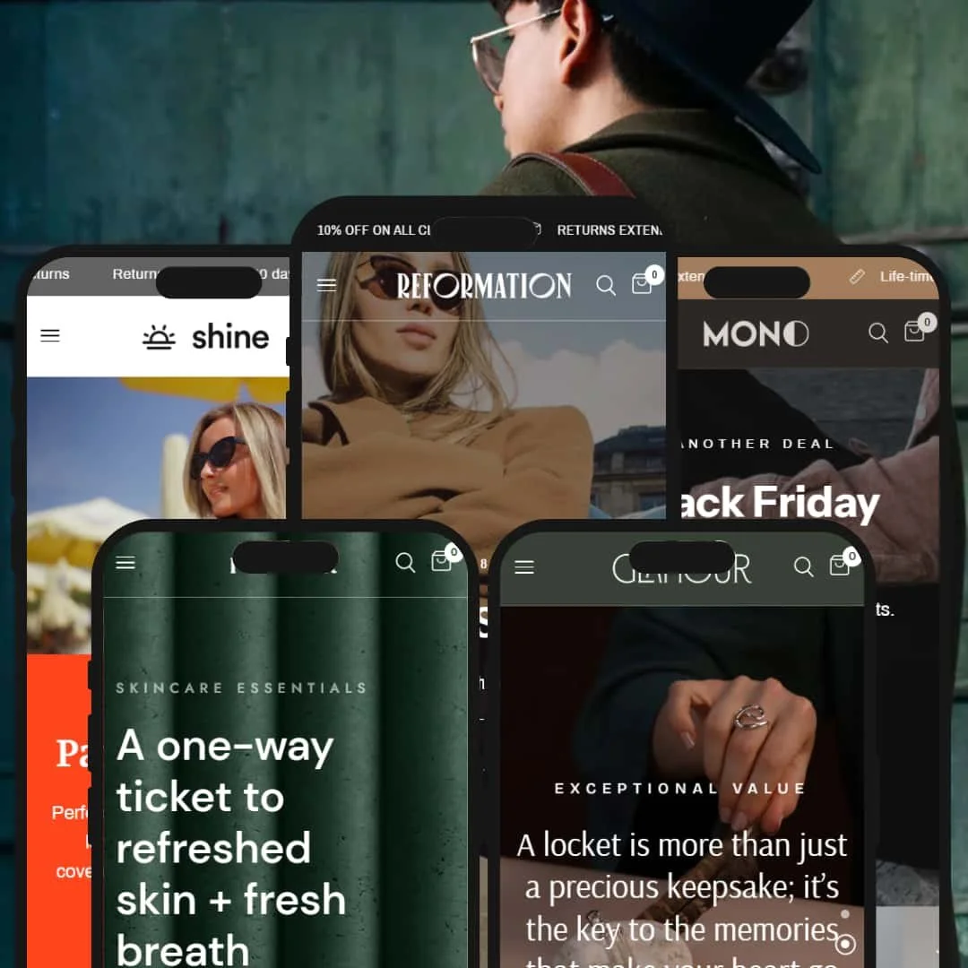
Reformation is a premium Shopify theme aimed at fashion, beauty, accessories, and lifestyle brands that want an editorial look without sacrificing day-to-day shopping polish. In hands-on testing across five presets—Default, Reinvent, Sunshine, Instance, and Glamour—it consistently delivered slick on-page merchandising, smooth slide-out interactions, and rich product detail layouts. The differing presets shift the brand voice dramatically, from cinematic apparel to sun-splashed swim to luxe jewelry, while keeping a familiar shopping rhythm.
Pros.
〰️
Pros. 〰️
✚ Quick-peek that shortens the path to purchase
Where enabled, product-card quick-view opens a slide-out with variant selection and add controls, letting shoppers commit without leaving the grid. It compresses the loop from curiosity to cart, especially for multi-variant apparel and jewelry.
✚ A polished cart drawer that works hard after the click
Adding to cart summons a right-side drawer with quantity steppers, a progress bar, note and discount fields, and smart cross-sells. That post-add moment is used to tidy orders and lift order value without feeling pushy.
✚ Sticky purchase aids that keep actions in reach
On product pages, a floating mini bar holds name, price, and a direct add button so shoppers can act from anywhere in the narrative. It’s a subtle but meaningful nudge for decisiveness on long pages.
✚ Rich product detail layouts that carry the sale
Across presets, product pages support multi-image galleries, videos, collapsible detail blocks, FAQs, and value grids. That density of context lets merchants sell the “why” as well as the “what.”
✚ Flexible search surfaces that fit different catalogs
Most presets use a slide-out search overlay for quick peeks, while Glamour opts for a full results page. Having both patterns available means merchants can match search to assortment breadth.
Cons.
〰️
Cons. 〰️
− Inconsistent adoption of quick-view across presets
Some presets omit the overlay entirely, forcing click-throughs for comparisons and slowing multi-item browsing. It’s a philosophical choice that trades grid speed for simplicity.
− Visual heaviness demands media discipline
Large heroes, multiple carousels, and image-led pages can weigh on perceived speed if assets aren’t optimized. The aesthetics are worth it, but they raise the bar on production quality.
− Stacked sticky elements can crowd smaller screens
When announcement bars, sticky headers, and purchase mini bars overlap, the viewport can feel tight; spacing and conditional visibility need care to keep the UI breathable.
-
What works in this preset
The homepage opens on a video hero with overlaid copy and a decisive call-to-action, which sets an immediate editorial tone and frames the rest of the page like a magazine cover. That cinematic opener creates a premium first contact for apparel.
Right below, the page flows straight into a product carousel and supporting merchandising blocks—cross-sell highlights, blog features, and a newsletter sign-up—so you’re never more than a scroll away from items to explore. It feels like a guided tour through the brand’s catalog.
The overall composition favors big, tactile imagery with just enough copy to orient the shopper, which suits multi-image garments and seasonal drops. The layout’s rhythm—hero, carousel, story blocks—reads like a runway show condensed onto a single page and keeps attention on the collection narrative.
-
What works in this preset
Product pages use concise bullet-style icons to surface attributes like “buildable,” “cruelty-free,” and “vegan,” so value cues land instantly without long descriptions. It’s a tidy way to make benefits scannable in a category where ingredients matter.
A restrained grid sends shoppers directly to product pages instead of interstitials, which keeps the journey focused when a customer wants to read details or scan ingredient callouts. It’s an intentional, low-distraction path that suits the category.
The “Our Story” page favors long-form narrative blocks and imagery, giving founders and missions room to breathe—useful for beauty brands building trust around ethos. The space for storytelling complements the clean product presentation.
-
What works in this preset
The homepage leads with a bold “Paradise Calling” aesthetic and sustainability icons, using a bright category strip (Bikinis, Swimwear, Tops, Bottoms, Bras) to nudge quick wayfinding. It’s breezy and on-brand for seasonal swim.
Product pages present a large, collage-style photo treatment that keeps attention on fit and fabric while maintaining an easy path to purchase. It complements the preset’s fun tone without clutter.
Small tooltips on hover surface product names unobtrusively, which keeps the grid looking airy even with many tiles. The light-touch labels preserve the beachy vibe without loading the page with extra UI.
Where it stumbles
Those tiny hover tooltips don’t convey much on their own, which can leave browsers wanting more detail before committing to a click-through. The minimalist approach keeps things clean, but it can slow comparisons when shoppers are scanning many similar items. By prioritizing airiness, the grid trades information density for mood.
-
What works in this preset
The homepage weaves “Meet our favorites,” “New Arrivals,” and a TikTok showcase into a lively scroll, making it feel plugged into social discovery without looking chaotic. It’s an easy fit for brands living on short-form video.
Sold-out badges are conspicuous in lists, sending a clear scarcity signal and helping customers avoid dead ends. It creates urgency while keeping expectations honest and reduces friction from clicking into unavailable items.
Feature grids highlight travel-friendly claims like “Lightweight, Innovative, Eco-Friendly,” giving a fast read on why a bag earns its price. The effect is a persuasive value ladder without overwhelming copy.
Where it stumbles
If the demo’s high volume of sold-out items were mirrored in a live store, it could dampen purchase momentum; curation matters when scarcity turns into emptiness. Merchants will want to balance urgency cues with in-stock depth to sustain confidence.
-
What works in this preset
Product pages spotlight values like “Recycled Gold” and “Handmade in NYC,” giving sustainability and craft the same stage as stones and settings. The copy and imagery work together to make the value story feel intrinsic to the purchase.
A moody palette and darker backdrops create a sense of depth that flatters reflective surfaces and faceted stones. The atmosphere signals luxury without drowning the page in ornament.
Sequenced hero panels organize the collection into small, dramatic chapters that feel curated. The pacing slows the scroll just enough to make each piece feel intentional.
Niche Suitability
Not Ideal For
-
Brands with substantial assortments that benefit from quick-peek shopping, persuasive product storytelling, and a refined cart experience—fashion, jewelry, and style-driven lifestyle labels.
-
Single-SKU or ultra-minimal operations chasing the absolute lightest footprint may prefer something leaner with fewer visual modules out of the box.
-
Medium — The theme’s visual power and interactive surfaces pay off when merchants optimize images and decide deliberately where quick-peek, sticky bars, and promotional elements are truly additive.
Final Recommendation
★ 7.4/10
Rating
9
8
8
7
9
FAQ
〰️
FAQ 〰️
-
No. It’s present in Default and on Glamour’s home grids, but Reinvent, Sunshine, and Instance intentionally route shoppers straight to product pages.
-
Default, Reinvent, Sunshine, and Instance use a slide-out overlay; Glamour opens a dedicated search page. The latter suits bigger catalogs that benefit from a full-page grid.
-
An elegant drawer slides in with steppers, note and discount fields, a progress bar, and cross-sell blocks—turning the post-add moment into a tidy, value-building step.
-
Yes, several presets surface a floating mini product bar with name, price, and a plus icon so shoppers can add to cart without scrolling back to the main button.
-
Where quick-view is enabled, the overlay exposes variant selectors; full product pages consistently present swatches and size buttons for clear choices.
-
A cinematic video hero hands off to immediate shopping modules—carousels, editorial blocks, and sign-ups—delivering a premium, magazine-like first pass through the catalog.
-
Reinvent uses compact attribute icons (e.g., vegan, cruelty-free), while Glamour highlights values like recycled gold and handcraft in feature grids on product pages.
-
Instance, in particular, makes sold-out badges conspicuous in lists, which sets expectations and creates scarcity without dead-ending the shopper.
-
Yes—each preset has a public demo, and purchase follows Shopify’s standard “pay when published” model, allowing unlimited previewing before going live.
This review is based on hands‑on testing of the publicly available Default, Reinvent, Sunshine, Instance and Glamour preset demos of the Reformation Shopify theme as of September 28 2025. Theme features, preset availability and performance can change with subsequent updates from the theme developer.