
Refresh delivers a clean, bold approach to e-commerce design that prioritizes product storytelling through minimalist aesthetics and strategic content placement. This free Shopify theme combines essential functionality with visual impact, making it effective for brands focused on ingredient transparency, quality messaging, and customer testimonials. The straightforward slideshow hero, comprehensive product information architecture, and smooth cart drawer create a shopping environment that encourages both browsing and conversion.
Pros.
〰️
Pros. 〰️
✚ Product information architecture for ingredient transparency
Refresh accommodates deep product detail with collapsible sections for highlights, scent or usage notes, ingredients, and instructions. Shoppers can verify what matters without digging, which builds confidence and reduces pre-purchase friction.
✚ Social proof that feels native
Quote blocks sit naturally within the homepage and PDPs, with attribution that reads cleanly. Testimonials support higher-consideration items while keeping the page flow intact.
✚ Seamless cart and quick-add flow
Quick-add on product cards and a responsive cart drawer keep shoppers in context. You can add, adjust quantities, and see thresholds without losing your place—momentum stays high and bounce risk stays low.
✚ Media galleries built for storytelling
High-resolution image galleries with smooth navigation make it easy to show texture, sizing, and angles. Visual clarity helps shoppers bridge the tactile gap of online purchasing.
✚ Merchandising levers without clutter
A simple hero carousel and contextual “pairs well with” recommendations give you room to promote without turning the homepage into an ad wall. The store stays calm while still nudging AOV.
Cons.
〰️
Cons. 〰️
− Uneven product card heights reduce scan rhythm
In sections with mixed product titles and kit pricing, card heights can drift. Longer names push some tiles to two lines while others sit on one, which breaks the grid’s baseline and creates slight visual wobble in the row.
− Variant selection friction from collection grids
Multi-option products require clicking through to the PDP to select variants. It’s straightforward, but shoppers looking to make quick multi-variant comparisons may feel an extra step.
− Moderate performance headroom
Interaction responsiveness and page transitions felt competent rather than blazing. Third-party testing places it mid-pack, leaving room for image, app, and script tuning.
− Limited dynamic promotional modules
If your merchandising strategy depends on frequent, complex promo blocks or highly animated surfaces, the theme’s restrained toolkit can feel confining.
-
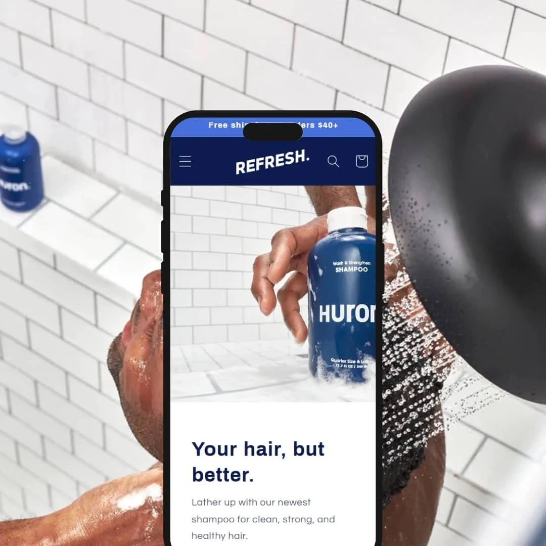
The Default preset stages a health and wellness catalog with a clean skincare aesthetic. It leans on neutral tones, generous whitespace, and a confident headline scale to frame ingredient-first storytelling without visual noise.
What works in this preset
The palette and whitespace feel clinical yet approachable, which suits products that rely on trust. Big, legible headings pair with spacious product tiles; the result is a calm rhythm that spotlights benefits and usage notes rather than flashy chrome. Hero imagery reads full-bleed and purposeful, keeping the opening screen focused on one claim at a time before handing off to product education.
Throughout the page, typography hierarchy—headline, kicker, body—stays consistent. That predictability helps long-form details (ingredients, routines, certifications) scan quickly. The overall staging feels intentional for skincare and personal care: fresh, simple, and content-forward.
Niche Suitability
-
Skincare, wellness, and supplement catalogs that benefit from clean staging, neutral palettes, and ingredient-first copy. The preset’s restraint makes trust signals and education easy to digest.
Not Ideal For
-
Merchants whose product names run long or whose kits vary widely in price presentation; the card grid can look uneven without title standardization.
-
Brands in beauty, wellness, and personal care where product education and trust drive purchases. If your story hinges on ingredients, routines, and testimonials, Refresh amplifies that message without getting in the way.
-
Fashion catalogs with heavy variant browsing, electronics with dense spec tables, or stores that live on aggressive promotional layouts will likely want a more feature-rich or promo-centric theme.
-
Low — Section-based editing and sensible defaults make setup fast. Most stores will reach a polished result by swapping imagery, tuning colors and type, and filling in product content without code.
Final Recommendation
★ 6.8/10
Rating
-
Reliable quick-add, a responsive cart drawer, clear product galleries, and baked-in testimonial blocks cover core commerce needs without excess complexity.
7
-
The theme editor groups sections and blocks logically. Merchants can shape the homepage and PDPs quickly with clear controls and predictable outcomes.
8
-
Responsive layouts adapt well on handhelds. Product grids remain readable, and the cart drawer behaves smoothly on touch devices.
7
-
Interaction speed feels adequate for typical browsing. Independent PageSpeed reports in the mid-70s to 90 range suggest optimizations can still help.
6
-
Color, type, and layout choices are solid but opinionated. You get a cohesive look without diving into heavy customization.
6
FAQ
〰️
FAQ 〰️
-
👑 Yes. The Refresh Theme demonstrates ingredient-first staging and long-form product details that suit regulated or education-driven categories.
-
📱Yes. Layouts, grids, and the cart drawer worked properly on mobile in testing; the browsing flow stayed intact on touch.
-
🎨 You can adjust colors, typography, and logo treatment to align with most brand systems. The focus is on refinement rather than radical redesigns.
-
⚡ Moderate out of the box. With disciplined media, app, and script choices, you can push it higher.
-
👕 Variants are handled on the product page through standard selectors. Collection cards emphasize quick add for simpler SKUs.
-
🔎 It leverages Shopify’s built-in SEO fields and structured data defaults. Technical SEO scores are serviceable, with room for enhancement via best practices.
-
💱 Yes. Refresh works with Shopify’s internationalization features for multiple languages and currencies through standard configuration.
-
⚙️ Most common apps slot in cleanly. A few edge cases may need light theme adjustments, as with any storefront.
-
🛒 Yes. You can explore the public demo and use Shopify’s theme preview to test in your store before publishing.
This review is based on hands-on testing of the publicly available “Default” preset demo of the Refresh Shopify theme as of October 14, 2024. Theme features, preset availability, and performance can change with subsequent updates from the theme developer.