
Most budget Shopify themes earn their price tags through what they leave out. Relax, a $170 Online Store 2.0 release from Swissuplabs, makes you hunt for the omission: it ships three vertical presets (furniture, beauty, and art supplies) plus the cross-sell toolkit its listing page leads with. I spent time in all three demo stores looking for where the corners got cut. They exist, but they're not where I expected.
Cross-selling is wired in, not bolted on
Every product page in the demos runs a Frequently Bought Together block: companion items with checkboxes and a live order total that updates as selections change, sitting alongside a goes-well-with carousel. It's a real bundle builder. For home-goods and beauty merchants with 50–300 SKU catalogs and add-on-friendly baskets, this is the section that pays the theme off, because it manufactures multi-line orders out of single-product traffic without adding a bundle app to the stack.
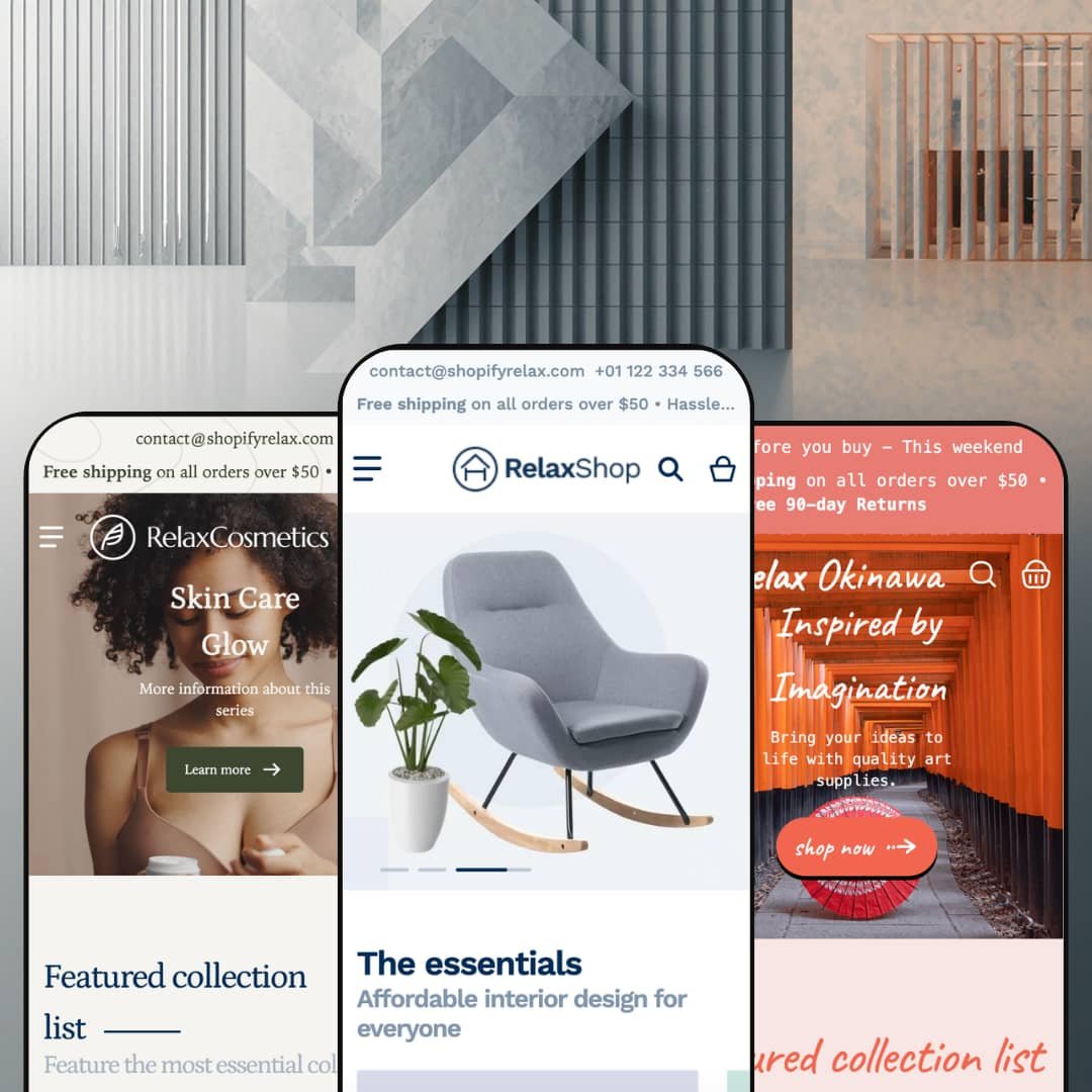
Three storefronts for one budget ticket
What does $170 actually buy here? Three staged verticals, each with its own demo catalog, navigation tree, and art direction, covering furniture, beauty, and art-and-craft retail from a single license. Three, not one. For single-brand founders still picking their lane, and for holding-company operators running stores in unrelated categories, the preset family works like three trial runs bundled into one purchase rather than a commitment to a single look.
The navigation sells before the page loads
Open the Sale dropdown in the furniture demo and you're not looking at a link list; you're looking at five discounted products rendered inside the menu itself, prices and percentage badges included. Collection entries carry image thumbnails, and a promotional banner rides along in the same panel. That surprised me. For promotion-heavy stores with deep category trees and 100–500 SKUs, navigation becomes a selling surface instead of a wayfinding chore.
The buy box deals in operational honesty
Transparency is the quiet feature here. Product pages show per-variant prices inside the picker, mark individual variants sold out without hiding them, surface SKU codes, and run live stock counters next to the add-to-cart button. The furniture demo goes further and lists pickup availability across three named warehouse locations with ready-in-24-hours notes. For brick-and-click retailers with physical pickup points and restock-driven, low-stock catalogs, that candor converts urgency into orders rather than support tickets.
Storytelling tools run thin
Read the feature list and you'll find merchandising, conversion, and discovery covered in depth, while editorial staging gets a slideshow, banners, and a blog. There's no lookbook, no shoppable hotspot section, no immersive campaign layout anywhere in the section library or the three demos. That's a deliberate identity. But campaign-led apparel labels and luxury lifestyle brands selling considered purchases at premium price points will run out of canvas the first time a seasonal campaign needs more than a hero image and a ticker.
The visual language plays it safe
Boxed sections, centered headings, conventional card grids. The boldest design move across three full demo stores is a scrolling text ticker, and that's timid for a product asking merchants to stand out with it. Design-led, single-brand DTC labels courting brand-first buyers who shop on aesthetics will need serious customization hours, or a different theme, to escape the default-store look that every preset settles into out of the box.
Unproven at catalog scale
This kept bugging me as I moved between the demos: every storefront stages a boutique-sized assortment. The lamps collection holds six products. Filter facets count one to three items each, and while infinite scroll, swatch filters, and mega menu depth all sit on the feature sheet, nothing in any demo shows them carrying real load. Merchants running 500+ SKUs with filter-heavy discovery patterns are buying on faith, because the demos never demonstrate the grid, the facets, or the navigation working at the scale those stores live at.
What it takes to launch
Expect a multi-day pass before launch: storefront UI string cleanup, navigation re-mapping, hero and footer link wiring, locale and currency configuration, and a full demo-copy replacement across testimonial, FAQ, and about sections in whichever preset you start from. Budget two to three working days beyond imagery and product data.
-
What works in this preset
Scrolling the homepage feels like walking a well-run showroom floor. A tabbed product rail flips between New, Special Offer, Best Seller, and Popular without leaving the section, a favourites carousel and brand strip follow, and an image-and-text ticker keeps the page moving between commercial blocks. The page never repeats a layout.
Six facets line the lamps collection: color, brand with product counts, a price range, style, and availability, with a grid-or-list toggle and nine sort orders riding above the grid. Below the products, the template keeps working; a similar-products carousel and a blog rail extend the page past the last card. Collection pages here are destinations, not directories.
Product pages get the full landing-page treatment. Accordion tabs hold customer-service and returns copy, an on-page FAQ answers material and shipping questions, a share row includes a copy-link option, and related products plus recent posts close out the template. A shopper can arrive cold and leave informed without ever touching the main navigation.
Where it stumbles
For a preset named after furniture, the staging thinks small. The catalog leans lamps, rugs, mirrors, and a fourteen-dollar folding bag, and the priciest item on display is a $236 TV stand, so merchants selling sofas at four-figure prices never see the theme argue a considered, spec-heavy purchase. The machinery is here; the furniture-scale proof isn't.
-
What works in this preset
A full-bleed product video opens the demo instead of a static hero, and the big mid-page banner swaps in a separately art-directed mobile image rather than a center-crop of the desktop file. Motion and mobile both got their own design pass. That's the right instinct for a category that sells texture and glow.
Navigation runs three levels deep, so Shop All opens named collections and those open sub-collections like Lip Perfection Picks, which lets a beauty catalog's natural taxonomy of face, lips, eyes, hair, and body map onto the menu intact. Nothing gets flattened. A separate dropdown even renders the collection list as its own browsable grid.
Trust-building is staged where skincare buyers actually hesitate. The homepage carries an FAQ accordion answering shipping and returns questions before the footer, an Instagram feed grid puts real-world content underneath the catalog, and testimonials sit between browsing and checkout intent. For ingredient-skeptical, claims-wary shoppers, the page answers objections in place.
Where it stumbles
Shade selection is the strange miss in the staging. The theme ships color-swatch rendering, yet the demo presents foundation shades named Pure, Natural, Healthy, and Honey as plain text buttons, leaving the one control cosmetics shoppers depend on most undemonstrated. A beauty merchant evaluating this preset has to take the swatch experience on trust.
-
What works in this preset
Art retail breaks product grids, because a CHF 2.50 sheet of pastel paper and a CHF 1,590 original painting have to share the same card layout. Okinawa stages exactly that spread and holds its composure. Prices spanning three orders of magnitude sit in one grid without the cheap items reading as errors or the originals reading as bloated.
Scarcity is staged honestly. I went looking for how the demo treats one-of-a-kind inventory and found a poster page reading one unit left in stock, with a size marked sold out directly inside the variant picker, its price still visible. For originals and small-batch work, that's the difference between urgency and ambiguity.
Of the three demos, this one carries the most coherent narrative voice. The taxonomy reads like a real craft shop (paintings, origami, stamps, sculpture, paper supplies), the testimonials talk about watercolor sets and secure packaging rather than generic praise, and a mid-page origami video does campaign work the other demos hand to static banners.
Where it stumbles
Then the gallery goes quiet. The originals and posters are staged with a single image apiece, with no detail crops, scale shots, or framing context, in a vertical where buyers purchase texture and presence sight unseen. The theme's multi-image gallery and zoom controls exist; this preset's staging never lets them make the sale.
No surface is left off duty
Read the three demos in sequence and one pattern emerges: every template carries commercial weight. Footers double as capture points with newsletter forms, top bars stack utility contact details over promotional messaging, and trust rows close out templates that other sections opened. The theme holds one conviction and applies it everywhere: attention, wherever it lands, should be convertible.
A theme that's still moving
Relax launched in March 2024 and stood at version 2.14.1 by June 2026, with a bugfix release landing the same week this review was written. The preset family has grown since launch rather than fossilized, and the newest storefront is staged with current material. For a purchase merchants live with for years, development pulse matters as much as the feature sheet, and the pulse here is steady.
Built to cross borders from day one
The localization posture spans the whole product: theme UI strings ship pre-translated in five EU languages, right-to-left rendering is supported, and the demos stage region selectors in header and footer while running in two different currencies. Merchants launching into multilingual European markets start measurably closer to done.
Three outfits, one body
Set the demos side by side and the silhouette repeats: announcement layer, hero, collection rail, tabbed product block, brand strip, ticker, testimonials, blog feed, trust row. The verticals change the wardrobe; the architecture underneath barely moves. Buyers drawn in by the three-design pitch should understand they're getting three art directions on one layout system, which is honest value but narrower than the preset count implies.
Discovery assumes shoppers arrive knowing what they want
Across every preset, the path to product runs through menus, search, and filters, full stop. There's no quiz flow, no guided finder, no need-based routing anywhere in the feature set. Stores whose buyers browse rather than hunt, gift-driven shops especially, will lean on manual collection curation to do work the theme doesn't.
★ 7.2/10
Rating
-
Checkbox bundles with running totals, in-menu product promotion, pickup display, and stock counters cover a lot of selling ground for $170. The gaps sit in editorial and guided-discovery territory.
8
-
Standard Online Store 2.0 section grammar means nothing exotic to learn in the editor. The launch checklist is the tax: link mapping, string cleanup, and locale setup take real hours.
7
-
Banners ship with dedicated mobile art direction rather than cropped desktop files, and filtering collapses into a tidy drawer pattern. Deep menus carry over without becoming a maze.
7
-
Pages stay disciplined, with WebP imagery served at request-sized widths, lazy-loaded media, and restrained script weight even on the merchandising-heavy templates.
8
-
A wide section library and three presets give range, but everything bends within one conservative visual system. Distinctiveness is on the merchant.
6
Frequently Asked Questions
-
Yes. Product cards and buy boxes in the demos carry an add-to-compare control, so multi-attribute shoppers can shortlist items without juggling five browser tabs.
-
Relax stages furniture and home accessories, Venus stages skincare and makeup, and Okinawa stages art and craft supplies, each with its own catalog, palette, and typography. Pick the one nearest your inventory and you inherit the least rework.
-
Yes, in two placements: full-width video heroes and in-page video sections, both fed by Shopify-hosted files rather than third-party embeds.
-
The demos layer a utility strip with contact details over an announcement line, and one storefront stacks two announcement messages, so promotions don't have to fight the navigation for space.
-
A slide-out cart with cart-notes support, backed by a sticky cart control that keeps the checkout path reachable mid-scroll on long pages.
-
Star displays in the demos run through review-app hooks rather than theme code. Budget for a review app if ratings matter in your category.
-
Storefront UI strings ship in English, French, Italian, German, and Spanish, and right-to-left layouts are supported. Your product content still needs its own translation workflow.
This review is based on hands-on testing of the publicly available preset demos of the Relax Shopify theme as of June 2026. Theme features, preset availability, and performance can change with subsequent updates from the theme developer.