
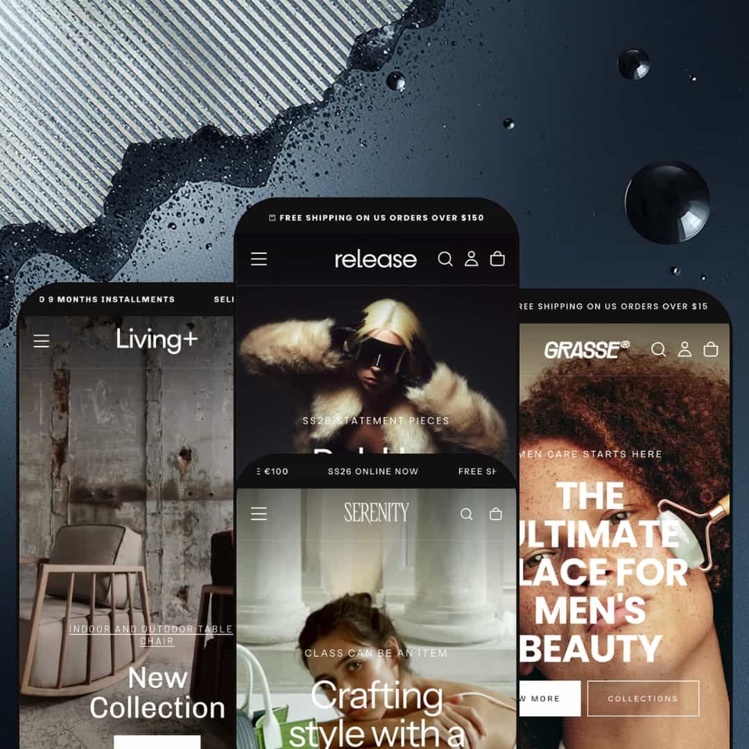
Most premium theme packs hand you one polished look and call it range. Release ships four, and they don't read like recolors of a single template: a streetwear shop, a men's grooming line, a luxury handbag house, and a furniture studio each get their own personality. Built on Shopify's Online Store 2.0 architecture, it leans on a 30-plus section library to make that spread feel deliberate rather than padded. The real question for a $400 buyer is whether the breadth holds up once you look past the cover shots.
One section library that genuinely bends across verticals
The 30-plus section catalog isn't padding; the same blocks reassemble into a streetwear rail, a grooming routine, a handbag lookbook, and a furniture film without looking forced. It's a deep kit. Before/after sliders, shoppable look sections, tabbed product rails, store locators with live maps, and video heroes all live in the shared library. For multi-line lifestyle brands in apparel, beauty, or home goods that run seasonal drops and refresh their homepage often, that range means fewer add-on apps and less custom section work down the line.
A product page that does the conversion heavy lifting
If you sell variant-rich, considered-purchase goods, the product page is where Release earns its price. I opened the zip-sweater listing and found a multi-image gallery with zoom, color options linked across separate products as a group, a size-guide modal, a pre-order flow with a ship date and an acknowledgment checkbox, a sticky add-to-cart bar, accordion tabs, and in-store pickup status all in one template. It's all native. For apparel and furniture sellers with multiple variants and a buyer who compares carefully before committing, that template removes a stack of would-be app installs.
Four real storefronts from a single license
The range is the point. Release ships four presets that read like four different companies, spanning a €29 t-shirt to a €4,449 marble table, and you get all of them from one purchase rather than buying a fresh theme for every project. The spread is unusual: the same design system credibly dresses budget apparel and ultra-premium furniture without cracking. For agencies and multi-brand operators standing up several stores, or a solo founder still deciding which direction to commit to, it's four genuine starting points instead of one.
Navigation and announcement tooling sized for broad catalogs
The header carries weight: a mega menu that mixes text columns with image tiles and promo blocks, predictive search with popular-search shortcuts, a country and language selector, and a sticky bar that holds on scroll. Grasse and Serenity run multi-message announcement bars that rotate shipping, returns, and seasonal lines instead of a single static strip. For merchants with many collections and cross-shopping visitors, like a grooming line spanning face, hair, beard, and body, that wayfinding keeps a deep catalog navigable.
The whole system speaks one dialect: premium lifestyle
All four presets live in the same world of editorial photography, generous whitespace, and curated mid-to-luxury catalogs. There's no preset built for dense, utility-style commerce. A merchant selling electronics, industrial supply, or auto parts, with thousands of SKUs and spec-led purchase decisions, will be rebuilding the visual language from the ground up rather than restyling a preset. The blocks can be repurposed, but none of the four starting points were drawn for that job.
Two of the listed merchandising features need Shopify Plus
Release's own feature list flags quantity pricing and combined listings as Shopify Plus only. It's a plan gate, not a theme one. If your model depends on tiered volume pricing or merging variants across products into a single listing, those sit behind the Plus plan, not the $400 theme. For wholesale-enabled or B2B sellers on a standard Shopify plan, it's worth confirming before buying, because two of the merchandising tools you might be counting on won't switch on.
It's hungry for real photo and video, and it shows when it's fed scraps
This design only sings with strong creative. Every preset assumes professional photography, and Forest leans on a wall of background videos to carry whole sections, so the layouts are sized for assets a brand-new store may not have shot yet. Drop in thin product photos or skip the video and the same layouts look empty fast. For a bootstrapped single-brand operation with no photographer or motion budget, that's the real cost of entry, not the license fee.
What it takes to launch
Expect a multi-day build: a full content and imagery pass across every hero, rail, spotlight, blog post, and testimonial; metafield and product-group population for variant linking, pre-orders, and size guides; store-locator map and announcement-bar configuration; and a review of the five-language EU translations before launch. Budget several days per preset you actually use, more if you adopt more than one.
-
What works in this preset
The homepage doesn't ease in. You land on a full-bleed SS26 statement hero, then drop straight into a "Just arrived" product rail where the cards carry inline size and color swatches, so a shopper can pick a variant before ever opening the product page. Quick-add sits on every card. It's a browse-and-grab rhythm built for impulse apparel buying.
Further down, the merchandising keeps changing gears. A tabbed "What's new" block splits Jackets, Hoodies, and T-shirts into one switchable rail, an "Item of the week" spotlight pairs a seven-image gallery with a full variant picker and inline add-to-cart, and a "Shop the look" section turns a styled photo into a shoppable outfit. I clicked through the look picker and each pieced product opened its own size selector in place. That's a lot of selling surface on one page.
It closes like a brand site, not just a shop. A store-locator block plots flagship addresses on live maps with directions, a before/after slider demos a transformation, and a testimonial wall plus a five-post blog round things out. The footer carries menu columns, payment icons, and a newsletter capture.
Where it stumbles
Release is the kitchen-sink preset, and that's also its risk. Stacking heroes, rails, spotlights, lookbooks, locators, and a blog onto one scroll gives a focused capsule drop far more page than it needs, and a single-product or tight-capsule brand will want to cut hard before launch.
-
What works in this preset
Grasse is the most instructive of the four. Its top nav quietly doubles as a feature tour: it labels three product-gallery layouts (slideshow, grid, carousel) and three collection-filter styles (collapsed, open left sidebar, thumbnails) as actual menu links, so you can click each variation and watch it render live. For a buyer trying to gauge configurability before purchase, that's gold.
The storefront itself is a men's grooming line, and it merchandises like one. A scrolling multi-message announcement bar runs shipping and returns promises, the mega menu drops image tiles for Face, Body, Hair, and Beard, and a tabbed best-seller block sorts Face care, Hair, and Candle into a single rail. Variant pills handle the 30ML/50ML size splits cleanly.
A rotating "LOOK good / SMELL AMAZING / SMELL FRESH" panel links each mood to a hero product, the before/after slider sells a skincare result, and a magazine-style blog backs the editorial tone. I scrolled the whole page and the rhythm stays coherent. It reads like a real grooming brand.
-
What works in this preset
Serenity swings the system the other way, into quiet luxury. Bags priced from €900 to €1,499 sit on big, calm imagery, a layered hero stacks overlay text on a single editorial shot, and an animated line ("We offer sustainable [image] luxury items [image] with stunning details") threads product photos through a sentence. Less shouting, more poise.
The conversion tooling is still here when it wants to be. Best-seller cards expose color thumbnails that swap the bag image on click, a "Shop the look" carousel pairs pieces, and a rotating marquee of "Eco-Friendly Luxury / Lifetime Warranty" badges stands in for hard discounting. The same engine, dressed for a boutique.
Where it stumbles
The restraint cuts both ways. A shopper weighing a €1,499 bag tends to want reassurance up front, things like materials, returns terms, and authenticity, and Serenity's homepage stages very few of those trust prompts, leaning on mood instead. The capability sits in the shared section library; this preset simply chooses not to deploy much of it, so a luxury merchant will likely add reassurance blocks before going live.
-
What works in this preset
Forest is the video preset. The homepage is built around motion: a layered hero of room scenes, then a run of full-width video panels for Glass Pendants, Newest Arrivals, Fast Delivery, and Most Popular, each one narrating a furniture collection. Product rails carry Oak/Walnut variant swatches and four-figure price tags that climb to €4,449.
Underneath the cinematics, the furniture logic holds. The mega menu organizes by both product type (Sofas, Lighting, Beds, Tables) and by Spaces (Living Room, Bedroom, Dining Room), which is how furniture shoppers actually browse, and collection-feature panels push named ranges like the Zen Collection. A trust row promises handcrafting, installments, and free delivery.
Where it stumbles
For a considered, high-ticket buy, the home leans almost entirely on atmosphere. Atmosphere leads, conversion waits. Several scrolls pass before a direct add-to-cart prompt appears, which suits inspiration-led furniture browsing but slows a shopper who already knows the piece they came for.
One design system with a wide tonal range
Reading all four presets back to back, the impressive part isn't any single section. It's that shared design tokens stretch from Serenity's hushed, white-space luxury to Release's dense, high-energy retail without feeling like different products bolted together. Few theme systems flex that far while staying coherent.
The demos teach the theme
Grasse turns its navigation into a working menu of gallery and filter layouts you can click through, and across the set the demos show the same blocks doing visibly different jobs. That makes Release unusually easy to evaluate before buying and faster to learn after. You see the options running live instead of guessing from a feature list.
The four verticals are really four shades of one register
On the surface the presets cover clothing, grooming, accessories, and furniture. Underneath, all four are premium European lifestyle retail with the same appetite for big imagery. The diversity is aesthetic, not structural, so a store outside that register gets less of a head start than the four-preset pitch implies.
Low information density in every preset
Big media and roomy spacing mean a shopper sees relatively little per scroll, in every preset. That favors browse-led discovery and brand mood over speed. A returning or high-intent buyer who already knows what they want has to travel to get to it, and a merchant chasing fast, repeat conversions may find the pacing working against them.
Rating
★ 8.0/10
-
Deep section library plus a product page that natively handles galleries with zoom, variant grouping, pre-orders, size guides, and a sticky add-to-cart bar.
9
-
The option depth that makes it flexible also lengthens setup; documentation and Sidekick compatibility help, but there is a lot to configure across four presets.
7
-
A slide-out accordion mega menu and responsive product cards with inline variant pills carry the dense desktop layouts down to small screens.
8
-
Markup stays lean with lazy-loaded imagery, but the demos run on multiple background videos and heavy photography, so real-world speed tracks how disciplined the merchant is with assets.
7
-
Four divergent presets from one token system, plus documented gallery and filter layout variants, give an exceptionally wide starting range.
9
Frequently Asked Questions
-
Match it to your catalog: Release for apparel and streetwear, Grasse for beauty or grooming, Serenity for premium accessories, Forest for furniture and home. You can pull sections between them afterward.
-
The demos don't surface a native review system; star ratings on storefronts like these are almost always a separate review app such as Judge.me, Loox, or Yotpo. Release does ship its own trust badges, stock counter, and press-coverage blocks on the theme side.
-
Yes. It includes swatch filters, product filtering and sorting, infinite scroll, and three collection-filter layouts (collapsed, open left sidebar, and thumbnails) that Grasse demonstrates live.
-
Treat it as a visual reference, not a starting database. Forest, for instance, is populated with a real furniture brand's content, so plan to swap imagery, copy, and products wholesale rather than editing in place.
-
Pre-orders are built in, with a ship-date line and a checkbox acknowledging the item isn't in stock yet; back-in-stock alerts appear on the feature list as well. I saw the pre-order flow running on the sweater listing.
-
Yes. An age-verification modal is included and can gate the storefront, which helps for alcohol, vape, or other 18-plus categories.
This review is based on hands-on testing of the publicly available preset demos of the Release Shopify theme as of June 7 2026. Theme features, preset availability, and performance can change with subsequent updates from the theme developer.