
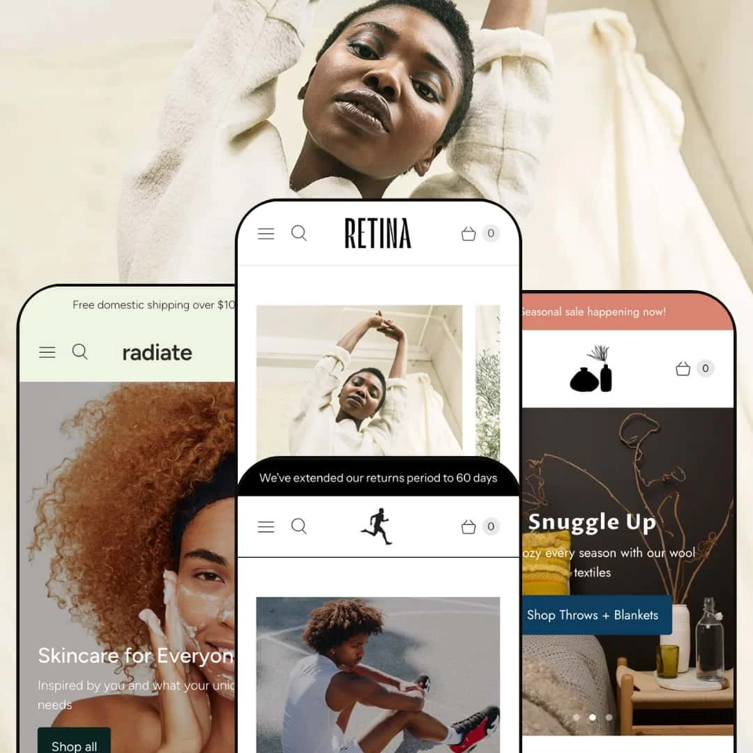
Retina is a premium Shopify theme aimed at merchants who want visually rich layouts and integrated shopping conveniences. From multi‑row hero sliders to fast slide‑out carts, the theme provides a toolbox of sections and blocks that can be combined in many different ways. The first impression is strong: each preset offers a distinctive brand story—fashion in Amsterdam, athletic gear in Austin, handcrafted home décor in Montreal and skincare in Melbourne—yet they all share a polished typography hierarchy and minimal, airy layouts that draw attention to products without clutter.
Pros.
〰️
Pros. 〰️
✚ Inline quick‑shopping with variant control
Across the theme, product cards and grids can open compact overlays that allow shoppers to choose variants and quantities without leaving the current page. In testing, these quick‑shopping modals respected colour and size selections and passed items cleanly into the cart drawer. For stores with medium‑sized catalogues, that balance between browsing and instant add‑to‑cart helps maintain momentum while still giving people enough information to make a choice.
✚ Storytelling sections for campaigns and content
Retina ships with a wide spread of sections aimed at both commerce and storytelling. Hero sliders, time‑sensitive promo bands, featured product modules, testimonials and blog previews can be mixed and matched so each preset weaves a slightly different narrative. That makes it straightforward to run campaigns such as clearance sales or new‑season launches without building one‑off landing pages from scratch. Horizontally scrolling product rails, tasteful promotions that introduce new arrivals and mid‑page strips of partner or press logos round out that toolbox, giving stores compact ways to surface many SKUs while reinforcing trust and social proof.
✚ Consistent cart drawer and navigation
The slide‑out cart behaves consistently across the presets, with quantity steppers and a space for order notes or special instructions built in. That consistency matters when shoppers move from one part of the store to another and always see the same pattern for adjusting their order. Header navigation and drop‑down menus are also handled cleanly, so even visually rich layouts remain easy to move through.
✚ Design flexibility across four presets
The four demos highlight how far you can push the styling without losing the shared core. Fashion, sportswear, handcrafted home goods and skincare each feel distinct in palette, typography and section sequencing, yet they clearly come from the same underlying system. That range should reassure merchants that they can adapt Retina to their own brand rather than feeling locked into one narrow aesthetic.
✚ Performance that keeps up with rich media
Despite the emphasis on large imagery, animations and overlays, the theme stayed responsive in testing. Page transitions felt smooth, the cart drawer opened quickly and interactive elements such as sliders and countdown‑style promos did not introduce noticeable lag. For merchants, that means you can lean into photography and content without immediately paying a performance penalty.
Cons.
〰️
Cons. 〰️
🚫 Quick‑shopping inconsistency across products
Not every product in the demos surfaced the same quick‑shopping behaviour. In some grids, a hover interaction led to a smooth overlay with variant choices, while other items either lacked the overlay entirely or produced a spinner without an immediate confirmation. That inconsistency can chip away at trust, so merchants should plan to test key collections carefully and make sure quick‑add behaviour is predictable.
🚫 Variant requirements not clearly signposted
On several product templates, the add‑to‑cart button stays disabled until a shopper has chosen a required variant such as size or colour. Functionally this is sound, but the interface does not always make it obvious why the button is greyed out. New visitors may briefly think the product is unavailable, so it is worth adjusting copy or helper text to clarify what needs to be selected.
🚫 Search overlay and modal behaviour quirks
Retina relies on a full‑screen overlay for search, which in testing only surfaced results after a query was submitted instead of offering live suggestions as you type. In at least one preset the search icon also occasionally failed to open the overlay when the user was scrolled all the way to the bottom of the page. Together with the occasional quick‑shop misfire, these small overlay issues introduce a bit of friction into what is otherwise a slick experience.
🚫 Configuration‑dependent friction points
A few of the rougher edges come down to configuration choices rather than hard limits in the theme. Examples include carts that require ticking a terms‑and‑conditions box before checkout and availability badges that do not always lead to a clear next action such as pre‑ordering or requesting an alert. Merchants should plan to review these flows during setup so that policy or stock messaging never leaves shoppers wondering what they can do next.
-
Main is staged squarely for fashion boutiques. It mixes editorial blocks with clean product grids so clothing, shoes and accessories read more like a magazine spread than a catalogue. The overall feel is light and minimal, giving product photography plenty of breathing room.
What works in this preset
Main’s home page leans heavily on that editorial mix. Hero areas, image‑with‑text rows and collection callouts are sequenced so a lookbook‑style image is often followed by a shoppable grid. That pacing lets a boutique owner tell short stories about occasions or outfits and then immediately present the pieces needed to recreate them. Because typography is restrained and spacing generous, even dense product grids stay readable. It feels tailored to stores that put a lot of effort into styling outfits or sets instead of simply listing stock.
On individual product pages in this preset, a dedicated size‑guide link supports the fashion focus. Opening a simple table of measurements next to fit options lets shoppers check lengths and widths before committing. For boutiques that sell multiple brands with different sizing, that small addition can reduce returns and pre‑sale questions. It also reinforces the sense that this preset was built first for apparel rather than being a generic layout hastily repurposed for clothes.
Towards the bottom of the home page, Main uses customer stories and editorial content to round out the brand narrative. Short testimonial quotes sit next to imagery so visitors see real‑world validation alongside styled outfits. A compact blog preview area makes it easy to surface lookbooks, care guides or trend posts without sending shoppers off to a separate journal section. For fashion brands that rely on storytelling and education, it is a neat way to keep that content inside the main shopping journey.
Where it stumbles
In Main, the rough edges observed are largely the same ones that show up across Retina as a whole rather than being unique to this preset. They relate to how overlays, search and variant‑dependent buttons behave and are covered in the theme‑wide weaknesses below. If you like the overall fashion staging here, you are unlikely to hit problems that belong only to Amsterdam.
-
Sprint is the athletic, high‑energy expression of Retina. It pairs bold colour blocks and full‑bleed action photography with punchy, sports‑centric copy so the store feels more like a performance brand site than a generic shop. The demo leans into a mix of footwear, apparel and accessories that would suit a training, running or gym‑focused catalogue.
What works in this preset
The landing hero cycles through large action shots and short taglines that speak directly to performance and motivation. Navigation dots and concise copy keep each frame focused, so shoppers see one clear message at a time before scrolling. For brands that invest in strong photography of athletes in motion, this hero format gives that content pride of place without feeling cluttered.
On the content side, Sprint’s blog layout uses a simple category accordion to organise training tips, product guides and other articles. That light structure invites visitors to explore without feeling like they are leaving the shop for a separate magazine. Fitness and sportswear brands that lean into education will appreciate having a built‑in place for training plans, injury‑prevention guides or style advice.
Where it stumbles
A more specific quirk in Sprint is how upcoming or out‑of‑stock items are labelled. In the demo, products marked as sold out or coming soon do not always offer a clear next step such as pre‑ordering or requesting a notification, even when the badge suggests future availability. That ambiguity can leave shoppers unsure whether an item is gone for good or simply not yet available, which is something merchants will want to tidy up when configuring their catalogue.
-
Sculpt is Retina’s softest, most artisanal preset. A pale palette, generous whitespace and careful typography give the demo the feel of a boutique homeware or ceramics brand rather than a mass retailer. The pacing is slower and more contemplative, matching brands that want to emphasise craft and texture.
What works in this preset
A prominent “Staff Picks of the Month” grid anchors the product story for this preset. Curated rows of objects give the sense that real people have chosen their favourites, which works well for handcrafted goods where curation is part of the appeal. Hover interactions and a compact overlay let shoppers get closer to an item directly from that grid before deciding whether to click through to the full page. It is a nice balance between editorial curation and everyday shopping convenience.
Blocks such as “Our Story” and “Turn Your House into a Home” pair warm photography with copy about materials, process and atmosphere. For shoppers, that extra context helps justify premium pricing and builds an emotional connection to the objects. For merchants, it offers a ready structure for talking about craft without needing to design custom landing pages.
Where it stumbles
The main annoyance specific to Sculpt in testing was how the new‑items promotion is configured. If cookies are not set correctly, the pop‑up can reappear on subsequent visits, which risks irritating loyal customers who browse often. It is the sort of behaviour that a merchant will want to check carefully once they plug the theme into a live store.
Some of the demo’s content blocks also ship with grey placeholder imagery rather than fully designed example photography. That makes it slightly harder to judge spacing and balance until you swap in your own assets. It is not a functional limitation, but it does mean you have to imagine the final look rather than seeing a fully polished composition straight away.
-
Radiate is the skincare and wellness preset in the Retina family. Soft greens, rounded accents and generous whitespace combine to create a soothing, almost spa‑like atmosphere. The demo is packed with cleansers, soaps and serums and reads like a modern apothecary.
What works in this preset
Radiate’s home page immediately steers visitors into the right part of the catalogue with skin‑type cards. Large tiles for dry, oily and sensitive skin, each with an image and clear call‑to‑action, make it easy for shoppers to self‑select a path that matches their concerns. That single design choice helps new visitors avoid overwhelm and gets them to a relevant group of products quickly.
Two‑column promotional sections like “Unique Skincare” and “Gentle & Natural Soaps” balance photography with more educational copy. One side of the row is devoted to imagery, the other to short paragraphs and a call‑to‑action that usually leads to a focused collection. This pattern is especially helpful for explaining ingredient stories or routines without requiring a separate landing page for each topic.
Even the 404 page receives attention in this preset. Typography, messaging and layout are aligned with the main site, and clear suggestions to continue shopping or search again keep the experience from feeling like a dead end. It is a small detail, but it reinforces the sense of a carefully designed, premium brand presence.
Niche Suitability
Not Ideal For
-
Retina is best suited to merchants with medium‑sized catalogues in visually driven verticals such as fashion, lifestyle, beauty, wellness and home décor. If photography, editorial content and curated product stories are central to how you sell, the theme’s presets give you a strong starting point.
-
Brands running a single flagship product, or those wanting an extremely stripped‑back, utilitarian layout with almost no imagery or storytelling, may find Retina more than they need. Stores that are highly dependent on one‑click, from‑the‑grid purchasing for every item might also prefer a theme that treats quick‑add behaviour as the only primary mode of shopping.
-
Medium — configuring hero sliders, storytelling blocks and detailed product information takes some upfront work, but the available sections cover most common marketing and merchandising patterns so you should rarely need custom code.
Final Recommendation
★ 8.0/10
Rating
-
Strong quick‑shop system, varied content blocks and product badges.
8
-
Drag‑and‑drop sections make setup straightforward, but variant requirements and inconsistent quick‑shop behaviour may confuse merchants and shoppers.
7
-
Tap‑friendly buttons and the slide‑out cart work well; no mobile‑specific quirks were observed.
8
-
Animations and modals load quickly, and page transitions are smooth even with large images.
8
-
Four distinct presets demonstrate broad styling possibilities, from fashion to skincare, plus a wide array of configurable sections.
9
FAQ
〰️
FAQ 〰️
-
👑 Yes. The Main preset is clearly styled for clothing boutiques, with quick‑shopping overlays and variant swatches that work well for garments and accessories.
-
📱In testing the Radiate and Sculpt presets, navigation, product grids and the slide‑out cart all worked well on resized windows. No mobile‑specific issues were observed.
-
🎨 Each preset includes configurable colour palettes, typography settings and multiple section layouts such as image‑with‑text blocks, testimonials and collection showcases. That allows merchants to tailor the look without editing code.
-
⚡ Pages load quickly and modal animations feel smooth. Even countdown‑style promo sections and testimonial sliders did not noticeably slow the experience.
-
👕 Yes. Quick‑shop modals and product pages allow selection of colours, sizes and quantities, but the required selection is not always obvious until you try to add an item to the cart.
-
🔎 No additional SEO toolkit is exposed in the theme settings, but Retina works with Shopify’s built‑in SEO features like meta tags and clean URLs. Blog and article sections encourage fresh content, which also helps.
-
💱 In the demos, a currency selector appears in the footer of each preset, and there is no sign that the theme’s layout interferes with Shopify’s multilingual features or currency features delivered via apps. The theme does not place obvious restrictions on using those options.
-
⚙️ Yes. As a Shopify theme, Retina remains compatible with most apps, though it is always wise to test integrations on a staging or unpublished theme copy before deploying to production.
-
🛒 The four preset demos—Main, Sprint, Sculpt and Radiate—are publicly accessible, and Shopify allows merchants to preview the theme on their own store before purchasing.
This review is based on hands‑on testing of the publicly available Main (Amsterdam), Sprint (Austin), Sculpt (Montreal) and Radiate (Melbourne) preset demos of the Retina Shopify theme as of November 21, 2025. Theme features, preset availability and performance can change with subsequent updates from the theme developer.