
The Retro Shopify theme blends nostalgic design with modern e-commerce functionality, offering three distinct presets: Summer, Shadow, and Skiny. This review moves beyond marketing descriptions, providing a detailed analysis based on hands-on testing of each preset's design, usability, and unique characteristics. While the theme shares a powerful set of universal features, this evaluation focuses on how each preset leverages them to create a distinct user experience.
Pros.
〰️
Pros. 〰️
✚ Integrated Conversion Accelerators: The theme consistently provides features like a sticky product header and strategically placed trust badges under the add-to-cart button, a combination that keeps purchase intent high and reduces friction at the funnel's most critical point.
✚ Dynamic Visual Merchandising: Polished tools like "Shop the Look" image hotspots, animated marquee text banners, and clean product tabs allow merchants to create a rich, interactive narrative that enhances brand perception and can support a higher Average Order Value (AOV).
✚ Seamless Navigation & Discovery: The theme's mega menu is exceptionally well-designed with dedicated space for in-menu promotions, a structure that streamlines product discovery and surfaces key offers without interrupting the user journey, potentially lowering site-wide bounce rates.
✚ Polished Micro-Interactions: From the smooth slide-out cart to responsive hover effects, the theme’s interactive elements feel fast and reliable, building subconscious trust and making the site feel high-quality to encourage longer Browse sessions.
Cons.
〰️
Cons. 〰️
− The Minimalist Trap: The theme's core strength—its clean, high-fashion design—is also its primary strategic weakness because it serves as a beautiful frame but offers little to hide imperfections. This poses a significant risk for merchants who lack professional photography, as sparse layouts can appear empty or generic, failing to deliver the intended premium impact.
− Downplayed Search Functionality: Across all presets, the theme relegates the search bar to a small icon, adding an unnecessary click for intent-driven shoppers. This creates user friction that could negatively impact conversion rates for stores with larger catalogs where search is a primary navigation tool.
− Underdeveloped Content Pages: The design focus is clearly on commerce, as the default blog and standard page layouts are visually basic. Merchants invested in content marketing may find this simplistic design undermines their brand’s premium feel, requiring extra customization.
-
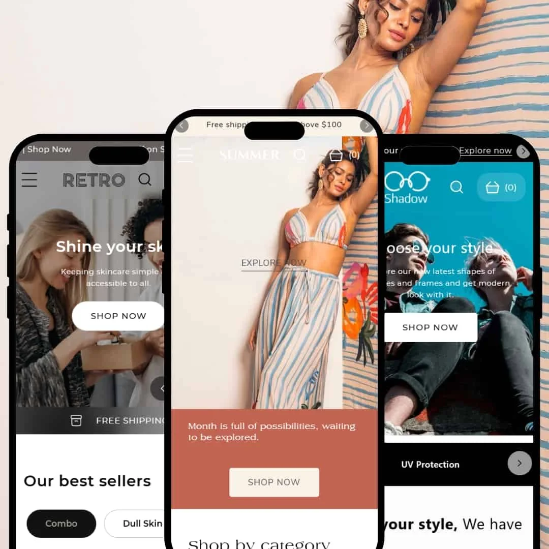
The Summer preset delivers a bright, high-energy vibe, perfect for brands that want to feel vibrant and youthful.
⊕ Pros
✚ Excellent Visual Hierarchy: The preset uses oversized, bold headlines and vibrant, colored-block backgrounds for its CTAs, making it incredibly easy for shoppers to know exactly where to click next.
✚ Impactful Product Testimonials: The design for customer testimonials is clean and visually prominent on the product page, placed right above the footer to build trust just before the final purchase decision point.
✚ Dynamic Collection Page Banner: The collection pages uniquely feature a full-width banner at the top, allowing for strong promotional messaging that doesn't get lost.
✚ Clear "Sold Out" Status: The "Sold Out" label is a large, black, solid block superimposed over the product image, making it impossible to miss and effectively managing customer expectations.
⊖ Cons
− Confusing Quick-Add Icon: Product cards feature a circular '+' icon to open the quick view modal. This universal symbol can be ambiguous for shoppers, who might not immediately understand it leads to product options, hindering product discovery compared to a clearer text label.
− Awkward Breadcrumb Placement (Mobile-Only): On product pages, the breadcrumb navigation path is squeezed between the product title and price on mobile, creating a slightly cluttered look that can be hard to read.
− Simplistic Footer Design: Compared to the other presets, Summer's footer is very basic. It lacks the richer multi-column layout for links and content, limiting space for trust-building information or expanded navigation.
-
This preset is purpose-built for the health and wellness industry, focusing on visual proof and product education.
⊕ Pros
✚ High-Impact "Before/After" Slider: This is the star of the homepage. The universal slider feature is used here to create a compelling, interactive case study that communicates a product's value far better than words alone.
✚ Clear Ingredient Highlights: Product pages feature a dedicated "Key Ingredients" section with icons and brief descriptions. It’s a clean, scannable design that makes complex product information easy for shoppers to understand.
✚ Prominent Trust Badges: Just below the main call-to-action on product pages, the theme displays clear, well-designed icons (e.g., "Vegan," "Cruelty-Free"). This is a smart, immediate way to build trust with conscientious buyers.
⊖ Cons
− Poor Default Contrast: The preset's announcement bar defaults to a low-contrast, light-gray-on-black color scheme. While fully customizable, this default choice fails basic accessibility standards and requires the merchant to immediately identify and change it to ensure readability for all visitors.
− Generic Newsletter Signup: The footer newsletter block is very plain and lacks the visual appeal of the rest of the theme, potentially reducing its effectiveness in capturing leads.
− Carousel-Hidden Details: While minimalist, hiding key details like materials or dimensions by default in accordions adds an extra click for curious shoppers, which can be a point of friction.
-
The Skiny preset finds a middle ground, blending a clean, modern aesthetic with a touch of warmth, making it versatile for lifestyle and wellness brands.
⊕ Pros
✚ Standout Before/After Image Slider: The homepage prominently features a Before/After slider, an excellent merchandising tool for skincare or service-based businesses to visually prove product value.
✚ Balanced Grid and Text Layouts: This preset does a great job of mixing product grids with text-and-image sections, allowing for effective brand storytelling alongside product showcases.
✚ Functional Footer Navigation: The footer is well-organized with clear headings and ample space for links, an FAQ section, and contact information, making it a genuinely useful hub for shoppers.
✚ Prominent Ingredient Sections: The product page design includes beautifully formatted, icon-driven sections perfect for highlighting key ingredients or benefits, a clear win for beauty and wellness brands.
⊖ Cons
− Ambiguous Cart Icon: The cart is represented by a "bag" icon paired with the word "Cart(0)". On mobile, this text can feel a bit small and less intuitive than a larger, more universally recognized cart symbol.
− Inconsistent Button Margins: On the homepage, the spacing above and below some CTA buttons is inconsistent from section to section, creating minor visual imbalances.
− Centered Text Readability: Some homepage sections feature wide blocks of centered text, which can become difficult to read for longer paragraphs compared to standard left-aligned text.
Niche Suitability
Not Ideal For
Final Recommendation
-
This theme is perfect for design-conscious, direct-to-consumer brands that have strong visual assets and want to create an editorial, campaign-driven shopping experience. Fashion, beauty, lifestyle, and other image-forward industries will benefit most from Retro's bold and clean aesthetic.
-
Merchants with very large, complex catalogs (e.g., auto parts, electronics) or those who rely on dense information rather than lifestyle photography may find Retro too restrictive. Likewise, businesses without high-quality creative assets should consider a theme that offers a more structured, less minimalist layout.
★ 8.2/10
Rating
-
Retro is packed with a strong suite of built-in features for marketing and merchandising. It correctly presents Shopify's standard filtering options in a clean, usable way, though advanced filter types depend on Shopify app configuration.
9
-
For shoppers, the theme is intuitive and easy to navigate. For merchants, its reliance on high-quality visuals means it may require more effort to populate and maintain a polished look.
8
-
The theme is fast and functional on mobile, but minor inconsistencies like cluttered breadcrumbs or small text in certain presets prevent a perfect score.
8
-
Based on hands-on testing, interactive elements were responsive, pages loaded quickly, and the overall experience felt fluid and lag-free.
9
-
While each preset is beautifully designed, the core aesthetic is opinionated and minimalist. It's highly effective within its niche but less adaptable for brands outside the fashion/lifestyle space.
7
FAQ
〰️
FAQ 〰️
-
👑 Yes, the strong visual storytelling features in presets like Skiny and Shadow make it an excellent choice for highlighting a single flagship product.
-
📱Yes, it's fully responsive. However, our testing found minor UX issues on mobile, such as cluttered navigation elements in certain presets, so be sure to test your specific content.
-
🎨 The theme allows full control over colors, typography, and section layouts. However, its core minimalist and bold identity is best suited for brands that align with that style.
-
⚡ Performance is a key strength. In our tests, pages and interactive elements like the slide-out cart and quick view loaded quickly with no noticeable lag.
-
👕 Yes, it supports product variants with clear dropdowns and color swatches. The presentation is clean and easy for customers to use on product pages.
-
🔎 The theme follows Shopify's SEO best practices. It allows for easy editing of meta titles and descriptions, and its clean structure is good for search engines.
-
💱 Yes, a language and currency switcher was present and functional in the header of the demo stores, allowing merchants to use Shopify Markets for international sales.
-
⚙️ Yes, as a modern Shopify theme, it is built to support Shopify App Store integrations and app blocks within the theme editor.
-
🛒 Yes, you can add the theme to your store and preview it with your own products for free. You only pay if you decide to publish it.
Disclaimer: This review is based on hands-on testing of the publicly available "Summer," "Shadow," and "Skiny" preset demos of the Retro Shopify theme as of June 2025. Theme features, preset availability, and performance can change with subsequent updates from the theme developer.