
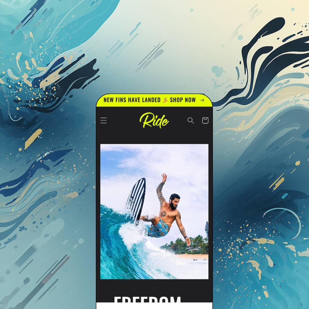
Most free Shopify themes keep the lights on: white canvas, quiet type, polite spacing. Ride flips the switch, pairing a dark default palette with heavy uppercase headlines and accent colors tuned to make gear photography glow. It's an Online Store 2.0 theme built by Shopify itself, pitched at sports brands, and staged in the demo as a surf label selling signature boards and swap-in fins. The question is whether a free theme this loud leaves room to build a brand that isn't shouting.
Long product content folds away instead of piling up
I clicked every collapsible panel open on the Filipe Toledo Wildfire page: a details panel carrying dimensions, foam core, stringer, fin system, and per-size volume, a tips panel, and a shipping panel holding full rate tables by board length without touching the buy box. Nothing scrolls forever. Spec sheets stay one tap away while add-to-cart stays on screen. That suits board-sports and outdoor gear merchants whose considered-purchase buyers compare volumes and fin setups before committing.
Rollover imagery that sells the use, not just the object
What actually sells a surfboard, the deck graphic or the wave? Ride hedges by showing both. Hover a product card and the studio shot swaps to a lifestyle image of the product in use, so the Kyuss King Fish flips from a clean deck photo to its rider mid-turn without a single click. For action-sports and lifestyle apparel brands with visually driven, impulse-leaning buyers, that one interaction does quiet conversion work on every grid where products appear.
Active development four years in
If you're launching a first store with a sub-30-SKU catalog on a tight budget and expect to sit on the free tier for years, maintenance pace matters more than any single feature. Ride is still moving. Version 15.5.0 landed on June 17, 2026, adding storefront-event support plus a new product-disclosures section and block, four years after the theme's April 2022 launch. You're not adopting an abandoned freebie; the theme keeps absorbing what the platform ships.
A rough public scorecard
The Theme Store rating sits at 36% positive across 22 reviews: eight positive, eight neutral, six negative. That's a thin endorsement. If you run a single-brand store with a small evergreen catalog and this theme will be your only storefront, a review base this lukewarm deserves real weight in the decision, whatever the individual complaints turn out to be.
Familiar bones under the paint
Underneath the paint job, it's Dawn in a wetsuit. The section primitives behave like Shopify's baseline theme, with slideshow, image-with-text bands, and multicolumn grids following the same editor rhythm, so the differentiation you're choosing is typographic and chromatic rather than a genuinely different layout toolkit. Apparel and accessories merchants in the 50-100 SKU range who want a structurally different toolkit from Shopify's baseline won't travel far here.
The identity doesn't switch off cheaply
The volume knob is glued near maximum. Dark defaults, all-caps headings, and loud accent colors run through every template, so a luxury jewelry label or a minimalist skincare brand courting considered-purchase buyers would spend setup time dialing the theme down instead of building anything up. Color schemes and heading typography are editable, but you'd be steering against the theme's center of gravity the whole way.
What it takes to launch
Expect a copy-and-imagery pass across hero statements, collapsible product panels, team bios, and shipping tables, plus sourcing photography with enough contrast to survive a dark canvas. Plan one to two days before launch.
-
What works in this preset
The homepage opens on a full-bleed shot of a surfer mid-wave, headline set in heavy uppercase over the water. I scrolled through the whole page twice and the rhythm holds: a featured board carousel, an athlete-signing announcement band, a single-board spotlight, and a two-image multicolumn for the fin system, all cut hard against the dark background. It reads like a brand film. Commerce arrives in between the story beats instead of leading them.
Land on the Ride Team page and you see what "championing sports" means in practice. Nine rider tiles, each a portrait with a two-sentence bio, laid out as an editorial grid that feels closer to a magazine feature than a store page. No app, no custom template work, just the theme's own sections doing roster duty.
The collection template earns its keep. Performance Boards opens with two stacked full-width action photos before the first product renders, and the filter-and-sort drawer keeps the grid itself clean while a nine-option sort list waits underneath. Seven boards, zero clutter.
Where it stumbles
The Theme Store pitch leans on asymmetrical layouts, and the demo doesn't really argue the case. Outside the fin-launch collage block, every homepage band runs symmetric and full-width; the layout language is bold, but it's bold in straight lines.
There's also a missed hand-off between story and shelf. I went looking for a link from any rider tile to the signature board carrying that rider's name and came up empty, which leaves the demo one click short of its own premise: athletes selling gear.
Ride is that rare free theme with an actual point of view: dark, loud, athletic, and unembarrassed about it.
The trade-off is that the point of view is the product. One preset means one starting position, so the closer your brand sits to high-energy gear, the more the defaults do for you, and every step away from that center gets paid for in configuration time rather than licence fees.
I'd still shortlist it for a zero-budget gear launch, eyes open about its mixed reception, because the money you aren't spending can go straight into the photography this design demands.
Rating
★ 7.0/10
-
Gear-selling essentials are all present: size chart, product video, lookbook, cross-selling, pickup display. The toolkit stays compact rather than deep, which is fair for a Shopify-built free theme.
6
-
One preset, a small section library, and familiar editor behavior mean there's very little to learn before a store looks like the demo.
8
-
The mobile menu folds both navigation lists into one slide-out with social links anchored at the bottom, and product galleries collapse to swipeable media with a thumbnail strip.
7
-
Pages stay lean, with restrained section counts, responsively sized imagery, and no heavy third-party payloads in the demo.
8
-
Plenty of control inside the identity (schemes, typography, section order), but the identity itself sets the walls, and quieter brands will feel them.
6
Frequently Asked Questions
-
Yes, it's in the theme's navigation options; the demo itself runs two plain dropdown menus (SHOP and EXPLORE), so you'd stage a mega menu yourself.
-
Badges render directly on product cards alongside strikethrough compare-at pricing: the Eric Geiselman Flash shows $320 against a crossed-out $330, and the Mason Ho Ride carries a sold-out badge.
-
A confirmation popup appears with checkout and continue-shopping actions, keeping shoppers on the page instead of redirecting them to the cart.
-
Both are part of the feature set, with product videos and a size chart joined by ingredients and usage panels aimed at consumable products.
-
Yes, quick buy is included in the cart and checkout feature set, so product cards can offer purchase triggers without a page visit.
-
Pickup availability display is a listed feature, so stores with local fulfillment can surface it on product pages once locations are configured in Shopify.
This review is based on hands-on testing of the publicly available preset demos of the Ride Shopify theme as of August 2026. Theme features, preset availability, and performance can change with subsequent updates from the theme developer.