
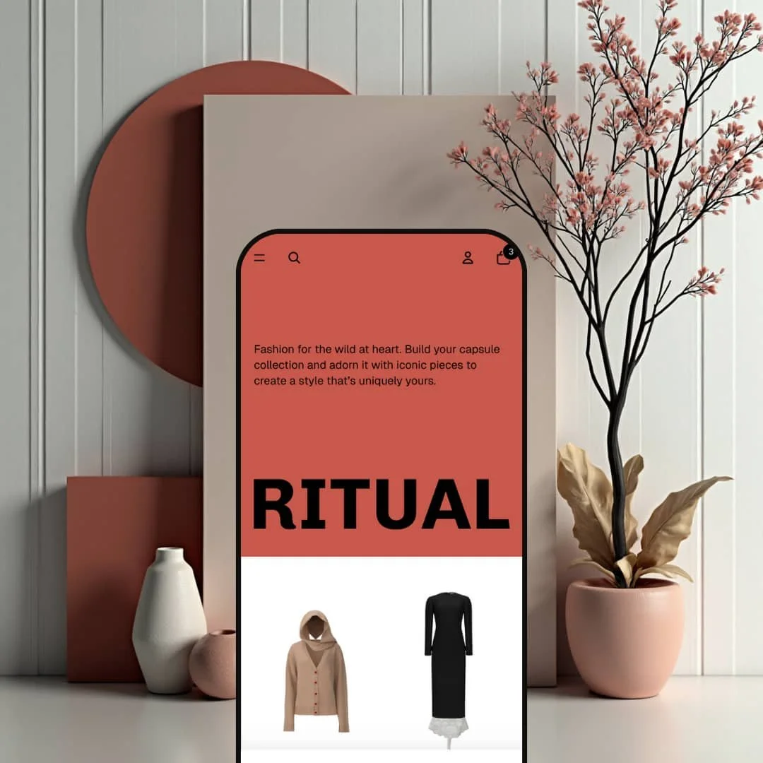
Ritual is a free, Shopify-built theme presented in the public demo as a single preset. In hands-on use, it reads like a modern fashion lookbook: a full-width hero, oversized typography, and generous whitespace that keeps attention on photography first. Navigation stays compact and easy to reach, and the browsing flow leans on fast search plus quick-view interactions rather than long blocks of on-page copy. If your brand sells with visuals and a clean editorial rhythm, Ritual’s default staging makes that feel natural from the first scroll.
Pros.
〰️
Pros. 〰️
✚ Lookbook-first layout that sells with photography
Ritual’s strongest advantage is its editorial pacing. The large hero, oversized type, and generous whitespace make products feel premium before a shopper reads a single description. For visual brands, that first impression can push faster engagement with collections and new arrivals.
✚ Predictive search that behaves like a product shortcut
The search overlay is designed to get shoppers to the right item quickly. As you type, it suggests products and collections, and it surfaces recently viewed items for fast backtracking. In real browsing, that reduces the “where was that product?” loop and keeps comparison shopping moving.
✚ Quick-view modal that keeps the grid flow intact
Quick view is implemented as a true modal experience with images, variant selection, quantity controls, and clear purchase actions. That matters because it lets shoppers learn enough to commit without leaving the product grid. When the goal is fast browsing and impulse-friendly shopping, this is one of the most useful mechanics in the demo.
✚ Variant presentation stays clear from browse to buy
Across quick view and the product page template, variants are handled with obvious swatches and buttons rather than hidden dropdowns. The quantity stepper and prominent purchase actions reinforce the path to checkout without visual noise. This kind of clarity reduces mis-clicks and makes the store feel more “shop-ready” out of the box.
✚ Cross-sell and brand pages feel native, not bolted on
The “Goes well with” section sits naturally under the product details, which is a clean way to introduce add-ons. Static pages like About Us and the Fit Guide match the theme’s visual language, so storytelling does not feel like an afterthought. The footer’s newsletter field and social links support retention without pulling attention away from shopping.
Cons.
〰️
Cons. 〰️
🚫 Minimal promotional framing in the default presentation
Ritual’s demo presentation keeps promotions understated. You do not see urgency-style modules or testimonial-style social proof being emphasized in the default flow. That can be a plus for premium branding, but stores that depend on louder conversion cues will need to stage them intentionally.
🚫 Low information density can be a mismatch for technical catalogs
The theme’s default rhythm favors images and short copy. If your products require detailed specs, comparisons, or reassurance-heavy copy, the pages can feel sparse unless you build that structure into your content. The upside is a clean canvas, but it puts more responsibility on the merchant.
🚫 Product detail content reads as one continuous block
On the product template in this demo, the description area is presented inline rather than being broken into smaller collapsible sections. Long-form information can still work, but it demands careful formatting. Without that effort, shoppers may have to scroll more than they would in a more segmented product layout.
-
Default is staged for premium apparel and accessories. The page rhythm is intentionally simple: big visuals, short headlines, and product grids that do most of the selling.
What works in this preset
The opening hero leans hard into a lookbook feel. Oversized type and a restrained palette make the first screen feel premium without needing much text. Because the layout gives the hero so much space, it naturally pushes visitors toward a scroll and a first click on products rather than a long read.
The header is kept minimal in this demo, which helps the site feel calm and uncluttered. While scrolling, the header remains visible, so the main category links and key icons stay within reach instead of disappearing after the first section. That “always there” behaviour makes browsing feel more like a gallery than a traditional catalog page.
Search is treated like a shortcut instead of a separate page you have to commit to. Clicking the magnifying-glass icon opens an overlay that starts suggesting products and collections as you type, and it also surfaces recently viewed items. In practice, that means shoppers can jump back into a product they were comparing without retracing their steps through the navigation.
Product grids are staged to reward hovering and quick comparison. Moving the cursor across a card can swap to a second image, and visible color swatches help you understand variation at a glance. The circular + trigger opens a quick-view modal with an image gallery, variant swatches, a quantity stepper, and clear Add to cart and Buy it now actions, so you can evaluate and purchase without breaking the grid browsing flow.
On the product page template used in this demo, variants are presented as straightforward size buttons and color choices, paired with a quantity stepper and prominent purchase actions. Beneath the main details, the “Goes well with” section introduces complementary items with pricing and sale badges, which feels like an integrated add-on rather than an aggressive pop-up. Outside the shopping flow, pages like About Us and the Fit Guide use large headings, lifestyle imagery, and simple calls to action, and the footer closes the loop with a newsletter field plus social links that feel consistent with the overall tone.
Where it stumbles
The demo’s conversion tone stays subtle. While browsing, you are not hit with urgency modules like countdown messaging, and you also do not see testimonial-style social proof being used in the default page flow. That keeps the aesthetic clean, but merchants who rely on stronger promotional framing will have to stage that content themselves.
Information density is intentionally low in this preset’s staging. The visuals do the heavy lifting, which is great for fashion, but it can feel thin if your customers expect spec-heavy shopping or side-by-side technical comparison. In those cases, you would need to add more explanatory content and structure to keep shoppers confident.
Product information reads as a continuous section rather than being broken into collapsible chunks. If you plan to run long descriptions, care instructions, or sizing guidance, you will want to be deliberate with headings and spacing so the page does not feel like a long scroll of text. In this demo template, there is also no obvious low-stock style messaging on the product page, so scarcity-based persuasion is not a front-and-center part of the presentation.
Niche Suitability
-
Fashion and lifestyle boutiques that sell with photography, brand mood, and curated drops. The Default demo makes it easy to browse visually, open quick view from the grid, and move from curiosity to purchase without friction.
Not Ideal For
-
Technical catalogs or stores that need dense on-page specification and heavy promotional framing as the default. If you depend on always-visible social proof, urgency messaging, or tightly structured product detail layouts, you will need to invest more effort into content and layout decisions.
-
Ritual is best for fashion and lifestyle brands that want a clean, editorial storefront where photography leads and shopping interactions stay fast. If you sell curated drops, premium basics, or accessories, the demo’s pacing and quick view can support a smooth browse-to-buy loop.
-
Stores selling technical, spec-heavy products or running aggressive promo cycles may find the default presentation too restrained. If your strategy relies on dense comparison content or constant urgency and social-proof cues, you will likely want a different starting point.
-
Medium — Ritual’s layouts make it easy to get a polished, premium look quickly, especially for image-driven catalogs. The extra work comes from adding your own promotional framing and structuring long product information so it stays scannable.
Final Recommendation
★ 6.8/10
Rating
-
The demo covers core storefront needs and adds strong browsing helpers like predictive search and a quick-view modal with purchase actions. The merchandising tone is intentionally minimal, so stores that need heavier promotional structure will do more work.
5
-
The layouts are uncluttered and section rhythm is straightforward, so it is hard to create a messy page by accident. Most of the visual polish comes from spacing and photography rather than complex configuration.
8
-
The interface is built around a compact header and clear purchase actions, which generally translates well to smaller screens. If you publish long descriptions, you may need to structure the content carefully so it stays easy to scan.
8
-
In hands-on use, pages loaded quickly and key interactions like the search overlay and quick-view modal opened without noticeable lag. Continuous loading on collection browsing did not stutter during testing.
8
-
Ritual gives you a strong editorial starting point, but its default personality is restrained. If you want a storefront that leans heavily into promotional widgets and dense content blocks, you may need more customization work.
5
FAQ
〰️
FAQ 〰️
-
👑 Ritual is staged like a fashion lookbook in the Default demo, with big visuals, quick view from the product grid, and clear size and color selection. It can work outside apparel, but products that need spec-heavy selling will require more content structure.
-
📱The Default demo relies on a compact header and large tap targets for purchase actions, which is a sensible pattern for smaller screens. If your product pages run long, you will want to format descriptions to stay scannable instead of feeling like a long wall of text.
-
🎨 The visual tone is driven by typography hierarchy, spacing, and large imagery, all of which are easy to reshape through your branding assets. In the demo, static pages like About Us use the same visual language, so brand storytelling stays consistent across the site.
-
⚡ In testing, navigation felt snappy and overlays like search and quick view appeared quickly after a click. Collection browsing remained smooth even as more items loaded during scrolling.
-
👕 Yes. The product page template in the demo uses clear size buttons and color selection, supported by a quantity stepper and prominent purchase actions. The quick-view modal also exposes variant choices, so shoppers can select the right option without leaving the product grid.
-
🔎 The demo experience points you to Shopify’s standard SEO workflow rather than a theme-specific SEO dashboard. The clean page structure and straightforward templates make it easy to publish pages that are readable for shoppers and structured for search engines.
-
💱 Yes. Language and currency behavior is handled through Shopify’s own configuration, so merchants can enable translations and multi-currency through Shopify settings and Shopify Markets as needed.
-
⚙️ Yes. Ritual supports the standard Shopify app ecosystem, so you can add apps for reviews, loyalty, subscriptions, or additional merchandising layers if your store needs them.
-
🛒 There is a public interactive demo for Ritual, and you can preview it with your own products in the Shopify editor before you publish a live storefront.
This review is based on hands-on testing of the publicly available preset demo of the Ritual Shopify theme as of December 26, 2025. Theme features, preset availability, and performance can change with subsequent updates.