
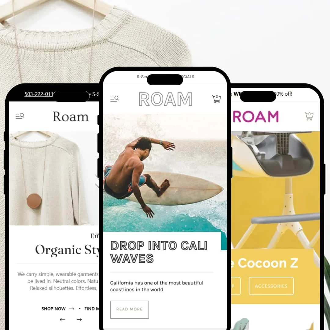
Roam is a premium Shopify theme with a flexible visual system and three distinct aesthetics. Each preset opens with a confident hero, leans on careful typography, and funnels attention toward clear calls to action. The net effect is a storefront that feels composed yet shoppable from the first scroll.
Pros.
〰️
Pros. 〰️
✚ A flexible merchandising toolkit
Roam ships with shopper-friendly mechanics—quick views, sticky add-to-cart bars, mega menus, and variant swatches—that cover most catalog needs without extra apps. Used well, these modules reduce pogo-sticking and keep purchase controls close to the scroll.
✚ Cohesive motion and layout language
Typography, spacing, and animation rhythms stay consistent across presets. Cart and overlay transitions feel smooth rather than flashy, which helps the storefront read as premium and intentional.
✚ Visual storytelling, built in
Across demos, you’ll find space for testimonials, brand stories, and video. That scaffolding makes it easier to sell on more than price, particularly for lifestyle products where narrative matters.
Cons.
〰️
Cons. 〰️
− Inconsistent card-level purchasing
Quick-add behavior varies by preset. Main surfaces quick views from the grid, while Trek and Wander route shoppers to the PDP first. That inconsistency can surprise repeat visitors and slows comparison shopping for some catalogs.
− Cart flow can interrupt momentum
In Wander, adding an item jumps to a full cart page instead of a drawer. Leaving the product context adds a beat of friction and can nudge bouncier shoppers away from multi-item sessions.
− Accessibility and content density
Small tap targets, lighter contrast pairings, and long PDPs put aesthetics over ergonomics at times. Merchants willing to tune sizes, colors, and section order will smooth most rough edges.
-
What works in this preset
The serif display type, generous whitespace, and neutral art direction give Main a boutique tone that flatters fashion and jewelry catalogs. Sections are paced like a lookbook, so product blocks feel editorial rather than crowded.
Hero and collection intros are styled to “frame” CTAs without shouting. Buttons sit in high-contrast fields, which helps first-time visitors move from browsing to product detail without hesitation.
Throughout the homepage, content modules are sequenced to alternate light and dark zones. That contrast makes long pages feel lighter and improves scannability for shoppers who skim.
Where it stumbles
We didn’t find any cons for this preset.
-
What works in this preset
Trek leans into bold headlines and full-bleed photography, then lines up products in horizontal bands. Browsing feels like flipping through a brand catalog, which suits boards, bikes, or any gear with dimensions that matter.
Product storytelling speaks to enthusiasts (e.g., emphasis on length, width, fin type). These callouts help shoppers translate specs into benefits without digging for technical tables.
The product cards favor a photography-first layout with minimal chrome. That keeps the grid visually clean and puts the burden—by design—on the image to sell the item.
Where it stumbles
Variant matrices can get dense on technical products. With many lengths or widths in play, picking the right option requires deliberate tapping, which slows fast comparisons.
-
What works in this preset
Pastel backgrounds, rounded shapes, and soft type create a friendly tone that resonates with parents. The aesthetic reads “safe and joyful,” which is useful when trust matters as much as price.
Navigation labels and header content lean into story. Sections like “Story” and “Play” invite exploration beyond products, helping new visitors understand brand values before they buy.
Homepage and PDP accents—illustrations, badges, and gentle micro-animations—keep kids’ items feeling lively without turning chaotic.
Where it stumbles
Some pastel-on-light pairings reduce contrast in secondary areas. Stores targeting accessibility guidelines will want to tweak those combinations for clearer legibility.
Niche Suitability
Not Ideal For
-
Mid-sized to larger brands in fashion, outdoor, or kids’ goods with solid imagery and a story to tell. If you value visual range plus built-in shopping patterns, Roam delivers.
-
Marketplaces or parts catalogs that depend on rapid grid-level comparison may prefer a theme with uniform quick-add across presets—and a tighter, more compact card system.
-
Medium: expect thoughtful image selection, preset choice, and menu configuration. The built-ins reduce custom code, but dialing in layout and brand voice still takes time.
Final Recommendation
★ 7.8/10
Rating
-
Quick views, sticky bars, and flexible mega menus cover most storefront patterns. Power is there, though not every preset exposes the same behaviors by default.
8
-
Clear navigation and labeled controls aid first-time visitors. Small tap targets and long PDPs can slow some users, and merchants will spend time sequencing sections well.
7
-
Core interactions translate cleanly and remain usable in narrow viewports. Hover-triggered affordances are less obvious on touch, so rely on clearly sized buttons and links.
7
-
Transitions feel quick and input-to-response latency stays low. Large hero images and embedded video can slow first paint if assets aren’t optimized.
8
-
Three distinct presets plus robust section controls make brand fit straightforward. The caveat: weaker photography shows—Roam rewards strong visuals.
9
FAQ
〰️
FAQ 〰️
-
👑 Yes. Main’s editorial pacing and Trek’s spec-forward layouts both suit apparel, footwear, jewelry, and outdoor gear.
-
📱Generally yes. Menus collapse cleanly and purchase controls remain reachable. Some small controls may need size tweaks for thumbs.
-
🎨 Fonts, colors, spacing, and section order can be adjusted in the Theme Editor. Mega-menu imagery and icons are easily swapped to fit your tone.
-
⚡ Page transitions and drawers feel responsive in testing. Compress large imagery and right-size video to keep initial load snappy.
-
👕 Yes. Variant swatches and size selectors are present on PDPs and in quick views where enabled; Trek also showcases a persistent selector on long pages.
-
🔎 Roam doesn’t get in the way. It presents standard fields cleanly, so you can handle metadata, alt text, and structured content as usual.
-
💱 The theme follows Shopify’s current architecture and works with app blocks. Reviews, recommendations, and loyalty tools slot in without template surgery.
-
🛒 You can preview Roam in your store before purchasing, and the public demos provide a good feel for setup and pacing.
-
🔆 Match your brand voice first: minimal (Main), energetic/spec-led (Trek), or playful/family-centric (Wander). Then fine-tune sections to fit your catalog size.
This review is based on hands-on testing of the publicly available “Main,” “Trek,” and “Wander” preset demos of the Roam Shopify theme as of 16 September 2025. Theme features, preset availability, and performance can change with subsequent updates from the theme developer.