
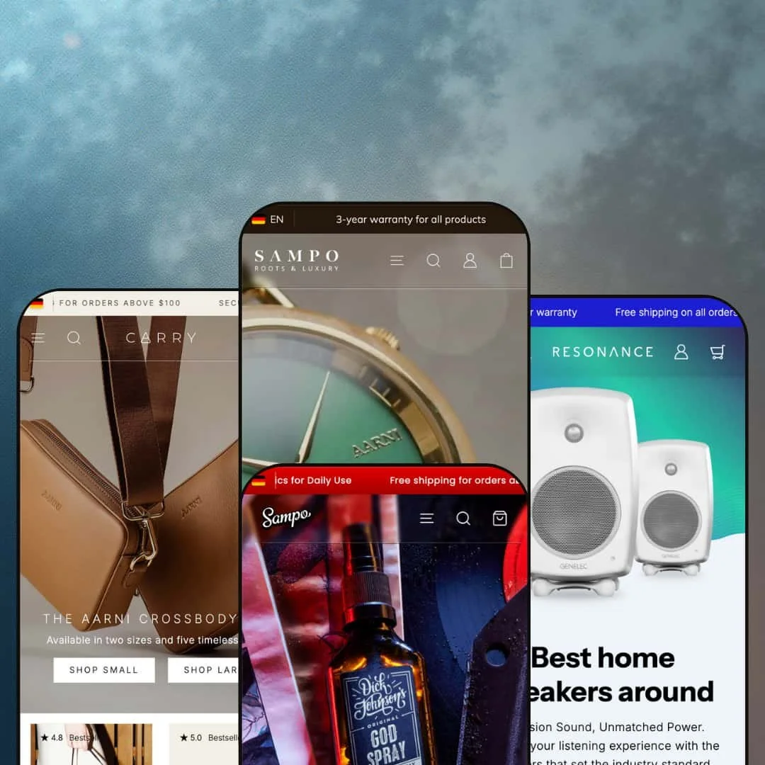
Sampo is a visual-first Shopify theme built for brands that sell on story as much as on product specs. Across the Default, Mighty, Resonance and Carry demos, the theme keeps the overall shopping framework familiar, but changes the mood dramatically from one preset to the next. You get big hero media, plenty of breathing room around headings, and a clear typography hierarchy that’s meant to nudge a first-time visitor into browsing rather than bouncing.
Pros.
〰️
Pros. 〰️
✚ Flexible presets, consistent core
flexible preset options that maintain core functionality while offering distinct aesthetic approaches. In practice, that shows up in how each demo keeps the shopping journey familiar while changing the visual tone completely. Default feels like a boutique editorial, Mighty goes bold and masculine, Resonance stays clean and technical, and Carry leans warm and craft-led.
✚ Navigation built for browsing
Sampo’s demos put a lot of emphasis on navigation that helps shoppers explore by category or product line. Default and Carry stage classic top navigation with richer dropdown-style browsing, while Mighty uses a plus-icon approach for category access and Resonance shifts navigation into a side-drawer layout that suits series style catalogues. In Default’s demo, the browse menu is dressed up with promotional imagery, which makes category exploration feel curated instead of purely functional. The common thread is that exploration stays close at hand, which matters when customers are still deciding what they want.
✚ Search that behaves like a shopping tool
Across all four presets, the search experience opens as an overlay and updates as you type. As you enter a query, the overlay surfaces suggestions and product results so you can click through without an extra results-page detour. In real browsing, that makes search feel less like a dead-end form and more like a guided route into products, especially when shoppers arrive with a specific term in mind. It’s also consistent enough that it doesn’t feel like a different feature from one preset to the next.
✚ Product discovery without losing context
Sampo supports quick product inspection flows, and the demos show more than one way to stage them. Default keeps quick-view access visually obvious on product cards and even uses a limited-edition style callout that acts like a mini product feature on the homepage, while Carry stages quick view more subtly inside product carousels and listings. When the quick view is used, the panel style lets shoppers see imagery, price and the add-to-cart action without losing their place in the grid. Several demos also pair product discovery with storytelling sections, using callouts placed over imagery and editorial blocks that explain materials or craftsmanship, and Carry frames promotions with event-style sale styling and discount labels.
✚ Cart and add-on merchandising are built in
The cart experience in the demos isn’t just a list of line items. In Mighty and Resonance, adding to cart triggers a slide-out view that surfaces recommendations alongside the subtotal and checkout action. Quantity controls are right there in the cart view, so adjusting an order doesn’t feel like a separate workflow. Carry pairs the cart with add-on suggestions and a progress-style message tied to free shipping, which encourages shoppers to keep browsing rather than treating checkout as the end of the session.
✚ Long product pages keep the buy action within reach
Product pages across the demos are designed to handle long content without burying the purchase action. Sticky add-to-cart bars appear as you scroll, and supporting details are staged in expandable sections so the page stays readable. The Mighty demo also pairs its product content with a slider-style detail element, which keeps extra information compact while staying on-brand. That matters for categories like fragrance, audio equipment or leather goods, where buyers often scroll for reassurance before committing.
Cons.
〰️
Cons. 〰️
🚫 Minor polish quirks on long layouts
In the Default demo, the back-to-top link scrolls close to the hero rather than landing at the absolute top of the page. It’s a small detail, but on long, section-heavy homepages those micro-interactions contribute to whether the site feels fully refined. The same demo also shows a slight overlap between the newsletter sign-up and social icons at narrower widths.
🚫 Media-heavy sections can shift during loading
The Mighty demo occasionally shows brief layout movement as product images load in the bestsellers grid. It’s not a dealbreaker, but it can create a momentary jump that makes the page feel less smooth than the design intends, especially on product-led sections where the eye is scanning quickly.
🚫 Sticky elements can stack over content
In the Carry demo, the sticky add-to-cart bar can overlap parts of the related-products area when the cart drawer is open. The intent is good, keeping purchase actions visible, but the stacking can reduce how much of the surrounding content is visible in that moment.
-
Default is the most understated of the four demos. It’s built around muted colours, generous whitespace and restrained typography, so the product photography ends up doing most of the selling.
What works in this preset
The overall pacing is calm. Sections don’t feel crowded, headings have room to breathe, and the tone stays consistent as you scroll. If you’re selling accessories where perceived quality matters, that restraint helps because nothing on the page fights with the product shots for attention.
The opening hero is a full-width product image with two call-to-action buttons. That “two clear choices” structure is useful when you want to guide a visitor without overwhelming them. One button can be staged as a direct purchase path, while the other can act as a softer browse route into the broader catalogue.
Default also stages category discovery in a straightforward way. The demo highlights watches, wallets and sunglasses early, then follows with brand-story content rather than jumping straight into wall-to-wall product grids. For boutiques, that order makes sense because it sets context first, then earns the click into the catalogue.
The supporting sections read like an editorial layout, not like a stripped-down product feed. If you have good lifestyle imagery, Default gives you space to use it without turning the homepage into a slideshow of disconnected blocks. The result is a storefront that feels like a brand site first and a catalogue second, which is often exactly what premium accessories need.
Where it stumbles
If your brand relies on loud promotional styling, Default may feel almost too composed. The same minimal approach that signals premium can also underplay urgency unless your imagery and copy do the heavy lifting.
-
Mighty takes the same underlying storefront structure and pushes it into a gritty, masculine direction. Dark backgrounds, bold type and red accents give it a grooming-and-fragrance vibe without needing extra visual tricks.
What works in this preset
The first screen is built around a tri-panel hero that showcases featured products right away. Instead of a single hero image and one button, the layout makes “featured selection” the whole point of the landing experience. That can work well for grooming brands that want to steer shoppers into a curated routine, scent drop or seasonal bundle.
Mighty’s styling is confident and direct. The contrast between dark sections and brighter product imagery creates a strong hierarchy: you notice the product photography first, then the supporting text. In the demo, that hierarchy keeps the page from feeling busy even when there are several product-led sections in a row.
This preset leans into a shop-now rhythm. It uses product-forward blocks alongside supportive brand messaging, rather than spending most of the page on long narrative sections. If you’re running frequent launches, that structure can help your storefront feel current without needing a full redesign every time.
The visual system is also consistent from section to section. Repeated accent colours and the darker background treatment give the demo a cohesive brand world, which is hard to achieve with a generic template. If you already have strong product shots, Mighty does a lot to make them feel more dramatic and premium.
Where it stumbles
In the Mighty demo, some small text elements like ratings and review counts sit in a very compact size. Against the dark background, those micro-details can become easy to miss, which matters if social proof is one of your main conversion levers.
-
Resonance is the cleanest, most technical-looking preset. It leans on off-whites, muted blues and generous spacing to create a high-fidelity, engineered-product tone.
What works in this preset
The page structure is built to feel trustworthy. The demo mixes lifestyle imagery with sections that read like product education, which fits categories where shoppers want to understand what they’re buying before they hit the cart. The overall design isn’t flashy, but it feels intentional in a way that suits premium electronics.
Resonance gives product information room to breathe. Technical details are staged as a first-class part of the layout rather than being squeezed into a short paragraph under the buy button. That approach is useful when your product pages need to support specs, comparisons or setup guidance without making the site feel like a support portal.
Even with the technical tone, the preset doesn’t feel sterile. The spacing and typography keep the reading experience smooth, and the product imagery remains the focal point. The demo’s use of a testimonial-style quote and an about-style section adds just enough human context to balance the engineering vibe.
Overall, Resonance feels designed for brands that need to communicate credibility. The colour palette is restrained, the hierarchy is clear, and the layout gives serious product energy without drifting into boring minimalism.
Where it stumbles
If your brand identity depends on warmth, texture or playful copy, Resonance can feel a bit clinical. The preset’s strength is clarity, but the visual restraint means your brand voice has to come through in photography and content rather than colour.
-
Carry is designed around craftsmanship and lifestyle. Earthy tones, refined typography and warm photography make the demo feel like a leather goods brand site rather than a generic storefront.
What works in this preset
The hero staging is clear: the demo leads with a crossbody bag presented in different sizes. That immediately signals what kind of store you’re in, and it sets expectations for the rest of the experience. For accessory brands, that kind of single-product introduction is often stronger than a busy multi-product hero.
Carry leans into long-form storytelling. The product pages in the demo don’t stop at a gallery and a buy box. They’re structured more like a narrative, with large imagery, supportive text sections and a rhythm that encourages scrolling. If your brand sells on materials and craft, that structure gives you room to explain value without stuffing everything into one short description.
The preset’s visual consistency is one of its strengths. Type is restrained, spacing feels deliberate, and the photography carries a cohesive colour story. That cohesion makes it easier to add new products over time without the homepage feeling like a patchwork of mismatched campaigns.
Carry also stages a promotion moment well. The demo includes a sale-oriented section and uses styling that makes discounting feel like an event rather than a quiet price change. For accessory categories where seasonality matters, that kind of presentation can make promotions feel more intentional.
Where it stumbles
Because the Carry demo is so narrative-heavy, it can feel like overkill for a very small catalogue. If you only have a handful of products and minimal content, the long sections may read as empty space rather than premium storytelling.
Niche Suitability
Not Ideal For
Final Recommendation
-
Sampo is a strong fit for merchants who invest in photography and want a theme that supports both storytelling and straightforward shopping. If you’re building a brand site feel, not just a product list, the demos show enough structure to carry long pages without feeling improvised.
-
If your store depends on ultra-minimal content, or you want a simple grid-first experience with very little editorial staging, Sampo may feel heavier than you need. The theme’s best moments rely on curated sections and strong visuals, so it rewards merchants who plan their content.
-
Medium — The theme provides a lot of structure out of the box, but it expects real assets. You’ll need strong photography and some time to stage sections so the presets feel intentional rather than like default demo blocks.
★ 7.6/10
Rating
-
Sampo’s demos show a theme that’s comfortable with modern shopping patterns: overlay search, cart interactions that surface add-ons, and product pages designed for long-form detail. The functionality feels geared toward real commerce rather than decoration, and the same core behaviors show up across very different visual presets. It’s particularly strong when you want a store that can feel editorial without becoming confusing to shop.
8
-
You can launch with the presets quickly, but the theme encourages deeper setup. To get the most from it, you’ll spend time arranging sections, staging navigation, and making sure product storytelling is consistent from homepage to product page. If you treat the presets as starting points rather than finished stores, the learning curve feels manageable.
7
-
In hands-on testing, the key shopping flows remained usable when viewing product pages and moving through add-to-cart interactions. Sticky add-to-cart bars help keep the purchase action accessible on long pages, and the overlay style for search and cart keeps the experience contained. The main requirement on mobile is simply having the content to justify the scroll, because the theme does not aim for short, minimalist product pages.
8
-
Most pages felt quick in use, and interactive overlays responded promptly. The main slowdown I noticed was occasional layout shifting as image-heavy product blocks loaded, particularly in the Mighty demo. If you use very large images or dense carousels, it’s worth checking that your media is optimised so the page feels as polished as the design.
7
-
The four presets cover a wide aesthetic range, from boutique minimalism to technical modern and craft-led lifestyle. Because the core shopping structure stays consistent, you can pick a preset for tone, then focus your work on content and merchandising rather than rebuilding the customer journey. The demos make it clear that a lot of the feel comes from spacing, typography and how you stage imagery.
8
FAQ
〰️
FAQ 〰️
-
👑 Yes. The Default and Carry demos are staged with an editorial feel and give product photography room to work, which suits premium accessories and small luxury catalogues.
-
📱Yes. In testing, sticky add-to-cart bars and overlay interactions stayed usable on product pages like G Four Active Speaker Black and Large Crossbody Bag – Taupe.
-
🎨 The presets already cover very different visual identities, and the demos show that section pacing, typography and colour choices can be staged to match a brand. Mighty’s dark, red-accent styling and Default’s muted editorial look are clear examples of that range.
-
⚡ Search and add-to-cart interactions responded quickly in the demos, and most scrolling sections felt smooth. The one notable exception was brief layout shifting when image-heavy grids loaded, especially in Mighty.
-
👕 Yes. In Resonance, single-variant items can be added directly, while multi-variant products trigger a selection step so shoppers don’t accidentally add the wrong option.
-
🔎 The demos don’t present a dedicated SEO dashboard, but the layout supports content sections like blogs and brand storytelling that can be useful for organic discovery. Product pages also give space for structured information beyond a short description.
-
💱 Yes. Language and currency are handled through Shopify’s standard tools, and the demos show a currency selector in the header, such as USD in Carry.
-
⚙️ Yes. As a Shopify OS 2.0 theme, Sampo supports app blocks, and the demo interactions around search and cart did not show obvious conflicts during testing.
-
🛒 Yes. The theme is publicly previewable through the four preset demos, which makes it easy to explore the layouts and shopping flow before committing.
This review is based on hands-on testing of the publicly available demo presets of the Sampo Shopify theme as of 25 December 2025. Theme features, preset availability and performance can change with subsequent updates from the theme developer.