
Something doesn't add up on Satoshi's Theme Store page. Five presets, an in-store pickup widget wired into Shopify locations, pre-translated EU strings, mega menus that carry featured-product tiles inline, a cart drawer with discount codes and gift-box add-on, and a $100 list price. That's a stacked feature list at a budget-tier price point. The question this review answers is whether Satoshi delivers across all five presets, or whether the spread thins out somewhere merchants don't notice until install.
Five-vertical preset coverage at disruptor pricing
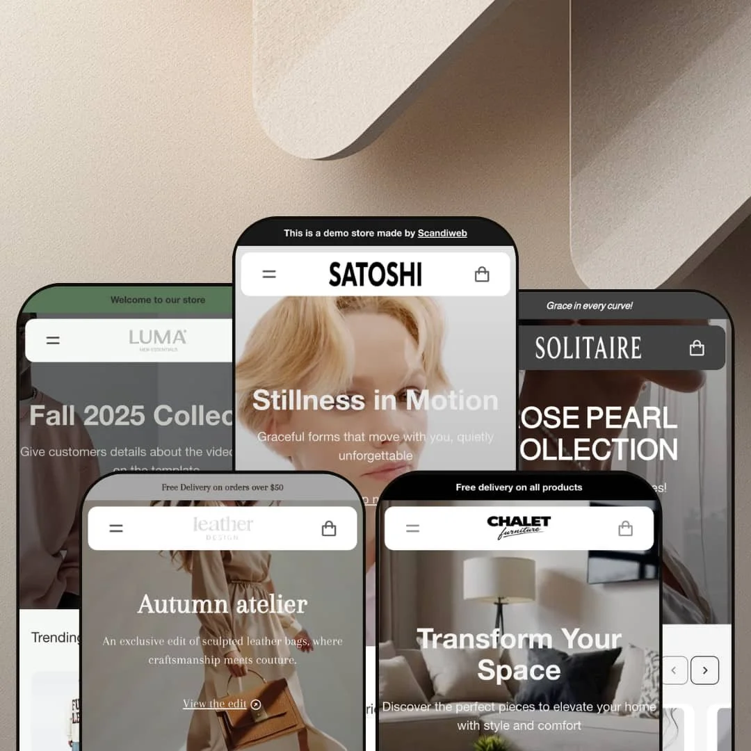
For multi-brand operators running two or three Shopify storefronts at the budget tier, Satoshi's five presets (Satoshi activewear, Luma menswear, Solitaire pearl jewelry, Leather bags, Chalet furniture and home decor) replace what would otherwise be multiple separate theme licenses. The aesthetic spread is unusually wide. From minimalist activewear category grids to soft-luxury pearl content blocks to room-and-category furniture browsing territory, each preset is structurally distinct, not just a palette swap.
In-store pickup widget wired to Shopify locations
The in-store pickup widget on Luma PDPs renders multiple physical store addresses inline, pulled from Shopify locations data: Cairo, Riga, and a France branch all surfaced under the add-to-cart button on the Wool Overshirt Set page. That's pickup-app work, free. For jewelry and leather goods brands with physical boutique footprints, this puts boutique availability in the buyer's view before checkout, not after a "where to find us" page detour.
Cart drawer ships with the full conversion stack
The slide-out cart drawer ships with discount code field, order notes textarea, upsell products strip, gift-box add-on, and tax-included subtotal display all visible by default. No app subscription needed. For jewelry, accessories, and gift-heavy verticals where decision-makers reconsider at the cart step, this means the cart-layer conversion tooling is wired in at install rather than assembled from separate paid integrations post-launch.
Vertical-appropriate navigation patterns across presets
Each preset's navigation maps to its vertical's actual shopping pattern. Chalet runs dual axes: Shop by Room (Living, Dining, Bedroom, Office) plus Shop by Category (Sofas, Beds, Tables, Chairs, Desks, Dressers), which is how furniture shoppers actually navigate. Solitaire runs by jewelry type: Bracelets, Earrings, Necklaces, Rings. Leather runs by gender plus product category. The nav isn't a single template stretched across five palette swaps; it's tuned per vertical. For multi-brand operators planning two or three storefronts at different price tiers, the per-preset nav tuning is one less information-architecture decision to commission at install.
Online Store 2.0 architecture, one generation behind Horizon
Satoshi is built on Online Store 2.0, not the newer Theme Blocks architecture that powers the Horizon family released in mid-2025. That means section nesting tops out at roughly two levels and AI-block generation workflows aren't compatible. For content-heavy clothing brands planning editorial depth, multi-section product storytelling, or deeply nested merchandising blocks within hero sections, the architectural ceiling is real. At $100, this is the trade. At full premium pricing, sharper.
Native subscription and bundle-builder features aren't in the box
Satoshi's feature list covers conversion infrastructure: cart drawer, in-store pickup, back-in-stock email capture. But it skips two capabilities subscription-first and bundle-first DTC brands assume in a premium theme: a native subscription toggle on the PDP, and a real bundle-builder beyond Leather's three-option variant picker. For subscription-coffee brands or beauty-bundle operators planning monthly recurrence as their primary revenue model, app installs are still required. The cart is sharp. The subscription stack isn't there.
Lead preset undersells the theme's depth
The Satoshi-branded lead preset is the simplest staging of the five demos: six homepage sections, basic category image grid, restrained section deployment. The other four presets (Luma, Solitaire, Leather, Chalet) stage richer demos with deeper section deployment and more aggressive merchandising. All section types and theme features are available across every preset (mega menu, in-store pickup, Customer Reviews block, multi-language switcher are theme-wide capabilities). For buyers evaluating the theme through the Theme Store preview, the lead preset that carries the theme's name shows the theme at its least dressed. Click through Chalet or Leather before deciding; the staging difference is dramatic.
What it takes to launch
Plan for a two-to-three-day pre-launch pass across all five preset homepages and PDPs: copy and brand-naming cleanup (vendor field overwriting, brand-bleed copy replacement, translation-key population on category navigation, currency-announcement alignment), collection-structure setup for dual-nav presets like Chalet where Shop by Room and Shop by Category both need real collection backing, in-store pickup location data entry, and merchant-side product photography upload at the scale the demos imply. The multi-preset breadth that makes Satoshi attractive at $100 is also what front-loads merchant install work.
-
What works in this preset
I clicked through the Men's Activewear, Women's Bottoms, and Women's Tops grids. The image-tile category arrangement is staged with model photography and gendered grouping, and each tile reads as a content card rather than just a text label. For activewear merchants with men's and women's lines who want category-tile entry before deep filtering, this is solid front-page architecture.
Trending Now pulls €30-70 product pricing with clean cards. The lean is studio-clean: no model shots in the main carousel, and the price range tells you who the demo is built for, mid-budget athleisure rather than luxury sport. Built on Online Store 2.0 architecture, the section variety covers the basics: Featured Collection, Image with Text, content blocks, sale strips.
The "Fall 2025 Collection" image-and-text content block links into the men's collection with an "Explore More" CTA. Basic editorial setup. Adequate, not striking, but for a lead preset positioned as the cheapest entry point in the catalog, adequate carries some weight.
Where it stumbles in this preset
The Satoshi-branded lead preset stages a stripped-down demo: minimal section count, restrained merchandising, basic navigation. The theme's deeper features (mega menu, in-store pickup widget, Customer Reviews block, multi-language switcher) are available in the theme editor but aren't surfaced in this preset's demo. For merchants evaluating only this preset before purchase, the demo reads thinner than the theme's actual capability. Configuration work brings it up to the staging depth of Chalet or Leather, but the preview undersells what's available.
-
What works in this preset
Luma trades activewear minimalism for streetwear weight. The Trending Now grid carries Statement Sweatshirts, Refined Slim Jeans, and Wool Overshirt Sets in the €78-213 range, heavier-fabric pieces with more aspirational pricing and a vendor field showing "LUMA" as the brand designation. The Shop the Look image-hotspot section sits below the carousel, demonstrating the theme's hotspot feature using a model image with tagged products inline.
The "Our Mission" and "Lifestyle First" content blocks alternate image-left and image-right layouts with long-form brand copy. For DTC merchants building brand-story depth into the homepage flow, this is a section pattern worth using. The trust-badge row at the bottom (Return Policy, Worldwide Delivery, Sustainability, Authorized Retailer) runs four icons across with merchant-editable copy underneath.
The sale section uses clean strikethrough pricing with percentage-off badges visible on each card: -19% OFF, -14% OFF, -26% OFF. The Active Series mid-page carousel folds back in 12 athleisure products at full price. Together, the homepage reads as a six-section editorial flow with content, product, content, product alternation, not the typical premium-theme stacking of feature blocks above the fold.
-
What works in this preset
Solitaire commits to a single audience, pearl jewelry with a soft luxury feminine voice, and the preset shows what happens when the theme drops its versatility pose. The hero opens on "ROSE PEARL COLLECTION," the announcement bar reads "Grace in every curve!," and the category grid offers four pearl-specific entries: Bracelets, Earrings, Necklaces, Rings. The Trending Now grid runs ten pearl pieces in the €78-339 range.
Five image-with-text content blocks stack mid-page: Timeless Elegance, Crafted with Care, Feminine by Nature, Versatile Beauty, Thoughtful Gifting. Each block carries a single soft-focus image and a two-to-three-sentence brand value. For pearl and fine-jewelry brands with under 50 SKUs leading with editorial story over catalog depth, this is a content-block library that pulls weight without app dependencies.
The Customer Reviews section caught my attention: four testimonials styled with five-star ratings and quoted text, all theme-rendered, no Yotpo or Judge.me wiring needed. It's not a UGC review tool. But for a preset built around feminine luxury where conversion lift comes from social proof, the testimonials section is a baked-in pattern most themes save for app integrations.
Where it stumbles in this preset
The commitment to pearl jewelry specifically (not gold, not silver, not gem-stones) is so visible that the preset is harder to re-aim than other Satoshi presets. It's pearl all the way down. The hero text, the category names, the brand-value blocks all default to pearl vocabulary. For merchants in adjacent fine-jewelry categories who'd benefit from Solitaire's editorial pattern, the rewrite work is meaningful.
-
What works in this preset
"Autumn atelier" reads in the hero, and the rest of the preset earns the editorial language. The hero CTA routes to /collections/spring-collection, the kind of demo slip you fix in the first hour of install, but the visual language is consistent: structured leather imagery, muted neutrals, condensed all-caps section headers. The Collections grid links into Women, Women Handbags, Women Accessories, Men, Men Bags, and Men Accessories.
The featured product mid-page is The Starlume Shoulder Bag at €138.99. The homepage variant picker is what makes the preset worth pausing on: "Bag only / Pendant only / Bag and pendant" as a three-option selector exposed inline. For accessories brands selling bundle-able combinations (purse plus charm, watch plus strap, necklace plus pendant), the inline variant-with-bundle picker is genuinely useful merchandising at the homepage layer.
Five image-with-text brand-value blocks stack the homepage: Handcrafted with Purpose, Timeless Not Trend-Driven, Premium Natural Materials, Designed for Real Life, Sustainable Philosophy. Same pattern as Solitaire. The blog grid at the bottom carries four articles on bag care, gifting, and brand story, and together with the trust pillars at the footer (Quality Promise, Satisfaction Promise, Durability Promise, Sustainability), the preset reads as a fully-built editorial bag storefront rather than a demo.
-
What works in this preset
The dual navigation is the first thing that registers when you open Chalet. Two image-tile grids stack one after the other. Shop by Room (Living, Dining, Bedroom, Office) and Shop by Category (Sofas & Couches, Beds, Dining Tables, Coffee Tables, Desks, Dining Chairs, Dressers). That's how furniture shoppers actually navigate, by where the piece will go and by what type of piece it is, and Chalet's preset surfaces both axes inline on the homepage instead of nesting one inside the other.
The bestsellers grid is wide. Thirteen pieces, €98 to €2,500 — Tessa Marble Top Table, Sloan Tufted Ottoman, Nova Bed at €2,099 sale-priced from €2,599, Harper Tufted Wingback Bed at €2,500. Sale-price strikethrough renders cleanly on the high-ticket items, percentage-off badges visible on the cards, and the trust-pillar row at the bottom carries furniture-vertical language: Quality Assurance, 30-Day Satisfaction, Free Delivery, Easy Assembly. For furniture and home decor merchants planning a mixed-price catalog from €100 accent pieces to €2,500 beds, the preset is built to stress-test the spread without looking either luxury-only or budget-only.
Real merchandising work. The Shop the Look hotspot section pairs a lifestyle furniture image with five tagged product cards: Cream Upholstered Ottoman €149, Modern Upholstered Bed €1,200, Brighter Wood Cabinet €45, Cozy Textured Rug €399, Minimalist Wall Frame Set €25. The Lifestyle First image-with-text block follows, and the styling tips blog grid at the bottom carries four articles on bedroom styling, small-space optimization, rug pairing, and mixing modern with vintage. Together, the preset reads as a fully-built furniture storefront with a content-marketing layer attached, not a demo that needs imagination to evaluate.
European-DTC default configuration
All five presets land with EUR pricing as the demo default, and the theme ships with pre-bundled EU translations (EN, FR, IT, DE, ES) per the Theme Store listing. The configuration set isn't a toggle to flip after install: it's where the theme starts. For European DTC operators specifically (Germany, France, Italy, Spain, and the broader EU market), that's near-zero localization work to publish. Merchants outside Europe will need to invert these defaults, which is the trade-off baked into the theme's positioning.
Consistent merchant-message infrastructure across retail presets
The trust-pillar rows at the bottom of Luma, Solitaire, Leather, and Chalet, the image-with-text brand-value block patterns repeated across presets (five blocks in Solitaire, five in Leather, dedicated content sections in Chalet's Lifestyle First and Satoshi's Fall 2025 Collection), and the blog grids appearing in Solitaire, Leather, and Chalet all show up as a consistent merchant-message infrastructure layer. That's section-library architecture, baked in. The pattern isn't built block-by-block at install; the merchant inherits it. Satoshi treats trust messaging as a default, not an add-on.
Section emphasis is conversion stack, not content depth
Reading across all five presets, the section library leans hard on product-grid surfaces, trust-pillar rows, and cart-stage conversion features (in-store pickup, gift-box, back-in-stock email capture). Long-form editorial content sections (branded story pages, deep brand-mission blocks, lookbook-style hotspot pages) appear in two or three presets but never as the architectural emphasis. For content-marketing-driven brands using the storefront as a discovery layer, Satoshi's section vocabulary biases toward conversion over storytelling. The conversion-first DNA is the strength and the constraint.
Customer Reviews section is content, not reviews
The Customer Reviews section that appears in Solitaire and Leather is theme-rendered: merchant-input testimonials with star ratings and reviewer-name attribution. For merchants reading these presets and assuming the theme handles UGC reviews natively, the gap is real. Judge.me, Loox, Yotpo, or Stamped is still the right install for actual customer-submitted reviews. The theme gives you a styled testimonials slot, not a review-submission tool.
★ 7.2/10
Rating
-
The in-store pickup widget wired to Shopify locations, cart drawer feature stack with discount code/notes/upsell/gift-box, theme-rendered testimonials section, and Chalet's dual-axis Shop by Room plus Shop by Category navigation push past what the $100 price tag suggests.
8
-
The Online Store 2.0 section editor is familiar terrain for merchants who've worked with Dawn or other premium themes. Multi-preset demo cleanup front-loads merchant time, and documentation lives at a Scandiweb Notion portal rather than a Theme Store-native developer page.
7
-
The mobile menu uses a slide-out drawer pattern, mobile-specific image assets are present in the section library, and the cart drawer is sized for thumb access on small screens.
7
-
The preset homepages run lean: image lazy-loading is present, section counts on the simpler presets stay restrained, and there's no heavy third-party script footprint. Chalet's denser nine-section flow with dual navigation grids adds weight that depends on the merchant's product image strategy at install.
7
-
Five presets covering five different verticals, a section library that shares cleanly across them, and merchant control over block-level content. Online Store 2.0 architecture caps nesting depth at standard JSON levels rather than offering Theme Blocks deep nesting.
7
Frequently Asked Questions
-
Short answer: no, but it's not plug-and-go either. The feature set genuinely exists: in-store pickup wired to Shopify locations on Luma PDPs, back-in-stock email capture, cart drawer with discount code and gift-box, theme-rendered testimonials section in Solitaire and Leather. The catch is multi-preset demo cleanup at install, which will take two to three merchant-days across all five preset homepages and PDPs.
-
The lead Satoshi preset is the closest aesthetic match, but it's also the simplest of the five. If you want activewear with editorial weight, Luma is the better starting point. Heavier content blocks, brand-mission sections, sale-grid integration in the same homepage flow.
-
Yes, and the in-store pickup widget on the PDP makes that a real strength. Wired into Shopify locations data, it renders address blocks with pickup availability per location below the add-to-cart button. For jewelry boutiques or leather goods stores with one to five locations, this is a feature you'd usually pay an app subscription for.
-
Partially. The theme ships with pre-translated UI strings in EN, FR, IT, DE, and ES per the Theme Store listing. The Chalet preset's header switcher advertises EN, NL, FR, DE, JP, and PL, so Dutch, Japanese, and Polish aren't in the pre-bundled set. Merchants targeting those markets will need to populate translations manually before launch.
-
Yes, and the Chalet demo specifically stress-tests this. The bestsellers grid mixes price points from €98 (Orion Vegan Leather Chair) to €2,500 (Harper Tufted Wingback Bed), with sale-price strikethrough rendering cleanly on the Nova Bed at €2,099 marked down from €2,599. The trust-pillar row at the bottom (Quality Assurance, 30-Day Satisfaction, Free Delivery, Easy Assembly) is furniture-vertical language, not generic e-commerce filler. For furniture and home decor brands moving €500+ pieces, the preset is built for the price range.
-
The Leather preset shows the answer cleanly: the featured product (The Starlume Shoulder Bag) exposes a three-option variant picker on the homepage itself, "Bag only / Pendant only / Bag and pendant." It's a native Shopify variant pattern surfaced as a bundle option in the section layer, no bundle app required for two-component combinations.
This review is based on hands-on testing of the publicly available preset demos of the Satoshi Shopify theme as of May 2026. Theme features, preset availability, and performance can change with subsequent updates from the theme developer.