
The Shark Shopify theme is a versatile and feature-rich option designed for modern e-commerce brands. It bundles multiple distinct styles into a single package, aiming to cater to niches from high fashion to home goods. This review moves beyond marketing claims, providing a hands-on analysis based on direct testing of the Bright and Decor presets to reveal their true strengths and weaknesses.
Pros.
〰️
Pros. 〰️
✚ App-Like Merchandising Tools: The theme includes native sections for an Image with Hotspots and a Before/After Slider. These features allow merchants to create rich, interactive shopping experiences (like shoppable lookbooks) that often require paid apps, which adds significant value and can directly increase AOV.
✚ Robust Dynamic Features: The theme-wide implementation of the sticky add-to-cart bar, a feature-rich quick view modal that handles variants perfectly, and the slick, slide-in predictive search are all flawlessly executed; this enhances the shopping experience on every preset and reduces friction at key conversion points.
✚ True Preset Differentiation: Presets offer more than just different fonts and colors; they have fundamentally different header layouts (centered vs. left-aligned) and product grid mechanics (hover-reveal vs. always-on buttons). This allows merchants to choose a truly different UX foundation to match their brand.
✚ Helpful "No Results" Search Page: When a search yields no results, the theme doesn't just show an error. It provides a helpful "Trending products" section, which is a smart recovery mechanic that prevents a customer journey from hitting a dead-end.
Cons.
〰️
Cons. 〰️
− The Minimalist Trap: The Decor preset, in particular, leans heavily on clean, minimalist design. This creates a strategic weakness for merchants who lack professional, high-quality photography. Without stellar visuals, the layouts risk feeling empty or unfinished rather than sophisticated, which could damage brand perception.
− Minor Styling Inconsistencies: Across the theme, some UI details lack polish. For example, the "Sold Out" badge can have low color contrast, and the "Quick view" label is vague. These small details can create minor user friction and slightly detract from an otherwise premium feel.
-
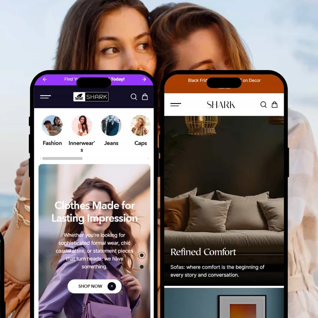
The Bright preset is designed for bold, trend-focused brands that want to make an immediate visual impact. Its aesthetic is energetic and youthful, prioritizing interactive shopping directly from the homepage.
⊕ Pros
✚ Conversion-Focused Header (Mobile-Only): The header is exceptionally clean, but the real win is that the cart and search icons are a built-in part of the bottom navigation bar. This places key actions within easy thumb-reach, reducing friction and potentially boosting mobile conversion rates.
✚ Hover-to-Reveal Product Grid: On collection pages, hovering over a product image reveals a secondary photo and a "Quick view" button. This interactive feedback entices user engagement and allows a fuller product story to be told without leaving the page, which can help increase AOV.
✚ Centered, High-Impact Branding: The centered logo and menu are a core part of this preset's design, creating a strong, symmetrical layout. This is a fundamental structural choice that feels confident and is well-suited for brands where the logo is a key visual asset.
⊖ Cons
− Potentially Distracting Motion (Demo Staging): The homepage demo utilizes multiple scrolling text marquees and a spinning "Scroll" graphic. While the theme provides these sections, their overuse in the demo could be distracting for some customers and may detract from the core product focus if not used sparingly.
− Limited "Below-the-Fold" Urgency (Demo Staging): Once you scroll past the energetic top sections of the demo, the design becomes more conventional. There's a missed opportunity to carry the interactive elements further down the page to maintain conversion momentum.
-
The Decor preset offers a complete contrast to Bright, presenting a refined, elegant, and minimalist aesthetic. It’s built for brands that want to showcase quality and detail with a calm, sophisticated confidence.
⊕ Pros
✚ Excellent Storytelling Layout: The homepage is structured perfectly for brand storytelling, with beautifully integrated sections for brand history, ingredient sourcing, and customer testimonials that help build customer trust.
✚ Warm and Inviting Typography: The choice of fonts feels traditional yet highly readable, contributing significantly to the theme's authentic and trustworthy brand vibe.
⊖ Cons
− Clean, Minimalist Product Grid: The grid design prioritizes whitespace and clean lines, giving each product room to breathe. This minimalist approach enhances the perceived value and sophistication of the items, which is ideal for premium brands.
− Elegant Serif Typography: The preset’s core design uses a sharp, high-contrast serif font for headings. This fundamental typographic choice immediately establishes a premium, editorial feel that elevates the perceived value of the products.
− Asymmetrical Header Layout: The left-aligned logo with navigation to the right is a classic, intuitive layout. This built-in structure provides ample space for a multi-level mega menu while maintaining a clean, uncluttered look.
Niche Suitability
Not Ideal For
Final Recommendation
-
This theme is ideal for ambitious, brand-conscious merchants who want to stand out with interactive merchandising. Businesses in fashion, home decor, or beauty that can leverage features like shoppable images or before/after sliders will find immense value.
-
Merchants with massive, multi-thousand-product catalogs (e.g., auto parts stores) might find the visual-first aesthetic less suited for pure utility-based browsing. Additionally, absolute beginners who lack strong brand assets (logos, photography) may struggle to make the more minimalist presets shine.
-
Low to Medium. The presets provide a very strong starting point, but realizing the theme's full potential requires high-quality visual assets and a clear brand strategy to match the built-in features.
★ 8.4/10
Rating
-
The theme includes valuable, app-like features like a before/after slider and image hotspots natively. Core functions like search, quick view, and color swatches are robust and well-implemented across presets.
9
-
From a shopper's perspective, the theme is highly intuitive. Sticky CTAs and clean navigation make browsing easy. For merchants, the clear separation of presets and powerful sections is a plus, though mastering the design requires some effort.
8
-
The mobile experience is excellent. Responsive design is flawless, and thoughtful touches like placing the cart/search in a bottom bar on the Bright preset show a deep understanding of mobile usability.
9
-
Based on hands-on testing, interactive elements like the quick view modal and slide-in search were fast and responsive. Pages loaded without any noticeable lag, providing a smooth and fluid user experience.
8
-
The theme offers powerful flexibility through its diverse sections. However, core layout structures (like the header or product grid interaction) are tied to the preset, which provides a strong foundation but limits some foundational mixing-and-matching.
8
FAQ
〰️
FAQ 〰️
-
👑 Absolutely. The "Bright" preset is perfect for modern fashion brands with its interactive grid, while the "Decor" preset's elegant typography and premium feel are tailor-made for home goods and furniture.
-
📱Yes, it is exceptionally mobile-friendly. Testing revealed a fluid experience, with smart UI choices like placing key navigation elements within thumb's reach on certain presets.
-
🎨 The theme is highly customizable. You can control colors, fonts, and layouts through Shopify's editor, and the distinctly different presets provide a strong starting point for varied brand identities (e.g., bold and playful vs. elegant and minimalist).
-
⚡Performance feels solid. Interactive elements like the search modal and quick view are snappy, and pages load quickly, providing a smooth user experience with no discernible lag during testing.
-
👕Yes. Product variants like colors and sizes are fully functional within both the main product pages and the quick view modals, using clear swatches and buttons.
-
🔎 The theme is built with standard SEO best practices in mind, like proper heading structures and breadcrumbs. It integrates seamlessly with Shopify's native SEO settings.
-
💱Yes, a language and currency switcher was present and functional in the footer of the demos. This allows merchants to use Shopify Markets to sell internationally.
-
⚙️ Yes, as a modern Shopify theme, it is designed to be compatible with the vast majority of apps available on the Shopify App Store.
-
🛒 Yes, you can try the theme for free on your store with your own products. You only pay if you decide to publish it. Live demos for each preset are also available on the Shopify Theme Store.
Disclaimer: This review is based on hands-on testing of the publicly available "Bright" and "Decor" preset demos of the Shark Shopify theme as of June 16, 2025. Theme features, preset availability, and performance can change with subsequent updates from the theme developer.