
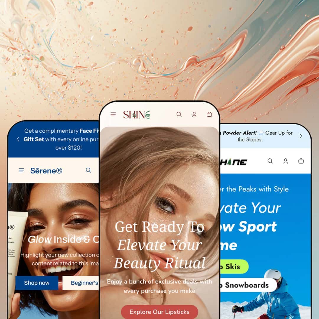
Most themes sold for beauty pick a mood and stay inside it: soft light, slow scroll, one shelf. Shine ships that, and then hands you a full snow-sports gear store built on the same Online Store 2.0 section library. Across its three presets it travels from color cosmetics to apothecary skincare to alpine equipment without ever looking like it borrowed a layout it didn't own. For a $210 theme pitched at "beauty and wellness," that range is the whole story, and the question worth testing is where the stretch holds and where it thins.
One purchase, three credible storefronts
Set Shine beside Dawn and the contrast lands immediately: where Shopify's free baseline gives you one neutral canvas, Shine delivers three fully composed storefronts that each commit to a different retail world. It's range you can see. The cosmetics, apothecary, and gear presets restructure navigation, product pages, and merchandising around their vertical rather than recoloring one layout, so for an agency or multi-brand operator launching several stores on considered-purchase products, that's three real starting points from a single license.
Product pages that sell on trust, not just price
Every preset can turn a product page into a credibility argument. No plugin required. The same toolkit recurs throughout, with certification and credential cards, ingredient and usage detail, and structured attribute fields that the merchant fills rather than codes, none of it dependent on a third-party content app. For ingredient-led beauty, skincare, or food-and-drink brands selling to claims-checking, considered buyers, that built-in detailing replaces a content app you'd otherwise install and wire up yourself.
The merchandising kit is already on the shelf
Shine ships its conversion furniture as part of the theme instead of as a shopping list of apps to add later. No app list required. Quick add and quick view, a live stock counter on the product page, countdown timers, promo popups, in-menu promotions, cross-sell and recommended-product rows, and a slide-out cart with order notes all arrive configured and waiting. For promo-driven and seasonal-drop merchants whose buyers shop on impulse, having that urgency stack native means launch-day campaigns don't wait on integration work.
No native way to compare products side by side
Shine tells stories beautifully and compares nothing. There's no built-in spec-comparison or side-by-side table anywhere in the section library, so a shopper weighing three pairs of goggles or two serums on their attributes has to open tabs and hold the differences in their head. For spec-driven, cross-shop-heavy buyers in gear, electronics, or supplements, that gap means installing and wiring a separate comparison app, or leaving customers to track the specs themselves. It's the clearest place the theme's editorial instincts cost it.
Social proof is editorial, not verified
The testimonial sections look convincing and carry nothing behind them. The quotes are set dressing. Across every preset the customer feedback is theme-managed editorial copy, not verified reviews, so there are no stars on product cards, no rating counts, and nothing a shopper can sort or read as real, earned feedback. A beauty, skincare, or repeat-purchase brand that lives on reviews will still need a dedicated reviews app to display verified ratings where they matter; at $210 the polish is there, but the proof layer is not.
No subscription or replenishment path for consumables
For products people reorder, Shine offers no native subscribe-and-save surface. The product page is built for a one-time, considered purchase, with no theme-level toggle for subscription cadence or auto-replenishment, which is app territory the merchant supplies and styles themselves. Subscription-driven skincare, supplement, or food-and-drink brands counting on recurring revenue will be bolting that flow on rather than configuring it. The theme assumes you sell moments, not refills.
What it takes to launch
Plan two to three days to replace demo imagery and copy across the hero, menus, and long storytelling sections, populate the metafields behind the structured product fields, re-stage the mega menu and its promo tiles around your own catalog, and reset every countdown and promotional schedule before going live.
-
What works in this preset
Open the cosmetics demo and the first thing that earns attention is the shade work. The range reads at a glance. The "Dangerous Cream Lipstick" page fans a nineteen-image gallery across a dozen named shades, and the collection rows carry that same color-first logic down the page, so a line built mostly on color sells itself before a shopper ever taps in.
The product page is where this preset makes its argument. It's a long read. Below the buy box sits a numbered application routine, a deep run of brand-story sections, and a usage walkthrough, all drawn from the section library rather than a bolt-on, so a beauty label can carry a full ritual narrative on a single scroll without paying for a page-builder.
A shoppable hotspot image anchors the mid-page. It tags individual products onto an editorial photo, so a browser can buy straight from the styling shot instead of backtracking into a collection grid first. I clicked it expecting decoration and found live links.
Where it stumbles
The composition assumes a deep catalog. Stacked product-tab rows, multiple featured-collection bands, and long storytelling sections fill a homepage that wants dozens of SKUs to justify its length, yet color cosmetics brands often launch with a tight line. You either pad the page or prune the sections; the preset rewards a depth a new makeup label may not have yet.
-
What works in this preset
Serene is the preset that feels most expensive, and it gets there with restraint. The product pages read like an apothecary shelf: "Suited to," "Skin feel," "Aroma," and "Key ingredients" each get a structured field, turning a single skincare SKU into a considered object rather than a listing, with gift-wrap and return-policy accordions sitting alongside in the same calm register. Restraint is the point.
Navigation is where this one shows off. The mega menu runs four grouped columns with image tiles and, usefully, a Page Templates column that surfaces the theme's alternate product layouts (media slideshow, media list, large width) right inside the demo so a merchant can preview them before committing. I went looking for layout options and the menu handed them over.
A video social wall, a marquee credibility strip, and an ethics row of B-Corp, Leaping Bunny, and PETA blocks round out the homepage, each one a section a wellness label can populate without reaching for a single plugin. It's trust, built in.
Where it stumbles
That same calm works against urgency. The free-gift announcement and the sale markers are styled so quietly that they nearly dissolve into the whitespace, which flatters a luxury mood but blunts a flash-sale push. A restock-driven or promo-heavy wellness brand will end up fighting the palette for attention.
-
What works in this preset
The gear preset is the clearest proof Shine travels beyond beauty, and it shows up first in the variant picker. The variants do the work. A single pair of goggles carries a size button group and color image-swatches at once, renders sold-out and unavailable states honestly per combination, and parks a size-chart link beside the picker, which is the difference between a usable apparel store and a frustrating one.
The store wayfinds by activity, not just category. Its mega menu leads with Everyday, Hike, Ski, and Snowboard tiles, each carrying real collection imagery instead of plain text links, which is much closer to how a sports shopper actually narrows a purchase down. I noticed the hero even swaps in a dedicated mobile banner asset rather than letterboxing the desktop one.
The product page brings gear-appropriate furniture, including a performance-metric stats block, a care-and-maintenance guide, numbered key-highlights, and a before/after UV comparison panel that all draw from the same shared section set. Technical products get room to explain themselves.
Where it stumbles
For all that, it never fully sheds its beauty-theme DNA. The type and spacing read editorial-soft. That airy rhythm suits a serum but undersells a brand that wants to look fast and rugged, so a high-energy sports label adopting Shine is really buying a beauty-first system wearing technical clothing, and the seams show in the quiet typography.
Three stores from one toolkit
The achievement isn't any single preset; it's that one section library convincingly assembles three genuinely different stores. It holds together. The presets reshape navigation, product pages, and merchandising rhythm rather than swapping palettes, and the build quality stays steady whether you're in cosmetics, apothecary skincare, or alpine gear. Buying Shine is really buying optionality, the freedom to land on a vertical, or change your mind, without changing themes.
Built for brands with something to say
Every preset privileges the slow, editorial scroll, the long homepage and the storytelling product page. That bias is a point of view. Shine assumes you have a narrative, a ritual, or a credential worth a reader's time, and it gives you the room to spend it, which means brands whose value is the story around the product find the whole system tilted in their favor.
Generalist by design
Breadth is bought with depth. Because Shine spreads itself across verticals, it stays a generalist: it nails first-touch storytelling but leaves the category-specific power tools, the operational machinery a scaling catalog leans on, to apps and custom work. The bigger and more specialized your store grows, the more of that depth you end up assembling yourself.
One tempo, and it's unhurried
Shine has a single rhythm and it's slow. The editorial pacing that flatters a hero product turns into drag for utilitarian, grab-and-go shopping, and there's no leaner, faster mode waiting underneath the storytelling one. Merchants whose buyers want speed over seduction will spend their setup time trimming the theme back toward brevity.
★ 8.0/10
Rating
-
A 28-plus section library covers shade merchandising, structured product transparency, image hotspots, and a full conversion kit, with two-axis variant handling that renders per-combination availability.
9
-
The Online Store 2.0 editor is approachable, but the long, section-dense presets demand real configuration and trimming before a small catalog looks right.
7
-
Presets ship dedicated mobile hero assets and slide-out navigation rather than shrinking the desktop view, and the variant pickers stay legible on a narrow screen.
8
-
Lazy-loading is in place, but the storytelling presets lean on large galleries, video walls, and many stacked sections, so media discipline matters to keep load times in check.
7
-
Three structurally distinct presets plus a deep section set give wide latitude to compose very different stores, from minimal apothecary to high-energy gear.
9
Frequently Asked Questions
-
Pick by how you merchandise. The Shine preset is built around color, with shade swatches and a gallery-heavy product page, while Serene leans apothecary, with structured ingredient and "suited to" fields for a slower, ritual-led story.
-
Yes. The Energetic preset runs a complete snow-sports gear store with size-and-color variants and spec blocks, though the type and spacing keep a soft, editorial feel even there.
-
Built in. They're part of the shared section library, so any of the three presets can use them without installing anything.
-
It's pitched at mid-size catalogs in the eleven-to-one-hundred-plus range. Past that you'll feel the absence of deep, attribute-level filtering and want extra tooling.
-
Both are native. Product pages can show a size-chart link beside the variant picker and a live in-stock count, which helps for apparel, footwear, and limited-run drops.
-
The theme's own interface text ships pre-translated for English, French, Italian, German, and Spanish out of the box. Translating product content and converting currency is handled by Shopify Markets, not the theme.
This review is based on hands-on testing of the publicly available preset demos of the Shine Shopify theme as of June 9 2026. Theme features, preset availability, and performance can change with subsequent updates from the theme developer.