
ShowTime is a premium Shopify theme built for large catalog stores that want to balance product discovery with conversion‑focused tools. In testing, both presets shared a number of global behaviors: a sticky header with built‑in search, multi‑level navigation, quick‑add buttons that either add directly to a slide‑out cart drawer or open a small quick‑shop panel for items with variants, cart‑drawer messaging that includes cross‑sell and free‑shipping progress, and comprehensive product pages with variant selectors and collapsible information tabs. Marketing sections such as countdown timers, video blocks and blog/news templates round out the package, giving merchants ample ways to merchandise without apps.
Pros.
〰️
Pros. 〰️
✚ Navigation built for big catalogs.
Both demos use a sticky header with multi‑level menus and live‑suggestion search, then diverge into two strong browse paradigms: an off‑canvas “Departments” side panel in Default and an image‑rich editorial navigation in Runway. Shoppers can go deep without losing context, and the nav itself becomes a merchandising asset.
✚ Cart experiences that nudge higher order value.
Default’s quick‑add drops items into a slide‑out drawer that shows free‑shipping progress, dynamic stock cues and cross‑sell prompts; Runway’s full cart page streamlines edits with quantity steppers, order notes and a continue‑shopping link. In both cases the cart surface is doing persuasive work, which reduces reliance on third‑party upsell apps.
✚ Product page depth out of the box.
Variant swatches, size selectors, availability messaging, pickup information and collapsible tabs are standard, and many products include a “Frequently bought together” or recommendation block. Shoppers get the details they need without hunting through long descriptions, and merchants don’t have to stitch together core PDP features.
✚ Editorial and content sections ready for marketing.
Countdown timers, video blocks, blog/news templates and promotional banners are used throughout the demos. The Default preset even stages the homepage to push shoppers toward categories before individual items, using callouts and promos to channel exploration; that structure fits broad assortments and reduces pogo‑sticking. Together, these blocks let teams run campaigns and publish stories without custom code.
✚ Quick actions tuned to context.
The grid behavior adapts to product complexity: single‑SKU items can be added immediately, while variants either open a light quick‑shop panel or a true quick‑view modal with gallery and selectors. Shoppers stay oriented, and stores can emphasize immediacy or consideration depending on assortment.
Cons.
〰️
Cons. 〰️
🚫 Required pages missing in the demos.
Footer links such as Customer Support, Shipping & Returns and About Us route to 404 pages. It’s a staging issue, but it’s the sort of oversight that breaks trust fast if a merchant forgets to finish content before launch.
🚫 Divergent add‑to‑cart journeys.
The Default demo prioritizes an efficient Add/Options path into a persuasive cart drawer, while Runway relies on a hover‑triggered quick‑view and redirects adds to a full cart page. The behaviors are both viable, yet the contrast may slow stores that prize one‑click grid adds across all categories.
🚫 Minor polish issues.
We saw occasional overlap between the search suggestion dropdown and the header in narrower desktop windows, plus a remove‑item icon that sometimes required multiple clicks on the full cart page. These aren’t blockers, but they do create small moments of friction that are worth tightening.
🚫 Setup is not plug‑and‑play.
There are many sections and options to configure; menus and informational pages must be built with care. Expect to fine‑tune cart behavior and quick‑actions to match your merchandising approach.
-
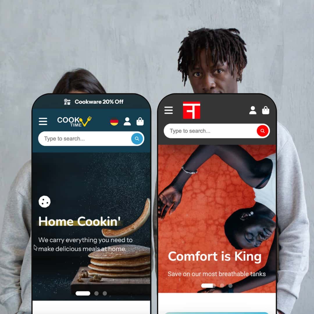
Styled for home, kitchen and general merchandise, the Default preset leans into warm colours, friendly typography and approachable iconography that suggest a family‑friendly store. Its navigation emphasizes breadth without forcing page changes, keeping shoppers oriented while they explore.
What works in this preset
A warm, home‑focused visual language. Typography and iconography are tuned for a household aesthetic rather than a stark, editorial one. That choice softens the tone of merchandising blocks and makes utilitarian items (mixing bowls, organizers) feel giftable. The presentation invites slow browsing across rooms and occasions, which suits stores built around seasonal collections and sets. This steady, welcoming tone helps everyday products read as part of a lifestyle rather than simple commodity buys.
-
Runway targets apparel with an editorial layout built around large hero images, neutral palettes and polished typography. The header offers an at‑a‑glance structure for Women, Men, Sale and New, and pivots into a magazine‑like browse experience.
What works in this preset
A clean, magazine‑style aesthetic. Large heroes, careful type and generous spacing give collection and article pages a polished feel. The look supports storytelling and brand campaigns without sacrificing clarity around sizes, variants and availability once shoppers reach PDPs. The presentation helps apparel stand out and makes editorial content feel at home alongside products. It reads like a fashion site first and a store second, which many style‑driven brands prefer.
Header composition built for fashion. The Women/Men/Sale/New scheme, with an arrow affordance that expands into the full navigation, makes seasonal pivots obvious and reduces the clicks needed to reach trend‑driven destinations. It creates a familiar rhythm for fashion shoppers used to scanning big‑brand nav bars. Merchandisers can highlight new arrivals or sales without rewriting the entire menu each season, which keeps the store nimble. The structure rewards habitual scanners who come back to check what’s new.
Niche Suitability
Not Ideal For
-
Large‑catalog merchants in categories like home goods and apparel who want strong navigation, persuasive cart experiences and room for editorial content. Teams planning to merchandise through campaigns, promos and stories will get the most from the sections provided.
-
Single‑product or digital‑only stores, and merchants who insist on one‑tap grid adds everywhere with minimal staging. Extremely utilitarian buyers who dislike editorial menus and content blocks may prefer a simpler theme.
-
Medium — ready‑made sections and cart logic reduce app dependency, but merchants still need to configure navigation, complete critical pages and choose the quick‑add/quick‑view emphasis that suits their catalog. Those tasks take planning more than code, yet they do require time and editorial discipline.
Final Recommendation
★ 8.0/10
Rating
-
ShowTime integrates quick‑add buttons, quick‑view modals, mega menus and marketing blocks without apps. Some inconsistency between presets and missing pages prevent a higher score.
8
-
The admin exposes many sections and options; merchants will need time to configure menus, fill content and choose between cart types.
7
-
Navigation and cart drawers translate well to mobile, though search suggestions occasionally overlap the header. Quick‑add and quick‑view remain accessible.
8
-
Pages loaded smoothly and animations (cart drawer and quick‑view) felt lightweight. Only minor glitches (remove‑item icon) appeared during testing.
8
-
With two very different presets and numerous sections, merchants can shape distinct storefronts; colour palettes and typography are customizable without code.
9
FAQ
〰️
FAQ 〰️
-
👑 Yes. The Default preset is tailored to kitchen and home goods, with an emphasis on category exploration and grid behavior that lets shoppers add items directly from the grid when appropriate.
-
📱Absolutely. Sticky headers, slide‑out menus and the cart drawer adapt to mobile. Search suggestions and quick‑add or quick‑view buttons remain accessible on smaller screens, though we noticed occasional overlap in the suggestion dropdown.
-
🎨 The theme supports custom colours, fonts and section layouts. You can enable or disable countdown timers, videos, blogs and other blocks from the editor. The presets show how different styles can be achieved without code.
-
⚡ Pages load quickly and animations (like the cart drawer and quick‑view modal) are smooth. We only observed minor hiccups with remove icons on the cart page. Overall, performance felt snappy on desktop.
-
👕 Yes. Variant swatches and size selectors are built in. For multi‑variant items, the Default preset offers a mini quick‑shop panel before adding to cart, while the Runway preset’s quick‑view modal lets shoppers select options and add to cart.
-
🔎 There aren’t dedicated SEO control panels, but the theme is compatible with Shopify’s built‑in SEO features. The blog and news templates make it easy to publish fresh content, which supports ongoing discovery.
-
💱 Yes. Languages and currencies are managed through Shopify’s standard settings, and the theme surfaces selectors when they’re enabled in your store.
-
⚙️ Yes. ShowTime worked smoothly with cart and variant behavior in testing, and we saw no signs of app conflicts during core flows.
-
🛒 You can explore both the Default and Fashion demos on the developer’s site and via the Shopify Theme Store. The theme can be previewed in your own store before purchasing.
This review is based on hands‑on testing of the publicly available “Default” and “Runway” preset demos of the ShowTime Shopify theme as of 15 November 2025. Theme features, preset availability and performance can change with subsequent updates from the theme developer.