
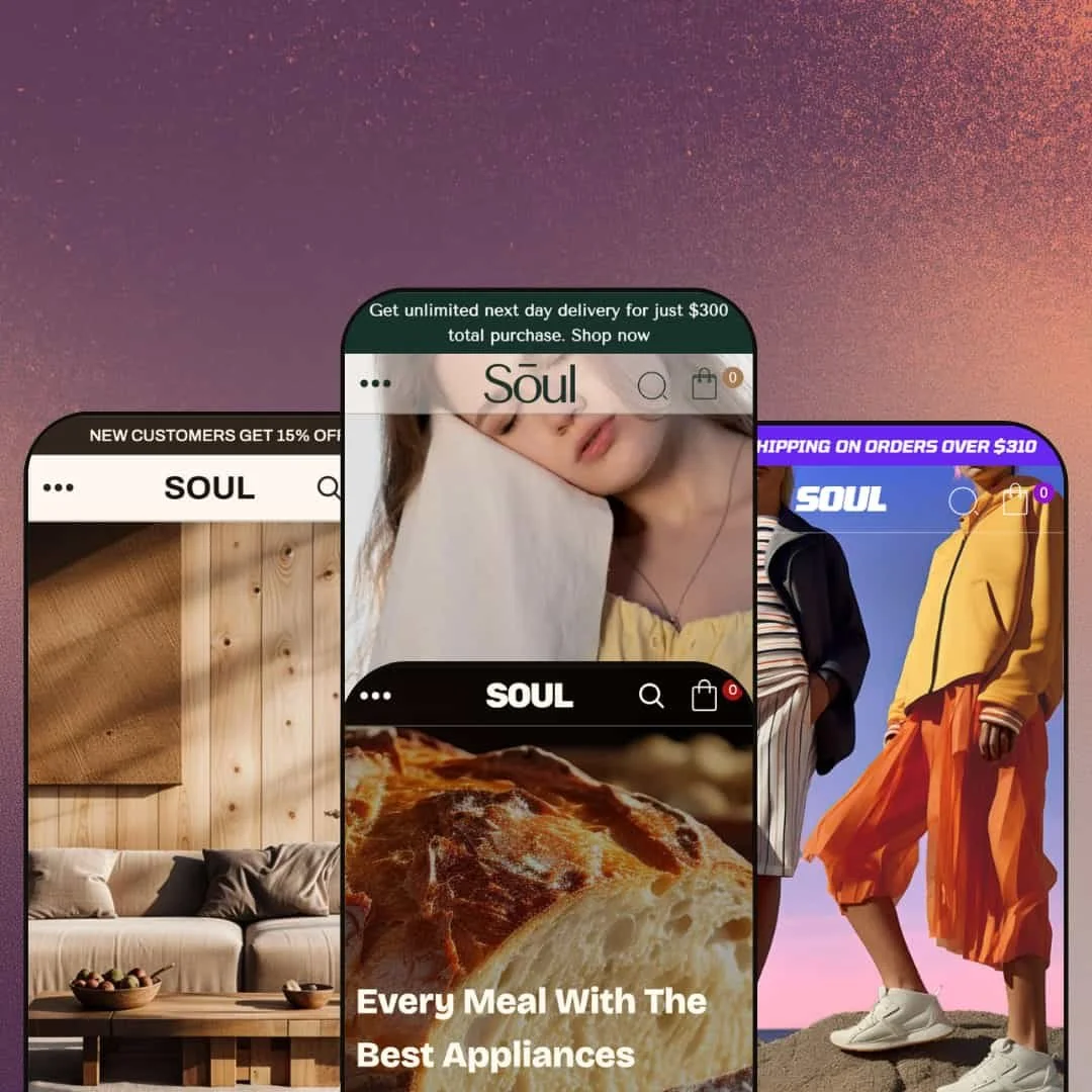
Most multi-preset themes hand you the same layout in four coats of paint. Soul does something harder: each of its four presets is aimed at a different business entirely, moving from fashion to furniture to activewear to wellness food. That decision is the whole story here, and it is the reason a single $190 license can outfit four very different storefronts without a redesign. Soul runs on Online Store 2.0 with its newer sections rebuilt on Theme Blocks, and the question this review answers is whether the breadth comes at the cost of depth.
Four presets, four real markets
Soul ships four presets that target genuinely different businesses: fashion in Soul, home and furniture in Hearth, activewear and footwear in Stride, and nutrition and natural food in Boule. The range is the value. These are not one layout in four colourways; the section mix, density, and conversion posture change with each one. For a studio or operator running more than one brand, or a single brand still deciding its visual direction, that range means one $190 license covers ground that would otherwise need separate theme purchases. Single-identity brands with a locked aesthetic will not use most of it.
A cart layer that does real conversion work
The slide-out cart is not a bare line-item list. It carries a free-shipping progress indicator, cart notes, gift wrapping, in-store pickup, and a sticky mini-cart that stays reachable on mobile. Merchants chasing post-add-to-cart lift normally bolt this together from two or three cart apps, so having it native trims the monthly app stack and keeps the buying loop on-theme. For mid-volume catalogs in food, apparel, or wellness that depend on average-order-value mechanics, this is one of the stronger cart implementations at the $190 tier.
A visual-merchandising kit, not just a homepage builder
Most themes at this price treat storytelling as a single lookbook and call it done. Soul gives you a lookbook, image hotspots, a before-and-after image comparison, dynamic hover blocks, and a Theme Blocks Flexible content section that nests media and text freely. The toolkit is broad. Together they let a brand build campaign and editorial pages without a page-builder app or custom Liquid, which is the difference between launching a seasonal story this week and waiting for next quarter. Photography-led brands in fashion, interiors, and wellness get the most from it.
Demand-capture and conversion features built in
Pre-order, back-in-stock alerts, a countdown timer, a stock counter, promo pop-ups, quick view, and a recently added age-verification popup all ship with the theme. These usually cost extra. A small-batch or launch-driven brand can collect demand before inventory lands and apply urgency without wiring up a stack of marketing apps that commonly runs $30 to $60 a month combined. That makes Soul a fit for drop-model and pre-launch brands in food, supplements, and apparel, and less essential for steady-state catalogs that never sell out.
Social proof, wishlist, and subscriptions still need apps
Soul exposes placement for review widgets and similar tools, but customer reviews, star ratings, wishlists, and subscribe-and-save are not theme features. That gap is real. They come from third-party apps, and that holds even where the demo makes them look built in. For a Boule-style wellness or supplement brand whose conversion depends on visible ratings and repeat-purchase subscriptions, budget for those apps from the start rather than expecting the theme to cover them.
The presets are only as good as your photography
Every preset leans on large lifestyle and product imagery to carry its editorial sections. Strip the demo photos and the lookbook, the "Image with product" block, and the image comparison slider look thin immediately. Photography is non-negotiable. The demo is the sales pitch; without comparable photography of your own it should be airtight, and it will not be. Brands without a styled, consistent photo library should budget for a shoot before they budget for the theme.
Heavy customizers should expect to re-test after major versions
Soul has moved fast: five major versions between August 2024 and mid-2025, including a version 4.0.0 that refactored the theme's architecture to current Shopify standards. Velocity has a cost. Frequent updates are mostly a good sign, but a major refactor can mean re-validating custom Liquid and template tweaks after you update. For merchants who commission significant custom development on top of the theme, plan an update-and-test cycle rather than a one-click upgrade.
What it takes to launch
Replace the per-preset demo copy and lifestyle imagery (each preset ships vertical-specific content), populate metafields for product tabs and swatch filters, and configure the mega menu, conversion pop-ups, and cart options before launch.
-
What works in this preset
The Soul preset is the fashion-forward default, and it leads with a deep, warm palette of browns and greens that reads as boutique rather than mass-market. The homepage stacks a full-bleed slideshow, a lookbook, and an "Image with product" section so a clothing brand can carry a shopper from mood to product inside two scrolls. Restraint, not clutter. Hover any product card and a second media item plays automatically if you have set a video as the second gallery asset, which gives apparel a motion preview without a third-party app.
Navigation runs through a mega menu that carries image columns alongside text links, so a brand splitting Men, Women, and Accessories can surface featured pieces inside the dropdown instead of routing shoppers to a landing page first. I clicked through three levels of menu depth and the hierarchy stayed legible on both desktop and the slide-out mobile pattern. The depth is there. For a fashion catalog with seasonal collections, that is the right merchandising spine.
The Dynamic hover blocks and Collection spotlight grid give the homepage editorial rhythm without custom code, and the Theme Blocks based Flexible content section lets you build a bespoke campaign block by nesting media and text freely. I kept scrolling and the pacing held. This is the preset I would point a design-led apparel brand at first.
Where it stumbles
The default demo leans hard on large lifestyle photography. Swap in weak product shots and the lookbook and "Image with product" sections lose their punch fast. Photography is load-bearing here. Brands without a styled photo library will feel that on day one rather than later.
-
What works in this preset
Scroll the Hearth preset and the temperature drops a few degrees: muted furniture-store neutrals, generous whitespace, and slow editorial pacing built for considered purchases rather than impulse grabs. It reads calm. An Image comparison slider sits on the homepage, which is genuinely useful for before-and-after staging shots, room makeovers, or material close-ups that home and interiors brands actually need.
The Collection showcase and Image gallery sections give a catalog of sofas, lighting, or tableware room to breathe, and product cards default to a quieter title-and-price treatment that suits higher-ticket goods. Less shouting, more showroom. I found the calmer density made even a sparse demo catalog feel intentional instead of empty, which is exactly what a furniture or homeware brand under a few hundred SKUs is buying this preset for.
Where it stumbles
Hearth is the most understated of the four, which means it does the least to push conversion on its own. That cuts both ways. There is no urgency styling in the default layout and no stock-pressure framing staged here, so a brand that needs harder selling will be switching features on rather than toning them down. I would treat it as a calm base, not a finished store.
-
What works in this preset
Stride flips the energy completely. Where the other presets whisper, this one is built to convert activewear and footwear shoppers fast, with bolder type, tighter product grids, and prominent quick-buy affordances. Product tabs let a running-shoe page split Description, Materials, and Size guide without an accordion wall, and the swatch filter on collection pages lets shoppers narrow by colour visually instead of through a dropdown.
The sticky add-to-cart bar follows you down a long product page, and quick view lets shoppers add a size from the collection grid without a full page load, which matters when someone is comparing four trainers at once. It is quick on its feet. I clicked through a multi-variant product with colour and size axes and the variant image swapped correctly as I changed the selection. This is the preset I would hand a performance or athleisure brand.
Free-shipping progress and a slide-out cart keep the buying loop tight, and the bold scheme is the most commerce-native of the four out of the box. Speed is the brief. For high-velocity catalogs, that bias toward momentum is the entire point of choosing Stride over the calmer presets.
Where it stumbles
The aggressive styling is a commitment. The bold headings and dense grid that help a sneaker brand can overwhelm a small, premium-positioned catalog, so a label selling eight hero pieces will be dialling Stride down rather than using it as shipped. It is the least versatile of the four.
-
What works in this preset
Crimson on cream, calm typographic spacing, trust signals stacked early: the Boule preset is unmistakably built for nutrition, wellness, and natural-food brands that sell on trust as much as taste. It commits to one audience. The "Product list: Tab" section, built on Theme Blocks, lets a supplement or pantry brand group products into switchable tabs by goal, by range, or by dietary tag inside a single homepage block.
Two newer conversion tools matter most here. Pre-order and back-in-stock alerts let a small-batch food or supplement brand collect demand before stock lands instead of losing the visit, and the age-verification popup added in a recent update covers brands operating near regulated categories. I would call this the most commercially complete of the four out of the box.
Trust comes first. What I noticed scrolling Boule is how early the trust work happens: testimonial and press-coverage sections sit high on the page so social proof lands before the first add-to-cart, which is exactly the rhythm this category lives on. For DTC wellness brands launching a focused range, Boule is the closest thing here to a ready store.
One license, four real markets
Read across all four presets and the pattern is range without dilution. Soul, Hearth, Stride, and Boule do not share a skeleton in different paint; each one changes section mix and selling posture for its vertical. That breadth is the theme's defining trait and the main reason to choose it over a single-vertical specialist.
Conversion depth is unusual at this price
Taken together, the cart layer, the demand-capture tools, and the merchandising sections add up to a feature set that mid-tier themes often split across paid apps. The value is not any single feature. It is that the conversion surface is mostly handled in-theme, which keeps both cost and complexity down for a small team.
Active, responsive development
The version history shows a developer shipping new presets, new Theme Blocks sections, and structural updates on a steady cadence, and the support feedback consistently singles out fast, hands-on help. For a theme this young, that trajectory matters as much as the current feature list.
The conversion story has app-shaped holes
For all the native tooling, the pieces a trust-driven brand leans on most sit outside the theme: reviews, wishlists, and subscriptions. The strongest presets for wellness and food are exactly the ones where that absence shows up first, which blunts the otherwise strong value argument.
It rewards brands that arrive prepared
Soul assumes you bring real photography and a content plan. The editorial sections that make the demos look expensive are the same ones that look hollow without equivalent assets, so the theme flatters prepared brands and exposes unprepared ones in equal measure.
Track record is still thin
As of this review the theme carries 100% positive feedback across only 8 reviews, and it has changed substantially version to version since its 2024 launch. The signal is encouraging but shallow, and risk-averse merchants may want to watch one more release cycle before committing.
★ 8.4/10
Rating
-
Large native conversion and merchandising set: lookbook, image hotspots, before-and-after comparison, pre-order, back-in-stock, countdown, and sticky cart.
9
-
The matching preset auto-applies on install and 30+ drag-and-drop sections speed setup, though the depth of settings takes real time to configure well.
8
-
Slide-out sticky cart, back-to-top, and a back-button mobile menu pattern; recent releases specifically addressed iOS layout consistency.
8
-
Lean default pages with lazy-loaded imagery and a restrained section count; weight only climbs when many media-heavy sections are stacked.
8
-
Four distinct presets plus a Theme Blocks Flexible content section and deep typography, colour, and button controls.
9
Frequently Asked Questions
-
Hearth. It began as the theme's furniture-inspired style and keeps the calm spacing, quieter product cards, and the Image comparison slider that suit higher-ticket interiors catalogs.
-
Yes. The Image comparison section is a draggable before-and-after slider, useful for skincare results, room makeovers, or material close-ups, and it is staged on the Hearth homepage by default.
-
Yes. Pre-order and back-in-stock alerts were added in the 5.0 line and let you capture orders or sign-ups before inventory lands, which is most relevant to the Boule wellness and food preset.
-
Review display is app territory, not a theme feature. Soul provides the placement for a reviews app on product pages, but you will install a dedicated app to actually collect and show ratings.
-
Language selection and currency switching are handled by Shopify Markets at the platform level. Soul's contribution is pre-translated UI strings for English, French, Italian, German, and Spanish, plus the rendering of the language and currency selectors in the header and footer.
-
Soul is the editorial, fashion-led default with a warm palette and lookbook-driven storytelling. Stride is the high-conversion activewear and footwear layout with bolder type, product tabs, swatch filters, and prominent quick-buy. Same theme, opposite temperaments.
This review is based on hands-on testing of the publicly available preset demos of the Soul Shopify theme as of May 2026. Theme features, preset availability, and performance can change with subsequent updates from the theme developer.